The last time

Two years ago Claire took me to see Lou Reed at the Hammersmith Apollo as a birthday present. The fact the gig was the day after my birthday, and not some distant point afterwards, made it all that more special.

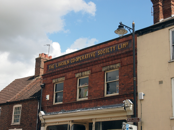
We spent the weekend with good friends in a rented apartment in Hammersmith, and it was they who first asked us if we wanted tickets. I’d never seen him live before, but was concerned, knowing that his voice was long shot. Lou singing songs that were written for his voice as it currently was, was one thing. But him trying to sing songs written for a voice that was long past, could be painful, as was attested by the live recording of the Berlin album he had made a few years before. But we said yes, and justifying the hefty ticket price by asking ourselves if we’d ever get the chance to see him live again, knowing the life he had lived and the toll this must have taken on his body. As it turned out, we wouldn’t.

I need not have worried, he was excellent that night. We were five seats from the stage, and just the thrill of seeing him that close was enough to create some sort of strange disconnected connection with the past and everything he had done—there was a sense of Warhol and the Factory that hung to him. This man had been there, the myth personified and right in front of me.

But this wasn’t just a nostalgia trip—nostalgia being something that I usually run a mile from—it was truly a great performance. The band he had were super tight, yet relaxed. They knew when to let the noise out of the bag, but kept it controlled at all times. The set was a surprise as well, with half of it being tracks from albums I’d passed by, such as Ecstasy, Legendary Hearts, Rock N Roll Heart, Songs For Drella among others. (Regardless of the quality of any Lou album, and there are a lot of shit ones, I’m convinced every release he’s made contains a nugget of gold in there somewhere.) He did a couple of intimate acoustic jazz versions of Velvet’s classics, before launching into an explosive rock version of Sweet Jane that made the audience erupt. The band encored to a gloriously riotous version of The Bells.

We knew then that all wasn’t well. He had to be helped on and off stage, and had to have his guitar lifted around his neck by someone. He appeared to be shaking for much of the set, and was unsteady. But despite this, his confidence in front of the mic and with a guitar round his neck was captivating. Claire and I, on leaving our friends to stay a week longer in the apartment and driving back to Ipswich, we pretty much spoke of nothing other than how great the gig was on the 2 hour car journey back to Ipswich.

The first time

I think it must have been Transformer I heard first. I obviously knew Walk On The Wild side, but my 14 year old ears didn’t really make the connection between this song I occasionally heard on the radio and the artist that my older sister’s boyfriend was going on at me about one time I was staying with them during a school summer holiday. I was hungry for new music, too young to experience punk first hand, catching its coat tails with post-punk and Two Tone and I was soaking up any and all music that wasn’t what my school friends listened to, (mainly heavy metal and prog-rock, punk didn’t reach Mansfield, where I was then living, until about 1982). So after bouts of staying with my brother or sister in London over the summer holidays, who would expose me to wonders I would never otherwise have come across and opened my mind to new possibilites, I would return to the cultural backwaters of Mansfield and raid the local library’s catalogue for anything that seemed strange, exciting, and that didn’t have pictures of satan or fairies on the cover. It was there that I borrowed Transformer and fell in love with it immediately.

But what cemented my love of anything by Lou Reed, was buying a foreign import Velvet Underground compilation record on the back of listening to Transformer. It only had six tracks, and was cheap, hence my paper-round money going on it. It also had a great booklet stapled into the 12″ gatefold sleeve, (in Spanish, I think), with some iconic photographs of the band. To a 14 year old anxious for rebellion and musical adventure, holed-up and feeling alienated in an east Midlands town, there could have been no better purchase I could have made at that time.

Venus In Furs is the track that first got me. I had never, ever heard anything like it before. The droning, the sonic overload, the sheer density of the song. And then there were the strange atonally voiced lyrics. I have a fantasy list of songs I wish I could hear again for the first time, that feeling of being totally amazed and dumbfounded by a new audio experience—Venus In Furs is at the top of that list.

The second track on the album that cemented my view of Lou being a songwriting genius, (and that is not a term I use lightly), which juxtaposed Venus In Furs completely, was Pale Blue Eyes. I lost count of the amount of times I played it over and over after that first hearing. Once heard, I immediately lifted the needle and put it back at the start of the track. I don’t think I’d ever heard a song before that almost ‘wasn’t there’. The lightness of touch, the minimalism, and the tenderness made it somehow rawer than the explosive and chaotic Venus In Furs. I then knew I would never ever be able to write and record a song as good as that, and for someone who was desperate to be in a band, that was an acceptance of failure before I’d even really started.

The middle

So I became a Lou Reed and Velvet Underground fan. I didn’t immediately buy everything, and there are still albums of his I don’t know. Spotify has proved the most useful tool to me in finding out what it is I want to buy and own and cherish; and what will take one listen to know that I don’t need to purchase that particular album. Most recently, and somewhat timely, I downloaded Magic and Loss, an album Lou wrote about death in 1992 that I hadn’t previously explored. I haven’t yet listened to it—it sitting in my iTunes library waiting to be dedicated some time to—and I sense it may take a while for me to pluck up the courage to do so.

Sunday evening

I’m not nostalgic, nor do I put celebrities on pedestals. I hate musician’s egos, (and in fact, many of the lyrics I’ve written over the years for different bands I’ve been in have lambasted such stupidity). And with Lou Reed, his best was past him—such a shame that the Metallica/Lulu project will be his dying record. But Lou Reed has followed me throughout my life and has influenced my opinions about what music can be more than any other artist. I don’t think any musician or lyricist has had a greater impact on my life, and so when I got the text from a friend on Sunday evening telling me the news he had died, I was floored. Not surprised, but speechless and tearful. Echoing my brother’s comments on Facebook as we swapped Lou Reed lyrics, I had to keep telling myself to ‘get a grip’ when tuning into Tom Robinson’s tribute on 6music while cooking dinner that evening. Thankfully it wasn’t played while I listened, but I don’t think I’m going to be able to listen to Pale Blue Eyes for some time.

In all the epitaphs that appeared online, and in all the lyrics being posted on Twitter, I searched for a suitable one to post myself. In Candy Says, Lou’s protagonist asks: “What do you think I’d see, if I could walk away from me?” That has always been a poignant lyric to me, and it was more so in that moment. And to try to answer your question Lou, I guess you now know what you see.

R.I.P

After reading the latest copy of Varoom the other day, I’ve really taken to Joe Caslin’s Our Nation’s Sons project which has just won a New Talent award from the Association of Illustrators.

Viewcraig-Street-575px

The project is aimed at repositioning the views of young men about themselves in a world of negative stereotypes. As Caslin puts it on his website: “As a nation we have pushed a significant number of our young men to the very edges of society and created within them feelings of neglect and apathy. It is now time to empower these young lads and give them a sense of belonging. I cannot fix the complex problems of apathy and disillusionment by simply sticking a drawing to a wall. However, I can create something more meaningful than any bureaucratic promise and generate a more positive social impact than many published articles, political broadcasts or speeches.”

At the centre of the project is the subject, in more ways than one—as Casiln explains when discussing the process of creating the work: “Find them, draw them, get them to stick them up”, and the positive power of this action on the participant/collaborators can clearly be heard in their voices in this video:


In watching the video it is refreshing to hear the observation of one of the lads involved: “When you’re walking around town you see these huge billboards with pictures of celebrities and models for big brands, it’ll be good just to see a giant image of a normal teenager”. This brings into question stereotypes beyond those of anti-social behaviour and challenges the perception that all teenagers are brand obsessed and incapable of decoding when they are being manipulated by advertising.

This project is a positive one on so many different levels, and it probably takes Caslin to sum it up best: “A drawing has the power to go further than words. But a 40ft drawing has the potential to resonate and disrupt the visual landscape of a city. It has the power to pull a passer-by from the mundane, the power to trend and the power to gain real social momentum. It will re-establish respect for and showcase the capabilities of our nation’s sons.”

The project has just recently moved from the streets of Edinburgh to Caslin’s native Ireland and the dramatic Achill-henge. Read here what the local news made of the project.


Follow Our Nation’s Sons on Facebook

To start the new academic year off with a shot of inspiration, we took all Graphic Design and Graphic Illustration students at UCS to GRAPHICS, the Romek Marber exhibition at The Minories in Colchester.

OLYMPUS DIGITAL CAMERAMarber’s influence on British Graphic Design can not be underestimated. His most famous work was for Penguin Books, particularly their crime series, producing many of the iconic green covers utilising photography, collage and drawn imagery to full effect to capture the title of each book he designed for. He also famously designed one of the grid systems that Penguin used for many years.

OLYMPUS DIGITAL CAMERAAmong the covers on display was also his rationale behind the layout. As the exhibition literature states: “Romek Marber’s work often communicates in a clear and direct manner that is bought by combining a stripped down use of colour with well defined formal structures within which text and image are framed. A sense of pragmatism and design that grows out of necessity in terms of delivery of message results in an efficient visual imagery that wastes nothing but at the same time appears to leave nothing out.”.

OLYMPUS DIGITAL CAMERASome of Marber’s typographic work balances a tightrope between experimentation and reductive modernist austerity, clearly influencing many designers working today. In fact, the covers he did for The Economist only look dated because of the mastheads—Marber’s type explorations themselves could grace many contemporary magazines and certainly wouldn’t look out of place on Bloomberg Business Week.

OLYMPUS DIGITAL CAMERAAnd this film title sequence could be mistaken for some of the experimental and fluid graphic illustration coming out of the UK at the turn of 21st century by the likes of Dávid Földvári et al:

OLYMPUS DIGITAL CAMERAGRAPHICS exhibition is highly recommended, and runs until 25 October: details here. Thanks to Cydney and Kaavous at The Minories.

While in Colchester, and with the Firstsite Gallery a stone’s throw from The Minories, we also took the opportunity to take a look at the Xerography exhibition that is on there. This celebrates the role of photocopying in art, from the 1960s through to the modern day.

OLYMPUS DIGITAL CAMERAThis show has an impressive list of 40 contributors, and naturally for graphic design students, the more graphic and book orientated work seemed to appeal the most.

OLYMPUS DIGITAL CAMERAThe Hockney’s were particularly good and of interest to illustrators:

OLYMPUS DIGITAL CAMERAAnd I was really taken with this mail-art piece by Eugenio Dittborn:

OLYMPUS DIGITAL CAMERAThe show is mixed enough for something to appeal to everyone, although I doubt that there would be anyone who would like everything that was on show. But despite its breadth, the one obvious omission for me was the lack of graphic design. For an exhibition which is tied together by the process of using a photocopier to produce work, this seems like a massive black hole. For example, there are no punk era fanzines such as Mark P’s Sniffin’ Glue which helped to define the aesthetic of an era. This form of instant publishing also helped to introduce some to a career in graphics, such as Terry Jones. There were also no rough and ready record sleeves, whether by the likes of practicing designer Linder Sterling or by the many unknowns who embraced the Do It Yourself nature of punk in 1976/77.

Omissions aside, this is a worthwhile exhibition to go and see, especially if you can go when the Marber exhibition is still on at The Minories, as the juxtaposition between the two makes for refreshing contrast. Xerography runs until 10 November, details here.

Thanks to Sue Hogan for the student talk.

FaceAcheLeft: Tate Etc. Issue 29, Autumn 2013. Design & Art Direction—Mark El-khatib and Sara De Bondt
Right: Face Dances by The Who. 1981. Sleeve—Peter Blake

photoAgainst my better judgement I bought a Ginsters’ sandwich yesterday.

On eating it, I glanced at the packaging to see the declaration above—that Ginsters had donated the side of the pack to a charity. I turned the packaging over, and, as they claim, there was information about the Royal Voluntary Service.

This struck me as somewhat insidious because of how this supposed act of corporate social responsibility was being turned into a marketing opportunity. In my opinion, the fact that Ginsters have felt it necessary to so prominently proclaim their act of altruism defeats any good will the act itself might bring to the company. To think that Ginsters’ marketing department didn’t realised this potential reaction might happen—that no one who see through this forced ‘look at us, aren’t we wonderful’ approach—is incredulous. The contempt for the consumer is further compounded by the additional emotional blackmail of the question “what could you give?”. Coming after the statement about their ‘donation’, (as if it really cost Ginsters anything other than a couple hours of a graphic designer’s time), is insulting as it suggests that the company believe they have done their bit and now the responsibility lies with the consumer.

Corporate social responsibility is an important issue in contemporary business practice. But if companies like Ginsters want us to believe that they are genuine in their commitment to the voluntary sector, then they need to stop patronising consumers and use their involvement in social issues for more than a marketing opportunity.

It was nearly enough to put me off a sandwich I wasn’t particularly enjoying.

Beatles

Hierarchy of albums by The Beatles

The Beatles were the first band I really liked. I can’t remember when I first heard them, but memories of being given a compilation album as a present, watching all their films one Christmas, having the 1964 Royal Variety poster on my wall and singing Yellow Submarine and When I’m 64 on family holidays between the age of 6 and 12, are lodged firmly in my memory.

Several Beatles albums became favourites, although I owned few of them. That is until recently. When Apple re-released their entire catalogue in 2009, remastered for CD  and download, I started to buy them one by one. I began with those that I either had on vinyl in the loft or on tape in a cupboard somewhere—Rubber Soul, Revolver, The Beatles (The White Album), Abbey Road—and then worked through some that I didn’t know so well such as Help, other soundtracks and their early releases. The earliest, I didn’t know at all as albums, and these were the last of my purchases.

That is, excepting Sgt Pepper’s Lonely Hearts Club Band. My father had oddly bought himself a copy circa 1973, and I can clearly remember him bringing it home, (this was odd because my father never bought LPs for himself). And over the years, I grew to first love, then hate that album. The songs you sing in the car as an eight year old with your family can quickly become toxic to the ears of a teenager discovering punk rock. It further grated with me when it was played every day back to back from the pyramid stage the one and only time I went to Glastonbury Festival, (1987 and the LP had just been released on CD for the first time).

So now I owned the set, I decided to experiment and listen to them one by one, in order of release, as an exercise in hearing a band develop and grow. And boy, what an interesting experiment it was.

The image above visually ranks the albums, in my opinion, in order from best at the top to worst at the bottom. The list, for those that don’t know the album covers is:
01. Rubber Soul
02. Sgt Pepper’s Lonely Hearts Club Band
03. The Beatles
04. Magical Mystery Tour
05. A Hard Day’s Night
06. Revolver
07. Abbey Road
08. With The Beatles
09. Help
10. Beatles For Sale
11. Let It Be
12. Yellow Submarine
13. Please Please Me

Lots of people will disagree with my list, so I ought to explain my judging criteria, (not that I think that will convince any music/Beatles purists reading this). Outside of personal enjoyment and taste, my analysis boiled down to an albums consistency and the band’s exploration/developmental leaps.

My first choice, Rubber Soul, has always been the Beatles album I’ve loved more than any other, so it is of little surprise that it remains my favourite. But nostalgia aside, to me, it is the sound of a band in transformation, on the verge of breaking new ground and is utterly of its time. Here they were breaking away from purely being a pop band, into recording artists who commanded their sound and their songwriting. It is the promise of what is to come, and therefore in my mind, better than what followed.

What did surprise me was that Sgt Pepper’s should come second, having anticipated that I would put Revolver in that spot and considering my previous contempt for The Hearts Club Band. But on listening to the albums in order, while Revolver probably contains one of the greatest songs ever in Tomorrow Never Knows, and also hosts probably one of the best opening tracks to an LP in Taxman, the rest of it lacks the consistency of Rubber Soul and Sgt Pepper’s. It feels like an album of extremes; they weren’t brave enough to jettison the frankly shit Yellow Submarine and sickly pop songs which sit awkwardly alongside the more pioneering experimental moments. It is still an astounding record, but doesn’t deserve second place based on my listening rationale. Where as Sgt Pepper’s, on listening to again after so many years of avoiding it, was a delight. It hung together really well, and I could even forgive When I’m 64, (just). In many respects, not listening to it as a concept album, and rather, thinking of it as a collection of songs helped. The distance helped as well, but just how soon I’ll get around to listening to it again, I don’t know. Now I’ve discovered it again, I don’t want to lose it straight away.

I’m not going to go through the rest of my choices here, although the big surprise to me was how good A Hard Day’s Night is. It isn’t an album that I previously knew, although I obviously knew most of the tracks on it from the film and various compilations. But for me, it was their first truly great record. It maintains some of the gritty rock n roll vibe from the previous albums, especially in Lennon’s vocal delivery, (although it must be said that McCartney can scream for England). All tracks were penned by the band themselves—a rarity in 1964—and the more feisty tracks are balanced with their delicate crafting of tender ballads and joyous pop songs. It was a gem to discover.

You could almost say that The Beatles didn’t make any bad albums, although Please Please Me isn’t great, Let It Be is the sound of a band that had run out of ideas, and Yellow Submarine is only half an album, (and it has Yellow Submarine on it). Regardless, they all have their moments, and to listen to them all from start to finish, in order, was a really interesting musical journey to witness. Especially considering that these 13 albums were all released within the space of seven years.

Well, I’ve been back at the day job for a week now and my summer holiday seems like a distant memory. So before it stretches back any further, I thought I should post some of the cultural highlights from our two weeks away.

First up, we stumbled across the Bubble Car Museum when in Lincolnshire, and what a find. I wasn’t sure what to expect, and all I really hoped was that they had a Bond Bug, because I had a Dinky toy version as a little boy. But it has to be said, this was a gem of a little museum.

OLYMPUS DIGITAL CAMERAFrom the outside the museum looked like a small shed, and I half expected to just see a few rusting, half refurbished cars. But no, the place was rammed with these amazing vehicles. There was something optimistic about these 700cc or less cars and bikes—futuristic and weirdly beautiful. And the museum curators had done an excellent job of displaying them all, trying to put them into context with mock-ups of 1950s shop fronts, front rooms and kitchens around the two exhibition rooms.

OLYMPUS DIGITAL CAMERAThis museum is highly recommended and it has a great little no nonsense cafe with adjoining campsite. I think we might be bringing the tent next time we visit Lincolnshire.

On the drive home, as mentioned here, we went via the north Norfolk coast. Having holidayed there for several summers we stopped off in Cley-Next-the-Sea hoping to catch their summer art exhibition, Cley 13, usually held in the village church. This year in a field next to the graveyard, as we approached the church, we were greeted by these wonderful bird sculptures.

Created by artist Jessica Perry and the children of Stalham High School, they certainly grabbed your attention. And while there was interesting work on display in the church, it is very much like a very well crafted and presented college foundation course end of year show. Good, but not exactly challenging.  However, these birds were just fun and unpretentious and as a result blew everything else away.

We took a couple days out in London in the second week of our holiday. We were lucky enough to have been bought membership of the Royal Academy as a present so decided to check out the Summer Show for the first time. As I’d only ever seen it on TV before, it was interesting to see it in the flesh, but ultimately, it is a difficult thing to review, what with so much on show. However, it was quite a good way to assess your tastes, as we ended up just looking at what immediately grabbed our attention. With most exhibitions we go to being themed or of a single artist/designer, just letting your instincts and knee-jerk judgements kick in was refreshing, and almost the only way to react to such an overwhelming display of work. I found several pieces that I really liked, but equally was surprised by many of the entries being allow in. An ultimate favourite for me though had to be the Greyson Perry tapestries, most of which were created in response to his TV programme on taste. Seeing them in their full glory, and being able to concentrate of their detail and the narrative they told, only went to confirm my opinion that the man is an illustrator rather than a fine artist, especially with his work deviating from pottery.

While at the RA, we also took the opportunity to see the Mexico: A Revolution in Art 1910–1940, which I loved. It hadn’t had great reviews, but the fact it was a mix of painting and photography, I thought made it a strong documentary on the the changes and difficulties that Mexico faced during this time period.

While in London, we also took in the Ibrahim El-Salahi exhibition, some of who’s drawings blew me away. This was shown alongside Meschac Gaba’s Museum of Contemporary African Art, which was sort of a museum within a gallery.

TateGaba’s show was really refreshing, not least because you were allowed to take photographs. Gaba wants to challenge the notion of what a museum/gallery should be, and over the years adds new ‘rooms’ to this travelling show, encourages audience participation, (in the first room there was a large Jenga type game for people to interact with), and showcases his life and work as part of the show, (he even had large scale photographs of his wedding and wedding gifts on display as an exhibit!). I wasn’t overly impressed with his individual pieces of work, with its over reliance on symbolism and a sense of having seen similar approaches done much better, but then the Museum has become an artwork in its own right. As a whole, it is definitely greater than the sum of its parts. And what he is trying to achieve with challenging the notion of an exhibition was a joy to behold and completely refreshing.

Gaba's wedding photographs and gifts

Gaba’s wedding photographs and gifts

Just the fact that I’m able to publish photographs here that I took in the exhibition, and couldn’t photograph anything and publish it here form the, arguable much stronger, El-Salahi show, is testament to breath of fresh air this approach filled me with. Why can’t you take (non-flash) photographs in exhibitions? I’ve always thought it was fucking rediculous.

Lastly, while in London, we met up with Claire’s daughter and they both went off to watch a show at The Globe, which was a present from Callie to her mother for her birthday. So I took myself off the Design Museum. It was a shame because the whole place felt like it was winding down, readying itself for its move across London to its new building in 2014/15. But despite there being an air of the place being unloved, the Future Is Here exhibition was genuinely interesting, once I got my head around what it was about. It basically gathers together examples of new ways of working and designing/producing goods, including crowdsourcing ideas, 3D printing, producing construction materials on a building site, and small scale robot construction. These themes and exhibits, when taken collectively, demonstrated how manufacturing processes are changing around us and how new methods of industry were being formed in the now. The Design Museum was half proposing we are in times of a new industrial revolution, and while I’m not completely convinced, it was a thought provoking experience.

As if to reinforce the feeling that the museum is ‘winding down’, it had on display items from its collection themed into six categories rather than the usual second commissioned exhibition. While it is good to see this work coming out of the closet, and promises much for the new bigger space the museum will have in Kensington, (with some of their collection being on permanent display), it did give the impression that energies and finances were being diverted elsewhere. That said, I naturally made a beeline for the graphic design section, and it was good to see Calvert and Kinneir‘s road signage templates:

Maidenheadand the Design Research Unit‘s branding guidelines for British Rail:

BR

Dear Mr Ball

Thank you for your letter to Sir Nicholas Serota raising your concerns about zero hours contracts at Tate. Sir Nicholas is currently away from the Gallery on Annual Leave but I will be sure to show him your letter when he returns at the end of August. In the meantime I would very much like to reassure you that Tate takes these concerns very seriously.We are aware that the use of zero hours contracts has been criticised in the media in recent weeks. We understand that you have questions about how Tate specifically uses them.

Tate Gallery, and its subsidiary Tate Enterprises Ltd, are committed to engaging members of staff with contracts and working arrangements that are fair. Tate Gallery does not employ any staff on zero hours contracts while Tate Enterprises Ltd employs 40 per cent of its staff on zero hours contracts. Staff engaged on zero hours contracts by Tate Enterprises Ltd work hours based on the employee’s agreed availability and the operational needs of the business. They also accrue holiday pay and are entitled to company sick pay.

Tate Gallery and Tate Enterprises Ltd engages people on a range of contracts appropriate to the type of work. Zero hours contracts, used by Tate Enterprises Ltd, are an effective way to manage the changes in staffing levels that are inherent in retail and catering operations. Zero hours contracts also mean that Tate can offer opportunities to those who require flexibility in their working hours and who choose not to commit to fixed hours.

Thank you again for contacting us with your concerns.

With kind regards,

Lucy Dow
Director’s Assistant
Director’s Office
TATE

Zero

Dear Nicholas

I have been a Tate member since 2005 and am writing to you regarding the recent disclosure in the media that the Tate employs people on what has been termed ‘zero-hours contracts’. As a Tate member, I feel that I am being complicit in an employment practice that I feel is unacceptable in 2013, and one that I am surprised that the Tate is actively involved in.

Not giving your employees guaranteed hours of employment, I believe, is a practice that should have been outlawed many years ago. I am sure you are aware of the many arguments against such contracts, but to state my opposition to them, I believe they give people on low incomes no security and forces them to live a hand-to-mouth existence. There is little chance of people employed on these contracts being able to find accommodation due to the lack of proof of a guaranteed income. Further to this, should they have legitimate reasons for turning down work, there are reports of people on such contracts fearing they will be marked down as being inflexible and risk losing future employment opportunities. As an organisation that I previously regarded as progressive, I am shocked to find that the Tate thinks this is an acceptable way to ‘reward’ its hard working staff and believe that it could potentially be regarded as an exploitative act, knowing how desperate some people are to work in the arts and how few job opportunities there are in this field.

As a graphic designer and arts based educator, just like you and your staff, I am employed in the creative industries. The UK based creative industries are globally respected and generate a vast wealth that feeds into the UK economy. Further to this, as a university lecturer, I discuss employment ethics with my students on a regular basis and have a strong personal interest in corporate social responsibility. As a result of this, I believe that employers in the creative sector have a responsibility to uphold this respect for all involved in the sector and to treat its workers fairly.

Because of my strong feelings about this issue, I find that my continued financial support of the Tate to be in conflict with my views. I have recently renewed my membership—I even increased it from a ‘Member + Guest’ to a ‘Member + Guest + Extra Card’—but had I been aware of the Tate’s use of ‘zero-hours contracts’ at the time, I would not have renewed it.

There is little I can do about my current membership. However, unless I learn that the Tate has stopped using these ethically questionable contracts before my current membership has run out, I will not be renewing it again. In the meantime, I will boycott cafes and bookshops at any of the Tate galleries that I visit over the coming year so as to not give further financial support to the Tate.

Yours sincerely

Nigel Ball


Claire and I have just returned from a holiday in the very untouristy Lincolnshire. We visited two years ago, knowing nothing about the county, (read a write up here), and decided to pay the delightful county another visit this year after scratching our heads wondering where to go for our summer break.

Interestingly, last time we visited, we commented on it feeling so unspoilt and un-gentrified, that it was probably reminiscent of the north Norfolk coast of 30 years ago. On our return journey back to Suffolk, we drove via the Norfolk coast, from Hunstanton to Cromer, which only served to reinforce this feeling—the difference between the two areas could not have been starker, and not just because of the amount of Volvos on the small country lanes. No, the most telling thing of the gentrification of north Norfolk was the signage. It is almost as if the entire north Norfolk coast has been branded by one design firm working to a single guideline with the area steeped in Farrow & Ball’s muted grey/greens and grey/blues, while upper case Gill Sans seems to have become the official typeface of the coast line. Upmarket eateries, gift shops and watercolour exhibitions all bare these hallmarks of ‘good taste’. I’m inclined to believe the National Trust marketing department has taken over the entire coastal district and marked it out as a middle class haven of national interest. (Sheringham and Cromer seem to have been left out of this gentrification process and there is a very clear visual divide as you pass by these bucket & spade and candifloss lower brow destinations).

In comparison, the visual language of Lincolnshire retains its vernacular, being a complete mixture of professional and amateur attempts at signage. Its historical typographic heritage is unashamedly on display, and as such, comes across as unpretentious, honest and down to earth. There is no typographic cleansing going on here, and long may it stay that way.

Find below a few typographic treats that caught my attention as we explored the Lincolnshire Wolds. More photographs to follow on Flickr—I’ll provide a link here when I’ve fully trawled through my memory cards.

Lincolnshire Co-op

Unfortunately this building is no longer a Co-op, there being a newly built store round the corner: Horncastle

The people of Spilsby are rightly proud of their new Co-op, enough to write graffiti welcoming others to the store.

The people of Spilsby are rightly proud of their new Co-op, enough to write graffiti welcoming others to the store.

To the train station in Market Rasen, on the edge of the Lincolnshire Wolds

To the train station in Market Rasen, on the edge of the Lincolnshire Wolds

Mareham on the Hill directions to a tiny chapel on a hillside behind a farm. We would have missed visiting the beautiful and picturesque church were it not for this sign. (Click on photo for more information).

An old pub and post office: Louth.

An old pub and post office: Louth.

Beautiful old school house in Spilsby.

Building ties as letterforms: Old Bollingbroke

Building ties as letterforms: Old Bollingbroke

Many Lincolnshire churches  had semi-circular graves. this one in Market Rasen had moss growing on the stone carving creating a living, growing  typographic memorial to the dead.

Many Lincolnshire churches had semi-circular tomb-stone graves. This one in Market Rasen had moss growing on the stone carving creating a living, growing typographic memorial to the dead.

Ghost typography on a building in Louth.

This restored building in Louth has had the original signage thoughtfully restored as well.

This restored building in Louth has had the original signage thoughtfully restored as well.

The Anderby Creek Cloud Bar, where no trip to Lincolnshire would be complete without a visit to both the bar, commissioned by the Cloud Appreciation Society, and to the miles of gloriously sandy dog friendly beaches that after 6pm are devoid of people.