Archive

Graphic interruptions

image

Graphic Interruptions book, front cover

Graphic Interruptions has reached some sort of a completion, for now, with the production of a one-off hard back book for an assessment of the project for my masters degree. The project will continue in the background and you can follow its Instagram account here.

image

Graphic Interruptions, back cover

I would like to have produced more books and sold them, but because of the production values I insisted on, it means each copy would cost upwards of £60 and I just can’t justify selling copies for that price. However, without going into details at the moment, I have been talking to a publisher and if a book proposal I’m writing is accepted, Graphic Interruptions may enter the public realm as part of a wider project.

image

Title page

In the latter stages of working on the project, which had been ongoing since October, I fell back on familiar territory, (see McJunk, links on Elsewhere page), as I needed to create a tangible outcome for a looming deadline. This resulted in me jettisoning explorations into maps, autobiographic writing and psychogeography which had all been part of this project at one point or another. My interest in these makes me certain I will return to them in the future but in order to wrap this up for an assessment I went with what I knew I could achieve.

image

The essay I wrote as the introduction to the book will see the light of day here in the near future, but for the time being I’m pleased to call some sort of pause to Graphic Interruptions, at least in relation to my MA studies. It has helped shape my thinking for the next stages of my academic research. And more than that, I’m looking forward to blogging about more than Graphic Interruptions here.

CoverMock

Book jacket proposal (front and back)—work in progress

Graphic Interruptions is reaching some sort of climax as I prepare the final artwork for a one off self-published book to go to print this week. As I near the end of this stage of the project, (i.e., an assessment hand-in for a 40 credit module in mid-May for my masters degree), for no reason what-so-ever other than a little procrastination, I’ve worked out some (sketchy) stats for the project to date:

—55 photographs in book, edited down from 224
—7 short psychogeographic writing trials
—1 long psychogeographic essay with umpteen drafts
—1 introduction essay of over 1300 words, 6 drafts and copious notebook ramblings
—3 book print trials
—7+ layout trials
—untold changes in direction
—7 months reading/researching, photographing, questioning, reflecting
—6 blog posts in duration of MA, (+1 associated)
—One 3 year old blog post, (genesis of project concept)
—3 presentations
—5 critiques
—2 ring binders
—63 plastic wallets
—2 sets of inkjet cartridges
—2 maps
—One 19x25cm Moleskine softcover notebook
—One 14x21cm Leuchtturm1917 softcover notebook
—3 or 4 Lamy rollerball cartridges
—untold visits to the library
—uncountable Google searches, RSS feed follow-ups and Evernote bookmarks
—1 part-related meeting with a publisher
—1 venn diagram


A selection of New York City Graphic Interruptions, as recorded 01–05 March 2016 on wanderings around the city.

DSCF4469

DSCF4777

DSCF4277

DSCF4460

DSCF4748

DSCF4747

DSCF4749

DSCF4306

imageTwo days in to this New York trip with my colleague Russell Walker and UCS graphic design and illustration students and they’ve been busy ones. I can’t even try to imagine how many miles I’ve walked so far.

The journey wasn’t without its problems, which I won’t go into here, but now we’ve settled in and are walking, walking, walking, and filling up memory card after memory card of photos. Here’s a few I’ve taken, with comments, while I manage to jump on Macy’s free wifi from my hotel room.

image

The first day I went to The Highline, an overhead deserted rail line that has been converted into a mile and a half long public park. It is absolutely stunning. Luckily the weather was excellent and it was a good choice of activity for the first day. It really helped me to feel embedded within New York as you get a real sense of location walking a few metres above the Avenues and Streets of this city and in amongst apartment blocks.

image

I was also very impressed with the honesty of the rubbish bins, labelling landfill waste as just that.

image

Other graphics that have impressed included this cycle path road sign with the addition of a cycling helmet. And no trip to New York for a graphic designer would be complete if it didn’t include some vernacular type spotting.

image

There have also been a plethora of Graphic Interruptions for me to record, such as this:

image

Today I went to The Guggenheim and saw an excellent Fischli & Weiss retrospective titled How To Work Better, and a Photo-poetics exhibition. The F&W exhibition opened my eyes to a lot of their work I hadn’t seen before, and I drew parallels between them and designers like Daniel Eatock, (as well as explaining to a few students I bumped into that the Honda ‘Cog’ ad ripped them off). With the photo exhibition I’ve found a few new names to research for my Masters, such as Erica Baum. Obviously though, it doesn’t really matter what is on at The Guggenheim as the building is stunning in itself and worth the entrance fee just to see the architecture.

I had planned to drop into MoMA on my way back to the hotel after visiting The Guggenheim, but having walked from the bottom of Central Park to the gallery and back, I was exhausted so jumped on a bus back to the hotel for afternoon tea. However, I did manage to get a few tourist shots in Central Park.

image

So as I write this I’m sitting in my very basic hotel room with a heater rattling away in the background, which at least helps to drown out the sounds of the street at night. Not that I’m getting much sleep, as while I hit the sack at a reasonable (US) hour, my body & brain seem to be colluding and waking me up in UK time, so sorry if this post is slightly uncoordinated and bitty. But I’m ploughing on regardless, and tomorrow I plan to take a boat trip around Manhatten Island that some of the students have done already and highly recommend. It’s predicted to be colder than today, (snow forecast for Friday), so I’m glad I packed some gloves because the camera will be out all the time.

I’ll leave you with my favourite photo I’ve taken so far, a shrine to rubbish, but expect more to follow on Flickr once I’ve had a chance to go through everything in a few weeks time.

image

Lampost-lottery

The blogging on here is truly taking a back seat as I thought it would *, but my Graphic Interruptions project continues. I got validation this week about its direction in the form of results for the first piece of assessed work on my Masters course, and I’m stumbling across more examples every time I step out onto a pavement.

The above example is one of my recent favourites. The reason I like it is because the graphics aren’t decayed by weather and its form isn’t physically broken. This is the case with a lot of examples I find which could lead to an accusation the project is solely concerned with ‘ruin-porn’, which it isn’t. This piece of graphic design is interrupted because of human interaction as someone has decided, (without too much thought), that health & safety concerns trump communication. This ultimately renders the intention of this item useless when approached from this direction. The question then needs to be asked about the suitability of such a communication device, in the form of pavement signage, if it is liable to have people tripping over it? I also like the irony this implies: the item becomes a lottery—will you or won’t you trip over it?—and I wonder whether there is more chance of financial gain if you were to trip over this and put in a ‘no win no fee’ claim than actually buying a lottery ticket.

Until now I’ve been using Tumblr as an image dump for my finds. However, I’m not convinced I was getting the traffic I wanted and I find Tumblr a little clunky. Now that Instagram have made switching between multiple accounts easy, I’ve created one for this project: you can find it at @graphic_interruptions

Lastly, for now—the undergraduate graphic design course I lecture on at UCS is taking students to New York at the end of this month. Exciting as it is to visit New York, I’m doubly excited to have the opportunity to make this project international.

Console

* It is typical that when I am extremely busy, (as seems to constantly be the case now), an idea for a blog post will throw itself at me that can’t be ignored, as happened recently with the article I wrote for Eye. See previous post. 

Venn_001

Since I last posted here about my Masters I have been fine tuning where I’m going with my work. Creating the above Venn diagram for a peer critique this week helped—the first Venn diagram I have ever produced! The problem I’ve had until now was making sense of what appeared to be very diverse aspects in my work and research. This diagram bought it all together visually and helped me explain where I was going to my peers. They got it, and gave me some very good feedback on the trial writing I have done to date.

Today I’ve been developing my written responses to photographs I’ve taken. In order to distance myself from what I had tried before, I used a series of images I shot earlier in the day while walking my dog in a local park. This writing was an exercise in honing the tone of voice I use, and testing the familiarity in my written language. I’m a long way from posting any of my writing for this project here, and I will only give a sneak peak when I do, wanting to save the major content for future printed publications that I produce. However, I now feel I’m starting to get a cohesive balance between descriptive elements, personal reflections, critical analysis and my use of humour.

As it will be some time before I have anything concrete to report here, such as publication details and images of designed work, I thought I’d share some of the photography from today’s session. Please bear in mind I am not presenting this as being in any sense ‘accomplished’ photography; these are purely shots I use to respond to in my writing and text & image will be seen side by side in any final outcomes.

The written context surrounding these images include: familiar scenery; walking to work; exercising the dog; sense of neighbourhood; Ipswich; civic pride; protest; and cat jokes.

streetsign

Street sign coat of arms

Alexander

Ipswich’s Alexandra Park

Dogwaste

Dog waste decal

Bin

Dog waste bin

Bench

Roger MacKay’s bench

bin2

Rubbish bin coat of arms

flw

Front Line Warriors

flwredacted

Front Line Warriors redacted


Perfect

Graphic Interruption: Perfect Image image

I am embarking on a new venture as of this week; that of starting a Masters. As a result it is unlikely that I will have the time to blog here as much as I have in the past. Dubdog blog is not closing, merely shifting emphasis and directing its attention elsewhere for the time being.

I anticipate I will still add to this blog over the next 2 years that I’m doing the MA course part time, but what with my day job and other commitments, I will have to prioritise rigorously and blogging here will be a much lower priority.

I am hugely looking forward to doing my MA. It is something I’ve been wanting to do for a long time but have had to put it on the back burner over the last 5 years due to work commitments. The irony is that as an academic I am expected to be conducting scholarly activity and researching but the lecturing and administration side of being an academic is the thing that has held me back from doing this in anything but a piecemeal fashion. In the last five years I’ve maintained a regular (ish) activity here; peer-reviewed and written reviews for books for art and design publishers; attended conferences; contributed to other blogs, including that of Eye magazine; and I’ve been actively researching historic typographic and print related publications. I’ve even managed to create the odd piece of graphic design, self-published a book and followed my growing passion for photography with a number of personal projects. However, none of this has had a continued focus or the structure that is needed to truly give any of it real academic merit. The framework of an MA will give me that structure and allow that focus.

Do keep checking back from time to time, there will be the odd new post every once in a while. Thanks for reading thus far.

Readinglist1

Earlier last month few could have escaped the surprise announcement of a new David Bowie album, scheduled for a March release, titled The Next Day.

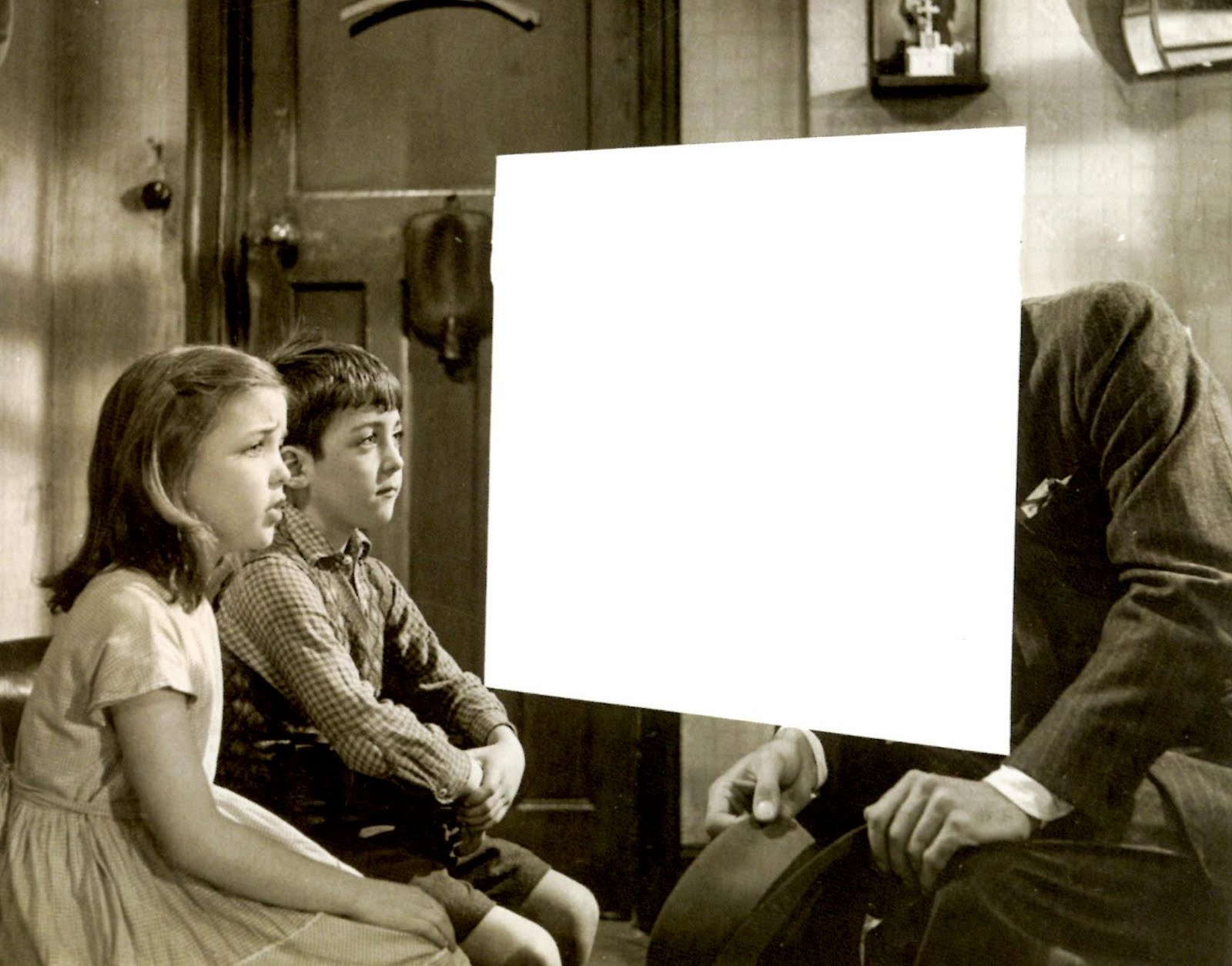
The artwork dropped with almost as much of a shock, to some, as the album. The artwork places a white square over the original iconic cover of “Heroes”, Bowie’s 1977 collaboration with Brian Eno which is considered by many as one of his best works. While this was sacrilege to some, others, along with myself, thought it a brave masterstroke by Jonathan Barnbrook, who has worked with David Bowie for the last 10 years.

newheroes_0

David Bowie – The Next Day. Sleeve by Jonathan Barnbrook, 2013

On seeing Barnbrook’s work for Bowie, I immediately drew associations between The Next Day sleeve and a new jacket for George Orwell’s Nineteen Eighty Four by David Pearson that was showcased on the Creative Review blog shortly before the announcement of the Bowie album. Here, Pearson obliterates the title and author of the book to reflect the redacting of history in this classic Orwellian tale.

nineteeneightyfourdropshadow569_0

George Orwell – Nineteen Eighty Four, cover by David Pearson, 2013

Naturally enough though, I wasn’t the only person to make such a comparison as Richard Weston’s Ace Jet 170 blog testifies. And there, my thoughts would have rested, beaten in the blogosphere to writing a post about the Bowie/Orwell connection.

However, I then got thinking about these two pieces of work and their deliberate graphic obscuring—where one piece of communication has been interrupted by another to create a new work that forces the viewer to question what they are reading—and how this related to things I’d been observing in my everyday. For a little while now I’d been noticing such occurances as road markings being obliterated by the visual remains of where road works had taken place, their primary communication scarred and temporarily interrupted; or where different street signs had been overlaid partially obscuring aspects of one or both.

IMG_2967

JacobsWay

These observations have started to inform a new photographic project of mine, (working title Graphic Interruptions), which currently only consists of some test pieces posted to Flickr. The obvious differences here are that Barnbrook’s and Pearson’s work both deliberately interrupt one visual device with another to form a new narrative, where as what I had been looking at were mostly accidental. I don’t quite know yet where this project is going, but I’m finding it visually intriguing.

But then this visual intrigue was whetted again this week when I succumbed to buying the John Stezaker monograph, which I had been coveting for some time. The book was published in 2011 to accompany his exhibition at the Whitechapel Gallery the same year. Unfortunately I missed the show, but was bowled over by the images that were shown alongside many of the rave reviews in newspapers and on blogs at the time. Could it be that this work, first seen a couple of years ago, had stayed with me and fed my visual thinking when walking around and noticing my graphic interruptions?

StezakerMaskIV 2005

John Stezaker, Mask IV, 2005

Mask IV is typical of the collage work that attracted me to Stezaker. At first, I didn’t make an immediate connection between all of the above and the influence Stezaker’s show, directly or indirectly, has potentially had on my thoughts about what the book calls ‘occlusion’, (the art of blocking).  But I am beginning to now.

And then, looking through the book, I came across two images that made me wonder whether Stezaker’s work had also influenced, consciously or otherwise, Barnbrook’s The Next Day sleeve:

StezakerTabula RasaXI2008

John Stezaker, Tabula Rasa XI, 2008

John Stezaker, Tabula Rasa II 1983

John Stezaker, Tabula Rasa II, 1983

With or without placing ‘The Next Day’ text in the white rectangle, you can easily see the connection between this and the sleeve of the anticipated David Bowie record.

My observations here are purely that, observations. I’m drawing together recent thoughts that may or may not have fed into each other, but that do spark a line of questioning regarding the narrative of an image. This might just become my 2013 obsession.
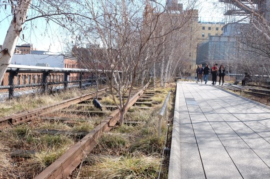