Archive

Culture

Eardrum Buzz is an irregular Dubdog feature looking at key pieces of music that have altered my perception of exactly what music can be. See Eardrum Buzz (intro) for further context. All comments are highly subjective.

flux_of_pink_indians-the_fucking_cunts_treat_us_like_pricks

Title: The Fucking Cunts Treat Us Like Pricks
Author: Flux of Pink Indians
Label: Spiderleg Records
UK Release Year: 1984

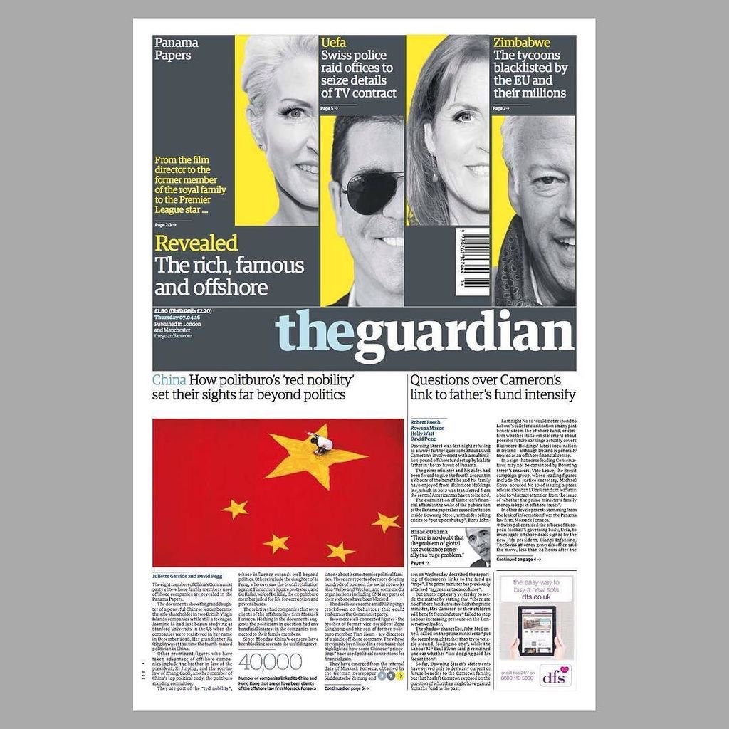
2016 sees celebrations of the 40th anniversary of the birth of Punk with a very London centric focus. Halfway into the year and only a couple of months into the festivities, I am already sick of the sight of computer generated ransom lettering, dayglo colours and screened images. Don’t get me started on musical anthems from my youth being used in TV adverts—every time I see that McDonald’s / Buzzcocks’ advert I die a little inside.

But I was late to punk as a teenager, that was more my older brother’s era. I grew up with 2-Tone for my teenage rebellion, before getting into punk well after-the-fact. After getting into the first wave of punk bands several years from when they emerged, I fell for anarchopunk, as much for its political stance as its musical output. If I listen to much of that genre’s oeuvre today I find it embarrassing, but musically I still hold Crass and Flux of Pink Indians in high esteem. Both pushed the boundaries of what they did and challenged their fans to embrace more than just a three chord thrash with shouty animal rights lyrics. Their investigation into social and personal politics stretched to their craft—they were progressive, embracing free-jazz, noise, industrial, electronics, and in Flux’s case, dub and funk.

When, in 1985, I returned home after swapping 8 LPs I’d grown tired of at Colchester’s Parrot Records for Flux’s second album, little had prepared me for the assault my ears were about to receive. I assumed, very wrongly, I would be getting more of the same of their first release: Strive To Survive Causing The Least Suffering Possible. That was a concise metallic guitar/feedback thrash through shouty green anarchist lyrics, pithy and earnest with song titles such as: They Lie, We Die; We Don’t Want Your Progress; and Myxomatosis. It was sharp, to the point, aggressive and polemic. But as I had already fallen in love with the uncompromising artwork and title of their second album: The Fucking Pricks Treat Us Like Cunts, The Fucking Cunts Treat Us Like Pricks; I didn’t want the music to let me down.

My first impression, (after WTF have I swapped 8 LPs for?), was to ask myself whether I had a miss-pressing? The sound was muffled in places; the tracks didn’t seem to end but bled into each other; overdubbed electronic noises burst in and out; music stopped dead, punctuated with samples from different radio stations; the whole thing sounded like a complete racket. Which it is, of course. The first track  starts with feedback, electronic vibrating noises, then what sounds like the band playing live punches in with several people yelping ‘punk punk punk punk punk punk punk punk…’ The music/noise was as uncompromising as the artwork and title.

So in the spirit of these Eardrum Buzz posts, why have I picked this record out as changing my perspective of just what music can be? Firstly because it taught me the value of not rejecting something on first listen—I learned to love this record. Secondly because it was deliberately challenging and it shocked me out of my then musical complacencies. Thirdly because I got into its experimental nature. This, I thought, is what punk should be all about. Not because it is aggressive, but because it is attempting to explore new ground beyond the conventional, and anarcho-punk, like punk rock before it, had become conventional with their rockisms and formulas.

Fucking Pricks… is punk, sure, but it is also noise, industrial, jazz, and Dada. It is also extremely and unapologetically political. Sure, there are moments of pious preaching when the noise abates and you can make out spoken lyrics. This is as only anarchopunk bands can be, and this is what I have come to wince at when listening back to the genre’s cast. In Flux’s case these are the weaker elements against the sonic overload that is the rest of this album, and these wince-inducing parts become inconsequential against the rest of the musical onslaught. But all that that aside, in 1985 the record felt exciting and it got my heart racing.

As it transpires, on looking back, it was an important record for me. Later I would get into Tackhead’s industrial funk and more recently I’ve been listening to a lot of free-jazz, things I’m convinced this record paved the way for my ears to appreciate when the time came for me to discover them. Fucking Pricks… taught me to give things a second listen, it reaffirmed in me that anything can be music, and that the more you become familiar with something that you don’t first understand, the more it can reward your senses as you spend time with it.

What would I make of it today if I heard it for the first time? I don’t know, I expect I would find it sprawling and in need of editing and honing. But I would still recognise its challenging nature, its uncompromising and brave approach, and its sense of perversion. In listening back to it for the first time in years before writing this post, I thought of it in comparison with the Buzzcocks advert and the 40th anniversary of the first wave of punk that McDonald’s have jumped on. In thinking about this, Flux of Pink Indians need high praise indeed for making something that no corporation could ever appropriate.

Other interesting articles on The Fucking Pricks… :
Uncarved
Public Embarrassment Blues

I’ve long believed the Guardian to be the best designed newspaper in the country, which is convenient for me considering some may think I fit the profile of a typical reader—feminist liberal-left vegetarian art teacher. It would be difficult for me to take if the Daily Mail fitted this design accolade.

But I like the Guardian for more than its graphic design; the fact its investigative journalism helps to keep in check those in power is equally as important to me, particularly in these days of party political impotence. Simon Jenkins summed this up well this week in From Snowden to Panama, all hail the power of the press during the breaking revelations about tax evasion.

But journalism with integrity isn’t enough on its own, just as great graphic design isn’t enough on its own. You have to be able to engage readers in your content or it won’t gain the attention it requires. And this is where the Guardian really sets itself apart from pretty much all other news vendors, (with the exception of Channel 4 News, albeit via a different medium). The marriage of purpose and presentation is given equal respect in this daily paper, and the approach is integrated across all of its platforms, from newsprint to website to app.

If anybody should need a case study to prove my point, the Panama Papers story this week should be a convincing one. Deputy Creative Director of the Guardian, Chris Clarke, tweeted the next day’s front page every evening, and there were many of his followers waiting for the reveal each night as the story broke, (and continued to break throughout the week). If the awkward adjective ‘impactful’ can be ascribed to anything, it is the design decisions the creative team at the Guardian took to grab their readership’s attention.

IMG_2792

Monday. Source: @chrisclarkcc

Monday’s front page was really brave, dropping the masthead from its usual position at the top to halfway down the page. All advertising was removed, and using the daffodil yellow to punch out of the grey, as Clarke’s choice of a ‘punching fist’ emoticon to accompany his tweets accurately indicated, had real visual impact to match the world leader shaking story.

And the approach continued all week:

IMG_2791

Tuesday. Source: @chrisclarkecc

IMG_2793

Wednesday. Source: @chrisclarkecc

It is not until Thursday that advertising crept back onto the front page, and then it was cornered and given bottom billing:

IMG_2794

Thursday. Source: @chrisclarkecc

On Friday the masthead resumed its usual position at the top of the paper, no longer taking second billing to the story, but the visual language deployed stayed the same—dramatic, powerful and as attention grabbing as the headline. Again, like Monday through Wednesday, Friday sees the front devoid of advertising:

IMG_2803

Friday. Source: @chrisclarkecc

IMG_2795

iPhone app: the visual approach worked across platforms

I would be very surprised if both the Guardian’s journalistic and graphic design approaches from this week’s editions does not win them awards in their respective fields—they rightfully should.


imageTwo days in to this New York trip with my colleague Russell Walker and UCS graphic design and illustration students and they’ve been busy ones. I can’t even try to imagine how many miles I’ve walked so far.

The journey wasn’t without its problems, which I won’t go into here, but now we’ve settled in and are walking, walking, walking, and filling up memory card after memory card of photos. Here’s a few I’ve taken, with comments, while I manage to jump on Macy’s free wifi from my hotel room.

image

The first day I went to The Highline, an overhead deserted rail line that has been converted into a mile and a half long public park. It is absolutely stunning. Luckily the weather was excellent and it was a good choice of activity for the first day. It really helped me to feel embedded within New York as you get a real sense of location walking a few metres above the Avenues and Streets of this city and in amongst apartment blocks.

image

I was also very impressed with the honesty of the rubbish bins, labelling landfill waste as just that.

image

Other graphics that have impressed included this cycle path road sign with the addition of a cycling helmet. And no trip to New York for a graphic designer would be complete if it didn’t include some vernacular type spotting.

image

There have also been a plethora of Graphic Interruptions for me to record, such as this:

image

Today I went to The Guggenheim and saw an excellent Fischli & Weiss retrospective titled How To Work Better, and a Photo-poetics exhibition. The F&W exhibition opened my eyes to a lot of their work I hadn’t seen before, and I drew parallels between them and designers like Daniel Eatock, (as well as explaining to a few students I bumped into that the Honda ‘Cog’ ad ripped them off). With the photo exhibition I’ve found a few new names to research for my Masters, such as Erica Baum. Obviously though, it doesn’t really matter what is on at The Guggenheim as the building is stunning in itself and worth the entrance fee just to see the architecture.

I had planned to drop into MoMA on my way back to the hotel after visiting The Guggenheim, but having walked from the bottom of Central Park to the gallery and back, I was exhausted so jumped on a bus back to the hotel for afternoon tea. However, I did manage to get a few tourist shots in Central Park.

image

So as I write this I’m sitting in my very basic hotel room with a heater rattling away in the background, which at least helps to drown out the sounds of the street at night. Not that I’m getting much sleep, as while I hit the sack at a reasonable (US) hour, my body & brain seem to be colluding and waking me up in UK time, so sorry if this post is slightly uncoordinated and bitty. But I’m ploughing on regardless, and tomorrow I plan to take a boat trip around Manhatten Island that some of the students have done already and highly recommend. It’s predicted to be colder than today, (snow forecast for Friday), so I’m glad I packed some gloves because the camera will be out all the time.

I’ll leave you with my favourite photo I’ve taken so far, a shrine to rubbish, but expect more to follow on Flickr once I’ve had a chance to go through everything in a few weeks time.

image

A Dubdog year in music. No favourites, no hierarchy, but a list of albums that have been bought, downloaded or given and have been returned to for more than one listen. Listed in reverse order from December to January.

Recorded  
Julia Holter – Have You In My Wilderness
Thee Oh Sees – Mutilator Defeated At Last
Courtney Barnett – Sometimes I Sit And Think, Sometimes I Just Sit
Eleanor Friedberger – Personal Record
Rocketnumbernine – Two Ways EP
Lynched – Cold Old Fire
Julia Kent – Asperities
Kode9 – Nothing
The Thing – Shake
British Sea Power – Sea Of Brass
Alternative TV – Viva La Rock ‘n’ Roll: The Complete Deptford Fun City Recordings 1977–1980
Roots Manuva – Bleeds
Mogwai – Central Belters
Niney The Observer – Sledge Hammer Dub In The Streets Of Jamaica
Sun Ra and his Arkestra – In The Orbit Of Ra
Various – The Wire Tapper 39
Girl Band – The Early Years EP / Holding Hands With Jamie
John Grant – Grey Tickles, Black Pressure
Sons of Kemet – Lest We Forget What We Came Here To Do
Various – Trevor Jackson’s Science Fiction Dancehall Classics
Arcade Fire – Reflektor (deluxe extra tracks)
Run The Jewels – Meow The Jewels
John Grant – Pale Green Ghosts
King Midas Sound / Fennesz – Edition 1
Low – Ones And Sixes
Jah Wobble – Redux: Anthology 1979–2015
The Bug – Zim Zim Zim
AFX – Orphaned Deejay Seek 2006–2008
FKA Twigs – M3LL155X EP
Various – King Jammy’s: Roots, Reality And Sleng Teng
Various – Rastafari: The Dreads Enter Babylon 1955–83
The Mothmen – Pay Attention!
Singers & Players – War Of Words
Beak> – Split EP
Storm Bugs – HKY502
Sleaford Mods – Key Markets
Chemical Brothers – Born In The Echoes
Various – Studio One Rude Boys
FKA Twigs – LP1
Dr Feelgood – All Through The City
Public Enemy – Man Plans God Laughs
The Nightingales – Mind Over Matter
Githead – Waiting For A Sign
Alternative TV – Opposing Forces
African Head Charge – My Life In A Hole In The Ground
Mark Stewart & The Maffia – Learning To Cope With Cowardice (Director’s Cut)
Alborosie vs King Jammy – Dub Of Thrones
Ezra Furman – Perpetual Motion People
Killing Joke – For Beginners
The Refused – Freedom
The Fall – Sub-lingual Tablet
Killing Joke – What’s This For…!
Linval Thompson – Strong Like Sampson
Burning Spear – Social Living/Living Dub
FFS – FFS
Viet Cong – Viet Cong
The Pre New – The Male Eunuch
Róisín Murphy – Hairless Toys
The Mountain Goats – Beat The Champ
Wire – Wire
Various – Sherwood At The Controls Volume 1 1979–1984
Young Fathers – White Men Are Black Men Too
The Unthanks – Mount The Air
The Special AKA – In The Studio (Remastered)
Polar Bear – Same As You
The Specials – Specials (Remastered) , More Specials (Remastered)
Sufjan Stevens – Carrie & Lowell
Godspeed You! Black Emperor – Asunder, Sweet And Other Distress
The Skull Defekts – Dances In The Dreams Of The Known Unknown
Steven Ball – Collected Local Songs
Bad Breeding – Burn This Flag
Dexys – One Day I’m Going To Soar
The Screaming Blue Messiahs – Good And Gone
The Grubby Mitts – What The World Needs Now Is
Various – The Wire Tapper 38
Andy Moor & Yannis Kyriakides – A Life Is A Billion Heartbeats
Elvis Presley – Elvis Presley
The Pop Group – Citizen Zombie + Versions Galore EP
Sherwood & Pinch – Late Night Endless
Various – Bunny ‘Striker’ Lee’s Early Reggae Productions 1968–72
Vic Godard & Subway Sect – 1979 Now!
Various – Studio One Classics
New Order – Substance 1987
Ragga Twins – On A Ragga Trip
King Champion Sounds – Songs For The Golden Hour
Aphex Twin – Computer Controlled Acoustic Instruments pt2 EP
Björk – Vulnicura
The Decemberists – What A Terrible World, What A Beautiful World
Belle & Sebastian – Girls In Peacetime Want To Dance
Fire! Orchestra – Enter
Panda Bear – Panda Bear Meets the Grim Reaper

And the odd trip to see a band at a venue or festival. In alphabetical order.

Live
Marc Almond
Belle & Sebastian
Martin Carthy
Ezra Firman
The Pop Group
Portishead
The Savages
Sleaford Mods
Wire
…and a friend’s heavy metal covers band whose name escapes me, (sorry Scott)

Live

Wall by the stairwell entrance to Hestercombe Gallery © Nigel Ball

Galleries that deal in driftwood ‘art’ and knick-knack souvenirs might be the predominating cultural experience you’d expect from a holiday to the beautiful Dorset coast. With this in mind, Claire and I were careful to make sure we investigated what cultural attractions were available to visit before travelling last week to a small hamlet just outside Bridport for our 2015 summer holiday. If washed-up sea craft ticks your art box then you won’t be disappointed from West Bay, Lime Regis and Charmouth et al, but if they don’t, we can highly recommend a couple of exhibitions.

We discovered before leaving that a colleague of mine, UCS senior lecturer and photographer Mark Edwards, was part of an exhibition at Hestercombe House & Gardens in Somerset. Being only about an hour’s drive from where we were staying we decided to pay it a visit. The show is titled Double Take: Photography and the Garden, and features two other contemporary artist photographers alongside Edwards; Sarah Jones and Helen Sear. It also showcases photographs by landscape gardener Gertrude Jekyll’s, who alongside Edwin Lutyens, designed the Formal Garden and Victorian Terrace at Hestercombe. It is an interesting exhibition in that each artist takes a very different approach in responding to the theme of the garden. Jekyll’s beautiful black and white shots from the early 1900s record garden vistas, plants, and most interesting to me, the gardeners working either horticulturally or on hard landscaping. Although none of these were of Hestercombe, they all come from a collection of photos Jekyll took of her own garden at Munster House near Godalming.

Hestercombe2

Hestercombe Gardens by Jekyll and Lutyens © Nigel Ball

Edwards photography is a much longer process than the ‘shots’ by Jekyll, as he finds locations and returns to them repeatedly before photographing them. He often captures gardens that are about to revert back to nature, on the cusp of becoming overgrown or are overlooked and as a result, despite the fact they can appear as everyday scenes that in the flesh you may not take a second glance at, but as large scale prints they have an underlying sense of tension between nature and nurture. Sear’s work is much more manipulated which can lead the viewer to question whether they are actually looking at photographs—some appear as if ceramic tiles and others potentially paintings or tapestry. Jones’ work has a more menacing tonality to it with very dark backgrounds that focus the viewer in on, for example, a woman lying on a large tree branch, or to pick out the detail of a rose bush and thus forcing you to pay equal attention to the thorns and branches as you do to the flowers.

The show is part of Hestercombe’s programme of showcasing art in reclaimed spaces, and much of the gallery attached to the house is in a poor state of repair, clearly having been reclaimed from going into ruin just in time. This adds a temporal air to the whole show which creates an atmosphere that contrasts appropriately to the very orderly gardens outside. It also helps to echo the fact that gardens that aren’t continually tended, much like buildings left unmaintained, soon destroy themselves, a feature that is not lost as you look at some of Edwards work in particular.

Apologies for not showing any images of the exhibition to accompany this post, but I was so engrossed in the work that I neglected to take any of the work on the walls, (and I didn’t want to scan in images from the catalogue for copyright reasons). The show runs until 18 October 2015, and the £10 admission price includes access to the exhibition, gardens and house.

Screen Shot 2015-08-01 at 14.17.11

Claire and I had also planned to take a look at Bournemouth at sometime during the holiday, as I believed, (wrongly), that I had never been there. (As we drove part the Pavillion, I was reminded that I went to a conference there some 30 years ago!) Unfortunately we left this visit until our return journey back to Ipswich, so didn’t have time to mooch around the town as we wanted to take in the Alphonse Mucha exhibition at the Russell Coates House and Gallery before continuing our drive back to Suffolk.

The house itself is a visual overload—a clash of Victoriana and Art Nouveau—rammed as it is with paintings, furniture, garish carpets and ornate internal architectural mouldings. A feast for the eyes and a fascinating insight into the lives and tastes of yuppie hipsters of the day. As the Russell Coates websites states: “In 1901 Merton Russell-Cotes gave his wife Annie a dream house on a cliff-top, overlooking the sea. It was an extraordinary, extravagant birthday present – lavish, splendid, and with a touch of fantasy. They filled this exotic seaside villa with beautiful objects from their travels across the world, and lined the walls with a remarkable collection of British art, creating a unique atmosphere in a most dramatic setting.”

Mucha

In many ways it is the perfect location for a Mucha exhibition outside of Paris, and the museum has done a good job of framing the entrance to the Mucha show with paintings that were contemporary to his work, thus informing the visitor of just what Mucha may have been influenced by. Once in the actual exhibition, (which you have to walk through the entire house to get to), there is a sense of calm after the visual overload you are subjected to beforehand.

I know Mucha’s work well, but what is impressive about this exhibition is actually seeing the life-size posters rather than reproductions in design books. Getting to see the work at this scale bought home to me once again just how important he was to the development of not just poster art but to Graphic Design, (poster art being the precursor trade before the concept of the ‘graphic designer’ emerged). His typographic excellence is something to be truly admired, and both his use of graphic architecture within an artwork to frame the subject/steer the viewer as well as his incorporation of type into the actual image must have appeared revolutionary in its day.

Mucha2

One thing that did strike me for the first time, seeing the work up close, was that in much of the early work he wasn’t particularly good at drawing facial features. In many pieces I felt there was a tentative hand at work when working in these areas whereas he displayed sheer confidence in figures, illustration, graphic patterns and typography. His execution improved as his techniques developed, but this difference was noticeable to me for the first time on looking at this early work at their intended size.

The exhibition isn’t large, it only occupies two rooms, but it does also include a video of his life, photography of some of his models which he would later draw from, and examples of packaging alongside preliminary sketches. All in all it is well worth a visit if you happen to be in the area and is on until 27 September 2015. The entrance fee is £5, (inclusive of house).

Screen Shot 2015-08-01 at 14.17.56

I left Facebook a while ago, but my abiding memory of it meant this advert in today’s Guardian was ripe for a swift détournement.


What Facebook would like you to think it is:

IMG_1072

What Facebook actually is:

IMG_1074

IMG_1008

iPhone Music montage screengrab

This blog, Dubdog, carries the strap-line: On art, design and music—mostly.

However, on closer examination a reader may come to the conclusion that in truth it is actually ‘mostly’ about design in one form or another. The music bit generally gets sidelined to lists of what I’ve been listening to at the end of any particular year. But recent thoughts have led me to consider adding a semi-regular feature that will address this.

Let me explain… I’ve been thinking a lot about music recently, partly prompted by corridor conversations with work colleagues and discovering a joint love of a particular band; but also through meeting new people and finding they have cross-over tastes to mine, but who then reel off a huge amount of band names or artists I’ve never come across. This has led me to ponder on how I have arrived at my subjective musical ‘tastes’.

I’ve never been a fan of pigeonholing. As a teenager, like many others, I had a perceived need to belong to something and thus create an identity for myself, usually based on a particular youth culture that followed the fashions of a particular musical ‘tribe’. As I matured I rejected this need to identify myself by the music I listened to, just as most people do when they distance themselves from their teenage years. But even when I was pigeonholing myself to the outside world through dress codes, I felt at odds with assigning myself to just one particular style or genre of music. When I was wearing bondage trousers and spiking my hair I was listening to far more than just The Clash.

As I think back on my life’s musical journey, one important thing it has taught me is to be open-minded to new experiences. As an addition to this I learned not to define something as being ‘music’ or not, especially as I learnt about, for example, Industrial Music, experimental sound artists, and more recently, Free Jazz. As a result, the term ‘music’ suddenly seems as arcane as the concept of dressing in the same style as the people in the bands you like. As I have heard new sounds, whether that be through chance happenings or someone directing me towards a particular artist, I can pinpoint key moments in my life when I’ve heard something for the first time and it has fundamentally altered my mind about music. I’m not talking about just hearing a new band, I’m talking about moments that have made me question my preconceived opinions and have taken me on an exciting journey of discovery. To use the term ‘paradigm shift’ is not too strong a term to use here in relation to what I’m trying to express.

Obviously context is everything. There are certain pieces of music that I’ve heard that if I’d come to them earlier in life I might not have been able to accept them—not having had preceding musical experiences I might need to get to that point of acceptance. A good example of this is the first time I heard Venus In Furs by The Velvet Underground. To my 15 year-old ears this blew my mind and I couldn’t stop playing the track on rotation for several days as I soaked up this incredible sound; a sound that I can’t recall having heard previously. Had I first heard this at age 10, my personal experience would likely be quite different. Equally, the situation I heard something in for the first time may also have bought a lot to the experience that outside of that situation it may not have had the same effect. Others who may already be familiar with a specific work which I signify as a paradigm shift in my conscious understanding of music may not consider that it the best example of that specific musical approach. This doesn’t matter as this is personal to my experience, and besides, if they are right, I will generally work that out for myself anyway as I explore further. And while I may come to the realisation that what I’ve heard is at the tame/lame end of its particular spectrum, the fact that it opened my world still holds a significance for me, and therefore I would still hold it in high regard, (albeit with accepted caveats).

As these considerations on music that I have been ruminating on recently have continued, I’ve started listing all the key works that have prompted a real paradigm shift in my musical appreciation. Over the coming months I will revisit some of these pieces and subsequently write about them here. Some will be very well known and discussed at length in other forums, but some will have slipped off the musical map and no end of searching online will uncover them being given any serious attention, (I can’t wait to write the post on Flux of Pink Indians’ The Fucking Cunts Treat Us Like Pricks, for example). They will all, obviously, be personal to me and my experiences. But equally, some readers may discover new music they haven’t previously experienced or re-evaluate something they had previously discarded. As an exercise I hope to find this personally enriching, but more than that, as I consider music in more depth and the phenomenon of the effect it can have on an individual, I hope to learn a little more about what music is, and the power it can wield over and above subjective appreciation.

As a sneak peak, first up will be a key album that has shaped much of my musical appreciation from a young age and that has aligned my tastes for many years to come, right up to the present day in fact. That album is Joe Gibbs and The Professionals—African Dub All Mighty: Chapter 3. Search it out on YouTube and give it a listen, I’ll be writing about it here soon. Until then, I’m now off to trawl the BBC Glastonbury website, while the festival goes on many miles away from my home town, in order to search out some new acts I’ve never heard of before. Who knows, I may be writing about them here in a few months time.

This series is titled Eardrum Buzz after the track of the same name by Wire.

P4241186

A large corner of my loft is stacked with vinyl records, mostly 12″ LPs, but there is a smaller pile of 7″ singles. They are going to stay there, save for the odd time I want to change the artwork in my three album-art frames that deck our landing. It is fair to say I haven’t jumped on the supposed vinyl revival—there’s already enough nostalgia in the world, I don’t need any more.

What I do miss about vinyl is the sleeves, hence my love of my album-art frames. Unfortunately 7″ single sleeves were never quite as explorative and there are few I can recall that deserve being displayed; a couple by The Clash, Sex Pistols or The Smiths maybe, but generally the design of 7″ single sleeves wasn’t anywhere as near as engaging as their LP counterparts, being more of a disposable commodity. But that’s certainly not the case with the recent Secret 7″ exhibition at Somerset House that I accidentally stumbled on last week when visiting Pick Me Up 2015. Secret 7″ is a project in its third year that chooses 7 tracks and presses each to 7″ vinyl. The organisers then invite designers and artists to interpret the tracks as they see fit and submit a cover, displayed anonymously, which the public can then buy for £50 apiece. All money goes to charity, and this year the chosen beneficiary is Nordoff Robbins, who are dedicated to transforming lives of vulnerable children and adults through music therapy. Like similar secret postcard projects, you don’t know whether you are buying a future collectors’ piece by a famous creative, or something whipped up by someone’s 5 year old daughter, (which could equally be a future collectors’ piece, of course).

P4241182

It is interesting to browse the racks not knowing who produced what and trying to guess the track. Many are clearly ‘just’ artworks that make no attempt to represent or link to their musical content. The fact that no title or band name is displayed obviously separates these sleeves from a standard 7″ sleeve—while some designers of commercial records have previously and deliberately not listed a band or track title on a cover, it is still the case that the vast majority of record sleeves do have this information adorning them, as obviously the reason d’être of the 7″ single from a record company’s point of view is to sell as many units as possible. But seeing so many sleeves displayed in one place with no typographic indication of band or title, I felt does reduce this exercise, in some cases, to appealing to an artist’s vanity and results in purely aesthetic outcomes rather than embracing communication—much like Pick Me Up, I felt there was a fair amount of style over substance. Regardless, taking a standard form and asking a plethora of people to work within its confines does lead to some interesting and innovative outcomes.

P4241179

I was personally taken with those creatives that had worked with photography, especially as the vast majority of the sleeves were illustrative. As a result, the photography pieces did tend to jump out to my eyes.

P4241170

P4241173

Alongside the rows and rows of sleeves, seven designers were asked to create a bespoke poster for one of the 7′ tracks chosen. These posters were also available to buy for £50 but limited to a 100 print run and included submissions from Erik Spiekermann, Craig Ward, Spin, The Counter Press, Peter Bankov, Felix Pfäffli and Bread Collective.

P4241172

P4241185

Unfortunately I’m writing this post on the last day the exhibition is open. However, the sale of the sleeves doesn’t start until tomorrow, 4 May 2015, so there’s still a chance to grab a 7″ single sleeve and give money to a good cause. Go to the Secret 7″ website for more details.

Secret 7″ 

The selected tracks for 2015 are:
The Chemical Brothers—Let Forever Be
Diana Ross and the Supremes—Reflections
The Maccabees—Go
Peter Gabriel—Sledgehammer
The Rolling Stones—Dead Flowers
St. Vincent—Digital Witness
Underworld—Born Slippy (Nuxx)

Secret

And while on the subject of singles:

WCountry_Cover

A few years ago I wrote an article for Eye magazine blog after coming across a programme for the 1951 Festival of Britain. At the time I was aware of the existence of a series of small guide-books published to coincide with the festival called About Britain, but it was only recently that I actually came across any.

There were 13 of these books published covering different regions of Britain. The two that I’ve been lucky enough to find cover the West Country and Home Counties. The latter is more fascinating to me being more familiar with the areas discussed within. As the inside dust jacket cover states: “These books are guides to the living Britain, covering the whole country, England, Wales, Scotland and Northern Ireland. Each is a guide to a well-defined district, planned to give you the fundamental facts about its scenery, its monuments, its buildings, its natural history, its people and their work and characteristics.”

HCounties_Cover

The covers feature maps of the region, both as a hard-case wrap and as a dust jacket. The fact the map was printed on both case and jacket allowed the owner of the book to remove the jacket and use it for reference while reading, as the inside back cover of the Home Counties edition explains, (below). Whether this was a deliberate design decision or some clever post-rationalisation will never be known, but it is still a great idea.

HCounties_InsideBackCover

Naturally the books at first glance seem somewhat dated. However, there is a real sense of optimism and forward thinking in regard to the contents once you consider the context within which these were published. These are meant to be egalitarian and easily accessible by all to instil a sense of pride in our nation, and encourage the reader of better times to come as the country shook off the last vestiges of the Second World War.

HCounties_Ford

Featured inside are stories of emerging industries, as can be seen in the spread above about Ford. However, I’m not sure how the residents of Canvey Island or Peacehaven would react to where they lived as being described as “unplanned calamities”. Alongside such articles were stories of traditional farming methods, town planning, historical features and natural wonders.

Also published in these guides were tours of local areas with maps you could follow by car, bus or bike, clearly aimed at the working classes taking time out to visit the country and thus encouraging an emerging tourist industry.

HCounties_TheTours

HCounties_Tour

Some aspects are seen as very antiquated, such as the description of Londoners’ characteristics: “his steadiness, humour, independence and attitude to authority…His loyalty to the ruler he approves is unbounded, and he likes to show it on Royal occasions.” Many republicans of today would disagree with such cap doffing, and further dating the writing, you have to remind yourself of the times when noticing the inherent sexism within the text. That, and references to empire aside, there is a refreshing regard to immigration: “London welcomes strangers of all countries and all colours, whether they seek refuge as exiles, come to work or come to play.” UKIP take note, the Britain in the 1950s you would wish us to return to was more forward thinking than you would have us believe.

HCounties_Londoners

HCounties_Welcome

The openness and forward thinking is evident throughout as Britain looked to escape the war years and propel itself into the 1950s. It had a plan to rebuild itself, reject the austerity of rationing and launch into a new era of rebuilding a country that worked for its inhabitants. As the opening chapter states:

“This guide-book is one of a series ‘About Britain,’ so we hope, in a new way…it begins with a portrait of the district—an account of many of the facts about it which are worth knowing…  These guides have been prompted by the Festival of Britain. The Festival shows how the British people, with their energy and natural resources, contribute to civilisation. So the guide-books as well celebrate a European country alert, ready for the future, and strengthened by a tradition which you can see in its remarkable monuments and products of history and even pre-history. If the country includes Birmingham, Glasgow or Belfast, it includes Stonehenge. If it contains Durham Cathedral, it contains coal mines, iron foundries, and the newest factories devising all the goods of a developing civilisation.”

Reading through these guide-books in the last three weeks of a General Election in this country—one that is caged in the terminology of austerity, cuts, Europe and immigration; one that seeks to blame, point fingers, build walls and retract in on itself—I am reminded of the feelings I had when I first read the official Festival of Britain programme that compelled me to write my Eye piece. And that is if politicians in the late 1940s/early 1950s could envisage emerging from such a financial disaster as the Second world War, looking forward and having hope for the future, why can’t they today? For the Festival of Britain organisers, their take on the world wasn’t one of austerity and boarders, blaming those worst off while appeasing financiers; theirs was a vision of everyone working together for the benefit of all. Something I believe that many of our current crop of politicians could do well to learn from.

Quaint maybe, ambitious certainly, but if history teaches us anything, it teaches us that these visionaries achieved their goals; for this is the era that gave us public services such as the NHS and much of the infrastructure that has supported us for the last 63 years. Will the decisions of the next government have such a huge impact on our way of life and our culture? Only negatively I fear.

image

Vector illustration and chunky lower case type make for the new look reductive graphics adorning McDonald’s take away packaging. Created by Leo Burnett design agancy in Chicago, (I’m currently unsure if this packaging has made it to the UK yet), it appears to be another opportunity missed.

I think it’s fair to say that McDonald’s has an image problem. Well, it has many image problems actually, but I’m specifically talking about the one that glares at us all from roadside gutters and courtryside hedgerows. Any repeat visitors to Dubdog will know that I’m talking litter, a particular bugbear of mine. The world over, McDonald’s is the top brand, or one of the top brands, found on fast food litter, (see this report from Australia, and this from the USA, and this by the UK’s Keep Britian Tidy). I first noticed it some 14 years ago and it prompted my McJunk project. McJunk was an exploration into the relationship between graphic design and disposable culture through a photographic study of McDonald’s litter, (download the introduction to the McJunk photobook as a PDF from here, or visit the McJunk website).

Discovering this new McDonald’s packaging today prompted me to hunt around the Internet for current research into littering and I found some key reports by Keep Britain Tidy, ( * links at bottom of post). In these I came across two specific points of interest that relate to my own graphic design related research:

  • Firstly: through focus group discussions it is claimed that people would be less likely to buy a brand that they saw being littered. While this could be one of a whole host of reasons why McDonald’s had a bad year in 2014, I’m somewhat sceptical—what someone states in a focus group in the company of others is not necessarily the reality of what they actually do. But even if this were true, and it makes business sense to take seriously such market research, you would have thought McDonald’s would take note and try to do more to convince people not to litter;
  • Secondly: many of those surveyed by Keep Britain Tidy stated that they thought the Tidyman logo made little difference to people’s littering habits. This I can well believe. Usually sidelined within any graphic design hierarchy—often on the bottom of any packet—as iconic as I think Tidyman is, the Keep Britain Tidy report suggests that as a nation we have become used to it if indeed we notice it at all.

And herein lies my major problem with this McDonald’s redesign. When the graphics applied to something do not affect whether someone is going to buy a product or not—McDonald’s takeaways are not bought off a shelf; you don’t see the packaging until a BigMac has been ordered, ‘cooked’ and handed over—graphics are technically not needed for marketing purposes. They are usually only there to encourage brand recognition or as decoration. Therefore, if you rethought the side of a take away bag, there is a perfect opportunity for McDonald’s to challenge their litter problem by educating consumers through graphic design. But alas McDonald’s chose not to take this opportunity.

As mentioned in one of the Keep Britian Tidy reports that I read, it is a depressing thought that litter problems will only get worse over the coming years with further public sector cuts. Such cuts mean local councils have to decide what services to shelve, and I suspect many authorities will rightly decide important issues such as social care trump litter patrols. And unfortunately public sector cuts are likely to continue. For regardless of who wins the UK general election this year, both Labour and Conservative have declared their intentions to continue with these cuts. Even if we have another coalition government come May, which is the most likely scenario, one of these two parties is likely to hold the balance of power.

A couple of years ago I put McJunk on a hiatus. With this new packaging launch and after reading several Keep Britian Tidy reports, it looks like it might be time to resurrect the project.

10105410934_ff578b3723_z

McJunk, as found, on Shingle Street beach, Suffolk. Pre-2015 redesign.

Keep Britain Tidy 2013 Litter Report 

Keep Britain Tidy 2013: When it comes to litter, which side of the fence are you on report findings