Archive

Graphic Design

13221597_1005670922852159_2585187013194617847_n

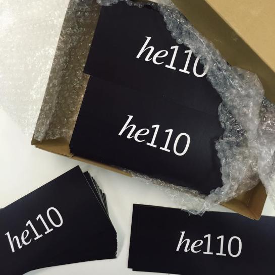
Degree show time is upon us, and this year the Graphic Design and Graphic Illustration students from UCS Ipswich have branded their show he110 after the studio number R110 they’ve been working in for the last 3 years.13131441_1000143950071523_6870947813051939198_oThe show opens to the public on 3 June in the UCS Arts Building, (weekdays 10:00–18:00; weekends 11:00–15:00), with the Private View on the evening of 2 June from 18:15–21:00.

This year the graphics students have been busy marketing their show and are posting daily on their Twitter, Instagram and Facebook profiles. They’ve also launched their own he110 website with links to their personal portfolio sites.

Graphic Design and Graphic Illustration students are exhibiting alongside other degree courses: Computer Games Design; Dance; English; Fine Art; Digital Film Production; Interior Architecture and Design; and Photography. The Photography degree show is on in the UCS Waterfront Building until 8 June before going to Free Range in London.

For details of how to get to UCS follow this link and come along to the show and say he110


image

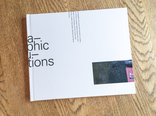
Graphic Interruptions book, front cover

Graphic Interruptions has reached some sort of a completion, for now, with the production of a one-off hard back book for an assessment of the project for my masters degree. The project will continue in the background and you can follow its Instagram account here.

image

Graphic Interruptions, back cover

I would like to have produced more books and sold them, but because of the production values I insisted on, it means each copy would cost upwards of £60 and I just can’t justify selling copies for that price. However, without going into details at the moment, I have been talking to a publisher and if a book proposal I’m writing is accepted, Graphic Interruptions may enter the public realm as part of a wider project.

image

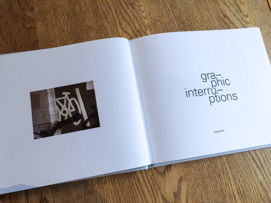
Title page

In the latter stages of working on the project, which had been ongoing since October, I fell back on familiar territory, (see McJunk, links on Elsewhere page), as I needed to create a tangible outcome for a looming deadline. This resulted in me jettisoning explorations into maps, autobiographic writing and psychogeography which had all been part of this project at one point or another. My interest in these makes me certain I will return to them in the future but in order to wrap this up for an assessment I went with what I knew I could achieve.

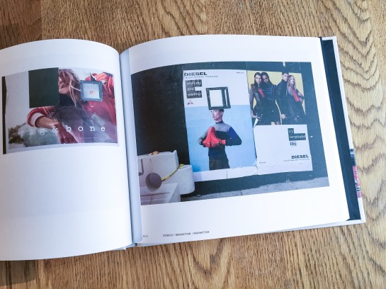
image

The essay I wrote as the introduction to the book will see the light of day here in the near future, but for the time being I’m pleased to call some sort of pause to Graphic Interruptions, at least in relation to my MA studies. It has helped shape my thinking for the next stages of my academic research. And more than that, I’m looking forward to blogging about more than Graphic Interruptions here.

CoverMock

Book jacket proposal (front and back)—work in progress

Graphic Interruptions is reaching some sort of climax as I prepare the final artwork for a one off self-published book to go to print this week. As I near the end of this stage of the project, (i.e., an assessment hand-in for a 40 credit module in mid-May for my masters degree), for no reason what-so-ever other than a little procrastination, I’ve worked out some (sketchy) stats for the project to date:

—55 photographs in book, edited down from 224
—7 short psychogeographic writing trials
—1 long psychogeographic essay with umpteen drafts
—1 introduction essay of over 1300 words, 6 drafts and copious notebook ramblings
—3 book print trials
—7+ layout trials
—untold changes in direction
—7 months reading/researching, photographing, questioning, reflecting
—6 blog posts in duration of MA, (+1 associated)
—One 3 year old blog post, (genesis of project concept)
—3 presentations
—5 critiques
—2 ring binders
—63 plastic wallets
—2 sets of inkjet cartridges
—2 maps
—One 19x25cm Moleskine softcover notebook
—One 14x21cm Leuchtturm1917 softcover notebook
—3 or 4 Lamy rollerball cartridges
—untold visits to the library
—uncountable Google searches, RSS feed follow-ups and Evernote bookmarks
—1 part-related meeting with a publisher
—1 venn diagram


NYer

For the UCS Graphic Design trip to New York at the beginning of March, Russell set students and staff the challenge of producing a New Yorker cover that responded to their time in the city.

I had made no plans what I was going to do for the project before I went but I started drawing my walks around Manhattan from memory every evening. I didn’t attempt to draw these to any sort of scale, nor did I refer to any map. In creating these drawings it quickly became obvious that these would work for my New Yorker cover submission.

The maps represent all walks I did over the five days, typically two a day; one during the day and the other in the evening. The evening walks tended not to stray very far from the hotel we were staying in on 7th Avenue opposite Madison Square Gardens, (the red dot). The top of the map stops at the Guggenheim and the bottom in SoHo. I resisted including the boat trip around the island I took, as it wasn’t a walk, although there are a couple of bus journeys represented as these were routes to, or back from, walks I did.

Once back home I redrew the separate maps into a single record, and then scanned it and redrew it digitally in Illustrator. I did trial using a different colour for each day, but decided that a singular approach worked better and unified the whole piece. I tried tearing the graph paper to the shape of the island, but felt this gave a scale reference and detracted the emphasis from the memory-map.

This piece now forms part of an exhibition alongside student work at UCS, check out the Graphic Design course Facebook page for photos of other submissions here and here.

Scroll down here to view a couple of posts I’ve written about the trip with accompanying photos, or check out my Flickr site.


I’ve long believed the Guardian to be the best designed newspaper in the country, which is convenient for me considering some may think I fit the profile of a typical reader—feminist liberal-left vegetarian art teacher. It would be difficult for me to take if the Daily Mail fitted this design accolade.

But I like the Guardian for more than its graphic design; the fact its investigative journalism helps to keep in check those in power is equally as important to me, particularly in these days of party political impotence. Simon Jenkins summed this up well this week in From Snowden to Panama, all hail the power of the press during the breaking revelations about tax evasion.

But journalism with integrity isn’t enough on its own, just as great graphic design isn’t enough on its own. You have to be able to engage readers in your content or it won’t gain the attention it requires. And this is where the Guardian really sets itself apart from pretty much all other news vendors, (with the exception of Channel 4 News, albeit via a different medium). The marriage of purpose and presentation is given equal respect in this daily paper, and the approach is integrated across all of its platforms, from newsprint to website to app.

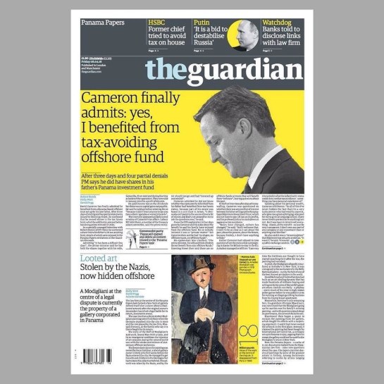
If anybody should need a case study to prove my point, the Panama Papers story this week should be a convincing one. Deputy Creative Director of the Guardian, Chris Clarke, tweeted the next day’s front page every evening, and there were many of his followers waiting for the reveal each night as the story broke, (and continued to break throughout the week). If the awkward adjective ‘impactful’ can be ascribed to anything, it is the design decisions the creative team at the Guardian took to grab their readership’s attention.

IMG_2792

Monday. Source: @chrisclarkcc

Monday’s front page was really brave, dropping the masthead from its usual position at the top to halfway down the page. All advertising was removed, and using the daffodil yellow to punch out of the grey, as Clarke’s choice of a ‘punching fist’ emoticon to accompany his tweets accurately indicated, had real visual impact to match the world leader shaking story.

And the approach continued all week:

IMG_2791

Tuesday. Source: @chrisclarkecc

IMG_2793

Wednesday. Source: @chrisclarkecc

It is not until Thursday that advertising crept back onto the front page, and then it was cornered and given bottom billing:

IMG_2794

Thursday. Source: @chrisclarkecc

On Friday the masthead resumed its usual position at the top of the paper, no longer taking second billing to the story, but the visual language deployed stayed the same—dramatic, powerful and as attention grabbing as the headline. Again, like Monday through Wednesday, Friday sees the front devoid of advertising:

IMG_2803

Friday. Source: @chrisclarkecc

IMG_2795

iPhone app: the visual approach worked across platforms

I would be very surprised if both the Guardian’s journalistic and graphic design approaches from this week’s editions does not win them awards in their respective fields—they rightfully should.


imageTwo days in to this New York trip with my colleague Russell Walker and UCS graphic design and illustration students and they’ve been busy ones. I can’t even try to imagine how many miles I’ve walked so far.

The journey wasn’t without its problems, which I won’t go into here, but now we’ve settled in and are walking, walking, walking, and filling up memory card after memory card of photos. Here’s a few I’ve taken, with comments, while I manage to jump on Macy’s free wifi from my hotel room.

image

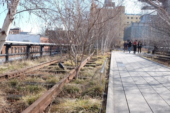
The first day I went to The Highline, an overhead deserted rail line that has been converted into a mile and a half long public park. It is absolutely stunning. Luckily the weather was excellent and it was a good choice of activity for the first day. It really helped me to feel embedded within New York as you get a real sense of location walking a few metres above the Avenues and Streets of this city and in amongst apartment blocks.

image

I was also very impressed with the honesty of the rubbish bins, labelling landfill waste as just that.

image

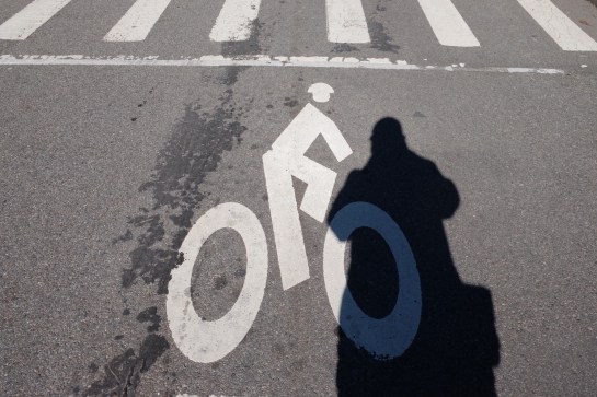
Other graphics that have impressed included this cycle path road sign with the addition of a cycling helmet. And no trip to New York for a graphic designer would be complete if it didn’t include some vernacular type spotting.

image

There have also been a plethora of Graphic Interruptions for me to record, such as this:

image

Today I went to The Guggenheim and saw an excellent Fischli & Weiss retrospective titled How To Work Better, and a Photo-poetics exhibition. The F&W exhibition opened my eyes to a lot of their work I hadn’t seen before, and I drew parallels between them and designers like Daniel Eatock, (as well as explaining to a few students I bumped into that the Honda ‘Cog’ ad ripped them off). With the photo exhibition I’ve found a few new names to research for my Masters, such as Erica Baum. Obviously though, it doesn’t really matter what is on at The Guggenheim as the building is stunning in itself and worth the entrance fee just to see the architecture.

I had planned to drop into MoMA on my way back to the hotel after visiting The Guggenheim, but having walked from the bottom of Central Park to the gallery and back, I was exhausted so jumped on a bus back to the hotel for afternoon tea. However, I did manage to get a few tourist shots in Central Park.

image

So as I write this I’m sitting in my very basic hotel room with a heater rattling away in the background, which at least helps to drown out the sounds of the street at night. Not that I’m getting much sleep, as while I hit the sack at a reasonable (US) hour, my body & brain seem to be colluding and waking me up in UK time, so sorry if this post is slightly uncoordinated and bitty. But I’m ploughing on regardless, and tomorrow I plan to take a boat trip around Manhatten Island that some of the students have done already and highly recommend. It’s predicted to be colder than today, (snow forecast for Friday), so I’m glad I packed some gloves because the camera will be out all the time.

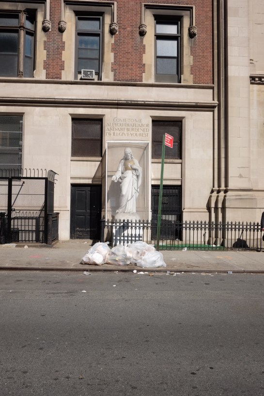
I’ll leave you with my favourite photo I’ve taken so far, a shrine to rubbish, but expect more to follow on Flickr once I’ve had a chance to go through everything in a few weeks time.

image

Lampost-lottery

The blogging on here is truly taking a back seat as I thought it would *, but my Graphic Interruptions project continues. I got validation this week about its direction in the form of results for the first piece of assessed work on my Masters course, and I’m stumbling across more examples every time I step out onto a pavement.

The above example is one of my recent favourites. The reason I like it is because the graphics aren’t decayed by weather and its form isn’t physically broken. This is the case with a lot of examples I find which could lead to an accusation the project is solely concerned with ‘ruin-porn’, which it isn’t. This piece of graphic design is interrupted because of human interaction as someone has decided, (without too much thought), that health & safety concerns trump communication. This ultimately renders the intention of this item useless when approached from this direction. The question then needs to be asked about the suitability of such a communication device, in the form of pavement signage, if it is liable to have people tripping over it? I also like the irony this implies: the item becomes a lottery—will you or won’t you trip over it?—and I wonder whether there is more chance of financial gain if you were to trip over this and put in a ‘no win no fee’ claim than actually buying a lottery ticket.

Until now I’ve been using Tumblr as an image dump for my finds. However, I’m not convinced I was getting the traffic I wanted and I find Tumblr a little clunky. Now that Instagram have made switching between multiple accounts easy, I’ve created one for this project: you can find it at @graphic_interruptions

Lastly, for now—the undergraduate graphic design course I lecture on at UCS is taking students to New York at the end of this month. Exciting as it is to visit New York, I’m doubly excited to have the opportunity to make this project international.

Console

* It is typical that when I am extremely busy, (as seems to constantly be the case now), an idea for a blog post will throw itself at me that can’t be ignored, as happened recently with the article I wrote for Eye. See previous post. 

image

The UK’s gutters and hedgerows will soon see new graphics on the McJunk strewn there. Below is a link to an article I wrote for Eye magazine blog about an uncritical design press showcasing the new designs, asking whether well respected blogs are just becoming advertising hoardings for big brands trying to ingratiating themselves with those working in the creative industries.

Gutter press on Eye blog

Venn_001

Since I last posted here about my Masters I have been fine tuning where I’m going with my work. Creating the above Venn diagram for a peer critique this week helped—the first Venn diagram I have ever produced! The problem I’ve had until now was making sense of what appeared to be very diverse aspects in my work and research. This diagram bought it all together visually and helped me explain where I was going to my peers. They got it, and gave me some very good feedback on the trial writing I have done to date.

Today I’ve been developing my written responses to photographs I’ve taken. In order to distance myself from what I had tried before, I used a series of images I shot earlier in the day while walking my dog in a local park. This writing was an exercise in honing the tone of voice I use, and testing the familiarity in my written language. I’m a long way from posting any of my writing for this project here, and I will only give a sneak peak when I do, wanting to save the major content for future printed publications that I produce. However, I now feel I’m starting to get a cohesive balance between descriptive elements, personal reflections, critical analysis and my use of humour.

As it will be some time before I have anything concrete to report here, such as publication details and images of designed work, I thought I’d share some of the photography from today’s session. Please bear in mind I am not presenting this as being in any sense ‘accomplished’ photography; these are purely shots I use to respond to in my writing and text & image will be seen side by side in any final outcomes.

The written context surrounding these images include: familiar scenery; walking to work; exercising the dog; sense of neighbourhood; Ipswich; civic pride; protest; and cat jokes.

streetsign

Street sign coat of arms

Alexander

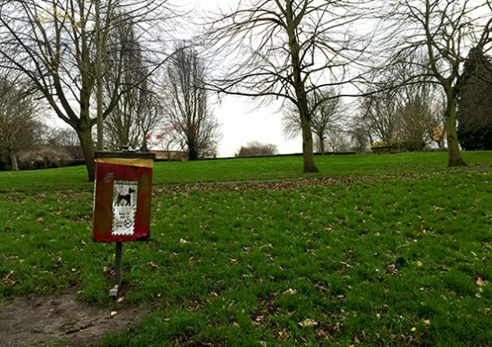
Ipswich’s Alexandra Park

Dogwaste

Dog waste decal

Bin

Dog waste bin

Bench

Roger MacKay’s bench

bin2

Rubbish bin coat of arms

flw

Front Line Warriors

flwredacted

Front Line Warriors redacted


DSCF3376

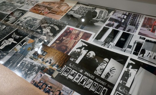
In my teens in the 1980s, as I was becoming politically aware and active, (going on CND demonstrations and reading radical publications), it is difficult for me not to be very familiar with the work of Peter Kennard. I think I must have held several of his images in my hands as placards and certainly stuck some of his photomontages on my bedroom wall torn from pages in lefty rags. When I heard he was having a retrospective at the Imperial War Museum, titled Unofficial War Artist, I debated whether I should go or not, thinking that I knew what I would get and worried about it being an exercise in personal nostalgia. It wasn’t until I read Art-e-facts’ review of her several visits to the show that I decided to go, and without a shadow of a doubt it blew me away, (no pun intended).

DSCF3390

From the outset it was refreshing to see an exhibition with both process and application on show, as you can see below in the anti-apartheid image for The Guardian.

DSCF3384

DSCF3385

It was equally good to see some sketchbook work that wasn’t ever applied.

DSCF3387

The skilfulness of Kennard’s photomontage is without question. There is an assured confidence and directness in his visual metaphors that makes them work with little-to-no text. His use of imagery isn’t subtle, but then neither are the effects of war. In that respect Kennard’s work creates a powerful message that hits its target again and again. Regardless of this skilfulness of technique, it is amazing that one man can find so many ways to keep attacking power-mongers’ lust for weaponry. For all of Kennard’s sheer determination we should have seen the back of nuclear weapons years ago, and it seems unfathomable to me that Jeremy Corbyn is criticised in 2015 for coming out saying he would not press the nuclear button, but I digress.

Up until I saw the show, what I knew of Kennard’s output was largely confined to his ‘Thatcher’ period. Before attending I considered what it is to be so defined by an era, just as John Heartfield was to the 1930s and Jamie Ried was to the mid-late 1970s. As the 80s moved to the 90s it isn’t surprising that Kennard became somewhat dejected, stating: “a mixture of personal experience, disillusion with organised politics and the use of the media of innumerable digital photomontages,” caused him to, “question the effectiveness of photomontage as a critical, social probe”, (exhibition panel.) Imagine coming to the realisation that such dedication of energy doesn’t appear to have actually won any battles and that the ‘opposition’ then adopt your mechanisms of protest for their own ends. While you could call any faith in art being able to change the world naive, with Kennard you need to remember that he cut his political teeth on the student protests of the late 1960s, when a different world really did seem possible.
DSCF3388

Not knowing much of his work past the 1980s, (save for the infamous Blair Photo-op), it was what Kennard did following this period that really blew me away as he started making work that was even more powerful, direct, and particularly brutal.

DSCF3399

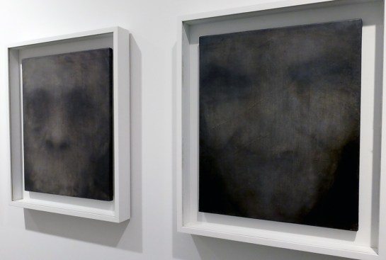
From the large eyes staring out at you from the Reading Room exhibit, and the hands clawing at newspaper columns, you sense humanity grasping and pleading for some sanity in a world full of marginalised desperate people. Then a corridor of paintings suduces you in with ghostly portraits that stop you in your tracks as their mouthless, thus voiceless, apparitions stare back at you. I was stunned into silence also by their power.
DSCF3398

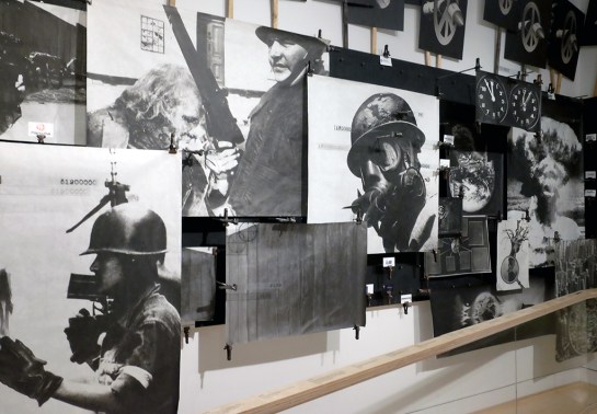
And all this before you enter the room with his most recent work, The Boardroom, an ongoing project of Kennard’s that revisits photomontage but in a 3D space. This room is not for the faint-hearted—the imagery is particularly brutal while equations and statistics about war, hunger and poverty adorn the handrails you just might need to cling to in order to steady yourself against the visual onslaught.

DSCF3409

DSCF3416

DSCF3405

No photograph can do justice to this room—it is truly powerful stuff. If you do not feel emotionally affected by its overload of the injustices of war then you either do not have a soul, or you are a government minister.

DSCF3407

The statistics displayed are as equally an important element of the work as the visuals are. In the exhibition’s accompanying book, Kennard states: “I realise the seed for the idea…was actually planted a quarter of a century ago, … I made a speech at the UN to open my exhibition that began with a series of numbers I heard from Dr Hiroshi Nakajima, Director General of the World Health Organisation. I recounted in the speech how these numbers had been haunting me. For one billion dollars, he had said, or the cost of 20 modern military planes, the world could control illnesses that kill 11 million children every year in the developing world. At that moment, I saw that the connection between children needlessly dying from illness and bloated military spending was concealed in our society; the numbers that are the foundation of our modern world”. (2015, Kennard, IWM.) That phrase is worth repeating as you look at the image below: the numbers are the foundation of the modern world.

Untitled-2

On leaving the exhibition and reflecting on the necessary brutality of The Boardroom, I thought of the bravery of the Imperial War Museum to commission this exhibition. It continues until May 2016, and I hope that when it is taken down, the museum consider making this last room a permanent exhibition in their collection.

Peter Kennard: Unofficial War Artist is free: go see.