Archive

Research

image

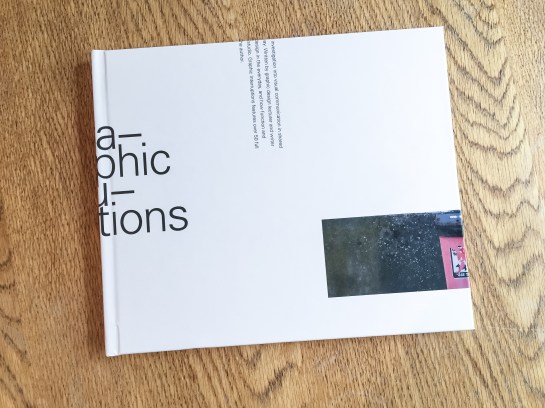
Graphic Interruptions book, front cover

Graphic Interruptions has reached some sort of a completion, for now, with the production of a one-off hard back book for an assessment of the project for my masters degree. The project will continue in the background and you can follow its Instagram account here.

image

Graphic Interruptions, back cover

I would like to have produced more books and sold them, but because of the production values I insisted on, it means each copy would cost upwards of £60 and I just can’t justify selling copies for that price. However, without going into details at the moment, I have been talking to a publisher and if a book proposal I’m writing is accepted, Graphic Interruptions may enter the public realm as part of a wider project.

image

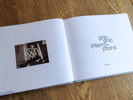
Title page

In the latter stages of working on the project, which had been ongoing since October, I fell back on familiar territory, (see McJunk, links on Elsewhere page), as I needed to create a tangible outcome for a looming deadline. This resulted in me jettisoning explorations into maps, autobiographic writing and psychogeography which had all been part of this project at one point or another. My interest in these makes me certain I will return to them in the future but in order to wrap this up for an assessment I went with what I knew I could achieve.

image

The essay I wrote as the introduction to the book will see the light of day here in the near future, but for the time being I’m pleased to call some sort of pause to Graphic Interruptions, at least in relation to my MA studies. It has helped shape my thinking for the next stages of my academic research. And more than that, I’m looking forward to blogging about more than Graphic Interruptions here.

CoverMock

Book jacket proposal (front and back)—work in progress

Graphic Interruptions is reaching some sort of climax as I prepare the final artwork for a one off self-published book to go to print this week. As I near the end of this stage of the project, (i.e., an assessment hand-in for a 40 credit module in mid-May for my masters degree), for no reason what-so-ever other than a little procrastination, I’ve worked out some (sketchy) stats for the project to date:

—55 photographs in book, edited down from 224
—7 short psychogeographic writing trials
—1 long psychogeographic essay with umpteen drafts
—1 introduction essay of over 1300 words, 6 drafts and copious notebook ramblings
—3 book print trials
—7+ layout trials
—untold changes in direction
—7 months reading/researching, photographing, questioning, reflecting
—6 blog posts in duration of MA, (+1 associated)
—One 3 year old blog post, (genesis of project concept)
—3 presentations
—5 critiques
—2 ring binders
—63 plastic wallets
—2 sets of inkjet cartridges
—2 maps
—One 19x25cm Moleskine softcover notebook
—One 14x21cm Leuchtturm1917 softcover notebook
—3 or 4 Lamy rollerball cartridges
—untold visits to the library
—uncountable Google searches, RSS feed follow-ups and Evernote bookmarks
—1 part-related meeting with a publisher
—1 venn diagram


Lampost-lottery

The blogging on here is truly taking a back seat as I thought it would *, but my Graphic Interruptions project continues. I got validation this week about its direction in the form of results for the first piece of assessed work on my Masters course, and I’m stumbling across more examples every time I step out onto a pavement.

The above example is one of my recent favourites. The reason I like it is because the graphics aren’t decayed by weather and its form isn’t physically broken. This is the case with a lot of examples I find which could lead to an accusation the project is solely concerned with ‘ruin-porn’, which it isn’t. This piece of graphic design is interrupted because of human interaction as someone has decided, (without too much thought), that health & safety concerns trump communication. This ultimately renders the intention of this item useless when approached from this direction. The question then needs to be asked about the suitability of such a communication device, in the form of pavement signage, if it is liable to have people tripping over it? I also like the irony this implies: the item becomes a lottery—will you or won’t you trip over it?—and I wonder whether there is more chance of financial gain if you were to trip over this and put in a ‘no win no fee’ claim than actually buying a lottery ticket.

Until now I’ve been using Tumblr as an image dump for my finds. However, I’m not convinced I was getting the traffic I wanted and I find Tumblr a little clunky. Now that Instagram have made switching between multiple accounts easy, I’ve created one for this project: you can find it at @graphic_interruptions

Lastly, for now—the undergraduate graphic design course I lecture on at UCS is taking students to New York at the end of this month. Exciting as it is to visit New York, I’m doubly excited to have the opportunity to make this project international.

Console

* It is typical that when I am extremely busy, (as seems to constantly be the case now), an idea for a blog post will throw itself at me that can’t be ignored, as happened recently with the article I wrote for Eye. See previous post. 

Venn_001

Since I last posted here about my Masters I have been fine tuning where I’m going with my work. Creating the above Venn diagram for a peer critique this week helped—the first Venn diagram I have ever produced! The problem I’ve had until now was making sense of what appeared to be very diverse aspects in my work and research. This diagram bought it all together visually and helped me explain where I was going to my peers. They got it, and gave me some very good feedback on the trial writing I have done to date.

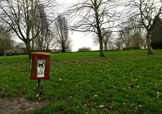
Today I’ve been developing my written responses to photographs I’ve taken. In order to distance myself from what I had tried before, I used a series of images I shot earlier in the day while walking my dog in a local park. This writing was an exercise in honing the tone of voice I use, and testing the familiarity in my written language. I’m a long way from posting any of my writing for this project here, and I will only give a sneak peak when I do, wanting to save the major content for future printed publications that I produce. However, I now feel I’m starting to get a cohesive balance between descriptive elements, personal reflections, critical analysis and my use of humour.

As it will be some time before I have anything concrete to report here, such as publication details and images of designed work, I thought I’d share some of the photography from today’s session. Please bear in mind I am not presenting this as being in any sense ‘accomplished’ photography; these are purely shots I use to respond to in my writing and text & image will be seen side by side in any final outcomes.

The written context surrounding these images include: familiar scenery; walking to work; exercising the dog; sense of neighbourhood; Ipswich; civic pride; protest; and cat jokes.

streetsign

Street sign coat of arms

Alexander

Ipswich’s Alexandra Park

Dogwaste

Dog waste decal

Bin

Dog waste bin

Bench

Roger MacKay’s bench

bin2

Rubbish bin coat of arms

flw

Front Line Warriors

flwredacted

Front Line Warriors redacted


Perfect

Graphic Interruption: Perfect Image image

I am embarking on a new venture as of this week; that of starting a Masters. As a result it is unlikely that I will have the time to blog here as much as I have in the past. Dubdog blog is not closing, merely shifting emphasis and directing its attention elsewhere for the time being.

I anticipate I will still add to this blog over the next 2 years that I’m doing the MA course part time, but what with my day job and other commitments, I will have to prioritise rigorously and blogging here will be a much lower priority.

I am hugely looking forward to doing my MA. It is something I’ve been wanting to do for a long time but have had to put it on the back burner over the last 5 years due to work commitments. The irony is that as an academic I am expected to be conducting scholarly activity and researching but the lecturing and administration side of being an academic is the thing that has held me back from doing this in anything but a piecemeal fashion. In the last five years I’ve maintained a regular (ish) activity here; peer-reviewed and written reviews for books for art and design publishers; attended conferences; contributed to other blogs, including that of Eye magazine; and I’ve been actively researching historic typographic and print related publications. I’ve even managed to create the odd piece of graphic design, self-published a book and followed my growing passion for photography with a number of personal projects. However, none of this has had a continued focus or the structure that is needed to truly give any of it real academic merit. The framework of an MA will give me that structure and allow that focus.

Do keep checking back from time to time, there will be the odd new post every once in a while. Thanks for reading thus far.

Readinglist1

Cover

It seems somewhat ironic that a journal called Signal should pass me by, again. I wrote about the first two issues here in 2012. I can’t remember what, but something pricked my memory of the journal a couple of weeks ago and I went searching for the publication again only to find that issue three was released nearly a year ago with the forth due out this coming May. I quickly ordered Signal:03 and it doesn’t disappoint.

IMG_0001

Once again, what I’m genuinely impressed about with this publication is its breadth. The level of research done by the contributors is impressive and there is a sense of importance given to documenting/archiving social design stories that otherwise would be lost in the midst of time. For example, the image above is from a comical anarchist publication from Brussels in the 1930s. Titled: Game of Massacre: 12 Figures Looking for a Ball, the article explains this Aunt Sally type parlour game, created by Fred Deltor, (aka Frederico Antonio Carasso, 1899–1969), that enables you to cut-out various puppet figures, such as The Military, Property, Fascism, Religion etc, in order that you can throw balls at them. Included in the game was a mock cut-out theatre to set the figures in, and a ball, along with descriptions of the puppets. The above were described thus: (3) “Philanthropy has a chest in the form of a bank vault full of cash and tosses a single coin toward a cadaverous figure (lacking an arm and a leg) in from of a hospital”; and (4) “Social democracy is a two-faced figure who wields the attributes of both royalty and communism”. In uncovering the original publication, Stephen Goddard says: “Stylistically Carasso’s figures betray a knowledge of many of the important international impulses associated with progressive art organisations, periodicals, and movements of the 1920s, such as DeStijl, Het Oversight, Constructivism, and…Agit-prop.”

Signal reprints the preface to the game with a translation which states: “This is the game of massacre. Come! … Here it is, the opulent collection of royal, imperial, and devine puppets, that control you as they wish, you poor crowd, and who, by tragic reversal of roles, pull, from one to the other, the strings of your poor destiny.” Who says that anarchists don’t have a sense of humour?

Like the previous two editions of Signal, issue three mixes historical and contemporary struggles and their associated graphics. So alongside an article on student led strikes in Québec in September 2012, you find the story of the incredible Barbara Dane, co-founder of Paredon Records. Between 1969 and 1985 Dane tried to document revolutionary music being made around the world and in an interview with Alec Dunn and Eric Yanke, she describes how she’d go from country to country recording different musicians and singers and return to the States to release them. In the space of 16 years, Paredon Records, with very little budget, released recordings from Vietnam, Salvador, Puerto Rico, Cuba, Northern Ireland, Ecuador, Italy, Britain, Angola, Chile, Greece, Thailand and a host of other countries. Of the sleeves, she says: “If you look at the records, they’re 12″ x 12″ on the front and then fold around about 5 inches on the back. It was done this way so they could print four at once, four-up on a single sheet of paper…At this printer, what dictated what you could do was economics… And so you figure out things like one color has read, the other blue, so then third cover can have purple. You figure out how to work with two colors, matte paper, that size.”

Record2

1978, design Ronald Clyne

Record1

1975, design by Ronald Clyne

Asking Dane about working with the designer Ronald Clyne, she says: ” If you caught him at the right time of day, before he drank too much wine, he was very very clever about what he did. You can see that he could take any kind of photo, work with it, and make it meaningful and not destroy the meaning of it. And always, his forte was selection of type and layout and all that. I’d bring him basic tools, the basic elements, photos and also drawings from artists I’d met.”

Record3

1975, design by Ronald Clyne

Record4

1974, cover art by Jane Norling

If Barbara Dane wasn’t inspirational enough, Signal:03 publishes an article by Ropbert Burghardt and Gal Kirn on the former Yugoslavia monuments to anti-fascism and revolution. These impressive and often modernist brutal memorials, built between 1945 and 1990, litter what is now split into seven different nations. The authors state: “These monuments are not only modernist, but contain as unique typology: monumental, symbolic (fists, stars, hands, wings, flowers, rocks), bold (and often structurally daring), otherworldly and fantastic. … Instead of formally addressing suffering, these memorial sites incite universal gestures of reconciliation, resistance, and progress…for those that encounter them, they remain highly imaginative objects: they could be ambassadors from far-away stars, witnesses of an unrealised future, historical spectres that haunt the present.”

Y_Mon4

Y_Mon3

Some have been landscaped and provide opportunities for family days out with cafes and play areas. Some are more formal monuments that you can enter, such as the one above in Kozara, while others you happen upon in the middle of nowhere. Started as a way of remembering the second world war, they were initially built spontaneously by local artisans. And if the guidebook to them printed in Signal is anything to go by, there is a vast amount of these monuments dotted around the region, with a map stating over 200 locations, (although many have been destroyed or decayed).

Y_Mon2

Y_Mon1

Once again I am truly impressed by Signal. Its historical importance stretches across many areas including art, design, architecture, music, politics, protest and social history. And although this could be seen as a research journal, it is easily accessible for those who are just generally interested in the topics it covers, students, scholars and armchair revolutionaries alike. I’m already looking forward to the forth edition due in May.

Signal:03 is available to buy from PM Press for $14.95

SA

Since leaving Facebook a while ago I’ve been meaning to update or remove other online presences of mine. As a result I have now spent some of this morning on a purge. I am only notifying Dubdog readers here in case trawling through previous posts you find some links are now broken.

With my long time project McJunk on hiatus, I’ve updated its website to take account of this and deleted McJunk’s Facebook page and Tumblr submission site. Unfortunately, as McJunk on Tumblr was the first Tumblr I set up it was automatically my ‘primary site’, which meant I couldn’t delete the site with out obliterating all my other Tumblr projects, (it seems crazy Tumblr doesn’t allow you to switch ‘primary sites’). I don’t regret loosing most of these other projects as none were particularly useful to me now, except that is for my type and print publication research archive The Small Letter. That said, I was never overly happy with the format of Tumblr for this archive so I bit the bullet and hit delete. I plan to resurrect The Small Letter, or a variation there of, at another time in another online space in the future when I have a little more time on my hands.

Along with these changes, the McJunk hardback book is now no longer available to buy so if you do own a copy it is now a very rare thing indeed. However, the essay and accompanying presentation are still available to download for free from my Academia.edu profile.

Lastly, I have also removed my ‘archive’ portfolio page from this site. It had moved further and further away from representing what my current interests and activities are.

ChildhoodRemixed_cover

I’m proud to have recently finished working on the third edition of Childhood Remixed, a University Campus Suffolk (UCS) online interdisciplinary academic journal themed on childhood. The journal, published annually, has previously only featured papers from staff and students at UCS. However, this year much of the publication has been made up of submissions to the international Children and Childhoods Conference held at UCS in July of last year.

ChildhoodRemixed_welcome

The international flavour of this edition demonstrates not just how much the journal has grown in three years, but how much UCS has developed in that time as well. First launched in 2012, Childhood Remixed was intended as a ‘stepping stone’ into the world of being peer-reviewed and published. For third year undergraduate and postgraduate students, and for lecturers who hadn’t been published before, this was an excellent opportunity for a safe trial into the daunting world of academic publishing. The journal still provides this platform, but now allows those same students and staff to be featured alongside academics and researchers from across the globe.

ChildhoodRemixed_pagesIt is hoped with this international issue, that the journal will be available to the wider public soon as a download rather than just internally within UCS as the previous two editions have been. More details will be posted here when it is available.

Thanks to Dr Alison Boggis, Senior Lecturer in Early Years at UCS, who has tirelessly pushed this publication forward since its first inception three years ago.  Read a report of the launch of the first edition here on Blogger.

Screen Shot 2013-06-18 at 07.59.00

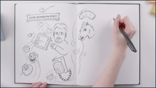
Still from Academic Earth video, The Psychology of the Internet Troll

Ever wondered what the psychology of a troll is, you know, those annoying people who are deliberately out to promote arguments and upset others on the internet? Well, according to the video The Psychology of the Internet Troll, hosted over on Academic Earth, it is all linked to being alone. “We all behave differently when alone. Anonymity frees us from a perceived obligation to act in accordance with certain social norms,” they state, going on to say that, “while most of our anonymous behavior is relatively benign, what happens when it isn’t?…We’re 20 years into the experiment of the World Wide Web, and we can clearly see how Internet anonymity plays out across social media, chat rooms, and comment sections. Usually just a nuisance, anonymous troublemakers, known as trolls, can be dangerous when they go after the vulnerable. In an effort to better understand what makes them tick, psychologists are starting to take a closer look at the psychology of the Internet troll.”

My own experience with trolls has thankfully been limited to befriending someone on Facebook who I hadn’t seen for over 15 years. They then preceded to comment, uninvited, on conversations I was having with others online, and stating to get argumentative with people they didn’t know. They also started to negatively comment on anything I posted. I didn’t think of this activity as trolling at first, until a friend posted a comment after a protracted argument with said protagonist that they had forgotten the adage “do not feed the troll”, and signed off from the conversation. This realisation that my old acquaintance’s behaviour was deliberately vindictive, which I had only previously thought of as annoying, opened my eyes to his divisive actions and I unfriended him straight away.

The video is well worth a watch, and uses animation to break down some complex psychological research that explains the behaviour and mentality behind trolling. And if there is any one thing you have to keep reminding yourself when online or using any form of social media, it is: DO NOT FEED THE TROLL.

Watch the Psychology of the Internet Troll here.

Earlier last month few could have escaped the surprise announcement of a new David Bowie album, scheduled for a March release, titled The Next Day.

The artwork dropped with almost as much of a shock, to some, as the album. The artwork places a white square over the original iconic cover of “Heroes”, Bowie’s 1977 collaboration with Brian Eno which is considered by many as one of his best works. While this was sacrilege to some, others, along with myself, thought it a brave masterstroke by Jonathan Barnbrook, who has worked with David Bowie for the last 10 years.

newheroes_0

David Bowie – The Next Day. Sleeve by Jonathan Barnbrook, 2013

On seeing Barnbrook’s work for Bowie, I immediately drew associations between The Next Day sleeve and a new jacket for George Orwell’s Nineteen Eighty Four by David Pearson that was showcased on the Creative Review blog shortly before the announcement of the Bowie album. Here, Pearson obliterates the title and author of the book to reflect the redacting of history in this classic Orwellian tale.

nineteeneightyfourdropshadow569_0

George Orwell – Nineteen Eighty Four, cover by David Pearson, 2013

Naturally enough though, I wasn’t the only person to make such a comparison as Richard Weston’s Ace Jet 170 blog testifies. And there, my thoughts would have rested, beaten in the blogosphere to writing a post about the Bowie/Orwell connection.

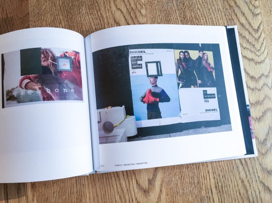
However, I then got thinking about these two pieces of work and their deliberate graphic obscuring—where one piece of communication has been interrupted by another to create a new work that forces the viewer to question what they are reading—and how this related to things I’d been observing in my everyday. For a little while now I’d been noticing such occurances as road markings being obliterated by the visual remains of where road works had taken place, their primary communication scarred and temporarily interrupted; or where different street signs had been overlaid partially obscuring aspects of one or both.

IMG_2967

JacobsWay

These observations have started to inform a new photographic project of mine, (working title Graphic Interruptions), which currently only consists of some test pieces posted to Flickr. The obvious differences here are that Barnbrook’s and Pearson’s work both deliberately interrupt one visual device with another to form a new narrative, where as what I had been looking at were mostly accidental. I don’t quite know yet where this project is going, but I’m finding it visually intriguing.

But then this visual intrigue was whetted again this week when I succumbed to buying the John Stezaker monograph, which I had been coveting for some time. The book was published in 2011 to accompany his exhibition at the Whitechapel Gallery the same year. Unfortunately I missed the show, but was bowled over by the images that were shown alongside many of the rave reviews in newspapers and on blogs at the time. Could it be that this work, first seen a couple of years ago, had stayed with me and fed my visual thinking when walking around and noticing my graphic interruptions?

StezakerMaskIV 2005

John Stezaker, Mask IV, 2005

Mask IV is typical of the collage work that attracted me to Stezaker. At first, I didn’t make an immediate connection between all of the above and the influence Stezaker’s show, directly or indirectly, has potentially had on my thoughts about what the book calls ‘occlusion’, (the art of blocking).  But I am beginning to now.

And then, looking through the book, I came across two images that made me wonder whether Stezaker’s work had also influenced, consciously or otherwise, Barnbrook’s The Next Day sleeve:

StezakerTabula RasaXI2008

John Stezaker, Tabula Rasa XI, 2008

John Stezaker, Tabula Rasa II 1983

John Stezaker, Tabula Rasa II, 1983

With or without placing ‘The Next Day’ text in the white rectangle, you can easily see the connection between this and the sleeve of the anticipated David Bowie record.

My observations here are purely that, observations. I’m drawing together recent thoughts that may or may not have fed into each other, but that do spark a line of questioning regarding the narrative of an image. This might just become my 2013 obsession.