Archive

Packaging

image

The UK’s gutters and hedgerows will soon see new graphics on the McJunk strewn there. Below is a link to an article I wrote for Eye magazine blog about an uncritical design press showcasing the new designs, asking whether well respected blogs are just becoming advertising hoardings for big brands trying to ingratiating themselves with those working in the creative industries.

Gutter press on Eye blog

image

Vector illustration and chunky lower case type make for the new look reductive graphics adorning McDonald’s take away packaging. Created by Leo Burnett design agancy in Chicago, (I’m currently unsure if this packaging has made it to the UK yet), it appears to be another opportunity missed.

I think it’s fair to say that McDonald’s has an image problem. Well, it has many image problems actually, but I’m specifically talking about the one that glares at us all from roadside gutters and courtryside hedgerows. Any repeat visitors to Dubdog will know that I’m talking litter, a particular bugbear of mine. The world over, McDonald’s is the top brand, or one of the top brands, found on fast food litter, (see this report from Australia, and this from the USA, and this by the UK’s Keep Britian Tidy). I first noticed it some 14 years ago and it prompted my McJunk project. McJunk was an exploration into the relationship between graphic design and disposable culture through a photographic study of McDonald’s litter, (download the introduction to the McJunk photobook as a PDF from here, or visit the McJunk website).

Discovering this new McDonald’s packaging today prompted me to hunt around the Internet for current research into littering and I found some key reports by Keep Britain Tidy, ( * links at bottom of post). In these I came across two specific points of interest that relate to my own graphic design related research:

  • Firstly: through focus group discussions it is claimed that people would be less likely to buy a brand that they saw being littered. While this could be one of a whole host of reasons why McDonald’s had a bad year in 2014, I’m somewhat sceptical—what someone states in a focus group in the company of others is not necessarily the reality of what they actually do. But even if this were true, and it makes business sense to take seriously such market research, you would have thought McDonald’s would take note and try to do more to convince people not to litter;
  • Secondly: many of those surveyed by Keep Britain Tidy stated that they thought the Tidyman logo made little difference to people’s littering habits. This I can well believe. Usually sidelined within any graphic design hierarchy—often on the bottom of any packet—as iconic as I think Tidyman is, the Keep Britain Tidy report suggests that as a nation we have become used to it if indeed we notice it at all.

And herein lies my major problem with this McDonald’s redesign. When the graphics applied to something do not affect whether someone is going to buy a product or not—McDonald’s takeaways are not bought off a shelf; you don’t see the packaging until a BigMac has been ordered, ‘cooked’ and handed over—graphics are technically not needed for marketing purposes. They are usually only there to encourage brand recognition or as decoration. Therefore, if you rethought the side of a take away bag, there is a perfect opportunity for McDonald’s to challenge their litter problem by educating consumers through graphic design. But alas McDonald’s chose not to take this opportunity.

As mentioned in one of the Keep Britian Tidy reports that I read, it is a depressing thought that litter problems will only get worse over the coming years with further public sector cuts. Such cuts mean local councils have to decide what services to shelve, and I suspect many authorities will rightly decide important issues such as social care trump litter patrols. And unfortunately public sector cuts are likely to continue. For regardless of who wins the UK general election this year, both Labour and Conservative have declared their intentions to continue with these cuts. Even if we have another coalition government come May, which is the most likely scenario, one of these two parties is likely to hold the balance of power.

A couple of years ago I put McJunk on a hiatus. With this new packaging launch and after reading several Keep Britian Tidy reports, it looks like it might be time to resurrect the project.

10105410934_ff578b3723_z

McJunk, as found, on Shingle Street beach, Suffolk. Pre-2015 redesign.

Keep Britain Tidy 2013 Litter Report 

Keep Britain Tidy 2013: When it comes to litter, which side of the fence are you on report findings

Scrutinising an Innocent drink carton several weeks ago I noticed that it was recyclable “in certain areas” and that I was to check with my local authority to see if it could be recycled in my area. I didn’t of course, not looking forward to either an elongated phone call being passed through various different departments or trawling through an impenetrable menu system on my local council website. I therefore forgot all about it and sent the package merrily onto landfill. To be fair, I had previously checked several years ago whether I could recycle this sort of packaging in Ipswich and finding out that I couldn’t, I didn’t hold out much hope that this would have changed.

image

Then when walking to work one morning last week I found myself confronted with a large graphic on the side of a bin lorry telling me that I could now recycle orange juice cartons in my blue bin. I was astounded for two reasons: firstly I was surprised that my local council was actually quite advanced; and secondly that this information was bought to me and that I didn’t have to hunt it out.

This is a prime example of design that works. Not only has it bought this important bit of information directly to me, but also to all the houses on the route of the bin round. In my neighbourhood the houses are no more than 3 metres from the road, with small front gardens and pavement the only things between window and residential traffic. This means anyone opening their curtains at refuse collection time will be delivered the same information. This is an excellent example of taking the message directly to its audience.

This advert won’t win any awards though because it isn’t necessarily a great piece of design. The non-threatening cheeky bin man sticking his thumb up giving recycling encouragement to locals isn’t exactly ground-breaking or particularly inventive, and for my money I find it a little patronising. It isn’t even particularly well laid-out. But none of that actually matters because this design ultimately works. This evening I cleaned out the first Tetra Pak style carton I’ve finished since seeing the billboard ready to put in my recycling bin tomorrow. For that this advert should win an award because fundamentally it does what all design should do: it works. In my own experience the message has been effectively delivered and I have acted upon it, regardless of personal aesthetic tastes and design criticism. There often isn’t enough research done into the effectiveness of a design after it has been implemented, especially for social design, (where as increased sales figures can justify a piece of design in a commercial setting). But in this case, job done. Give a yellow pencil to whoever created this advert and decided to stick it on the side of a bin lorry.

photoAgainst my better judgement I bought a Ginsters’ sandwich yesterday.

On eating it, I glanced at the packaging to see the declaration above—that Ginsters had donated the side of the pack to a charity. I turned the packaging over, and, as they claim, there was information about the Royal Voluntary Service.

This struck me as somewhat insidious because of how this supposed act of corporate social responsibility was being turned into a marketing opportunity. In my opinion, the fact that Ginsters have felt it necessary to so prominently proclaim their act of altruism defeats any good will the act itself might bring to the company. To think that Ginsters’ marketing department didn’t realised this potential reaction might happen—that no one who see through this forced ‘look at us, aren’t we wonderful’ approach—is incredulous. The contempt for the consumer is further compounded by the additional emotional blackmail of the question “what could you give?”. Coming after the statement about their ‘donation’, (as if it really cost Ginsters anything other than a couple hours of a graphic designer’s time), is insulting as it suggests that the company believe they have done their bit and now the responsibility lies with the consumer.

Corporate social responsibility is an important issue in contemporary business practice. But if companies like Ginsters want us to believe that they are genuine in their commitment to the voluntary sector, then they need to stop patronising consumers and use their involvement in social issues for more than a marketing opportunity.

It was nearly enough to put me off a sandwich I wasn’t particularly enjoying.

sound-system-the-clash

In my teens and early twenties I was a big Clash fan. Then as my music tastes matured, and I started to tire of rock music’s clichés, I started to fall out of love with the band’s early work, which traded so heavily on rock clichés. Half of Black Market Clash, and all of Sandinista and Combat Rock are all I can really listen to by them now. It is almost as if I have divided them into two different bands. The diversity of their later work, post-London Calling, which experimented with different styles and genres of music, bought a breadth to the band that wasn’t previously there. This period of material outshines anything that went before it for its sheer inquisitiveness. Their artistry flourished as their music became conceptually linked to lyrical content and they matured as they became more and more interested in emerging popular cultures from around the globe.

Outside of their music, another appeal of The Clash to my young eyes was their over-all aesthetic. Encouraged in their early days by manager Bernie Rhodes, the army surplus and leather jacket stylings gave a rebel stance that became emblematic, and spawned many a teenage lookalike. This defined punk fashion in many immotators eyes, not least myself in my late teenage years. In their graphics, their evolving visual language of distressed or stencil typography, saturated revolutionary reds and military greens, heavily posed photographs, and knowing reggae and hip-hop reference points, formed an aggressive identity that flirted with insurrectionary fervour. The influence of this has been utilised by many a marketeer in the last 20 years, and you see their graphic stylings on anything nowadays that is trying to look slightly edgy, urban and rebellious, from skateboard magazines to energy drinks. Mainstream ‘alternative’ would be an apt description and the ‘making money out of rebellion’ Strummer quote rather obviously comes back to haunt his memory.

When I heard about the proposed release of Sound System, a box set of Clash material due to hit the shops this September, nostalgia got the better of me and I searched it out online. I was expecting to be disappointed, a feeling that nostalgia often promotes—stripped of any contemporary relevance and promoting a sense of longing for something that can never be again. However, disappointing is too weak a word for what I found; as I looked at the pre-release marketing shots and promo videos I was gob-smacked by how truly awful this looked. The ‘boom’ box container is the first thing that grates. I can’t even think where I would keep this in my house if I owned one, I certainly wouldn’t want it on show. Ugly and cheap are words I try to avoid when discussing design, but I’m afraid I can find no better ones to articulate here. Then there are the contents—stickers, dog tags, a poster presented in a giant cigarette tube, badges, more stickers—gimmick after gimmick thrown together on a whim with little thought to consistency or sophistication. Childish, naive, and verging on being patronising, it is if Sound System is aimed at the average 14 year-old punk new-bee rather than ageing Clash fans with the disposable £111 to spend on it.

If this project was just down to record company excesses trying to make a quick buck in a dying industry, then I could almost excuse it, distancing as it would the product from the band. But to know that Mick Jones and Paul Simonon have been involved in designing this is disheartening, as it does a real disservice to The Clash’s legacy. I can’t believe that Joe Strummer isn’t turning in his grave.

Screen Shot 2013-04-02 at 17.51.22

I’m not sure when streaming a band’s forthcoming album, pre-launch date, became a popular marketing ploy. But for at least 7 of the new releases I’ve bought this year so far, I’ve been able to listen to them in their entirety prior to making a purchase, and usually several weeks in advance.

As a marketing ploy, this is good news for me—it is good to know what I’m getting before I buy it, especially with bands I am unfamiliar with. It was streaming The Villagers album {Awayland}, a band that had previously passed me by, that convinced me to buy it. This doesn’t mean I’m not prepared to take risks, or rely on a trusted journalist’s or friend’s recommendation, but it does mean I can be more discerning when hitting the ‘buy’ button.

Could this work against an artist? Well, certainly. That hotly tipped release that has been slavered over by critics who have had advance copies months ahead could end up being just hyperbole and bandwagon jumping, which is often the case. I pre-ordered the last, much lauded, Nick Cave CD when its release was first announced, and then nearly cancelled the order when it streamed on The Guardian as the lyrics were, in places, embarrassing, and the overly dramatic vocal delivery grated, (The Bad Seeds though, what a band—please make a solo album without Nick). But I still kept the order if only for the promise of well designed packaging.

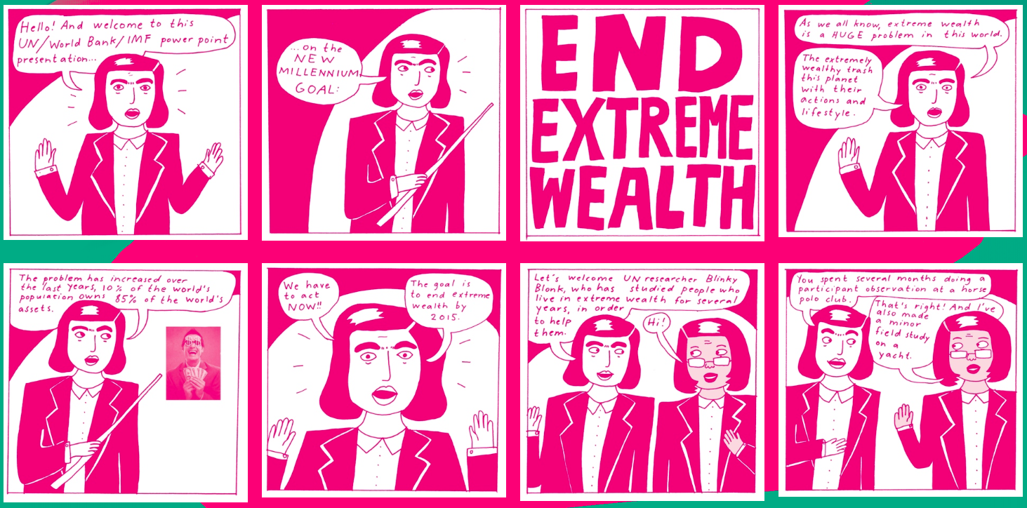
Therefore, it struck me as odd yesterday, when The Quietus announced that Stockholm electronic experimentalists, The Knife, were streaming their new album, due for release next week, on their website. Not so odd in itself in this day and age, but the fact that the artwork for Shaking The Habitual was also on show for all to see did strike me as such. The artwork contains a witty anti-capitalist side swipe by comic strip artist Liv Strömquist, (section above). This will come with all physical and digital purchases, and, as The Knife proudly announce, be fully readable online. As someone who has never given up on buying CDs as I’m old fashioned enough to still like having an artefact with artwork, this stumped me slightly. For now, I’ve read the comic online, laughed, got the joke. I’ve heard the music. Anytime between now and next week I can go back to The Knife’s website and listen to it again to the point that I could get bored with it. And then, I could stream it on Spotify once it has been released if there are still a few listens left in it. And I can point anyone that I might think is interested in such things to the website to read the comic strip, as I’m technically doing here. Therefore, this seems to really make buying a physical or digital own-able item pointless.

The question that now remains is: will I buy the album? Under normal circumstances I would do, as I like it. In some respects, as a sucker for (good) experimental electronic music that has its feet firmly rooted in pop, and as the sort of person who laps up satirical agit-prop comic book art, then I’m a target market for this ‘product’. The fact I’ve become interested enough to want to write about all this ‘new’ media gubbings, probably, also demonstrates that I’ve already, metaphorically at least, bought into this album. The fact that I will want to put it on my iPhone for the walk to work or for playing in the car, as well as listen to it on the decent stereo we have in our front room, (rather than on my computer speakers), will probably tip the balance. But if free wifi was rolled out across the country and I was truly always connected, then this, and other similar marketing activities, would probably, finally, start to kill the collector in me.

There is much talk about The Lost Tapes by Can at the moment, and with good reason. For those reading this that know nothing about the band, or the context within which they emerged, then there is an excellent essay on Quietus by Taylor Parkes that comes with a Dubdog recommendation. However, the point of this post isn’t to talk about Can, or the fact that these lost tapes were only rediscovered recently, or the importance of the band and their music, but to discuss the artwork and packaging.

The graphic design is done by Julian House at Intro, who is no stranger to music related projects. He has worked with many bands in his time at Intro, as well as setting up a label, Ghostbox, which bares all the visual hallmarks of his distinctive 1950s styling. Although it is a term I usually try to avoid using, but ‘retro’ can appropriately be applied to what he does for Ghostbox releases and label identity.

Here for Spoon Records he has created a handsome and sturdy 10″ box to house the 3 disc set, with accompanying 28 page booklet. The box itself, obviously recalls reel to reel tape boxes, which helps set an ‘authentic’ tone of voice for the whole project. The front and back cover theme of cut and paste imagery, with yellowing Sellotape and halftone-screened photographs follows through into the internal graphics perfectly emulating the immediacy of much of the music—Can famously jammed a lot of their material, and the visual language applied to The Lost Tapes mirrors that aesthetic.

It could be argued that this showcases the House style, (pun intended), with the typewriter font, cut and paste approach and seemingly random placements, that he established with his work for Broadcast and Primal Scream. Certainly there are similarities with what he has done before, but the trick with much of his output is to make the work look as if it was thrown together, when in fact there is obvious consideration and a keen designers eye employed throughout. Image selection, editing, cropping and placement rarely look this good when they are done spontaneously—making an attractive scrapbook is not easy.

Uncoated stock helps to instil a tactile sense as the viewer holds this oversized CD packaging to read the comments from band members about the selection process they went through to edit down 50 hours of music contained in the uncovered tapes. There’s even a photograph of the cupboard they found the material in. It is remarkable that so much survived, considering that during times of little money, the band would record over old tapes they had decided weren’t worth preserving.

This is probably one of the major releases of 2012—expect it to keep cropping up in many end of year polls. And as such, it is good to see that the importance of creating visually empathetic packaging for the discs has been held in such high regard, something rare in this era of imageless digital downloads.

I would have bought this as a physical release regardless of the packaging, as I do for all albums that I consider audio quality to be of importance for. But regardless of wanting to possess high quality audio, this package is well worth £30 of anyones money in my opinion. For the first time in a long time, when I stuck on my headphones to listen to the first CD from The Lost Tapes and study the sleeve notes and artwork, I was taken back to a time when I used to do the same with vinyl LPs.