Archive

Event

P4241186

A large corner of my loft is stacked with vinyl records, mostly 12″ LPs, but there is a smaller pile of 7″ singles. They are going to stay there, save for the odd time I want to change the artwork in my three album-art frames that deck our landing. It is fair to say I haven’t jumped on the supposed vinyl revival—there’s already enough nostalgia in the world, I don’t need any more.

What I do miss about vinyl is the sleeves, hence my love of my album-art frames. Unfortunately 7″ single sleeves were never quite as explorative and there are few I can recall that deserve being displayed; a couple by The Clash, Sex Pistols or The Smiths maybe, but generally the design of 7″ single sleeves wasn’t anywhere as near as engaging as their LP counterparts, being more of a disposable commodity. But that’s certainly not the case with the recent Secret 7″ exhibition at Somerset House that I accidentally stumbled on last week when visiting Pick Me Up 2015. Secret 7″ is a project in its third year that chooses 7 tracks and presses each to 7″ vinyl. The organisers then invite designers and artists to interpret the tracks as they see fit and submit a cover, displayed anonymously, which the public can then buy for £50 apiece. All money goes to charity, and this year the chosen beneficiary is Nordoff Robbins, who are dedicated to transforming lives of vulnerable children and adults through music therapy. Like similar secret postcard projects, you don’t know whether you are buying a future collectors’ piece by a famous creative, or something whipped up by someone’s 5 year old daughter, (which could equally be a future collectors’ piece, of course).

P4241182

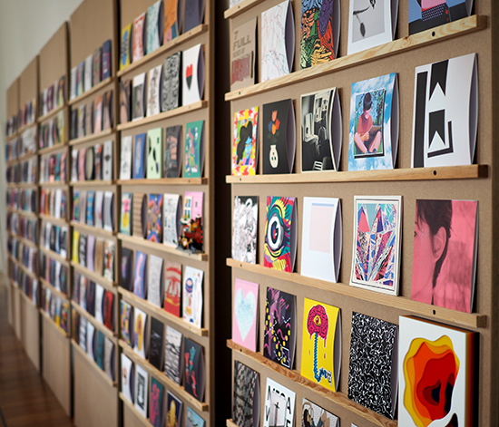
It is interesting to browse the racks not knowing who produced what and trying to guess the track. Many are clearly ‘just’ artworks that make no attempt to represent or link to their musical content. The fact that no title or band name is displayed obviously separates these sleeves from a standard 7″ sleeve—while some designers of commercial records have previously and deliberately not listed a band or track title on a cover, it is still the case that the vast majority of record sleeves do have this information adorning them, as obviously the reason d’être of the 7″ single from a record company’s point of view is to sell as many units as possible. But seeing so many sleeves displayed in one place with no typographic indication of band or title, I felt does reduce this exercise, in some cases, to appealing to an artist’s vanity and results in purely aesthetic outcomes rather than embracing communication—much like Pick Me Up, I felt there was a fair amount of style over substance. Regardless, taking a standard form and asking a plethora of people to work within its confines does lead to some interesting and innovative outcomes.

P4241179

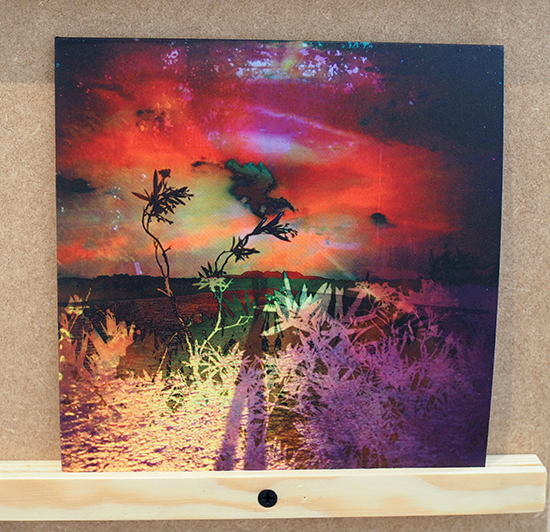
I was personally taken with those creatives that had worked with photography, especially as the vast majority of the sleeves were illustrative. As a result, the photography pieces did tend to jump out to my eyes.

P4241170

P4241173

Alongside the rows and rows of sleeves, seven designers were asked to create a bespoke poster for one of the 7′ tracks chosen. These posters were also available to buy for £50 but limited to a 100 print run and included submissions from Erik Spiekermann, Craig Ward, Spin, The Counter Press, Peter Bankov, Felix Pfäffli and Bread Collective.

P4241172

P4241185

Unfortunately I’m writing this post on the last day the exhibition is open. However, the sale of the sleeves doesn’t start until tomorrow, 4 May 2015, so there’s still a chance to grab a 7″ single sleeve and give money to a good cause. Go to the Secret 7″ website for more details.

Secret 7″ 

The selected tracks for 2015 are:
The Chemical Brothers—Let Forever Be
Diana Ross and the Supremes—Reflections
The Maccabees—Go
Peter Gabriel—Sledgehammer
The Rolling Stones—Dead Flowers
St. Vincent—Digital Witness
Underworld—Born Slippy (Nuxx)

Secret

And while on the subject of singles:

With the day job taking over of late, it’s been a while since I’ve managed to get to a graphic design talk. But thanks to an invite from Kemistry Gallery for helping with their recent Kickstarter campaign, I managed to get up to London one evening last week for a talk that was boldly titled Graphic Design: what next? With design critic, journalist, educator and publisher Adrian Shaughnessy; Why Not Associates’ Andy Altmann and designer/artist Daniel Eatock speaking, it would have been rude not to attend. And besides, I was intrigued as to what they would claim was next for graphic design.

CCx2

Gordon Young/Why Not Associates: Comedy Carpet, 2011. (Photo: comedycarpet.com)

So did any of the speakers answer the question? Well, not exactly. One tried more than the other two, but Andy Altmann, who was up first, did swear at the beginning of his talk that he was instructed to talk about Blackpool’s Comedy Carpet—Why Not Associate’s joint project with artist Gordon Young. And why not, (to coin a phrase)? If anyone should attempt to break the ‘rules’, then I think Andy Altmann has had plenty of experience of doing so and no-one should expect him to change now.

The story of the Comedy Carpet is a truly awe inspiring one, and despite knowing much about the project already, hearing the tale from Altmann himself revealed much more than I could previously ever have known. Interesting memories were keenly told, such as the tale that meeting Ken Dodd at the launch of the project humbling Altmann. However, he still managed to break a cardinal sin of comedy—being bowled over by Dodd telling him a joke while standing on his creation, Altmann blurted out the punchline as he had previously heard the gag. Dodd was not pleased, apparently. (In case you are wondering; Q: “How do you get a fat girl into bed? A: “Piece of cake”.) And the story that Gordon Young, in setting up his own concrete company in order to cut the costs of the project, had to get in one of the UK’s leading experts on concrete who just happened to be Harry Hill’s dad, was gold-dust. (I will resist going into detail here about the Comedy Carpet for those uninitiated with it, check out the dedicated website to the project for more details.)

Henrion_page header_optimised2

FHK Henrion (Photo: Unit Editions)

When Adrian Shaughnessy took the stage he wondered how he was going to follow Altmann’s tales, and he was also concerned he had no jokes. But at least he tried to answer the question. In choosing designer FHK Henrion to discuss—of whom Unit Editions had published a book about in 2013—Shaughnessy put the case that as a ‘complete’ designer Henrion demonstrated an attitude that future graphic designers would need to have in this ever evolving discipline. Henrion started his career as a poster artist, in the footsteps of Cassandra and Games. He then went on to be instrumental in introducing visual branding to the UK, producing in-depth identity guidebooks. He also brought his social concerns to the fore by producing work for CND, become an educator, product designer, interior architecture designer and worked in a host of other areas of design, including the emerging field motion graphics for television. A true all-rounder, one of the key aspects of his approach was to bring an open mind to all projects, in terms of what could be achieved, which meant all his work was truly tested the boundaries of design thinking. If the phrase ‘can do’ was invented for anyone, then surely it was for Henrion. In pitching that future designers should avoid becoming a niche entity and be open to all experiences, Shaughnessy put forward a credible case.

404_christmas-card-1996

Daniel Eatock, 1996. (Photo: Daniel Eatock)

The third and final speaker was Daniel Eatock. I have been a longtime admirer of Eatock’s work and his approach in putting ideas at the heart of his outcomes. For his talk Eatock went for the middle ground and attempted to answer the question at the end after he had spoken about his work. Conceptual as ever, he decided on a system for his presentation: 20 years in 20 minutes, one project a year for one minute each, (an Eatockian Pecha Kucha if you like). He failed, due to over-talking about some projects, but this didn’t matter. It was interesting to hear him discuss his desire in his early practice to try to eradicate subjectivity from his work, fearing that style and decoration was too shallow and over-shadowed the concept. His family’s 1996 Christmas card pictured above was one attempt at this. I would argue that it is impossible to be completely objective in design, for even the choice of typeface and deliberate ‘non-styling’ becomes a style and subjective choice. Regardless, this was a fascinating insight into Eatock’s thinking and was genuinely thought provoking.

In wrapping up his talk Eatock finally attempted to answer the question of ‘what next?’, by providing a slightly awkwardly worded statement. It suggested, (and I paraphrase), that problems shouldn’t necessarily be the starting point of design, and that through investigating outcomes first, we will uncover problems we didn’t previously know existed. Or to put it in simpler terms, produce answers in order to find questions. In throwing out such a knotty statement, Eatock has, for my money, at least tried to answer the question with some sense of critical thinking and avoided defining graphic design purely in terms of commerce which is too often the case. The latter usually closes down critical thinking rather than opening it up, and if graphic design is to be anything other than a means to sell stuff, then we have to resist the market place defining our reference points, even if the market place is where most designers have to operate in order to pay their rent or mortgage.

This very enjoyable evening was rounded off with a Q&A session chaired by Ravensbourne Course Director Liz Friedman, in which education, a hand’s-on approach to design, and ‘post-digital’ became subjects of discussion.

Kemistry Gallery now starts the long haul towards trying to establish a centre for Graphic Design in London.

digital_invite_international_design_auction_27_November

This week saw the first exhibition in London by UCS Ipswich Graphic Design graduates. Titled We Are, the exhibition was held at The Coningsby Gallery, and was a deliberate attempt to try and buck the trend of the morale sapping rigmarole of New Blood, New Designers and Free Range graduate exhibitions, where by thousands of graphic design students compete for attention all at the same time of year and all under one roof. Notably at such events, those from the design industry tend to seek out the courses they already have contacts with, and rarely spend time looking for new talent from emerging courses. What successes come from this first UCS solo exhibition this week are as yet to be seen, but as this was the first of its kind for our students, it was a bit of a trial run and will hopefully develop over the coming years.

It appeared to inspired current first, second and third year students, who we took up to the gallery at various stages this week. And during a very busy period for current final year students as they are in the middle of writing their dissertation proposals and completing course work, they are also preparing for their International Design Auction which will help to finance any such ventures for them in 2014. The ‘We Are‘ graduates ran one last year, and raised nearly £2000 for their end of year show and London exhibition, and if the lots that are coming in so far this year are anything to go by, the 2013 auction is likely to raise a lot more money. There is signed work from Stefan Sagmeister, Tom Gauld, Jessica Hirsche, Milton Glaser, Armin Vit…I could go on, (and on, and on). While in London on Monday to catch the We Are show, current students even managed to find time to visit Margaret Calvert to pick up her 3 donations to the auction, (as well as accept her hospitality of tea and biscuits).

International Design Auction 2013 is being held at University Campus Suffolk’s Waterfront Building in Ipswich on 27 November at 17:30. Check out the lots on the  students’ website for the auction, and follow them on Facebook and Twitter for up to date information.

ida2013.com
ida on Facebook
@IDAuction2013

Ipswich is having a bit of a surge of cultural activity of late, much to the surprise of many of the locals. Sure, for a few years there’s been hi-brow events at the NewWolseyTheatre and Jerwood DanceHouse, and the chattering classes love it when productions in these venues are mentioned in The Guardian Guide.  Alongside this, the annual Ip-Art Festival also brings a cosy but somewhat parochial Gig In The Park, visual art and performance to the town, and big name acts play the football stadium or big parks throughout the year for the X-factor crowd. But for a town with a growing University, a vibrant FE College and culturally diverse population, Ipswich lacks a musical/cultural scene that many other towns of a similar size take for granted. There have always been a lot of gigs over the years, run on a shoe string and in the back rooms of pubs by music obsessives, but you have to know they are happening and they take a little hunting out for anyone new to the town. I’ve stated much of this before on Dubdog, especially earlier this year when there was a call for an Ipswich Arts Centre, (you can read previous posts about this here). But this week sees the Switch Fringe Festival get into full swing which should hopefully start to redress the balance:

The excitement amongst aged local gig goers is palpable as Switch takes the town by storm with its diverse range of acts and culturally rich itineracy. I’m particularly looking forward to seeing the Sons of Joy play the local Labour Club tomorrow night, supported by Nathaniel Robin Mann of The Dead Rat Orchestra.

While I have my gripes about Switch—I think it has an identity problem, Ipswich already has the (albeit performance art focused) Pulse Fringe Festival to rival Ip-Art, and Switch is happening when most of the university students have gone home for the summer—but I can’t knock it for the effort that has gone into making this happen, and that it has created the sense of vibrancy about Ipswich that it hasn’t had for a while. That has got to be a good thing.

Switch will hopefully fuel others to get up and do something in this town, and that, to me, is the beauty of this little festival. It doesn’t feel like it has been organised by the local town council doing something for the ‘kids’, nor does it come across as something created by a cultural elite desperate to get in the pages of coffee table magazine. So all power to Switch, and thanks to those who are involved for making it happen.

20120518-193141.jpg

Gold bikes have started appearing in Ipswich advertising a Bicycle Ball. To celebrate National Bike Week 2012, and as part of Switch Festival, the good people of Ipswich are being invited to take their bike as a partner to an evening of music and performance after a mass cycle ride through the town and along the quayside. It’s all happening on 23 June; more details at Bicycle Ball