Archive

Typography

imageTwo days in to this New York trip with my colleague Russell Walker and UCS graphic design and illustration students and they’ve been busy ones. I can’t even try to imagine how many miles I’ve walked so far.

The journey wasn’t without its problems, which I won’t go into here, but now we’ve settled in and are walking, walking, walking, and filling up memory card after memory card of photos. Here’s a few I’ve taken, with comments, while I manage to jump on Macy’s free wifi from my hotel room.

image

The first day I went to The Highline, an overhead deserted rail line that has been converted into a mile and a half long public park. It is absolutely stunning. Luckily the weather was excellent and it was a good choice of activity for the first day. It really helped me to feel embedded within New York as you get a real sense of location walking a few metres above the Avenues and Streets of this city and in amongst apartment blocks.

image

I was also very impressed with the honesty of the rubbish bins, labelling landfill waste as just that.

image

Other graphics that have impressed included this cycle path road sign with the addition of a cycling helmet. And no trip to New York for a graphic designer would be complete if it didn’t include some vernacular type spotting.

image

There have also been a plethora of Graphic Interruptions for me to record, such as this:

image

Today I went to The Guggenheim and saw an excellent Fischli & Weiss retrospective titled How To Work Better, and a Photo-poetics exhibition. The F&W exhibition opened my eyes to a lot of their work I hadn’t seen before, and I drew parallels between them and designers like Daniel Eatock, (as well as explaining to a few students I bumped into that the Honda ‘Cog’ ad ripped them off). With the photo exhibition I’ve found a few new names to research for my Masters, such as Erica Baum. Obviously though, it doesn’t really matter what is on at The Guggenheim as the building is stunning in itself and worth the entrance fee just to see the architecture.

I had planned to drop into MoMA on my way back to the hotel after visiting The Guggenheim, but having walked from the bottom of Central Park to the gallery and back, I was exhausted so jumped on a bus back to the hotel for afternoon tea. However, I did manage to get a few tourist shots in Central Park.

image

So as I write this I’m sitting in my very basic hotel room with a heater rattling away in the background, which at least helps to drown out the sounds of the street at night. Not that I’m getting much sleep, as while I hit the sack at a reasonable (US) hour, my body & brain seem to be colluding and waking me up in UK time, so sorry if this post is slightly uncoordinated and bitty. But I’m ploughing on regardless, and tomorrow I plan to take a boat trip around Manhatten Island that some of the students have done already and highly recommend. It’s predicted to be colder than today, (snow forecast for Friday), so I’m glad I packed some gloves because the camera will be out all the time.

I’ll leave you with my favourite photo I’ve taken so far, a shrine to rubbish, but expect more to follow on Flickr once I’ve had a chance to go through everything in a few weeks time.

image

When walking the Victorian stroller pier in Swanage, as Claire and I did a week ago on our Dorset holiday, you could be forgiven for staring at the glorious sea-scapes out towards the Isle of Wight.

Fromthepier

The view from Swanage Pier out to the English Channel

But if you can tear yourself away from this beautiful vista for just a second and glance down at the planks you are walking on, you will discover thousands of memorial plaques.

Pier

Wrought-iron railings and memorial plaques

Set out in rows they are each very personal memorials, dedications or private jokes that are helping to pay for the maintenance of this Victorian structure.

Grid

The dedications are in the most part very personal and sometimes very touching. Other’s are comical or celebratory. The fact the pier is no longer used for its historical commercial function, (to load paddle steamers with Purbeck stone), and now is predominantly used for the pleasure of taking in sea-views and fresh air, makes the stories even more pertinent in my mind. This is neither a candy-floss and arcade games pier, nor one of busy tourist boat trippers—it is much more sedate for simple pleasures with loved ones or in solitude.

Grandad

Grandson and Granddad creating future memories

On the day we were there we saw one person cleaning his plaque, which with a sneak glance, revealed itself to be dedicated to his late dog. His current pet, whether a new addition to the family or not, sat patiently by his side. After he had finished polishing the brass, he tearfully hugged his four-legged companion in what was a truly touching sight. Our thoughts immediately went out to him, having lost so many pets ourselves over the years. While we might not choose to show our emotions so publicly, we certainly know the feelings this man must have been experiencing—that rawness of losing a loved one, whether human or animal, was bought home to us again in that instance.

Brasso

One man and his dog

I became fascinated with memorial benches a few years ago after I started to study them on a visit to Felixstowe, (see Flickr set here). I had previously not given these little brass rectangles much thought. But on this Felixstowe visit I saw a silver haired woman sitting on a bench staring out to sea and a realisation hit me: she may have sat there many times before with her partner. I suddenly felt the sense of loss I assumed she was feeling—all she had left was to sit there alone, remembering their life together. Obviously this is something I laid on top of what I was witnessing, and this may not have been her personal situation at all. But whether it was the truth or not, I was hit by how important such memorials could be in helping to remember the past, to respect departed loved ones, or simply to spend some personal time reflecting on life. Since then I have always taken the time to read an inscription on a bench whenever I come across one, weaving in my own voyeuristic narrative onto someone else’s personal experience recorded in such a public way. Walking up Swanage Pier I found myself doing exactly the same.

Waggy

Birthdays, dogs and newly weds

On Swanage Pier though, it is amazing the amount of different stories that present themselves to you as you stare down at the woodwork. What makes them so poignant is that they are tales that are common to all of us—we can appreciate the emotions attached as we relate these messages to our own experiences. Marriages, deaths, anniversaries, birthdays, dogs, friends, family, football teams, and private jokes that will remain lost to everyone else but those who bought the plaque. The sense of loss, celebration or the joy of a private joke creates an all embracing sense of humanity and that we aren’t all so different from each other.

Myturn

C’mon Matthew

There are even celebrities represented; this plaque from a BBC’s Britain At Risk programme made in 2011, (the B signifies the row, helping people to find their plaque), has John Craven and Jules Hudson leaving a dedication.

BBC

Craven image

Unfortunately I wasn’t able to find a video online of Britain at Risk to link here. However, I did find this fascinating documentary about the pier that features a 4 minute section purely about the plaques. It interviews the ‘plaque warden’ and some of the people who have bought them talking about their stories, and is well worth a watch.

So if you find yourself in the Purbeck area of Dorset, do take time out to visit Swanage Pier and read some of the messages beneath your feet. Touching and amusing alike, collectively they are themselves a memorial to the human need for reflection and remembrance. And if Claire and I have decided what we want on the plaque we’re planning to buy by then, you can search out ours and tweet me a picture.

OLYMPUS DIGITAL CAMERA

There has been a surge of typography publications dropping through my letterbox recently. They are all very different in their own ways, but one thing unites them all over and above the excellent content, and that is the very high production values. Unfortunately my poor photographic skills won’t do any of them justice, but hopefully will give some indication that these are objects of desire.

Circular 18
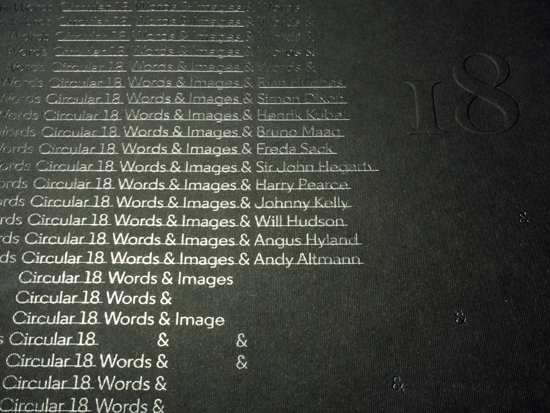
The first that hit my door mat recently was Circular 18, the bi-annual publication of the Typographic Circle. Designed by Pentagram’s Domenic Lippa and Jeremy Kunze, and printed by Leycol in the UK, its oversized A4 proportions and clean pages are a thing of beauty.

OLYMPUS DIGITAL CAMERA

Interviews with a wide range of typographers and designers, from Ruan Hughes and Harry Pearce to Angus Hyland and Andy Altmann fill the majority of Circular 18 with images of the designers’ work relegated to a few pages at the back of the publication. This allows the focus of the issue to concentrate on the words of the designers through confident typography as conversations about graphic design function and working processes take the lead. There is a real sense that this publication was a labour of love for Lippa and Kunze.

OLYMPUS DIGITAL CAMERA

OLYMPUS DIGITAL CAMERA

Circular 18 is available free to members of The Typographic Circle, or for £15 to non-members. Email info@typocircle.com for information.

The Recorder
The second magazine I received recently is issue one of the new look The Recorder. Previously published for over 70 years by Monotype, in 2014 it has been relaunched to continue its tradition of looking at the history of typography and contemporary applications.

OLYMPUS DIGITAL CAMERA

In its own words: “Making its first appearance in 1902 … it covered everything from technology and typeface releases to historic features; offering readers an in-depth look at the type industry”. It goes on to say of its relaunch issue: “…features both the heritage of typography, and its contemporary application, focussing on how designers have used and responded to type, and how its influence has played a role in our culture and daily lives over the years”. Like Circular 18, its production quality is second to none, with a gold foiled front cover that wraps around the back, and a range of different articles all treated to individual layouts depending on the topics covered. Sized more like a traditional magazine, this is the least conventional thing about this publication. It must have been a daunting publication to revisit, given its revered history, but designer Luke Tonge has managed to give it a contemporary face that respects The Recorder’s legacy and sense of heritage while making it accessable to a new audience.

OLYMPUS DIGITAL CAMERA

The content consists of articles, essays, reviews and even a photo essay of the great poster artist / printmaker Alan Kitching.

OLYMPUS DIGITAL CAMERA

OLYMPUS DIGITAL CAMERA

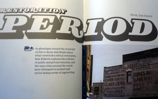
The Recorder proves to be a critical read, with an excellent article by Sam Roberts on ghostsigns and the ethics of restoration, while Harry Leeson looks at how typography manipulates our relationship with the urban environment and applies theories of class to the field of graphic design. Such depth of discussion in one publication is rare outside of Eye magazine, and The Recorder is a welcome, and beautifully produced, addition to critical design writing.

OLYMPUS DIGITAL CAMERA

(As an aside, I came across an original copy of The Monotype Recorder last year, and I was lucky enough for it to be a version dedicated to the life of Stanley Morison. Unfortunately, due to leaving Tumblr and deleting my The Small Letter blog, my digital archive of this is no longer online, but I am planning to resurrect it sometime soon on a different platform.)

StanleyMorison_Cover

The Recorder is available for $17 USD from this dedicated website: click here. 

Typograph.journal
Last but by no means least, I stumbled across the new Typograph.journal via various postings from designers I follow on Instagram. Published by Nicole Arnett Phillips, aka Typography.Her, it focusses on design process through her personal reflcetions, case studies of different designer’s approaches to their work, interviews and commissioned exercises. Volume.01, published earlier this year, is titled on its spine: Can A Text Be Both Readerly And Experimental; while the recently published Volume.02 asks: Where Do We Find, And How Do We Feed, Our Creative Energy?

OLYMPUS DIGITAL CAMERA

OLYMPUS DIGITAL CAMERA

Smaller in scale than the previous publications mentioned here, it has a pocketable quality that belies its depth of discussion and questioning. Like The Recorder and Circular 18, it is inward looking and aimed squarely at graphic designers, typographers and those interested in print processes, but that doesn’t mean that those outside of these fields will not find anything of interest.

OLYMPUS DIGITAL CAMERA

OLYMPUS DIGITAL CAMERA

OLYMPUS DIGITAL CAMERA

Phillips is an Australian designer who certainly understands how to create a visually rich and consuming document. In her own words she states: “I believe rigour and critical design thinking is important. As is a great outcome. But no more so than the design discovery and creative play that happens in the middle”. As an outcome, Typography.journal is both thoughtful and inspirational in its content and production, but equally impressive due to the proud authorship Phillips demonstrates—she is a doer and has made this happen, she self-promotes it through social media and is getting people interested in what is essentially a personal project.

OLYMPUS DIGITAL CAMERA

OLYMPUS DIGITAL CAMERA

It is also very rewarding to receive Typography.journal through the post as Phillips envelopes the book in its own bespoke wrapping paper and includes print ephemera associated with the release and a hand-written note. This personal approach is a nice touch that reinforces the nature of the publication’s content as well as creating a connection with someone producing such an item half-way around the world.

Typograph.journal 01 & 02 are available to buy either individually or together for $30 AUD from Phillips’ website: click here.


What is really encouraging about these recent publications is that critical design writing is alive and well. Longstanding titles such as Eye, Creative Review, Baseline and the Journal of Design History have their specific areas carved out. And with design blogs being in rude health, it is possible to have questioned whether there was ever going to be any more room, let alone demand, for design writing. Well, these bespoke publications prove that there is a market for well produced high-quality material, both in terms of a physical entity itself, and in terms of content.
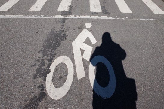
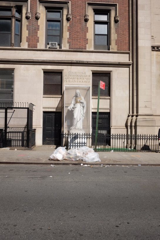


September is a busy month for me in the run-up to the start of a new academic year, hence no new posts here for a month. However, I’ve been far from idle and I’m proud to announce one particular project is about to come to fruition. ‘This is us’ is something I’ve been working on with colleagues at University Campus Suffolk for a few months now, with the launch set for Tuesday 29 September and press ads to hit the news-stands from 1 October.

OLYMPUS DIGITAL CAMERA

3 of the 11 portraits in the UCS Waterfront Building lobby

The campaign was envisaged by UCS Provost Richard Lister who wanted to celebrate the individual stories of both students and staff at the institution as it turns seven years old this September. After initial idea sessions between Richard, Graphic Design Senior Lecturer Russell Walker, UCS Head of Marketing Michelle Wootton, Photography Lecturer Matthew Andrew and myself, we decided large portraits of some of the individuals who have been involved in the UCS story over the last seven years would be appropriately fitting.

BeckyBlunk

UCS Librarian Becky Blunk—Becky is American, before anyone comments on the spelling

After Michelle selected some initial candidates for the project, Matthew set about shooting them in-house at UCS over the summer. Michelle then copy-wrote the text based on interviews with all the sitters while I worked on handwriting samples, scanning them in at ridiculously high resolutions and cutting them about to compliment Matthew’s stunning portraits.

MarkEdwards

Course Leader and Senior Lecturer for Photography, Mark Edwards

After Matthew had finished the post-production, we worked closely with printing and hanging the images, using a low tack and re-positional adhesive paper that was completely new to us. The scale creates a dramatic statement as you enter the UCS Waterfront Building lobby, where the 11 images are currently hung.

EstherFaniyan

Esther Faniyan, current BSc (Hons) Bioscience student

JonCoy

UCS receptionist, Jon Coy

It is hoped that this project will develop into more portraits and stories over the coming years, but in the meantime, the full scale images can be seen in the UCS Waterfront Building until the end of October, and over the coming weeks will be run as press ads, one-a-week, in the East Anglian Daily Times which will expand upon the sitters’ stories. Alongside this, postcard packs will provide further information about the individuals’ accounts of their time at UCS.

HannahMaynard

It has been an honour to work alongside my colleagues on ‘This is us’ and it has been a mark of pride to be able to help showcase the difference UCS is making not just to Ipswich and East Anglia, but to the individuals involved; from students to academic and support staff.

For more information, go to: ucs.ac.uk/thisisus

TomGauld_Marvello

Tom Gauld’s response to reader’s letters about Steven Pinker’s article on grammatical rule breaking. The Guardian Review 23.08.14.

Do we need less or fewer pedants in this world? Well, according to Steven Pinker’s article in last weeks’ Guardian Review, (16.08.14), there are some grammatical ‘rules’ that we can afford to break. If you are convinced by his argument, then we can clearly agree we need less pedants in the world.

Personally I’m with him on this. There are just too many English language rules, many of which I have no knowledge of. And if you don’t know what they are, how can you change your behaviour? One of the problems with language pedants is they adopt a moral high ground that judges the character of the person who doesn’t quite get it right, despite the fact they may be communicating perfectly well.

That doesn’t mean I don’t have my pet peeves. My wife and step-daughter will warn anyone in my company they will fuel my wrath if they start a list-based sentence with ‘A’, and then progress to the second part of their list without saying ‘B’ beforehand. This in my mind is less about pedantry though, and more about committment. Worse though, they will tell you about my hatred of the use of the word ‘evocative’ to describe something without stating what it is evocative of! I find this particularly annoying if used to describe music. But again, this is less about pedantry and more about ensuring what you are saying actually makes sense.

Professionally however, when it comes to communicating clearly, use of language is important. My degree design students don’t know it yet, (they will find out in approximately one month, unless any of them read this post), but in one of my second year modules I ban certain words. That’s not quite true; I have a list of words and phrases that they aren’t allowed to use unless they are followed with a qualifying statement. For example, I don’t allow them to use the word bold. In and of itself, bold a meaningless describer for something visual unless it is being used when talking about a typeface, in which case it is entirely appropriate. Otherwise, it is just a subjective descriptor. I want my students to dig deeper than that—for starters, what makes something bold as opposed to not being bold? It is important to acknowledge such distinctions otherwise such phrases are meaningless. Likewise, the phrase ‘eye-catching’ has me thinking of someone playing ‘catch’ with an eyeball. What does eye-catching actually mean if it isn’t qualified; it is not something that can exist in its own vacuum. And while this might mark me out as a pedant to my students, it is an important aspect of design education, because as graphic designers we have to justify our rationale for the design decisions we make. We have to convince clients that we have analysed their communication problems and aim to successfully deliver their messages to their target audience, rather than employing our own artistic tastes. I’ve said it before and I’ll say it again: when we are designing we are not artists.

Despite not classing myself as a pedant, there is one area where I will confess to such a trait and that is when teaching typography. Students get sick of me discussing the difference between dashes and hyphens and appropriate usage of an ampersand. I’m not about to go into a typographic lesson here, but I think it is fair to say that there is a certain amount of pedantry at the heart of any typographer.

The contradictions in my views are not lost on me. Where I’m happy for the English language to be adapted over time, and accept this as part of a cultural/societal evolution, I am more resistant to the bastardisation of typographic constructs. But I equally accept that this is all they are, constructs—rules some people have mutually agreed to adopt that then become standards that others follow. Despite this dichotomy I am able to accept both my pedantry and that some of the things I believe in will fall out of usage by the simple fact others don’t accept it as that important as I do. I shudder that the em dash could disappear within my lifetime, but by rights, what should I really care?

Regardless of what does or doesn’t happen in the future of typography, I still believe it is important that graphic designers should understand what they are doing, (or not doing), and why, and to be able to justify their reasoning. The ability to communicate is at the heart of being a designer, and to choose to break ‘rules’ is fine if, A: you can demonstrate this is appropriate for the communication that needs to be delivered; and secondly: errr… if it makes a point.

I’d read about Ditchling Museum of Art+Craft on the Design Week blog last year when it reopened after being refurbished. It made the design press largely because of the rebranding by Phil Baines, in which he re-drew Gill Sans for all accompanying graphics. In truth, what Baines had done more than help advise on the dressing of the museum was to shine a light on an important historical design gem. And when I realised we wouldn’t be too far away while holidaying on the Kent / East Sussex boarder last week, it went on the itinerary of possible things to do. But rather than visit after going to the Chermayeff exhibition in Bexhill on our return journey home, we decided to go on a separate day, worried that two exhibitions in one day would be too much.

OLYMPUS DIGITAL CAMERA

As it turned out, the museum is very small, and we could have easily done it after visiting the De La Warr pavilion rather than travelling the congested A259/A27 from Kent on a hot summer’s day especially to see it. But Ditchling Museum of Art+Craft’s size, (and accompanying over-priced admission fee), was the only disappointment for what is otherwise an excellent museum that focusses mainly on Ditchling’s rich typographic and printing heritage. For it was in this sleepy village that Eric Gill founded an artist community that attracted the likes of Edward Johnston, Philip Hagreen and Hilary Pepler, amongst others.

OLYMPUS DIGITAL CAMERA

As one would expect, much of the museum is given over to Gill, although it is interesting to note that his controversial animal and child abuse accusations are glossed over. The only mention I could find anywhere was on a display board that simply read: “Controversy and debate were part of Gill’s day to day life when alive and they continue to be part of this artist’s legacy”. Regardless, the important work that he produced, along with all other exhibits, are given plenty of space for visitors to study.

OLYMPUS DIGITAL CAMERA

OLYMPUS DIGITAL CAMERA

OLYMPUS DIGITAL CAMERA

Some of my favourite work displayed were these small wood engravings by Philip Hagreen, and it was interesting to note how the importance of the faith of those involved in the artist community spilled over into social welfare considerations and general philanthropy.

OLYMPUS DIGITAL CAMERA

It was also refreshing to see sketches and preliminary work alongside finished pieces.

OLYMPUS DIGITAL CAMERA

There is even a small mock-up of a print room.

OLYMPUS DIGITAL CAMERA

OLYMPUS DIGITAL CAMERA

This was a delightful little museum to visit. The sensitivity with which the branding and display presentation has been approached is testament to the attention to detail paid by Phil Baines, and ensures due respect is paid to some of Britain’s most important early twentieth century graphic designers and typographers.

Ditchling Museum of Art+Craft website


One sunny Sunday afternoon walk around Woodbridge today and all I seemed to see around me were examples of living, moving typography.

ImageThis antique shop’s sign caught my eye with its peeling letterforms. There’s something fittingly accidental in the evolving visual language of an old sign decaying for an antique’s dealer. And the shapes created by this natural ageing process give up unique shapes—a typeface being undesigned, if such a thing were possible—that organically visualise the forward march of time. While the motion may not be obvious in the moment in which I looked at these, motion had happened and was happening none–the–less, albeit at a very, very slow rate.

ImageAnother antique shop had a similar feel but this time caused by peeling paint, rather than lifting vinyl.

ImageI moved from black and white to a dash of colour when walking through a graveyard and I caught sight of moss taking hold to letterforms carved on a gravestone. An interesting thought occurred to me that this type that usually memorialises the dead has turned into a piece of living type, changing with the seasons.

Image

ImageLater, after returning from Woodbridge and taking the dog for a walk I found this spray painted GUR on a local heath that doubles as a golf course. I have no idea what GUR stands for, and as this is a golf course it is likely to be cut short before anyone will get to see how it develops. But it is still a piece of living typography while it lasts, as the grass grows.

Image

Timelessness

Last week I was asked to introduce Gary Hustwit’s Helvetica for a screening to UCS MA Journalism students and members of the public. Afterwards, in a question and answer session, someone unexpectedly asked if I thought Helvetica was timeless. It was a good question in relation to the film we had just watched, but not one that I had anticipated being asked, and therefore I said the first thing that came into my head, (and a little more sharply than maybe I should have done). As the thought of something being timelessness has always seemed an odd concept to me, I stated that nothing was timeless.

As a result of this knee-jerk response, the idea of timelessness has been on my mind all week. It is a phrase that crops up again and again in graphic design circles. It is often spoken of as a quality of good logo design and it is supposedly one of the characteristics that a design classic should embody, according to the cover of Phaidon’s publication on the same topic at least.

Phaidon2

But I’m highly sceptical about this. Taking issue with Phaidon’s description, if you look at my idea of a design classic—the iconic Donor Card as written about here a few weeks ago—it could never be described as timeless. Its styling’s are very much of the 1970s.

DonorCardThen

Any piece of visual communication stays the same as the world around it moves on, leaving the item caged in the aesthetics of the time it was created. Think of one of the most famous pieces of graphic design in the history of this country—Beck’s Underground map—it is absolutely a product of its time. It may have been tweaked, altered and changed over the years, and maybe not enough each time that anyone would notice that it was dramatically different from its predecessor. But if you see the original and the current version side by side, you can automatically see that it came from a different era. Jump to a recent piece of famous graphic design, the 2012 Olympics logo, and that arguably started to date even before the games started, designed as it was 5 years previously.

HarryBeck_TubeMap_580

Harry Beck’s original Underground Map c.1932

standard-tube-map

Current version of the Underground Map

To strive to make something timeless from the outset is to set oneself a challenge that I believe can never be achieved. Maybe as an old Marxist I’m still stuck with the philosophy that everything changes; but this is an philosophy that history seems to have proved right. As a designer, at best you may create some sort of longevity in a piece of work. If your creation doesn’t have to be redesigned too soon then your client can get many years of service out of it, decades even, but eventually it will look dated.

I accept that in the case of a typeface much of that dating may depend on the application. Sure, Helvetica can still look contemporary when applied well in 2014 as much as it did when it was designed in 1957, but that is because it may be used in a contemporary setting. However, there are plenty of examples from the history of graphic design where it looks outdated. I agree that one has to be cognisant of the fact that there are lots of things that can change the appearance of a typeface even if the individual characters remain the same; tracking, point size, uppercase/lowercase, background colour, supporting imagery such as illustration, photography or other graphic architecture; all will alter how you ‘read’ the form of the face and bring different meaning to it. But over time, the choices diminish and it has to be asked whether Helvetica will still have fresh ways of being applied in 1000 years time? I personally doubt it.

I’ve been asked to give an introduction to a showing of Helvetica.

helvetica

IMG_6407It may not be a great piece of graphic design, but this random act of kindness impressed me on Boxing Day, when Claire and I took our dog for a walk to one of his, and our, favourite haunts. He was equally impressed with the treat, (and surprised, considering we don’t usually take them with us on walks). Given the sentiment, and the touching words, I can forgive the use of Comic Sans *.

Text reads: “Dear dog-walkers. Please help yourselves to a treat for your doggy friend as a small gesture to remember our beloved chocolate Labrador Rolo, who passed away 3 years ago today. Rolo enjoyed many wonderful walks along these paths – he is very much missed and forever in our hearts. May you and your canine companion have a happy Christmas together.”


* (Comic Sans aside though, there really is no excuse for the clip art.)