Archive

Design

imageTwo days in to this New York trip with my colleague Russell Walker and UCS graphic design and illustration students and they’ve been busy ones. I can’t even try to imagine how many miles I’ve walked so far.

The journey wasn’t without its problems, which I won’t go into here, but now we’ve settled in and are walking, walking, walking, and filling up memory card after memory card of photos. Here’s a few I’ve taken, with comments, while I manage to jump on Macy’s free wifi from my hotel room.

image

The first day I went to The Highline, an overhead deserted rail line that has been converted into a mile and a half long public park. It is absolutely stunning. Luckily the weather was excellent and it was a good choice of activity for the first day. It really helped me to feel embedded within New York as you get a real sense of location walking a few metres above the Avenues and Streets of this city and in amongst apartment blocks.

image

I was also very impressed with the honesty of the rubbish bins, labelling landfill waste as just that.
image

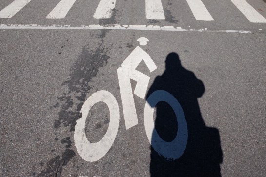
Other graphics that have impressed included this cycle path road sign with the addition of a cycling helmet. And no trip to New York for a graphic designer would be complete if it didn’t include some vernacular type spotting.

image

There have also been a plethora of Graphic Interruptions for me to record, such as this:

image

Today I went to The Guggenheim and saw an excellent Fischli & Weiss retrospective titled How To Work Better, and a Photo-poetics exhibition. The F&W exhibition opened my eyes to a lot of their work I hadn’t seen before, and I drew parallels between them and designers like Daniel Eatock, (as well as explaining to a few students I bumped into that the Honda ‘Cog’ ad ripped them off). With the photo exhibition I’ve found a few new names to research for my Masters, such as Erica Baum. Obviously though, it doesn’t really matter what is on at The Guggenheim as the building is stunning in itself and worth the entrance fee just to see the architecture.

I had planned to drop into MoMA on my way back to the hotel after visiting The Guggenheim, but having walked from the bottom of Central Park to the gallery and back, I was exhausted so jumped on a bus back to the hotel for afternoon tea. However, I did manage to get a few tourist shots in Central Park.

image

So as I write this I’m sitting in my very basic hotel room with a heater rattling away in the background, which at least helps to drown out the sounds of the street at night. Not that I’m getting much sleep, as while I hit the sack at a reasonable (US) hour, my body & brain seem to be colluding and waking me up in UK time, so sorry if this post is slightly uncoordinated and bitty. But I’m ploughing on regardless, and tomorrow I plan to take a boat trip around Manhatten Island that some of the students have done already and highly recommend. It’s predicted to be colder than today, (snow forecast for Friday), so I’m glad I packed some gloves because the camera will be out all the time.

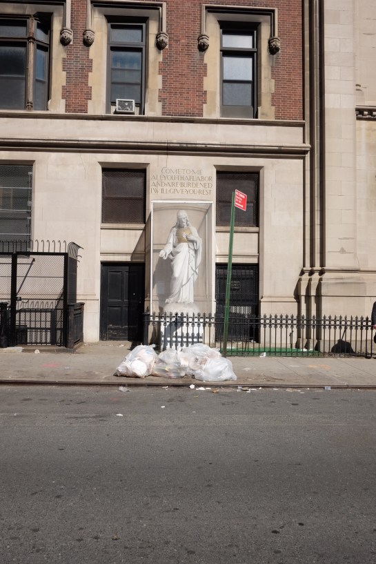
I’ll leave you with my favourite photo I’ve taken so far, a shrine to rubbish, but expect more to follow on Flickr once I’ve had a chance to go through everything in a few weeks time.
image

Cover

It seems somewhat ironic that a journal called Signal should pass me by, again. I wrote about the first two issues here in 2012. I can’t remember what, but something pricked my memory of the journal a couple of weeks ago and I went searching for the publication again only to find that issue three was released nearly a year ago with the forth due out this coming May. I quickly ordered Signal:03 and it doesn’t disappoint.

IMG_0001

Once again, what I’m genuinely impressed about with this publication is its breadth. The level of research done by the contributors is impressive and there is a sense of importance given to documenting/archiving social design stories that otherwise would be lost in the midst of time. For example, the image above is from a comical anarchist publication from Brussels in the 1930s. Titled: Game of Massacre: 12 Figures Looking for a Ball, the article explains this Aunt Sally type parlour game, created by Fred Deltor, (aka Frederico Antonio Carasso, 1899–1969), that enables you to cut-out various puppet figures, such as The Military, Property, Fascism, Religion etc, in order that you can throw balls at them. Included in the game was a mock cut-out theatre to set the figures in, and a ball, along with descriptions of the puppets. The above were described thus: (3) “Philanthropy has a chest in the form of a bank vault full of cash and tosses a single coin toward a cadaverous figure (lacking an arm and a leg) in from of a hospital”; and (4) “Social democracy is a two-faced figure who wields the attributes of both royalty and communism”. In uncovering the original publication, Stephen Goddard says: “Stylistically Carasso’s figures betray a knowledge of many of the important international impulses associated with progressive art organisations, periodicals, and movements of the 1920s, such as DeStijl, Het Oversight, Constructivism, and…Agit-prop.”

Signal reprints the preface to the game with a translation which states: “This is the game of massacre. Come! … Here it is, the opulent collection of royal, imperial, and devine puppets, that control you as they wish, you poor crowd, and who, by tragic reversal of roles, pull, from one to the other, the strings of your poor destiny.” Who says that anarchists don’t have a sense of humour?

Like the previous two editions of Signal, issue three mixes historical and contemporary struggles and their associated graphics. So alongside an article on student led strikes in Québec in September 2012, you find the story of the incredible Barbara Dane, co-founder of Paredon Records. Between 1969 and 1985 Dane tried to document revolutionary music being made around the world and in an interview with Alec Dunn and Eric Yanke, she describes how she’d go from country to country recording different musicians and singers and return to the States to release them. In the space of 16 years, Paredon Records, with very little budget, released recordings from Vietnam, Salvador, Puerto Rico, Cuba, Northern Ireland, Ecuador, Italy, Britain, Angola, Chile, Greece, Thailand and a host of other countries. Of the sleeves, she says: “If you look at the records, they’re 12″ x 12″ on the front and then fold around about 5 inches on the back. It was done this way so they could print four at once, four-up on a single sheet of paper…At this printer, what dictated what you could do was economics… And so you figure out things like one color has read, the other blue, so then third cover can have purple. You figure out how to work with two colors, matte paper, that size.”

Record2

1978, design Ronald Clyne

Record1

1975, design by Ronald Clyne

Asking Dane about working with the designer Ronald Clyne, she says: ” If you caught him at the right time of day, before he drank too much wine, he was very very clever about what he did. You can see that he could take any kind of photo, work with it, and make it meaningful and not destroy the meaning of it. And always, his forte was selection of type and layout and all that. I’d bring him basic tools, the basic elements, photos and also drawings from artists I’d met.”

Record3

1975, design by Ronald Clyne

Record4

1974, cover art by Jane Norling

If Barbara Dane wasn’t inspirational enough, Signal:03 publishes an article by Ropbert Burghardt and Gal Kirn on the former Yugoslavia monuments to anti-fascism and revolution. These impressive and often modernist brutal memorials, built between 1945 and 1990, litter what is now split into seven different nations. The authors state: “These monuments are not only modernist, but contain as unique typology: monumental, symbolic (fists, stars, hands, wings, flowers, rocks), bold (and often structurally daring), otherworldly and fantastic. … Instead of formally addressing suffering, these memorial sites incite universal gestures of reconciliation, resistance, and progress…for those that encounter them, they remain highly imaginative objects: they could be ambassadors from far-away stars, witnesses of an unrealised future, historical spectres that haunt the present.”

Y_Mon4

Y_Mon3

Some have been landscaped and provide opportunities for family days out with cafes and play areas. Some are more formal monuments that you can enter, such as the one above in Kozara, while others you happen upon in the middle of nowhere. Started as a way of remembering the second world war, they were initially built spontaneously by local artisans. And if the guidebook to them printed in Signal is anything to go by, there is a vast amount of these monuments dotted around the region, with a map stating over 200 locations, (although many have been destroyed or decayed).

Y_Mon2

Y_Mon1

Once again I am truly impressed by Signal. Its historical importance stretches across many areas including art, design, architecture, music, politics, protest and social history. And although this could be seen as a research journal, it is easily accessible for those who are just generally interested in the topics it covers, students, scholars and armchair revolutionaries alike. I’m already looking forward to the forth edition due in May.

Signal:03 is available to buy from PM Press for $14.95

SA

2014 sees the 50th anniversary of the 1964 First Things First manifesto. In the run up to the launch of First Things First 2014 on Monday 3 March, you can read an article I recently wrote, along with an interview with the author of this contemporary update, over on Eye blog.

Designforlife

Well, I’ve been back at the day job for a week now and my summer holiday seems like a distant memory. So before it stretches back any further, I thought I should post some of the cultural highlights from our two weeks away.

First up, we stumbled across the Bubble Car Museum when in Lincolnshire, and what a find. I wasn’t sure what to expect, and all I really hoped was that they had a Bond Bug, because I had a Dinky toy version as a little boy. But it has to be said, this was a gem of a little museum.

OLYMPUS DIGITAL CAMERAFrom the outside the museum looked like a small shed, and I half expected to just see a few rusting, half refurbished cars. But no, the place was rammed with these amazing vehicles. There was something optimistic about these 700cc or less cars and bikes—futuristic and weirdly beautiful. And the museum curators had done an excellent job of displaying them all, trying to put them into context with mock-ups of 1950s shop fronts, front rooms and kitchens around the two exhibition rooms.

OLYMPUS DIGITAL CAMERAThis museum is highly recommended and it has a great little no nonsense cafe with adjoining campsite. I think we might be bringing the tent next time we visit Lincolnshire.

On the drive home, as mentioned here, we went via the north Norfolk coast. Having holidayed there for several summers we stopped off in Cley-Next-the-Sea hoping to catch their summer art exhibition, Cley 13, usually held in the village church. This year in a field next to the graveyard, as we approached the church, we were greeted by these wonderful bird sculptures.

Created by artist Jessica Perry and the children of Stalham High School, they certainly grabbed your attention. And while there was interesting work on display in the church, it is very much like a very well crafted and presented college foundation course end of year show. Good, but not exactly challenging.  However, these birds were just fun and unpretentious and as a result blew everything else away.

We took a couple days out in London in the second week of our holiday. We were lucky enough to have been bought membership of the Royal Academy as a present so decided to check out the Summer Show for the first time. As I’d only ever seen it on TV before, it was interesting to see it in the flesh, but ultimately, it is a difficult thing to review, what with so much on show. However, it was quite a good way to assess your tastes, as we ended up just looking at what immediately grabbed our attention. With most exhibitions we go to being themed or of a single artist/designer, just letting your instincts and knee-jerk judgements kick in was refreshing, and almost the only way to react to such an overwhelming display of work. I found several pieces that I really liked, but equally was surprised by many of the entries being allow in. An ultimate favourite for me though had to be the Greyson Perry tapestries, most of which were created in response to his TV programme on taste. Seeing them in their full glory, and being able to concentrate of their detail and the narrative they told, only went to confirm my opinion that the man is an illustrator rather than a fine artist, especially with his work deviating from pottery.

While at the RA, we also took the opportunity to see the Mexico: A Revolution in Art 1910–1940, which I loved. It hadn’t had great reviews, but the fact it was a mix of painting and photography, I thought made it a strong documentary on the the changes and difficulties that Mexico faced during this time period.

While in London, we also took in the Ibrahim El-Salahi exhibition, some of who’s drawings blew me away. This was shown alongside Meschac Gaba’s Museum of Contemporary African Art, which was sort of a museum within a gallery.

TateGaba’s show was really refreshing, not least because you were allowed to take photographs. Gaba wants to challenge the notion of what a museum/gallery should be, and over the years adds new ‘rooms’ to this travelling show, encourages audience participation, (in the first room there was a large Jenga type game for people to interact with), and showcases his life and work as part of the show, (he even had large scale photographs of his wedding and wedding gifts on display as an exhibit!). I wasn’t overly impressed with his individual pieces of work, with its over reliance on symbolism and a sense of having seen similar approaches done much better, but then the Museum has become an artwork in its own right. As a whole, it is definitely greater than the sum of its parts. And what he is trying to achieve with challenging the notion of an exhibition was a joy to behold and completely refreshing.

Gaba's wedding photographs and gifts

Gaba’s wedding photographs and gifts

Just the fact that I’m able to publish photographs here that I took in the exhibition, and couldn’t photograph anything and publish it here form the, arguable much stronger, El-Salahi show, is testament to breath of fresh air this approach filled me with. Why can’t you take (non-flash) photographs in exhibitions? I’ve always thought it was fucking rediculous.

Lastly, while in London, we met up with Claire’s daughter and they both went off to watch a show at The Globe, which was a present from Callie to her mother for her birthday. So I took myself off the Design Museum. It was a shame because the whole place felt like it was winding down, readying itself for its move across London to its new building in 2014/15. But despite there being an air of the place being unloved, the Future Is Here exhibition was genuinely interesting, once I got my head around what it was about. It basically gathers together examples of new ways of working and designing/producing goods, including crowdsourcing ideas, 3D printing, producing construction materials on a building site, and small scale robot construction. These themes and exhibits, when taken collectively, demonstrated how manufacturing processes are changing around us and how new methods of industry were being formed in the now. The Design Museum was half proposing we are in times of a new industrial revolution, and while I’m not completely convinced, it was a thought provoking experience.

As if to reinforce the feeling that the museum is ‘winding down’, it had on display items from its collection themed into six categories rather than the usual second commissioned exhibition. While it is good to see this work coming out of the closet, and promises much for the new bigger space the museum will have in Kensington, (with some of their collection being on permanent display), it did give the impression that energies and finances were being diverted elsewhere. That said, I naturally made a beeline for the graphic design section, and it was good to see Calvert and Kinneir‘s road signage templates:

Maidenheadand the Design Research Unit‘s branding guidelines for British Rail:

BR

sound-system-the-clash

In my teens and early twenties I was a big Clash fan. Then as my music tastes matured, and I started to tire of rock music’s clichés, I started to fall out of love with the band’s early work, which traded so heavily on rock clichés. Half of Black Market Clash, and all of Sandinista and Combat Rock are all I can really listen to by them now. It is almost as if I have divided them into two different bands. The diversity of their later work, post-London Calling, which experimented with different styles and genres of music, bought a breadth to the band that wasn’t previously there. This period of material outshines anything that went before it for its sheer inquisitiveness. Their artistry flourished as their music became conceptually linked to lyrical content and they matured as they became more and more interested in emerging popular cultures from around the globe.

Outside of their music, another appeal of The Clash to my young eyes was their over-all aesthetic. Encouraged in their early days by manager Bernie Rhodes, the army surplus and leather jacket stylings gave a rebel stance that became emblematic, and spawned many a teenage lookalike. This defined punk fashion in many immotators eyes, not least myself in my late teenage years. In their graphics, their evolving visual language of distressed or stencil typography, saturated revolutionary reds and military greens, heavily posed photographs, and knowing reggae and hip-hop reference points, formed an aggressive identity that flirted with insurrectionary fervour. The influence of this has been utilised by many a marketeer in the last 20 years, and you see their graphic stylings on anything nowadays that is trying to look slightly edgy, urban and rebellious, from skateboard magazines to energy drinks. Mainstream ‘alternative’ would be an apt description and the ‘making money out of rebellion’ Strummer quote rather obviously comes back to haunt his memory.

When I heard about the proposed release of Sound System, a box set of Clash material due to hit the shops this September, nostalgia got the better of me and I searched it out online. I was expecting to be disappointed, a feeling that nostalgia often promotes—stripped of any contemporary relevance and promoting a sense of longing for something that can never be again. However, disappointing is too weak a word for what I found; as I looked at the pre-release marketing shots and promo videos I was gob-smacked by how truly awful this looked. The ‘boom’ box container is the first thing that grates. I can’t even think where I would keep this in my house if I owned one, I certainly wouldn’t want it on show. Ugly and cheap are words I try to avoid when discussing design, but I’m afraid I can find no better ones to articulate here. Then there are the contents—stickers, dog tags, a poster presented in a giant cigarette tube, badges, more stickers—gimmick after gimmick thrown together on a whim with little thought to consistency or sophistication. Childish, naive, and verging on being patronising, it is if Sound System is aimed at the average 14 year-old punk new-bee rather than ageing Clash fans with the disposable £111 to spend on it.

If this project was just down to record company excesses trying to make a quick buck in a dying industry, then I could almost excuse it, distancing as it would the product from the band. But to know that Mick Jones and Paul Simonon have been involved in designing this is disheartening, as it does a real disservice to The Clash’s legacy. I can’t believe that Joe Strummer isn’t turning in his grave.

printedpages_1_1024x1024

I received the latest publication from It’s Nice That through the post today, (above), which promises to be a good read over the Easter break. However, one of my pet hates struck me as I flicked through it, (through no fault of INT), is a photo in an article about design studios that features happy designers working on laptops at desks.

IMG_4393

Now I’ve nothing against laptops if used as occasional mobile working machines, or if a desk space is equipped properly to accommodate one. The problem, however, is one of un-ergonomic working environments and the risks that this brings to the user of suffering repetitive strain injury (RSI) at some point in their future careers. And it isn’t just the small studios supplying desk space for interns and freelancers that seem to not notice this is a problem, as a picture in the same issue of Printed Pages shows Stefan Sagmeister works like this as well:

IMG_4391

And the trouble is, you see this sort of photo time and time again, and the issue never gets mentioned. Look, lots of happy designers working together in a ‘cool’ creative space, (photo below from It’s Nice That’s website):

TBMAIN

As someone who suffers from RSI, I have to be very careful about how I work. I never use a mouse anymore, as I worked out that much of my problem had come from a combination of poor posture for long hours while drawing in Illustrator using a mouse. That, and being hunched over a laptop at a desk in a previous job. Now, my home studio set up and my day job set up are designed exactly the same, with a Trackbar that I use to scroll and click with my left hand, and a Wacom tablet for cursor control with my right hand.

IMG_4389

I came to this set up through my employer, University Campus Suffolk, organising a work station assessment by a company called Posturite who gave some great advise about how I should work. Properly adjusted chairs, the angle of your back, arms and legs are all important factors as well, as important in fact, as taking regular breaks.  I also use voice recognition software for when I have to do a lot of writing. These measures, along with physiotherapy when RSI first reared its ugly head in 2009, have kept me working efficiently and not having to have time off because of the problem.

But I worry about future designers over reliance on laptops and poor work station set ups who aren’t aware of the issues. It makes me wince every time I see such a photograph of a ‘cool’ studio space that I know my students would love to work in once they graduate. I now include a health and safely lecture in one of my first year modules, which I know is not a sexy issue, but then neither are shooting pains in your arms or numbness in your fingers, and a depressing sense that you will never be able to do the job you love again.

Please note: this post is in no way meant as a criticism of It’s Nice That, these sort of photos are prevalent throughout the design media.

IMG_1052

Coastguard mast seen from the ground, Shingle Street, Suffolk

I’ve recently rejoined Instagram. My departure in December 2012 was, like many others, due to the announcement that Instagram was going to change their terms and conditions that would allow them to let advertisers use my content without asking. Instagram soon backtracked on this, but I had made the break. At the time I was considering leaving anyway, as I had started to question how many social networking sites I was on, and what I was getting out of them. So this minor media blow-up prompted my exit, and as such, I wasn’t bothered about rejoining once the back peddling started.

However, much to my surprise, I actually found that I missed it.

Around the same time, many photographers I know started getting quite vitriolic about people who use Instagram, and posted articles on their Facebook walls against the photo sharing app. One such was by Jonathan Jones in The Guardian, which pretty much calls anyone who uses Instagram mindlessly deluded. Now, if there is one thing that winds me up more than anything else, it is artistic elitism—so I rejoined Instagram, if for nothing more than to wind up people with such attitudes.

To be honest, I was a little incensed by such opinions, and so some furious notebook scribbling has resulted in the following points, presented here for your reading pleasure:

  • Anyone who is so vehemently opposed to something usually feels threatened by it, and this usually results in a defensive attitude. This is what I believe we are seeing here. Anything that looks popular is immediately denounced and elitist walls start rising, soon to be followed by over blown pompous statements and incredulous derisions that do not really have an ounce of an objective rationale.
  • Photographers do not own photography. It is a popular activity, for anyone to take part in for their own purposes. In fact, anyone who owns a camera is automatically a photographer, and therefore has as much right to do what they want within the medium as anyone else. For good or for bad.
  • I do not disagree that much on Instagram is vacuous and of little artistic merit. Particularly the filters, which I use sparingly and only to enhance a poor photograph. But that doesn’t damn the medium. A good analogy is with that of looking at Punk music between1976–79. Immediate and of the people, Punk encouraged anyone to pick up a guitar and get involved. This was both its beauty and its downfall, as a thousand god awful bands formed. But a few fantastic talents emerged that wouldn’t have otherwise, and they developed and grew to be of great importance to the wider world of music. So to with Instagram—it is there, free to download if you are lucky enough to be able to afford a smart phone, and there is stuff of value there if you choose wisely in who you follow.
  • Many of the people I follow are designers. There is something about its immediacy and ‘of the now’ nature that is appealing in sharing with people who have a particular visual outlook on their surroundings. As well as locations I am unlikely to see, typography, book jackets found in flea markets and architectural points of interest, to name a few subject matters that occur regularly, are visual thoughts knocked backwards and forwards between followers. To be able to check this in the middle of a mundane day is not just to feel connected, but it encourages the viewer to look at their own everyday from a different perspective.
  • Instagram is by far a better designed interactive mobile image sharing vehicle than Tumblr, which, in and of itself, tends to encourage the sharing of other people’s work with little to no respect for copyright. (No offence Tumblr, you have your purpose and are good at it).
  • There is just as much vacuous art photography outside of Instagram as there is engaging and intelligent work. Shit photography is not the preserve of Instagram, and photographers have no high-horse to get on from this perspective.
  • And finally, the concept that something can only be validated if it is on a gallery wall is beyond ridicule.

I use Instagram as a visual scrapbook for my on-the-go visual notes and thoughts, albeit a scrapbook that I welcome others to share in. I do not want to see photographs of other people’s meals or kids or snowmen with or without a wacky filter; so I don’t follow those that post such things. But I do want to see the photos of, say, Dan Hill, the architect, designer, writer and CEO of communication research centre Fabrica , whose City of Sound blog is always a stimulating and intelligent read and who has much to say on all things design related. To see the the experiences and interests behind what informs his opinions and his writing is always engaging, and never ever deluded.

We had Jude Law bemoaning Michael Gove’s education plans from the Turner Prize rostrum earlier this month, and there have been a few rumblings beneath the surface from a few design professionals, not least with Neville Brody taking the presidency at D&AD earlier this year, (as mentioned here a few months ago). But generally, no one was really sticking their neck out and actually organising anything to try and counter act this government’s disastrous education policy and fighting for the future of the creative industries in this country. Well, now many design professionals have decided to club together to try and make the government see sense in not abandoning art and design education in the new Ebacc qualifications. Check out the Include Design website, sign the petition, and write to your MP.

Screen Shot 2012-12-16 at 17.04.37

Every year there must be hundreds of dissertations being written by undergraduate design students about the portrayal of women in advertising, all referencing the Dove Campaign for Real Beauty and Adbusters along the way. And you could spend a long time trawling the Internet for articles about sex being used to sell commercial products. I’ve become a little used to such arguments. However, I never expected to see sex being used to sell integrated office systems. That is, until I turned a corner in Norwich the other day to be confronted by this image on the back of a van:

I was dumbfounded and genuinely taken aback for a few seconds. I could start a basic National Diploma level Media Studies deconstruction at this point, mentioning the see-through blouse and the provocative pointing of the metaphor, sorry, I mean pen. I haven’t worked in many offices over the years, but I suspect this attire would receive raised eyebrows in the average insurance office. It certainly would in the Art and Design department staff-room I frequent in my day job.

Just as I was getting over the shock of this image, thinking how utterly inappropriate and offensive it was, I was confronted with this sight on the side of the van:

I can only imagine the conversation going on here, as the guy stares at the woman’s breasts and she leans provocatively over his desk. I don’t think I have ever seen anything quite so ridiculous on the side of a van before—I almost expected a slow 1970s groove to start playing as the woman in the photograph dropped her pen and reached under the table to ‘pick it up’!

I find it incredible that neither the designers who proposed this, nor the people at Mayday thought this wouldn’t be objectionable. The objectification of women in advertising and throughout the media is endemic in our society. However, the image on this van, for a photocopying business of all things, could not only be seen as an example of how sexist imagery has become a typical state of affairs in our everyday, but also how accepting and unchallenging many have become to such things. Without wanting to sound like some 1980s anarcho-feminist tubthumping kill-joy, the jolt of seeing this atrocious piece of applied graphics in a high street has convinced me more than ever that design criticism needs to challenge such things a little more often. It can’t be left to the undergraduates who still feel passionate enough about such things to write a critical dissertation only they and their lecturers will read.

Earlier this week, a colleague and I went to the New Designers fair at the Business Design Centre in Islington. Jumping on a Circle Line train at Liverpool Street I was immediately impressed with the brand new tube train we found ourselves on.

Spot the end of the train.

My immediate surprise was how spacious it felt. It took me a few seconds to realise that this was because the eye is taken down the entire length of the train—the doors separating each carriage have gone, replaced by a generously wide space.

Where once there were doors…

Secondly, the seats have been arranged much more appropriately, and they cleverly float off of the floor, giving the illusion of more space as the eyeliner is unbroken as you look at the floor.

So impressed was I with this layout and sense of space, (accepting that the train I got on wasn’t exactly full), the short journey we took was a pleasant experience. I will go as far as to say I was actually slightly excited—I was witnessing intelligently considered design that put the user experience first.

This experience was sharply contrasted when we stepped out of the train at Moorgate, which is a rough and unloved station. To make matters worse, changing to the Northern Line, the deepest of the lines on the London Underground, the lift wasn’t working! This proved problematic for the pensioner in front of us, who struggled with the stairs clinging onto the rail with one hand and a walking stick with the other. Just in front of her was a man with a small child in a pushchair on his own. There could not have been two greater examples of the contrast between the user focussed design I had previously experienced and just how bad this was for people going about their everyday activities, bar there being a wheelchair user on the top step staring blankly ahead.

Pushchair man managed the first flight of stairs, conventional as they were—he was able to bump the chair down on its back wheels. However, when he got to the spiral staircase, he looked exasperated. I therefore offered to help him and carried the front of the pushchair for him. Finally, out of breath and sweating profusely on a humid and muggy summer day, my colleague and I got on a Northern Line train, which was cramped, unfriendly, and had none of the sense of consideration for giving people a quality experience that we had previously felt.

Back to reality