Archive

History

WCountry_Cover

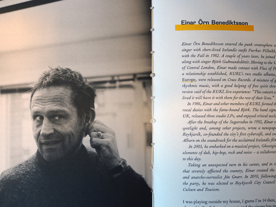
A few years ago I wrote an article for Eye magazine blog after coming across a programme for the 1951 Festival of Britain. At the time I was aware of the existence of a series of small guide-books published to coincide with the festival called About Britain, but it was only recently that I actually came across any.

There were 13 of these books published covering different regions of Britain. The two that I’ve been lucky enough to find cover the West Country and Home Counties. The latter is more fascinating to me being more familiar with the areas discussed within. As the inside dust jacket cover states: “These books are guides to the living Britain, covering the whole country, England, Wales, Scotland and Northern Ireland. Each is a guide to a well-defined district, planned to give you the fundamental facts about its scenery, its monuments, its buildings, its natural history, its people and their work and characteristics.”

HCounties_Cover

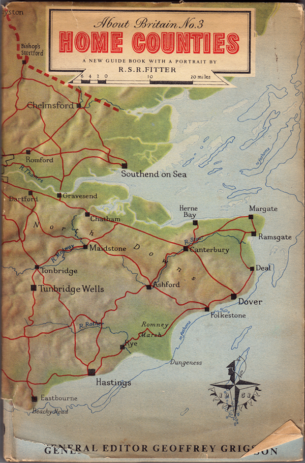
The covers feature maps of the region, both as a hard-case wrap and as a dust jacket. The fact the map was printed on both case and jacket allowed the owner of the book to remove the jacket and use it for reference while reading, as the inside back cover of the Home Counties edition explains, (below). Whether this was a deliberate design decision or some clever post-rationalisation will never be known, but it is still a great idea.

HCounties_InsideBackCover

Naturally the books at first glance seem somewhat dated. However, there is a real sense of optimism and forward thinking in regard to the contents once you consider the context within which these were published. These are meant to be egalitarian and easily accessible by all to instil a sense of pride in our nation, and encourage the reader of better times to come as the country shook off the last vestiges of the Second World War.

HCounties_Ford

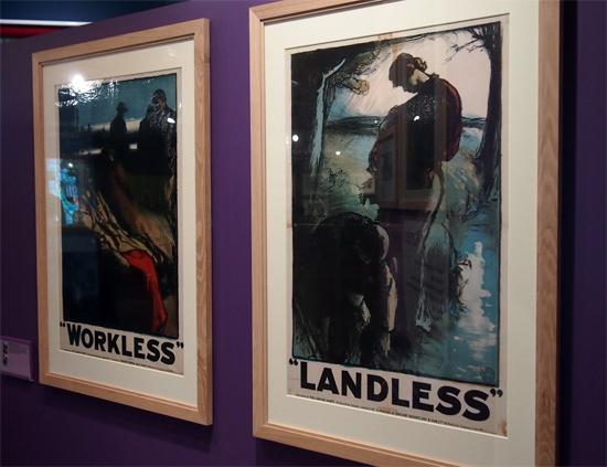
Featured inside are stories of emerging industries, as can be seen in the spread above about Ford. However, I’m not sure how the residents of Canvey Island or Peacehaven would react to where they lived as being described as “unplanned calamities”. Alongside such articles were stories of traditional farming methods, town planning, historical features and natural wonders.

Also published in these guides were tours of local areas with maps you could follow by car, bus or bike, clearly aimed at the working classes taking time out to visit the country and thus encouraging an emerging tourist industry.

HCounties_TheTours

HCounties_Tour

Some aspects are seen as very antiquated, such as the description of Londoners’ characteristics: “his steadiness, humour, independence and attitude to authority…His loyalty to the ruler he approves is unbounded, and he likes to show it on Royal occasions.” Many republicans of today would disagree with such cap doffing, and further dating the writing, you have to remind yourself of the times when noticing the inherent sexism within the text. That, and references to empire aside, there is a refreshing regard to immigration: “London welcomes strangers of all countries and all colours, whether they seek refuge as exiles, come to work or come to play.” UKIP take note, the Britain in the 1950s you would wish us to return to was more forward thinking than you would have us believe.

HCounties_Londoners

HCounties_Welcome

The openness and forward thinking is evident throughout as Britain looked to escape the war years and propel itself into the 1950s. It had a plan to rebuild itself, reject the austerity of rationing and launch into a new era of rebuilding a country that worked for its inhabitants. As the opening chapter states:

“This guide-book is one of a series ‘About Britain,’ so we hope, in a new way…it begins with a portrait of the district—an account of many of the facts about it which are worth knowing…  These guides have been prompted by the Festival of Britain. The Festival shows how the British people, with their energy and natural resources, contribute to civilisation. So the guide-books as well celebrate a European country alert, ready for the future, and strengthened by a tradition which you can see in its remarkable monuments and products of history and even pre-history. If the country includes Birmingham, Glasgow or Belfast, it includes Stonehenge. If it contains Durham Cathedral, it contains coal mines, iron foundries, and the newest factories devising all the goods of a developing civilisation.”

Reading through these guide-books in the last three weeks of a General Election in this country—one that is caged in the terminology of austerity, cuts, Europe and immigration; one that seeks to blame, point fingers, build walls and retract in on itself—I am reminded of the feelings I had when I first read the official Festival of Britain programme that compelled me to write my Eye piece. And that is if politicians in the late 1940s/early 1950s could envisage emerging from such a financial disaster as the Second world War, looking forward and having hope for the future, why can’t they today? For the Festival of Britain organisers, their take on the world wasn’t one of austerity and boarders, blaming those worst off while appeasing financiers; theirs was a vision of everyone working together for the benefit of all. Something I believe that many of our current crop of politicians could do well to learn from.

Quaint maybe, ambitious certainly, but if history teaches us anything, it teaches us that these visionaries achieved their goals; for this is the era that gave us public services such as the NHS and much of the infrastructure that has supported us for the last 63 years. Will the decisions of the next government have such a huge impact on our way of life and our culture? Only negatively I fear.

Cover

It seems somewhat ironic that a journal called Signal should pass me by, again. I wrote about the first two issues here in 2012. I can’t remember what, but something pricked my memory of the journal a couple of weeks ago and I went searching for the publication again only to find that issue three was released nearly a year ago with the forth due out this coming May. I quickly ordered Signal:03 and it doesn’t disappoint.

IMG_0001

Once again, what I’m genuinely impressed about with this publication is its breadth. The level of research done by the contributors is impressive and there is a sense of importance given to documenting/archiving social design stories that otherwise would be lost in the midst of time. For example, the image above is from a comical anarchist publication from Brussels in the 1930s. Titled: Game of Massacre: 12 Figures Looking for a Ball, the article explains this Aunt Sally type parlour game, created by Fred Deltor, (aka Frederico Antonio Carasso, 1899–1969), that enables you to cut-out various puppet figures, such as The Military, Property, Fascism, Religion etc, in order that you can throw balls at them. Included in the game was a mock cut-out theatre to set the figures in, and a ball, along with descriptions of the puppets. The above were described thus: (3) “Philanthropy has a chest in the form of a bank vault full of cash and tosses a single coin toward a cadaverous figure (lacking an arm and a leg) in from of a hospital”; and (4) “Social democracy is a two-faced figure who wields the attributes of both royalty and communism”. In uncovering the original publication, Stephen Goddard says: “Stylistically Carasso’s figures betray a knowledge of many of the important international impulses associated with progressive art organisations, periodicals, and movements of the 1920s, such as DeStijl, Het Oversight, Constructivism, and…Agit-prop.”

Signal reprints the preface to the game with a translation which states: “This is the game of massacre. Come! … Here it is, the opulent collection of royal, imperial, and devine puppets, that control you as they wish, you poor crowd, and who, by tragic reversal of roles, pull, from one to the other, the strings of your poor destiny.” Who says that anarchists don’t have a sense of humour?

Like the previous two editions of Signal, issue three mixes historical and contemporary struggles and their associated graphics. So alongside an article on student led strikes in Québec in September 2012, you find the story of the incredible Barbara Dane, co-founder of Paredon Records. Between 1969 and 1985 Dane tried to document revolutionary music being made around the world and in an interview with Alec Dunn and Eric Yanke, she describes how she’d go from country to country recording different musicians and singers and return to the States to release them. In the space of 16 years, Paredon Records, with very little budget, released recordings from Vietnam, Salvador, Puerto Rico, Cuba, Northern Ireland, Ecuador, Italy, Britain, Angola, Chile, Greece, Thailand and a host of other countries. Of the sleeves, she says: “If you look at the records, they’re 12″ x 12″ on the front and then fold around about 5 inches on the back. It was done this way so they could print four at once, four-up on a single sheet of paper…At this printer, what dictated what you could do was economics… And so you figure out things like one color has read, the other blue, so then third cover can have purple. You figure out how to work with two colors, matte paper, that size.”

Record2

1978, design Ronald Clyne

Record1

1975, design by Ronald Clyne

Asking Dane about working with the designer Ronald Clyne, she says: ” If you caught him at the right time of day, before he drank too much wine, he was very very clever about what he did. You can see that he could take any kind of photo, work with it, and make it meaningful and not destroy the meaning of it. And always, his forte was selection of type and layout and all that. I’d bring him basic tools, the basic elements, photos and also drawings from artists I’d met.”

Record3

1975, design by Ronald Clyne

Record4

1974, cover art by Jane Norling

If Barbara Dane wasn’t inspirational enough, Signal:03 publishes an article by Ropbert Burghardt and Gal Kirn on the former Yugoslavia monuments to anti-fascism and revolution. These impressive and often modernist brutal memorials, built between 1945 and 1990, litter what is now split into seven different nations. The authors state: “These monuments are not only modernist, but contain as unique typology: monumental, symbolic (fists, stars, hands, wings, flowers, rocks), bold (and often structurally daring), otherworldly and fantastic. … Instead of formally addressing suffering, these memorial sites incite universal gestures of reconciliation, resistance, and progress…for those that encounter them, they remain highly imaginative objects: they could be ambassadors from far-away stars, witnesses of an unrealised future, historical spectres that haunt the present.”

Y_Mon4

Y_Mon3

Some have been landscaped and provide opportunities for family days out with cafes and play areas. Some are more formal monuments that you can enter, such as the one above in Kozara, while others you happen upon in the middle of nowhere. Started as a way of remembering the second world war, they were initially built spontaneously by local artisans. And if the guidebook to them printed in Signal is anything to go by, there is a vast amount of these monuments dotted around the region, with a map stating over 200 locations, (although many have been destroyed or decayed).

Y_Mon2

Y_Mon1

Once again I am truly impressed by Signal. Its historical importance stretches across many areas including art, design, architecture, music, politics, protest and social history. And although this could be seen as a research journal, it is easily accessible for those who are just generally interested in the topics it covers, students, scholars and armchair revolutionaries alike. I’m already looking forward to the forth edition due in May.

Signal:03 is available to buy from PM Press for $14.95

SA

You could argue the need for yet another publication about punk. The ‘1976 and all that’ narrative has been told so often now that it reads like a dull pantomime with all original relevance of the story bled dry through over telling. There have been some publications in the last few years that have gone beyond this nostalgic rehash, such as 2012’s excellent Punk: An Aesthetic, but recently published The Truth of Revolution, Brother: An Exploration of Punk Philosophy (Situation Press) focusses, as the title says, on an area of the punk phenomenon that has largely been ignored.

OLYMPUS DIGITAL CAMERA

Produced by Lisa Sofia, Robin Ryde and Charlie Waterhouse, The Truth of Revolution, Brother, taking its title from a lyric by UK’s Crass, mostly examines second and third generation punks that took the early rebellious attitude and DIY beliefs and formed life philosophies of them. The UK anarcho-punk scene is more of a starting point for many of the very personal stories told throughout to book, and specifically Crass are cited by many as being influential to their world view. But this book is much more expansive than that as the authors travelled the globe to interview those they thought carried the spirit of ‘Do It Yourself’ and who looked for alternatives to accepted societal belief systems. Interviews with Crass‘ Penny Rimbaud, Steve Ignorant and Gee Vaucher, Subhumans’ Dick Lucas and the Poison Girls’ Vi Subversa tell the tale of alternative living and libertarian leanings in the UK. What punk meant to those on the other side of the Atlantic is represented by American comic book author and singer songwriter Jeffrey Lewis, producer / musician Steve Albini, straight-edge pioneer and Fugazi guitarist Ian MacKaye and Dead Kennedys‘ Jello Biafra.

OLYMPUS DIGITAL CAMERA

OLYMPUS DIGITAL CAMERA

Penny Rimbaud

Similar themes emerge throughout the different interviews, from being anti-war to championing vegetarianism, from environmental concerns to resolutely rejecting the ideology of government and control. While this may be a book about philosophy, personal politics and taking responsibility for your own actions is really at its heart.

OLYMPUS DIGITAL CAMERA

It is incredible to see what impact a small music scene from the UK, (in anarcho-punk), has had globally, for this isn’t just a tale of Anglo-American agit-prop. Einar Örn Benediktsson, (from Iceland’s The Sugarcubes), and Jón Gnarr formed the Best Party as a protest against Iceland’s 2008 economic crash which resulted in Gnarr becoming Major of Reykjavik in 2010—both cite punk as major influences on their attitude to politics. When it was set up the Best Party declared it would dissolve itself and as a result, after 4 years in power, Gnarr stepped down as Mayor this year after successfully running the city on anarchist principles. Benediktsson, who was a City Councillor says: “I’m an anarchist and people say, ‘But you’re not an anarchist because you work within the system. You are part of the system now’. Okay, I may be part of the system, but what I learned through punk was to listen and to take on board ideas, to try to understand and not make up my mind that things should be only one way.” After also stepping down after his first term, he goes on to say: “I don’t want the power. It’s not mine to own. It is everybody else’s so please, please come in, use it, be part of it because it’s ours to share, to feel good. I don’t think it’s naïve to say it.”

OLYMPUS DIGITAL CAMERA

OLYMPUS DIGITAL CAMERA

The interviews running throughout the book are interspersed with topic heading such as Disruption; Construction; Distraction; Creation; and The Dark Side of Punk as monikers to discuss different philosophical attitudes that emanated from punk. Anarchy as a political theory and personal practice is interwoven throughout, and shining through all the interviews and discussions is a positive attitude to humanity and wanting to make life better firstly through self-determination and secondly through not wanting to rip others off. As a result, at the heart of this is a very humanist world view, one that believes living by a personal set of principles is as important as trying to shake things up.

OLYMPUS DIGITAL CAMERA

There are several new pieces of artwork featured throughout as well, from the likes of Gee Vaucher, Jeffrey Lewis, Dominic Thackray, Gaye Black and David King, among others.

OLYMPUS DIGITAL CAMERA

Jeffrey Lewis, 2014

OLYMPUS DIGITAL CAMERA

David King, 2014

OLYMPUS DIGITAL CAMERA

Dominic Thackray, 2014

OLYMPUS DIGITAL CAMERA

Gee Vaucher, 2014

Co-author Charlie Waterhouse, a graphic designer and photographer, has ensured that the book is beautifully typeset avoiding any punk aesthetic clichés. This helps to set this study firmly in the here and now, deliberately steering this away from coffee table book nostalgia and ensuring the reader sees this text is about the relevancy of punk and its myriad of associated philosophies to today.

OLYMPUS DIGITAL CAMERA

OLYMPUS DIGITAL CAMERA

OLYMPUS DIGITAL CAMERA

Gee Vaucher

OLYMPUS DIGITAL CAMERA

Each of the authors have been affected by punk as a musical force in different ways. “Charlie’s life was derailed when he heard the Fall’s Lay Of The Land on [John] Peel'”, declares the acknowledgements. While, “Lisa’s DJing career was almost strangled at birth by Steve Albini when she cued up her first record by Big Black at the wrong speed,”…and “Robin cut his teeth on punk music at the age of 13 by sneaking into UK Subs and Stiff Little Fingers gigs”. It goes on to say: “Although none of them knew it, The Truth of Revolution, Brother was always going to be the result of their friendship.”

For myself this book has allowed me to reflect on my days as a punk and the attitudes and beliefs that sprang from reading bands’ lyrics as I listened to their music. This went on to shape my personal view of the world and my sense of responsibility to those around me and society in general. One of the things that bands like Crass did for me was to teach me not to just be anti something but to also consider my role in shaping the world. As such, my vegetarianism, environmental considerations and distrust of hierarchical structures and elites comes very much from my time listening to Crass and associated bands in my late teens and early twenties. While I haven’t called myself a punk in years—I haven’t needed the youthful obsession of creating an identity for myself and thus labelling my whole persona for many years—this book has made me think again about punk as a proud term, the philosophies I adopted in my youth that have stuck with me to this day, and how this has shaped my outlook on life. And for that, I am very grateful to Lisa, Robin and Charlie, and to all the contributors to The Truth of Revolution, Brother.

OLYMPUS DIGITAL CAMERA

Truth of Revolution back cover

The Truth of Revolution, Brother and a number of prints of photographs taken while conducting interviews can be purchased directly from Situation Press

Below, Crass’ Bloody Revolutions, the last line of which gives this publication its title:

Back in May I wrote here about a visit Claire and I paid to the People’s History Museum in Manchester. Today I read in The Observer that due to spending cuts the museum is under threat.

image

This museum is a true gem that collects together many important pieces of graphic design that chart the history of people’s movements in this country, from pamphlets to posters, from badges to banners. As a result of the funding cut, which means the museum is due to lose out on £200,000, the PHM has launched a campaign to fill this gap. Help the museum survive by making a donation or becoming a supporter and save these graphic relics that played their part in getting us the many rights that we enjoy today.

Cover

“You’re not an artist, you’re a wanker,” or so Viv Albertine claims her husband said to her in her brutal and honest autobiography: Clothes Clothes Clothes, Music Music Music, Boys Boys Boys. Neither the former nor latter are true, actually. The latter is proved wrong in the book’s opening with Albertine claiming in a chapter dedicated to the subject that she has never masturbated; the former isn’t true as her story is one of struggling for self-expression against the many obstacles life has thrown at her.

Viv Albertine is most famous as the guitarist and co-songwriter in the all female punk / post-punk band The Slits. But Clothes Clothes Clothes, Music Music Music, Boys Boys Boys is about so much more than this brief period in her life. It obviously covers her growing up as punk emerged around her, and her friendship with some of the key characters, not least showing a fascinating insight into Sid Vicious’ character. But as the book moves on from her being a central character during the early punk years, it covers her struggle with her own creativity as a film maker, surviving cancer, being traumatised by IVF treatment, domestic boredom, to finally to her throwing away all of her comforts in exchange for feeling creatively fulfilled again. This is the story of an artists’ struggle to survive as a creative individual regardless of the worth of her output, as she readily accepts the flaws in her work, but champions the need for expression and taking her own path far beyond any desire to be deemed ‘good’ at what she does. As a result she demonstrates a real bravery and determination that should be a tonic for any aspiring artist.

SidNViv

Sid Vicious and Viv Albertine circa 1976

The book is raw throughout, with Albertine being nothing but completely and refreshingly open. She never attempts to glamorise her experiences and keeps coming back to her lack of self-esteem throughout—the constant tension between lack of self-belief but determination to do her own thing provides a driving force to the narrative all the way through the book. Her matter-of-fact tone adds believability to an extraordinary life story that could otherwise be read as a movie script. Sex, drugs, blood and bodily functions are spoken about as easily as discussing record deals and famous associates. Her thoughts on domestic boredom in a stale marraige are laid bare alongside tales of battles against sexist attitudes that she has encountered in all areas of her life. Despite this, Albertine’s deep routed feminism never displays an anti-male agenda, but it does expose her experiences with individuals that left this male reader with a sense of disbelief that such attitudes still exist in the twenty-first century. But ultimately, her story is one of trying to be an individual—to be herself—and the fact that she is female has just thrown the added obstacles of sexism and misogyny into the mix.

I initially picked up Clothes Clothes Clothes, Music Music Music, Boys Boys Boys because I loved The Slits first album ‘Cut’. But the book gave me so much more than just a history of the group and the evolution of punk in mid-to-late 1970s Britain. I would go as far to say that this is an important story that even goes beyond Viv Albertine herself. See through the shock / marketing tactics of the publishers putting a chapter about masturbation at the very beginning and read a book that is focussed on the quest for individuality and artistic endeavour against the odds of a lack ‘natural’ talent and closed worlds. Clothes Clothes Clothes, Music Music Music, Boys Boys Boys, in my opinion, should be on the national curriculum as an honest account of individualism, determination and refusing to accept your lot.

Below, Confessions Of A Milf, from Albertine’s 2013 album The Vermilion Border

I’d read about Ditchling Museum of Art+Craft on the Design Week blog last year when it reopened after being refurbished. It made the design press largely because of the rebranding by Phil Baines, in which he re-drew Gill Sans for all accompanying graphics. In truth, what Baines had done more than help advise on the dressing of the museum was to shine a light on an important historical design gem. And when I realised we wouldn’t be too far away while holidaying on the Kent / East Sussex boarder last week, it went on the itinerary of possible things to do. But rather than visit after going to the Chermayeff exhibition in Bexhill on our return journey home, we decided to go on a separate day, worried that two exhibitions in one day would be too much.

OLYMPUS DIGITAL CAMERA

As it turned out, the museum is very small, and we could have easily done it after visiting the De La Warr pavilion rather than travelling the congested A259/A27 from Kent on a hot summer’s day especially to see it. But Ditchling Museum of Art+Craft’s size, (and accompanying over-priced admission fee), was the only disappointment for what is otherwise an excellent museum that focusses mainly on Ditchling’s rich typographic and printing heritage. For it was in this sleepy village that Eric Gill founded an artist community that attracted the likes of Edward Johnston, Philip Hagreen and Hilary Pepler, amongst others.

OLYMPUS DIGITAL CAMERA

As one would expect, much of the museum is given over to Gill, although it is interesting to note that his controversial animal and child abuse accusations are glossed over. The only mention I could find anywhere was on a display board that simply read: “Controversy and debate were part of Gill’s day to day life when alive and they continue to be part of this artist’s legacy”. Regardless, the important work that he produced, along with all other exhibits, are given plenty of space for visitors to study.

OLYMPUS DIGITAL CAMERA

OLYMPUS DIGITAL CAMERA

OLYMPUS DIGITAL CAMERA

Some of my favourite work displayed were these small wood engravings by Philip Hagreen, and it was interesting to note how the importance of the faith of those involved in the artist community spilled over into social welfare considerations and general philanthropy.

OLYMPUS DIGITAL CAMERA

It was also refreshing to see sketches and preliminary work alongside finished pieces.

OLYMPUS DIGITAL CAMERA

There is even a small mock-up of a print room.

OLYMPUS DIGITAL CAMERA

OLYMPUS DIGITAL CAMERA

This was a delightful little museum to visit. The sensitivity with which the branding and display presentation has been approached is testament to the attention to detail paid by Phil Baines, and ensures due respect is paid to some of Britain’s most important early twentieth century graphic designers and typographers.

Ditchling Museum of Art+Craft website


I’ve been admiring St Andrew’s church in Felixstowe every time I have walked or driven past it for a while now. Today, I finally went out of my way to take a closer look, and some pictures.

OLYMPUS DIGITAL CAMERA

As a bit of a fan of concrete buildings my eye was drawn to St Andrew’s from afar, and as I got closer, it didn’t disappoint.

OLYMPUS DIGITAL CAMERA

I assumed correctly that it was built circa 1930, as there is an Art Deco essence to it with the gridded balustrades and sharp geometric corners. After my foray, I did a little bit of searching on the Internet and discovered St Andrew’s was completed in 1930–31 by Hilda Mason and Raymond Erith.

OLYMPUS DIGITAL CAMERA

OLYMPUS DIGITAL CAMERA

It is certainly an imposing figure, albeit one that has been softened by the Yew trees surrounding it. Interestingly, on closer inspection, you can see lots of other architectural influences. In the image below, if you replaced the concrete and pebble-dashing with timber beams & wattle and daub you would have what looked like a Tudor manor house.

OLYMPUS DIGITAL CAMERA

One of the most striking features in my opinion are the balustrades that top off the whole building giving a sense of a battlement or castle like structure.

OLYMPUS DIGITAL CAMERA

OLYMPUS DIGITAL CAMERA

OLYMPUS DIGITAL CAMERA

These Modern features, (for 1930), are then strangely augmented by more traditional big heavy oak doors.

OLYMPUS DIGITAL CAMERA

OLYMPUS DIGITAL CAMERA

A notable point that I’ve come across in my research is one of female architects and their associations with churches. In an article on the subject by Lynne Walker, St Andrew’s and Hilda Mason are featured extensively:

The tradition of women as patrons of ecclesiastical buildings goes back to at least the middle ages. In the nineteenth century, the design of churches, their furnishings and decoration were considered appropriate for women, especially if they were built as a memorial to a family member or associated with the professional activities of a male family member. The design of churches reinforced the idea of women’s supposedly superior moral and spiritual nature. Like the design of houses, it could be viewed as associated with private unpaid ‘ladies’ accomplishments’ which were comfortably within the domestic sphere.

With professionalisation, churches continued to be a building type which attracted women’s design activities. Experimentation with concrete was a pre-war Arts and Crafts adventure, but it became a hallmark of modernism. St. Andrew’s Church in Felixstowe was designed in reinforced concrete by Hilda Mason (1880- 1955) in collaboration with Raymond Erith.

The Architectural Review called it: “The only English Church built in concrete—this is, in which concrete is used otherwise than as a cheap substitute for stone”. The construction was concrete frame with steel rods providing the tensile strength and concrete slabs made on the site (cavity brickwork). It was a church which the Architect & Building News, and its architects, believed welded “a logical and straight forward use of material to the strong fifteenth century tradition of East Anglia, such as Dedham, Lavenham, and Blythburgh”, although the tower, an important element of the composition was unexecuted. Erith’s superb drawing skills were put to good use in producing a set of presentation drawings for parish consumption which made the concrete church look more like a Suffolk parish church than it would ever do again.

Not surprisingly perhaps this unexpected building got a rough ride from the Church Commissioners’ architects, but Architectural Review supported St. Andrew’s as a “brave experiment that has the merit of combining structural sincerity with a genuine English feeling.” Hilda Mason anticipated that a connection with the Perrett’s concrete Church of Notre Dame, Le Raincy (1922-3) was, and is, inevitable. She feared that this would increase the unpopularity of her own church by association with architecture which was too innovative, foreign and Catholic.

Hilda Mason’s other major work was completely modernist, Kings Knoll, 1933, Woodbridge, a house for herself in the International Style.

OLYMPUS DIGITAL CAMERA

This now Grade II listed building is a fascinating hodgepodge of styles, one that bravely predates by many years postmodernist architects willingness to mix historical styles which was so forbidden by hardline Modernists.


People Power installation by Stephan Charnook

Claire and I visited Manchester for the first time at the end of April. Of the many things we saw and did, a highlight for us both was a visit to the People’s History Museum. Housed in a specially converted pump-house, the museum hosts an amazing visual display of artefacts relating to political history of ordinary people in this country, with an obvious bent towards Manchester related events and organisations, from the Peterloo Massacre to celebrating 150 years of the Co-op.

OLYMPUS DIGITAL CAMERA

OLYMPUS DIGITAL CAMERA

The museum could equally be called the Graphic People’s History Museum, as walking around it becomes obvious just how important graphic design has been to organised labour and grass-roots movements in this county. From broadsheets to posters, from trade union banners to badges and T-shirts—this must be a go-to museum for anyone interested in political graphic design. Importantly, they also have a dedicated conservation room, with conservers fighting the effects of time on historically important trade union banners. (You even get to see them at work through a large plate glass window into what looks like a humidity controlled room with banners laid out on vast tables; unfortunately this is the only area you are not permitted to take photographs).

OLYMPUS DIGITAL CAMERA

OLYMPUS DIGITAL CAMERA

OLYMPUS DIGITAL CAMERA

OLYMPUS DIGITAL CAMERA

OLYMPUS DIGITAL CAMERA

As the museum covers a vast time period, it is not surprising that the visuals employed to ‘agitate, educate and organise’ change throughout the three floors. From original iconic pre-World War 1 posters that you’ll readily see in graphic design history books, to some truly excruciating 1980s anti-racist GLC posters:

OLYMPUS DIGITAL CAMERA

If there are any criticisms I can make of the collection it is that the narrative presented has a left-wing bias that gives the sense that this is the ‘official’ story. While it is understandable that the Labour Party and key trade unions are focussed on in large measure, being highly important and having the biggest historical impact on this country, some factional left parties and organisations are given exposure over others. For example, a sympathetic nod is given to the Anti-Nazi League and the SWP and Militant Tendency, while there is a complete lack of anything relating to anarchist history; there is no Class War or anarcho-punk mentioned anywhere, both of which were very visual in their output and both politically and culturally important throughout the 1980s and into the 1990s in the north of England. Despite this minor gripe, there is a good spread of other worthy causes such as gay & lesbian rights and the Anti-Apartheid Movement, although these were quite fleeting considering the impact they had on changing societal attitudes.

OLYMPUS DIGITAL CAMERA

OLYMPUS DIGITAL CAMERA

One of the most touching displays for me was a celebration of those that volunteered from the UK to fight fascists in Spain during the Spanish Civil War in 1936, including a typed and signed letter from George Orwell. There is something about this story that I always find moving. Having read and seen much about how ordinary people gave up their time, (and many their lives), to help fight the advance of fascism in Spain, so that the Spanish themselves could concentrate on fighting their own revolution, being confronted by collections of belongings from those on the front lines was over-powering.

OLYMPUS DIGITAL CAMERA

A POUM wallet is displayed with volunteers’ belongings from the Spanish Civil War. POUM—a Spanish communist/Marxist party with anarchist sympathies who organised battalions of foreign volunteers to help fight fascists, (and for whom George Orwell fought alongside).

OLYMPUS DIGITAL CAMERA

It seems both fitting and sad to write this post today when many right-wing, (and some openly racist), parties have had electoral success in European elections this last week. It was hard not to let his thought linger today as I edited these images to post here. But when we were walking around the museum it was equally depressing that there was not only a corner of the permanent collection devoted to the Manchester born Co-operative Society, but also on the ground floor the Museum was hosting a special exhibition celebrating 150 years of the Co-op. While this in and of itself was a great exhibition, with the Co-op in so much financial and organisational trouble at the moment, it felt like a very deflating experience looking through the Co-operative’s rightfully proud history with knowledge of how recent greed and mismanagement has bought such an important British institution to its knees.

Employees’ magazine for the pre-Co-op CWS

OLYMPUS DIGITAL CAMERA

OLYMPUS DIGITAL CAMERA

OLYMPUS DIGITAL CAMERA

So it is with a bitter-sweet taste in my mouth that I post these pictures here. But regardless, if you are in Manchester at any time then I can not recommend a visit to the People’s History Museum enough.

OLYMPUS DIGITAL CAMERA


Today I stumbled across The Truth of Revolution, Brother, a proposed book about the philosophy of punk.

Taking its title from a Crass lyric, (the infamous anarcho-punk band that took punk’s DIY ethos to a whole new socio-political level), the book promises to go well beyond the music, fashion and graphics shlock that most nostalgic punk cash-ins opt for. For anyone like myself who formed many of their personal and social political beliefs from their experiences within the punk movement will understand what an important document this could end up being. Particularly if the accompanying promo video is anything to go by:


The book is being put together by the surnameless Lisa, Charlie and Robin, who say the book is largely written and designed, almost ready to go. With a launch date of August 2014, they’ve started a Kickstarter campaign to raise enough funds for the first print run, and come payday, I’ll be on Kickstarter making my donation.


2014 sees the 50th anniversary of the 1964 First Things First manifesto. In the run up to the launch of First Things First 2014 on Monday 3 March, you can read an article I recently wrote, along with an interview with the author of this contemporary update, over on Eye blog.

Designforlife