A selection of New York City Graphic Interruptions, as recorded 01–05 March 2016 on wanderings around the city.


A selection of New York City Graphic Interruptions, as recorded 01–05 March 2016 on wanderings around the city.
Multicoloured triangles seem to be everywhere at the moment. Some are produced using low poly online generators for backgrounds, (or overlays), others are a little more discerning. But no doubt it is an emerging trend and now that I am aware of them, I can’t stop seeing them everywhere.
And as I spot more, the more I have to add examples of them to this post! Please make it stop!

Front cover for the UCS Arts and Humanities brochure. Design: Firebrand. In Firebrand’s defence, this was the first occasion I saw these triangles over 9 months ago—you can therefore consider yourselves trendsetters Firebrand.

Back cover of Bloomsbury catalogue of Fairchild Books art and design imprint. Design: unknown

BBC election graphics. Design: unknown

BBC election 2015 logo. Design: unknown

Van livery seen in Ipswich. Design: unknown

International Innovation online journal. Design: unknown

Album sleeve for Jamie XX – In Colour. Design: unknown.

How Design Live Conference 2015. Design: unknown

How Design Live close-up
I never place much importance on traditional English New Year celebrations, and as I’ve grown older, I’ve found I’ve stopped staying up to hear the ship horns blasting at 00:00 from Ipswich docks, and will now gladly go to bed before 10 o’clock if there aren’t any decent films on TV. But as my summer holiday ended with a jolt and a return to work yesterday, I started thinking about the concept of a ‘year’, as going back to work usually signals a start of a new year in my mind much more than 1 January. In considering this, I came to realise there are so many different ‘years’ in my calendar, that I decided to share my thoughts as a point of interest.
My calendar
—There’s the obvious January to December 12 month measurement.
—My personal work year, where-in I count one year ending and another starting depending on when my summer holiday falls.
—The academic year I work to as an educator. This runs from September to August, although work for this obviously starts well before September, and is usually signified to me by returning to work after my summer holidays as mentioned above.
—The finical year April to March. Thankfully now I don’t take on so much self-employed work, I don’t have to fill out an annual tax form but I have to keep it at the back of my mind in case I ever do take on a well paid commission and I have to contact the tax office.
—My workplace, University Campus Suffolk, has its own finical year which runs from August to July. This means any budget I have responsibility for has to be spent by the end of July.
—Subscription year pt 1. One of the luxuries I consider of having a job that pays reasonably well is that I can afford several magazine subscriptions, such as to Eye, Creative Review, The Wire and Baseline. Eye and Baseline, the latter in particular, have a somewhat loose relationship to regular publishing dates, and I think my current annual subscription to Baseline has been active for nearly 2 years.
—Subscription year pt 2. Outside of magazines, there are professional memberships to keep topped up such as D&AD, Typographic Circle and Design History Society. The former is currently free with the fact that the BA (Hons) Graphic Design course at UCS is a member, and were it not a member, I’m not convinced I would see the worth in paying to be a member myself. Thankfully, over the years, (no pun intended), I’ve managed to stagger magazine and membership subscriptions so that as few as possible fall within the same month.
—Annual fees. These include paying for no ads and domain name mapping on WordPress, domain name and hosting renewals for other websites, and a variety of things that I’d forget if they weren’t programmed into Omnifocus on my phone and tablet.
—The football year. This doesn’t really register with me, not being the slightest bit interested in football other than knowing when home matches are as Ipswich is a massive football town and the traffic system grinds to a halt at certain times on a match day.
—Clocks changing year. With the soon to be drawing in summer, I look forward annually to Autumn, my favourite season, and the changing of the clocks signals this as much as the changing weather.
—The Chinese year which runs differently to our new year. The only reason I need to remember this is to wish the Chinese couple who run our local chip shop a happy new year when it comes around.
—Finally, not technically anything that affects me, but I’ve always been interested in the Ethiopian year since the time of Live Aid when I heard that Ethiopia follows a completely different monthly cycle to ours and, according to Wikipedia, it is actually 2006 there at the moment.
2006, that means I haven’t started work at University Campus Suffolk yet. I expect that won’t be a justifiable excuse for taking a slightly longer holiday and extending my year a little longer.
Last week I was lucky to catch the Museum of Water exhibition at Somerset House before it closes at the end of this month.

The Museum of Water is a project by Amy Sharrocks who has been collecting donated water and associated stories for the last 2 years. As the museum’s website pronounces: “In a time of relative plenty in Britain, we are gathering a collection of water for future generations to consider. Clean water is more and more difficult to access across the world: will people look back at our current profligacy with horror and amazement…will the notions of fountains, swimming pools and baths become as archaic as the Broad St Pump now seems? We need to hold on to it, consider what is precious about it and how we are using it now in order to explore how we might save it for the future.”
The museum doesn’t have a permanent site, and tours the country showing its collection in different locations. But for the month of June it is being hosted in the basement of Somerset House.
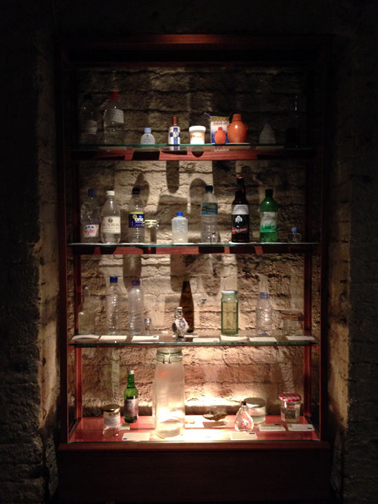

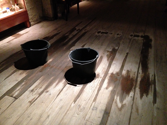
The basement of Somerset House is a suitably dark and damp venue, with the added feature of a leaky roof complimenting the exhibition. Volunteers are on hand to talk you through the exhibits and show you the filing systems used to log all the donations.
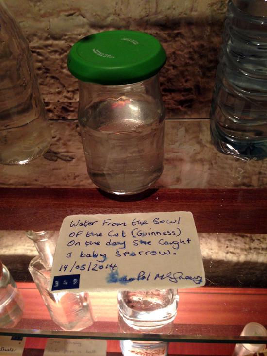
In this location, a sense of a victorian curiosity show is overpowering. The shelves are laden with vast amounts of bottles and the dark wood and sensitive lighting help to focus the attention of the viewer on the different shapes of bottles and the explainers contained next to each.
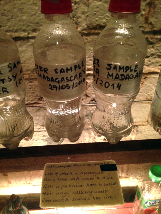
The stories of people donating water veers from the poignant and academic to the pointless and banal. There is a unifying sense regardless and the whole feels very human and touching, let alone thought provoking. It struck me as I view the different donations that water is a single source, as all of it is contained within this world of ours. What I drink out of a tap today, and then pass into the British sewage system could end up half-way around the world. So despite some of the donations being from Madagascar or Delhi, it is fitting for it to sit next to water from Suffolk. And at the same time, because of the discolouration of some of the samples, (and yes, there are some of those sort of ‘samples’ as well), it becomes blindingly obvious that safe drinking water is easier to come across in Ipswich than in Delhi.


There are interactive ‘puzzles’ in some of the alcoves in the basement as well which are fun. For example, one alcove contains a bowl of water with pots surrounding it; if you pour water from one pot into the bowl, you form a connection and a recording of someone talking about their relationship to water starts playing. And it immediately stops if you break the flow.

It is a shame that the exhibition is only on at Somerset House for the month of June. So depending on when you are reading this, you either haven’t got long left to see it, or you’ve missed your chance. However, this is an ongoing project, so some aspects of it will be viewable in other locations in the future: follow the Museum on Facebook or Twitter to keep abreast of its development, or view its Flickr page to see photographs of more donations and different locations to Museum has visited.

I have always been fascinated by maps. On returning from family camping holidays in France as a boy, my dad, a photographer by trade, would create a big photo album of our adventures, and in pride of place at the front of these albums he would stick a photostat map of France that detailed our journey. My father had itchy feet on holiday and we would rarely stay in one location more than 2 days before he bundled the five of us back in our rusty old Fiat van to trundle off to another site of interest. I think between the age of 8–14 I must have experienced most of France over 2 week periods every summer. Now days Claire and I mostly holiday in the UK, and as we near the date of departure we always buy an Ordinance Survey map of where we are heading and study it intently. It has become a bit of a ritual which I think harks back to the family holidays of my youth.
This information is given as background to the fact that I have recently come across several personal coincidences featuring maps. Two weeks ago it was my mother’s eightieth birthday, and struggling to think of what to get her I struck upon the idea to take her to Norfolk on a trip down memory lane, (my family had relocated there from London in the 1960s, and as a result it is my county of birth). The obvious way to physically give this as a present to my mum—with the date for the intended trip yet to be arranged—was via a map. So I bought an Ordinance Survey map of The Broads, some stickers, and wrapped them up with an instruction card informing her to choose the locations she wanted to revisit.


The coincidence of maps on that weekend happened when early on the Saturday morning, prior to making my mum’s card and wrapping her present, I had to go to the Post Office to pick up my order of Where You Are by Visual Editions, a book / box of maps by “writers, artists and thinkers … each one exploring the idea of what a map can be”. The coincidence was cemented in my mind when sitting down to look through the Visual Edition maps, still prior to creating my mum’s card, and realising another book on my studio table waiting to be read had a map on its front cover. This book about typography and printing was published in 1947 by the long gone Cowell’s printers in Ipswich, which I had been prompted to buy the week before after reading Ruth Artmonsky’s excellent Do You Want It Good Or Do You Want It Tuesday: The Halcyon Days of W.S. Cowell Ltd. Printers.


A Handbook of Printing Types by John Lewis, published by W.S Cowell Ltd, 1947
The former of these two books, Where You Are, really stretches the traditional concept of what a map actually is and how maps can be interpreted. I was particularly taken with Valeria Luiselli’s beautiful and mysterious Polariods in her map: Swings of Harlem contained within Where You Are, in which she photographed her daughter on every set of swings in every play-park in Harlem. In her text accompanying these images she passes detached thoughts on the location, the procedure of getting to the park, and her own mood as she watches her daughter play and eavesdrops on other people’s parent–child conversations.
I got to thinking about the concept of psychogeography as I read Luiselli’s piece over the following week. In particular I was considering how we can approach the world around us in a detached manner, forming our own maps of our circumstances and psychologies, and how these can differ greatly from maps produced with the purpose of trying to give order to the world around us. Feeding into this thought process was a post I read in February on Al Jazeera America questioning why the north ended up on top of the map. This led me to dig out The Situationist City by Simon Sadler, a book that had been sitting on my shelf unread since I bought it last year.

The cover of Sadler’s book features Guy Debord’s 1959 psychogeographical map, of which the author says: “…made as part of Debord’s correspondence with his situationist colleague Constant, the piece was a tiny gem of situationist pot-latch (art created as a gift) and détournement (art composed from ‘diverted’ aesthetic elements).” This image in turn reminded me of a catalogue cover I had produced 12 years previously for a graffiti art-trail of Ipswich I curated. The project’s intention was to question what could be constituted as an art gallery and the cover image I designed openly and appropriately rips off Debord’s visual concept—appropriate because situationism was never afraid of plagiarism as a concept and actively courted it as an artistic device, as highlighted by Sadler above when discussing détournement.

The catalogue, circa 2002, also contained a map I designed, (below), for exhibition goers to follow. A few years after designing this I realised it was similar to a map of London that NB Studio created, (see link). I don’t know when NB Studio made their work, but if it was prior to my map, I was completely ignorant of it at the time—this is a statement which I realise calls into question my honesty considering my previous comment about Debord’s map, but I swear it is true. Regardless of this, anyone looking at NB Studio’s map will soon agree that my mediocre design effort pales into insignificance in comparison.

To wrap up all this map talk I suppose that I’ve come to realise that all my recent thinking around the subject has actually been a journey in itself, and therefore, this blog post is a map of my thought processes over the last few weeks. I will be the first to admit that these thoughts and coincidences are somewhat ill formed and disjointed at the moment, but I’m currently ruminating on many different thoughts with the hope of formulating some of the more interesting ones into a future project. So without wanting to force a pun, I haven’t come to the end of my journey in this matter, and I fully expect to return to it again here in the near future.
However, it is probably worth pointing out an irony from the starting point of this post. On the way to a celebratory meal in a pub for my mother’s eightieth birthday on the evening of the aforementioned Saturday, at which my childhood fellow French adverturer brother and sister were going to be present, Claire and I got completely lost on the drive there, too reliant were we on Apple’s iPhone Maps app!
One sunny Sunday afternoon walk around Woodbridge today and all I seemed to see around me were examples of living, moving typography.
 This antique shop’s sign caught my eye with its peeling letterforms. There’s something fittingly accidental in the evolving visual language of an old sign decaying for an antique’s dealer. And the shapes created by this natural ageing process give up unique shapes—a typeface being undesigned, if such a thing were possible—that organically visualise the forward march of time. While the motion may not be obvious in the moment in which I looked at these, motion had happened and was happening none–the–less, albeit at a very, very slow rate.
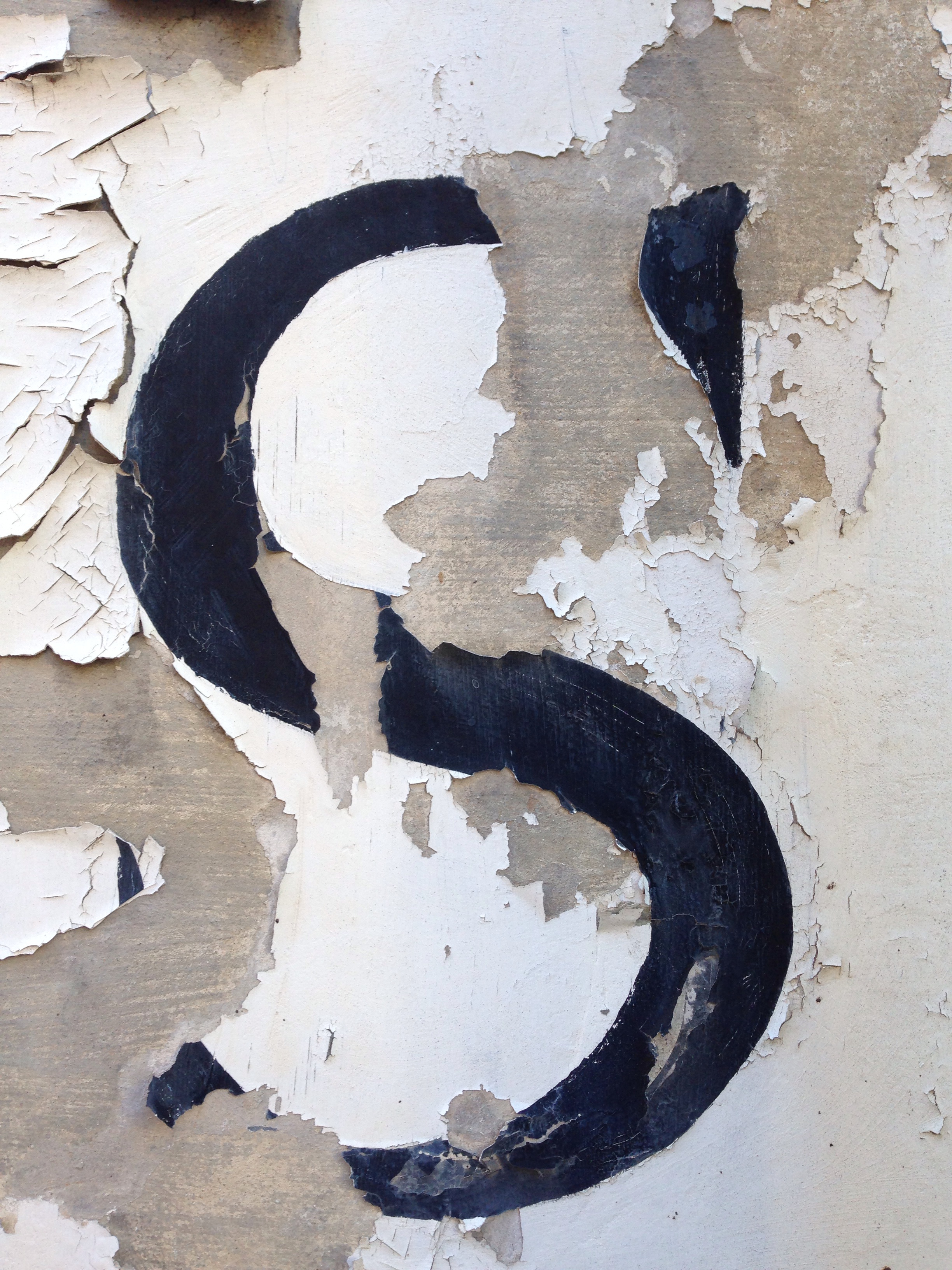
 Another antique shop had a similar feel but this time caused by peeling paint, rather than lifting vinyl.
 I moved from black and white to a dash of colour when walking through a graveyard and I caught sight of moss taking hold to letterforms carved on a gravestone. An interesting thought occurred to me that this type that usually memorialises the dead has turned into a piece of living type, changing with the seasons.

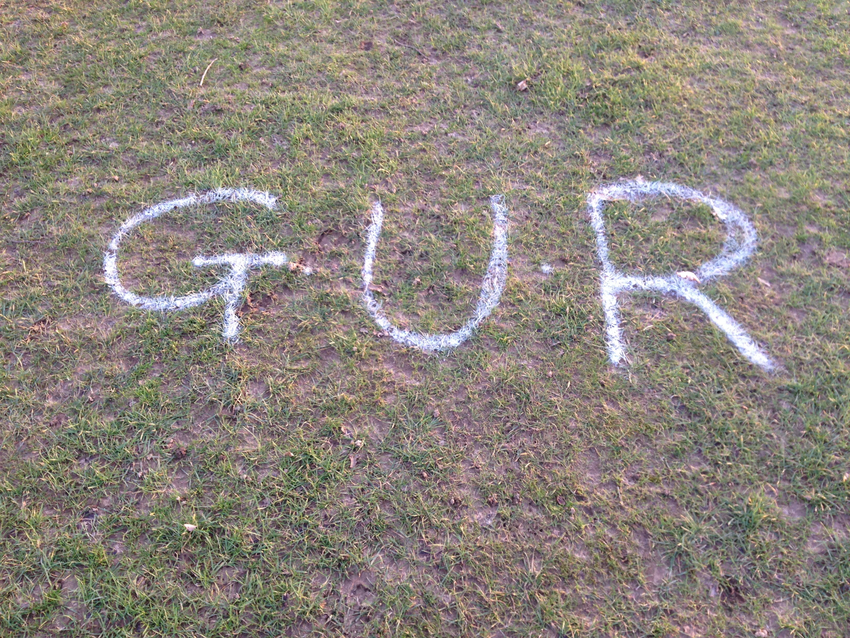
 Later, after returning from Woodbridge and taking the dog for a walk I found this spray painted GUR on a local heath that doubles as a golf course. I have no idea what GUR stands for, and as this is a golf course it is likely to be cut short before anyone will get to see how it develops. But it is still a piece of living typography while it lasts, as the grass grows.
 It may not be a great piece of graphic design, but this random act of kindness impressed me on Boxing Day, when Claire and I took our dog for a walk to one of his, and our, favourite haunts. He was equally impressed with the treat, (and surprised, considering we don’t usually take them with us on walks). Given the sentiment, and the touching words, I can forgive the use of Comic Sans *.
Text reads: “Dear dog-walkers. Please help yourselves to a treat for your doggy friend as a small gesture to remember our beloved chocolate Labrador Rolo, who passed away 3 years ago today. Rolo enjoyed many wonderful walks along these paths – he is very much missed and forever in our hearts. May you and your canine companion have a happy Christmas together.”
* (Comic Sans aside though, there really is no excuse for the clip art.)
 Left: Tate Etc. Issue 29, Autumn 2013. Design & Art Direction—Mark El-khatib and Sara De Bondt
Right: Face Dances by The Who. 1981. Sleeve—Peter Blake

Hierarchy of albums by The Beatles
The Beatles were the first band I really liked. I can’t remember when I first heard them, but memories of being given a compilation album as a present, watching all their films one Christmas, having the 1964 Royal Variety poster on my wall and singing Yellow Submarine and When I’m 64 on family holidays between the age of 6 and 12, are lodged firmly in my memory.
Several Beatles albums became favourites, although I owned few of them. That is until recently. When Apple re-released their entire catalogue in 2009, remastered for CD and download, I started to buy them one by one. I began with those that I either had on vinyl in the loft or on tape in a cupboard somewhere—Rubber Soul, Revolver, The Beatles (The White Album), Abbey Road—and then worked through some that I didn’t know so well such as Help, other soundtracks and their early releases. The earliest, I didn’t know at all as albums, and these were the last of my purchases.
That is, excepting Sgt Pepper’s Lonely Hearts Club Band. My father had oddly bought himself a copy circa 1973, and I can clearly remember him bringing it home, (this was odd because my father never bought LPs for himself). And over the years, I grew to first love, then hate that album. The songs you sing in the car as an eight year old with your family can quickly become toxic to the ears of a teenager discovering punk rock. It further grated with me when it was played every day back to back from the pyramid stage the one and only time I went to Glastonbury Festival, (1987 and the LP had just been released on CD for the first time).
So now I owned the set, I decided to experiment and listen to them one by one, in order of release, as an exercise in hearing a band develop and grow. And boy, what an interesting experiment it was.
The image above visually ranks the albums, in my opinion, in order from best at the top to worst at the bottom. The list, for those that don’t know the album covers is:
01. Rubber Soul
02. Sgt Pepper’s Lonely Hearts Club Band
03. The Beatles
04. Magical Mystery Tour
05. A Hard Day’s Night
06. Revolver
07. Abbey Road
08. With The Beatles
09. Help
10. Beatles For Sale
11. Let It Be
12. Yellow Submarine
13. Please Please Me
Lots of people will disagree with my list, so I ought to explain my judging criteria, (not that I think that will convince any music/Beatles purists reading this). Outside of personal enjoyment and taste, my analysis boiled down to an albums consistency and the band’s exploration/developmental leaps.
My first choice, Rubber Soul, has always been the Beatles album I’ve loved more than any other, so it is of little surprise that it remains my favourite. But nostalgia aside, to me, it is the sound of a band in transformation, on the verge of breaking new ground and is utterly of its time. Here they were breaking away from purely being a pop band, into recording artists who commanded their sound and their songwriting. It is the promise of what is to come, and therefore in my mind, better than what followed.
What did surprise me was that Sgt Pepper’s should come second, having anticipated that I would put Revolver in that spot and considering my previous contempt for The Hearts Club Band. But on listening to the albums in order, while Revolver probably contains one of the greatest songs ever in Tomorrow Never Knows, and also hosts probably one of the best opening tracks to an LP in Taxman, the rest of it lacks the consistency of Rubber Soul and Sgt Pepper’s. It feels like an album of extremes; they weren’t brave enough to jettison the frankly shit Yellow Submarine and sickly pop songs which sit awkwardly alongside the more pioneering experimental moments. It is still an astounding record, but doesn’t deserve second place based on my listening rationale. Where as Sgt Pepper’s, on listening to again after so many years of avoiding it, was a delight. It hung together really well, and I could even forgive When I’m 64, (just). In many respects, not listening to it as a concept album, and rather, thinking of it as a collection of songs helped. The distance helped as well, but just how soon I’ll get around to listening to it again, I don’t know. Now I’ve discovered it again, I don’t want to lose it straight away.
I’m not going to go through the rest of my choices here, although the big surprise to me was how good A Hard Day’s Night is. It isn’t an album that I previously knew, although I obviously knew most of the tracks on it from the film and various compilations. But for me, it was their first truly great record. It maintains some of the gritty rock n roll vibe from the previous albums, especially in Lennon’s vocal delivery, (although it must be said that McCartney can scream for England). All tracks were penned by the band themselves—a rarity in 1964—and the more feisty tracks are balanced with their delicate crafting of tender ballads and joyous pop songs. It was a gem to discover.
You could almost say that The Beatles didn’t make any bad albums, although Please Please Me isn’t great, Let It Be is the sound of a band that had run out of ideas, and Yellow Submarine is only half an album, (and it has Yellow Submarine on it). Regardless, they all have their moments, and to listen to them all from start to finish, in order, was a really interesting musical journey to witness. Especially considering that these 13 albums were all released within the space of seven years.