Archive

Photography

Impact

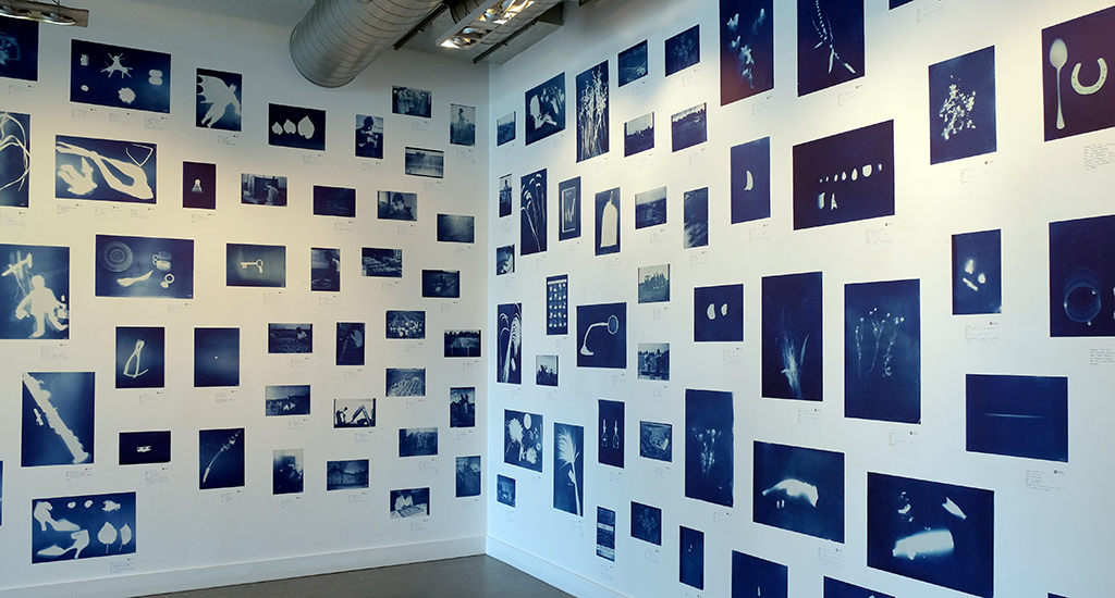
PhotoEast, Suffolk’s first festival of photography, was launched this week in Ipswich and can claim to be a major success, even within its first few days of existence. The half-mile walk along Ipswich’s waterfront from DanceEast to Cult Cafe brings dramatic images from around the world to this small Suffolk town. Local history and Ipswich life are presented alongside contemporary photography as part of the fabric of the waterside architecture. There is even a projection room inside a shipping container at the far end of the marina.

Waterfront2

Waterfront1

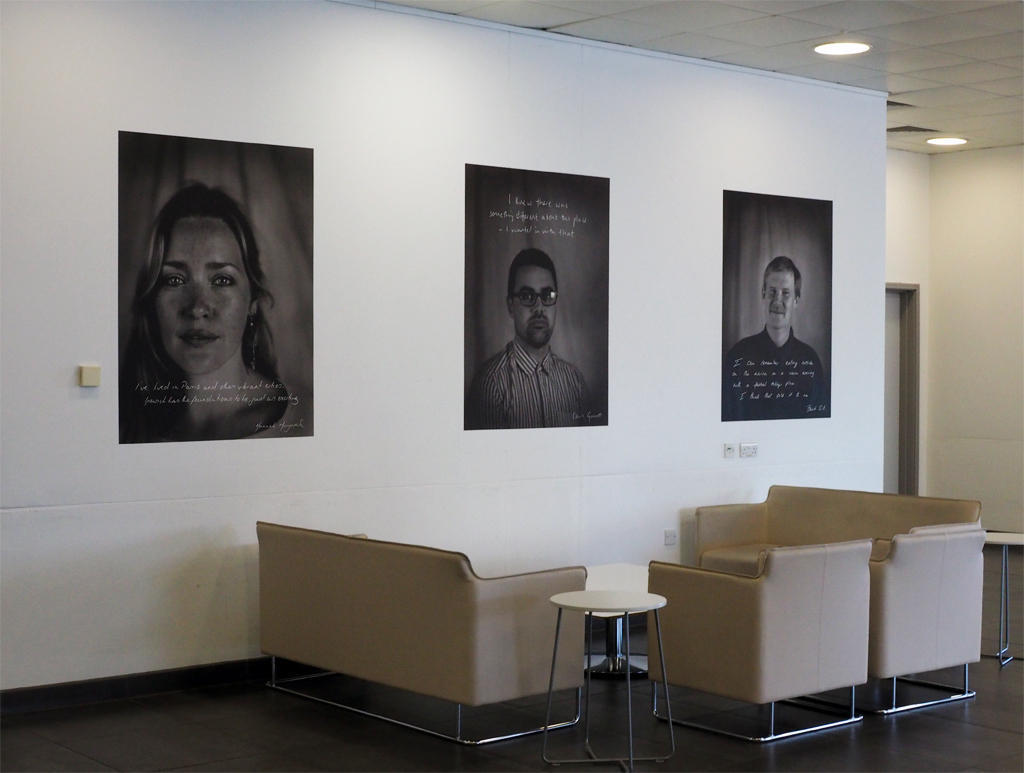
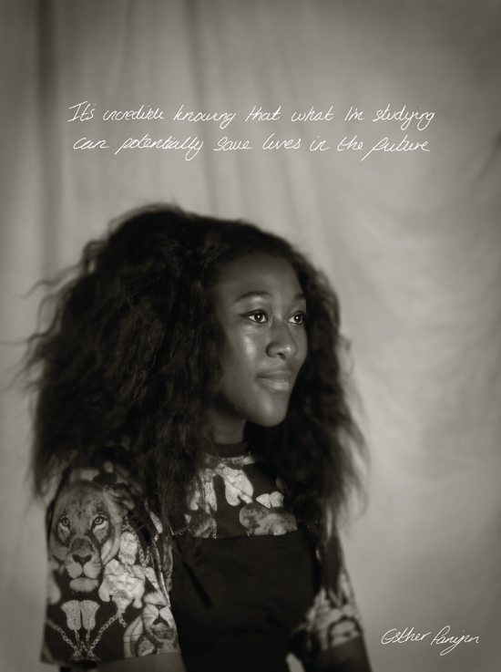
Further to the monumental quayside exhibitions, two poignant projects looking at ageing and the family by Zed Nelson and Julian Germain are displayed in UCS’s Waterfront Gallery. Alongside these keynote exhibitions, the BA (Hons) Photography degree show in the UCS Waterfront Building lobby showcases the next generation of photographers emerging from the region; while a PhotoEast Young Person’s Fellowship exhibition of local school and college students’ work is on display in the nearby Arts Building.

Stretch

Fishermen

While walking around the quayside several times this week it has been hard not to notice a buzz in the air that this very public exhibition has brought to the town. Listening in to the conversations of teenage skateboarders making their way home from the local skatepark as they discuss the images is as fascinating as the work itself. And you can watch the drama of some of the photographs stopping people in their tracks in order to contemplate and comprehend what they are looking at.

Accompanying the exhibition is a one-day series of talks. This morning Claire and I went to hear the Picture Editor of The Guardian, Fiona Shields, talk about the challenging job of choosing the right image to illustrate a news story from some of the 25,000 pictures she looks at everyday! This afternoon we are heading back into a lecture theatre to hear George Georgiou discuss his commissioned project of photographing Ipswich from the top deck of a bus. In-between these there is a programme of talks from Mark Edwards, the Course Leader for the Photography degree course at UCS Ipswich; social documentary photographer Julian Germain will discuss his work in the Waterfront Gallery; and curator Katie Barron is in discussion with Chloe Dewe-Mathews about her WW1 tribute Shot At Dawn. The scale and breadth of this festival, both aesthetically and cerebrally, is truly impressive.

Bus

The festival continues in Halesworth and various other venues along the A12 towards Lowestoft. Tomorrow Claire and I plan to visit an exhibition of Rodchenko’s photographs in a garden nursery at Darsham, and People and Their Dogs at The Cut in Halesworth. PhotoEast organisers are hoping to host exhibitions in more towns throughout the region as the festival develops over time.

Container

In considering what has made this festival so successful there are three key ingredients which need to be taken into account. Firstly, the calibre of the work on show is extremely high, a parochial exhibition of sunsets this is not! Secondly, the presentation is what you would expect from any metropolitan gallery or major arts event. Thirdly, the festival branding brings all the disparate aspects of the festival together with a cohesive graphic unity. If any one of these parts was not as fully considered as they have been I am in no doubt the sum total would have suffered as a result. PhotoEast is evidence of just how to put on a culturally exciting and vibrant arts event in a small town that engages local audiences well beyond their geographical boundaries.

Congratulations to the organisers for their vision, to all those involved at UCS, and to all the sponsors and supporters for helping to make this happen. PhotoEast 2016 continues until 25 June across various venues in the region. Check out the PhotoEast website for more details.


CoverMock

Book jacket proposal (front and back)—work in progress

Graphic Interruptions is reaching some sort of climax as I prepare the final artwork for a one off self-published book to go to print this week. As I near the end of this stage of the project, (i.e., an assessment hand-in for a 40 credit module in mid-May for my masters degree), for no reason what-so-ever other than a little procrastination, I’ve worked out some (sketchy) stats for the project to date:

—55 photographs in book, edited down from 224
—7 short psychogeographic writing trials
—1 long psychogeographic essay with umpteen drafts
—1 introduction essay of over 1300 words, 6 drafts and copious notebook ramblings
—3 book print trials
—7+ layout trials
—untold changes in direction
—7 months reading/researching, photographing, questioning, reflecting
—6 blog posts in duration of MA, (+1 associated)
—One 3 year old blog post, (genesis of project concept)
—3 presentations
—5 critiques
—2 ring binders
—63 plastic wallets
—2 sets of inkjet cartridges
—2 maps
—One 19x25cm Moleskine softcover notebook
—One 14x21cm Leuchtturm1917 softcover notebook
—3 or 4 Lamy rollerball cartridges
—untold visits to the library
—uncountable Google searches, RSS feed follow-ups and Evernote bookmarks
—1 part-related meeting with a publisher
—1 venn diagram


A selection of New York City Graphic Interruptions, as recorded 01–05 March 2016 on wanderings around the city.

DSCF4469

DSCF4777

DSCF4277

DSCF4460

DSCF4748

DSCF4747

DSCF4749

DSCF4306

image
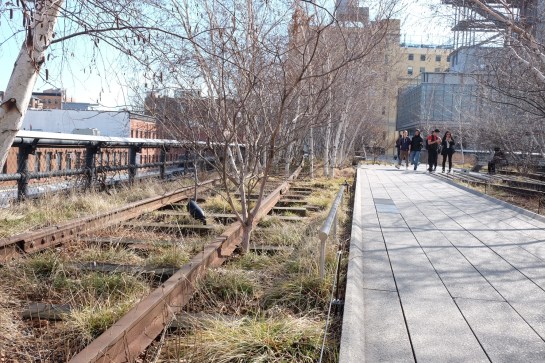
Two days in to this New York trip with my colleague Russell Walker and UCS graphic design and illustration students and they’ve been busy ones. I can’t even try to imagine how many miles I’ve walked so far.

The journey wasn’t without its problems, which I won’t go into here, but now we’ve settled in and are walking, walking, walking, and filling up memory card after memory card of photos. Here’s a few I’ve taken, with comments, while I manage to jump on Macy’s free wifi from my hotel room.

image

The first day I went to The Highline, an overhead deserted rail line that has been converted into a mile and a half long public park. It is absolutely stunning. Luckily the weather was excellent and it was a good choice of activity for the first day. It really helped me to feel embedded within New York as you get a real sense of location walking a few metres above the Avenues and Streets of this city and in amongst apartment blocks.

image

I was also very impressed with the honesty of the rubbish bins, labelling landfill waste as just that.

image

Other graphics that have impressed included this cycle path road sign with the addition of a cycling helmet. And no trip to New York for a graphic designer would be complete if it didn’t include some vernacular type spotting.

image

There have also been a plethora of Graphic Interruptions for me to record, such as this:

image

Today I went to The Guggenheim and saw an excellent Fischli & Weiss retrospective titled How To Work Better, and a Photo-poetics exhibition. The F&W exhibition opened my eyes to a lot of their work I hadn’t seen before, and I drew parallels between them and designers like Daniel Eatock, (as well as explaining to a few students I bumped into that the Honda ‘Cog’ ad ripped them off). With the photo exhibition I’ve found a few new names to research for my Masters, such as Erica Baum. Obviously though, it doesn’t really matter what is on at The Guggenheim as the building is stunning in itself and worth the entrance fee just to see the architecture.

I had planned to drop into MoMA on my way back to the hotel after visiting The Guggenheim, but having walked from the bottom of Central Park to the gallery and back, I was exhausted so jumped on a bus back to the hotel for afternoon tea. However, I did manage to get a few tourist shots in Central Park.

image

So as I write this I’m sitting in my very basic hotel room with a heater rattling away in the background, which at least helps to drown out the sounds of the street at night. Not that I’m getting much sleep, as while I hit the sack at a reasonable (US) hour, my body & brain seem to be colluding and waking me up in UK time, so sorry if this post is slightly uncoordinated and bitty. But I’m ploughing on regardless, and tomorrow I plan to take a boat trip around Manhatten Island that some of the students have done already and highly recommend. It’s predicted to be colder than today, (snow forecast for Friday), so I’m glad I packed some gloves because the camera will be out all the time.

I’ll leave you with my favourite photo I’ve taken so far, a shrine to rubbish, but expect more to follow on Flickr once I’ve had a chance to go through everything in a few weeks time.

image

Lampost-lottery

The blogging on here is truly taking a back seat as I thought it would *, but my Graphic Interruptions project continues. I got validation this week about its direction in the form of results for the first piece of assessed work on my Masters course, and I’m stumbling across more examples every time I step out onto a pavement.

The above example is one of my recent favourites. The reason I like it is because the graphics aren’t decayed by weather and its form isn’t physically broken. This is the case with a lot of examples I find which could lead to an accusation the project is solely concerned with ‘ruin-porn’, which it isn’t. This piece of graphic design is interrupted because of human interaction as someone has decided, (without too much thought), that health & safety concerns trump communication. This ultimately renders the intention of this item useless when approached from this direction. The question then needs to be asked about the suitability of such a communication device, in the form of pavement signage, if it is liable to have people tripping over it? I also like the irony this implies: the item becomes a lottery—will you or won’t you trip over it?—and I wonder whether there is more chance of financial gain if you were to trip over this and put in a ‘no win no fee’ claim than actually buying a lottery ticket.

Until now I’ve been using Tumblr as an image dump for my finds. However, I’m not convinced I was getting the traffic I wanted and I find Tumblr a little clunky. Now that Instagram have made switching between multiple accounts easy, I’ve created one for this project: you can find it at @graphic_interruptions

Lastly, for now—the undergraduate graphic design course I lecture on at UCS is taking students to New York at the end of this month. Exciting as it is to visit New York, I’m doubly excited to have the opportunity to make this project international.

Console

* It is typical that when I am extremely busy, (as seems to constantly be the case now), an idea for a blog post will throw itself at me that can’t be ignored, as happened recently with the article I wrote for Eye. See previous post. 

Venn_001

Since I last posted here about my Masters I have been fine tuning where I’m going with my work. Creating the above Venn diagram for a peer critique this week helped—the first Venn diagram I have ever produced! The problem I’ve had until now was making sense of what appeared to be very diverse aspects in my work and research. This diagram bought it all together visually and helped me explain where I was going to my peers. They got it, and gave me some very good feedback on the trial writing I have done to date.

Today I’ve been developing my written responses to photographs I’ve taken. In order to distance myself from what I had tried before, I used a series of images I shot earlier in the day while walking my dog in a local park. This writing was an exercise in honing the tone of voice I use, and testing the familiarity in my written language. I’m a long way from posting any of my writing for this project here, and I will only give a sneak peak when I do, wanting to save the major content for future printed publications that I produce. However, I now feel I’m starting to get a cohesive balance between descriptive elements, personal reflections, critical analysis and my use of humour.

As it will be some time before I have anything concrete to report here, such as publication details and images of designed work, I thought I’d share some of the photography from today’s session. Please bear in mind I am not presenting this as being in any sense ‘accomplished’ photography; these are purely shots I use to respond to in my writing and text & image will be seen side by side in any final outcomes.

The written context surrounding these images include: familiar scenery; walking to work; exercising the dog; sense of neighbourhood; Ipswich; civic pride; protest; and cat jokes.

streetsign

Street sign coat of arms

Alexander

Ipswich’s Alexandra Park

Dogwaste

Dog waste decal

Bin

Dog waste bin

Bench

Roger MacKay’s bench

bin2

Rubbish bin coat of arms

flw

Front Line Warriors

flwredacted

Front Line Warriors redacted


Caravan

Last week The Cabinet of Curiosities caravan pulled up outside University Campus Suffolk to coincide with an exhibition of the same project in UCS’s Waterfront Gallery.

This visit and exhibition is the culmination of a year long project by UCS Fine Art Senior Lecturer Jane Watt. Jane and her bright blue caravan have visited various locations, and in particular many around Cambridge throughout the Autumn of 2014, providing an opportunity for people to come and document curiosities via cyanotypes. “At each location my assistant Amy Sage and I went through the same ritual: paper ready, aprons on, lights on,” says Jane. “The blue door is opened, the sign put outside inviting people to ‘Bring in your curious object’. Each venue brought many new visitors with unexpected objects and related unique tales.”

Claw2

Claire’s claw

Claire and I went to pay Jane a visit and take our curiosities. I took what I believe to be a one-off metal cycle handle-bar spirit level for measuring hill gradients, (I suspect it is from the 1950s and the like of which I haven’t seen anywhere else), and Claire took along a claw. Delicate objects were processed inside the caravan under a lamp on coated paper, (see above), while more robust objects were left in the sun before being fixed.

Claw3

Our curiosities being fixed

JaneWatt

Jane Watt inside her blue caravan

The caravan itself is a traveling exhibition as selected cyanotypes are hung up on clothes pegs or stored away in draws for visitors to inspect. Each print is numbered and all information recorded on a card in, obviously, blue ink.

Draws

I find this project fascinating for many reasons. What seem like randomly chosen objects to a casual observer at first glance reveal on reading the accompanying card that these items mean something to their owners. In some respects this aspect reminded me of the Museum of Water that I visited when it was at Somerset House last year—art that relies on audience participation and records an aspect of their lives will forever be intriguing to me. There is a democratisation at work here; but at the same time the hand of the artist controls the visual output ensuring a considered rather than chaotic display. The artist’s vision is supported by those that choose to take part and ‘buy into’ the concept, and sates in them a need to document what they feel is important in their lives. In a nutshell, projects such as Jane’s have a real sense of humanity at their core and art blurs into anthropology.

Exhibition1

A (very) small section of the exhibition in the UCS Waterfront Gallery

Exhibit1

The exhibition in UCS is a mass of cyanotypes that Jane has recorded in the past year. Don’t expect to see the exhibition in 5 minutes, as a visit can drag you in to looking at all the objects recorded and trying to work out what many of them are, resulting in the need to read their accompanying cards. In many respects the cards are as fascinating as the objects.

From a design perspective what I also really like about The Cabinet of Curiosities is its overarching branding and the attention to detail that Jane and those that she has worked with have gone to. Badges, postcard packs, a hardback book and accompanying website have been thoroughly thought through by the design team she worked with: LMNOP.

Book

The accompanying hardback book, designed by LMNOP

Despite the caravan only being outside UCS for one day last Saturday, you can still see the results of much of Jane’s work as the exhibition continues in the UCS Waterfront Gallery, Ipswich, until 4 September. It is well worth a visit.

Live

Wall by the stairwell entrance to Hestercombe Gallery © Nigel Ball

Galleries that deal in driftwood ‘art’ and knick-knack souvenirs might be the predominating cultural experience you’d expect from a holiday to the beautiful Dorset coast. With this in mind, Claire and I were careful to make sure we investigated what cultural attractions were available to visit before travelling last week to a small hamlet just outside Bridport for our 2015 summer holiday. If washed-up sea craft ticks your art box then you won’t be disappointed from West Bay, Lime Regis and Charmouth et al, but if they don’t, we can highly recommend a couple of exhibitions.

We discovered before leaving that a colleague of mine, UCS senior lecturer and photographer Mark Edwards, was part of an exhibition at Hestercombe House & Gardens in Somerset. Being only about an hour’s drive from where we were staying we decided to pay it a visit. The show is titled Double Take: Photography and the Garden, and features two other contemporary artist photographers alongside Edwards; Sarah Jones and Helen Sear. It also showcases photographs by landscape gardener Gertrude Jekyll’s, who alongside Edwin Lutyens, designed the Formal Garden and Victorian Terrace at Hestercombe. It is an interesting exhibition in that each artist takes a very different approach in responding to the theme of the garden. Jekyll’s beautiful black and white shots from the early 1900s record garden vistas, plants, and most interesting to me, the gardeners working either horticulturally or on hard landscaping. Although none of these were of Hestercombe, they all come from a collection of photos Jekyll took of her own garden at Munster House near Godalming.

Hestercombe2

Hestercombe Gardens by Jekyll and Lutyens © Nigel Ball

Edwards photography is a much longer process than the ‘shots’ by Jekyll, as he finds locations and returns to them repeatedly before photographing them. He often captures gardens that are about to revert back to nature, on the cusp of becoming overgrown or are overlooked and as a result, despite the fact they can appear as everyday scenes that in the flesh you may not take a second glance at, but as large scale prints they have an underlying sense of tension between nature and nurture. Sear’s work is much more manipulated which can lead the viewer to question whether they are actually looking at photographs—some appear as if ceramic tiles and others potentially paintings or tapestry. Jones’ work has a more menacing tonality to it with very dark backgrounds that focus the viewer in on, for example, a woman lying on a large tree branch, or to pick out the detail of a rose bush and thus forcing you to pay equal attention to the thorns and branches as you do to the flowers.

The show is part of Hestercombe’s programme of showcasing art in reclaimed spaces, and much of the gallery attached to the house is in a poor state of repair, clearly having been reclaimed from going into ruin just in time. This adds a temporal air to the whole show which creates an atmosphere that contrasts appropriately to the very orderly gardens outside. It also helps to echo the fact that gardens that aren’t continually tended, much like buildings left unmaintained, soon destroy themselves, a feature that is not lost as you look at some of Edwards work in particular.

Apologies for not showing any images of the exhibition to accompany this post, but I was so engrossed in the work that I neglected to take any of the work on the walls, (and I didn’t want to scan in images from the catalogue for copyright reasons). The show runs until 18 October 2015, and the £10 admission price includes access to the exhibition, gardens and house.

Screen Shot 2015-08-01 at 14.17.11

Claire and I had also planned to take a look at Bournemouth at sometime during the holiday, as I believed, (wrongly), that I had never been there. (As we drove part the Pavillion, I was reminded that I went to a conference there some 30 years ago!) Unfortunately we left this visit until our return journey back to Ipswich, so didn’t have time to mooch around the town as we wanted to take in the Alphonse Mucha exhibition at the Russell Coates House and Gallery before continuing our drive back to Suffolk.

The house itself is a visual overload—a clash of Victoriana and Art Nouveau—rammed as it is with paintings, furniture, garish carpets and ornate internal architectural mouldings. A feast for the eyes and a fascinating insight into the lives and tastes of yuppie hipsters of the day. As the Russell Coates websites states: “In 1901 Merton Russell-Cotes gave his wife Annie a dream house on a cliff-top, overlooking the sea. It was an extraordinary, extravagant birthday present – lavish, splendid, and with a touch of fantasy. They filled this exotic seaside villa with beautiful objects from their travels across the world, and lined the walls with a remarkable collection of British art, creating a unique atmosphere in a most dramatic setting.”

Mucha

In many ways it is the perfect location for a Mucha exhibition outside of Paris, and the museum has done a good job of framing the entrance to the Mucha show with paintings that were contemporary to his work, thus informing the visitor of just what Mucha may have been influenced by. Once in the actual exhibition, (which you have to walk through the entire house to get to), there is a sense of calm after the visual overload you are subjected to beforehand.

I know Mucha’s work well, but what is impressive about this exhibition is actually seeing the life-size posters rather than reproductions in design books. Getting to see the work at this scale bought home to me once again just how important he was to the development of not just poster art but to Graphic Design, (poster art being the precursor trade before the concept of the ‘graphic designer’ emerged). His typographic excellence is something to be truly admired, and both his use of graphic architecture within an artwork to frame the subject/steer the viewer as well as his incorporation of type into the actual image must have appeared revolutionary in its day.

Mucha2

One thing that did strike me for the first time, seeing the work up close, was that in much of the early work he wasn’t particularly good at drawing facial features. In many pieces I felt there was a tentative hand at work when working in these areas whereas he displayed sheer confidence in figures, illustration, graphic patterns and typography. His execution improved as his techniques developed, but this difference was noticeable to me for the first time on looking at this early work at their intended size.

The exhibition isn’t large, it only occupies two rooms, but it does also include a video of his life, photography of some of his models which he would later draw from, and examples of packaging alongside preliminary sketches. All in all it is well worth a visit if you happen to be in the area and is on until 27 September 2015. The entrance fee is £5, (inclusive of house).

Screen Shot 2015-08-01 at 14.17.56

As opposed to:

Top: Understanding a Photograph. John Berger. 1968
Bottom: Premier Inn wisdom. 2015

September is a busy month for me in the run-up to the start of a new academic year, hence no new posts here for a month. However, I’ve been far from idle and I’m proud to announce one particular project is about to come to fruition. ‘This is us’ is something I’ve been working on with colleagues at University Campus Suffolk for a few months now, with the launch set for Tuesday 29 September and press ads to hit the news-stands from 1 October.

OLYMPUS DIGITAL CAMERA

3 of the 11 portraits in the UCS Waterfront Building lobby

The campaign was envisaged by UCS Provost Richard Lister who wanted to celebrate the individual stories of both students and staff at the institution as it turns seven years old this September. After initial idea sessions between Richard, Graphic Design Senior Lecturer Russell Walker, UCS Head of Marketing Michelle Wootton, Photography Lecturer Matthew Andrew and myself, we decided large portraits of some of the individuals who have been involved in the UCS story over the last seven years would be appropriately fitting.

BeckyBlunk

UCS Librarian Becky Blunk—Becky is American, before anyone comments on the spelling

After Michelle selected some initial candidates for the project, Matthew set about shooting them in-house at UCS over the summer. Michelle then copy-wrote the text based on interviews with all the sitters while I worked on handwriting samples, scanning them in at ridiculously high resolutions and cutting them about to compliment Matthew’s stunning portraits.

MarkEdwards

Course Leader and Senior Lecturer for Photography, Mark Edwards

After Matthew had finished the post-production, we worked closely with printing and hanging the images, using a low tack and re-positional adhesive paper that was completely new to us. The scale creates a dramatic statement as you enter the UCS Waterfront Building lobby, where the 11 images are currently hung.

EstherFaniyan

Esther Faniyan, current BSc (Hons) Bioscience student

JonCoy

UCS receptionist, Jon Coy

It is hoped that this project will develop into more portraits and stories over the coming years, but in the meantime, the full scale images can be seen in the UCS Waterfront Building until the end of October, and over the coming weeks will be run as press ads, one-a-week, in the East Anglian Daily Times which will expand upon the sitters’ stories. Alongside this, postcard packs will provide further information about the individuals’ accounts of their time at UCS.

HannahMaynard

It has been an honour to work alongside my colleagues on ‘This is us’ and it has been a mark of pride to be able to help showcase the difference UCS is making not just to Ipswich and East Anglia, but to the individuals involved; from students to academic and support staff.

For more information, go to: ucs.ac.uk/thisisus