Scribble cover. Image courtesy of Three&Me.
When you work with someone on a regular basis you tend to get to know them well. You tell each other stories, you share aspects of your life and you get to know their working nuances intimately. But just recently I’ve been spending time with my work colleague, friend and ex-tutor Russell Walker a lot more than I would normally outside of typical ‘office’ working hours. This is because Russell Walker, designer, illustrator and educator of some 30+ years has just published a book of his creative and educational life called Scribble, and I’ve been immersing myself in it.
Starting from his earliest memories of childhood in his father’s tailor shop, Russell’s close friend Mike Doherty narrates his move through school and on to art school, into the world of being a professional illustrator and times spent teaching generations of design students as a lecturer, course leader and senior lecturer. From the outset the pair proclaim that the intention is to share these memories and experiences in order that others can dip in and benefit from them in some small way.

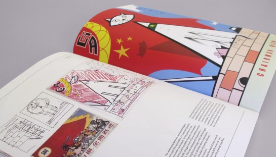
Fetchaset spread. Image courtesy of Three&Me.
From his days at Hornsey College to describing leaving student life as looking over a bottomless cliff, there is much here for the novice designer stepping out into the world of work to learn from, and all illustrated with the sumptuous and colourful portfolio that Russell has built up over the years. From initial excursions in the world of going freelance, tales abound of interviews, knock-backs, successes, international agents and working for some big name corporate clients. Those that know Russell as well as I do will know that his determination generally wins out in the end and this book is ample proof of a will to not so much stay ahead of the game, but to shape it. The phrase I’ve often heard Russell say to students: ‘if you are hungry for it you will get it’, couldn’t be more true of the man himself.
Chairman Meow. Image courtesy of Three&Me.
While knowing much of this work already, albeit seeing it in singular sittings, the collection that Scribble presents brings a personal awe at the vastness of Russell’s output—witnessing this work again but in collected form only reinforces my understanding of his creative talent. From early drawings through to skilful air-brushing; onto digitally rendered outcomes before coming back to collage and the hand-drawn in more recent pieces; Scribble showcases the visual journey of someone who doesn’t like to sit on their laurels.
The fact that Russell has dedicated much of his career to the education of others, and in doing so has potentially sacrificed the fame other illustrators of equal standing may have afforded themselves, I would argue has kept him more creatively relevant. He has avoided pitfalls of stylistic cul-de-sacs and the development of his technical and stylistic approaches in visual attitude is on show here for all to see. To say someone is ‘of their time’ often suggests they are stuck in some distant past glory, but such a phrase used to describe Russell I propose suggests that each stage in his creative journey has been ‘of its time’; a continuous line of constant updating. Russell treads a fine line in remaining alive to nuances in contemporary illustration while keeping a firm grip on his personal visual language—this is in no way an easy task and is in part driven by the requirements of educating others.

Run’m Up, Run’m Out. Image courtesy of Three&Me.
The importance of line, colour and composition in Russell’s work is present from the start of the book to the closing pages. The inclusion of original sketches, work-in-progress and quotes from others, (typographer and designer Jonathan Barnbrook tells of his time as one of his students, and this rubs shoulders with a portrait of Russell by illustrator Brian Grimwood), alongside his perspectives on design education make this a book that works on many levels for many audiences. The fact that this book has been produced in collaboration with alumni from the Graphic Design course at UCS who now run their own successful design studio, Three&Me—described in the closing pages as ‘design partners’—is testament itself to Russell’s dedication to encouraging and supporting the next generation of creative talent.

Le Kit Adagio, Viande. Image courtesy of Three&Me.
The one thing that I can’t quite get my head around with Scribble is that to publish a book such as this suggests some sort of end point has been reached. But knowing Russell as I do, this will certainly not be the case. Ever a person to develop and push forward, there are many more chapters yet to be written for Scribble.
To purchase a copy of Scribble, contact Russell Walker via Fetchaset
 The show opens to the public on 3 June in the UCS Arts Building, (weekdays 10:00–18:00; weekends 11:00–15:00), with the Private View on the evening of 2 June from 18:15–21:00.


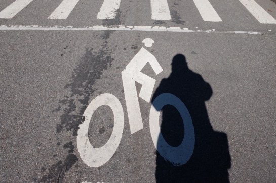
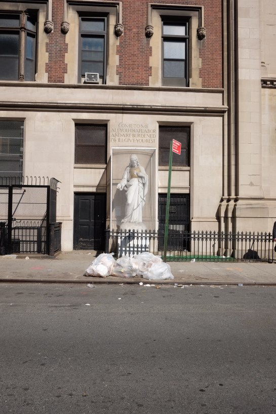
 Two days in to this New York trip with my colleague Russell Walker and UCS graphic design and illustration students and they’ve been busy ones. I can’t even try to imagine how many miles I’ve walked so far.