Archive

Media

I’ve long believed the Guardian to be the best designed newspaper in the country, which is convenient for me considering some may think I fit the profile of a typical reader—feminist liberal-left vegetarian art teacher. It would be difficult for me to take if the Daily Mail fitted this design accolade.

But I like the Guardian for more than its graphic design; the fact its investigative journalism helps to keep in check those in power is equally as important to me, particularly in these days of party political impotence. Simon Jenkins summed this up well this week in From Snowden to Panama, all hail the power of the press during the breaking revelations about tax evasion.

But journalism with integrity isn’t enough on its own, just as great graphic design isn’t enough on its own. You have to be able to engage readers in your content or it won’t gain the attention it requires. And this is where the Guardian really sets itself apart from pretty much all other news vendors, (with the exception of Channel 4 News, albeit via a different medium). The marriage of purpose and presentation is given equal respect in this daily paper, and the approach is integrated across all of its platforms, from newsprint to website to app.

If anybody should need a case study to prove my point, the Panama Papers story this week should be a convincing one. Deputy Creative Director of the Guardian, Chris Clarke, tweeted the next day’s front page every evening, and there were many of his followers waiting for the reveal each night as the story broke, (and continued to break throughout the week). If the awkward adjective ‘impactful’ can be ascribed to anything, it is the design decisions the creative team at the Guardian took to grab their readership’s attention.

IMG_2792

Monday. Source: @chrisclarkcc

Monday’s front page was really brave, dropping the masthead from its usual position at the top to halfway down the page. All advertising was removed, and using the daffodil yellow to punch out of the grey, as Clarke’s choice of a ‘punching fist’ emoticon to accompany his tweets accurately indicated, had real visual impact to match the world leader shaking story.

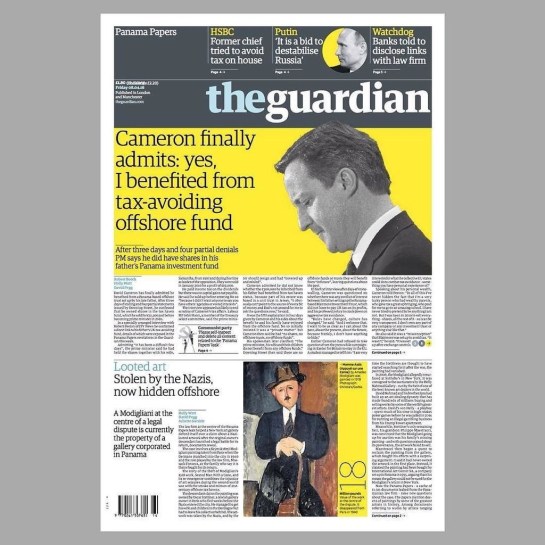
And the approach continued all week:

IMG_2791

Tuesday. Source: @chrisclarkecc

IMG_2793

Wednesday. Source: @chrisclarkecc

It is not until Thursday that advertising crept back onto the front page, and then it was cornered and given bottom billing:

IMG_2794

Thursday. Source: @chrisclarkecc

On Friday the masthead resumed its usual position at the top of the paper, no longer taking second billing to the story, but the visual language deployed stayed the same—dramatic, powerful and as attention grabbing as the headline. Again, like Monday through Wednesday, Friday sees the front devoid of advertising:

IMG_2803

Friday. Source: @chrisclarkecc

IMG_2795

iPhone app: the visual approach worked across platforms

I would be very surprised if both the Guardian’s journalistic and graphic design approaches from this week’s editions does not win them awards in their respective fields—they rightfully should.


I received David Byrne’s new book, How Music Works, through the post yesterday. It is a beautifully produced object. The cover is subtly padded, (as if the book itself was actually sound proofed), while the layout is sensitively understated.

Book cover for David Byrne's How Music Works

Spread from How Music Works

Byrne pulls on his vast experience as a musician to explore how technological changes in the production of music has affected music itself, looking at what it means to go on stage, and many other associated topics. Therefore, it is both part autobiographical, and, as he puts it himself, a series of ‘think pieces’.

Byrne avoids being highly technical, as well as steering clear of stories about rock star excess and redemption, it is therefore the perfect antidote to the ego massaging rockumentaries being spewed out by the BBC of late. This is not a trawl through the history of his many musical projects, although they are used as a contextual sounding board to discuss the business of music, (as opposed the the music business). As an introduction to some of the contexts discussed, and the self-effacing nature of the man himself, it is well worth watching the Ted.com talk Byrne gave in 2010, where he talks about how architecture has helped to shape the evolution of music.


Still from the fil Ride Rise Roar

Spread from How Music Works‚ (a still from the film Ride Rise Roar)

Intelligent and accessible, interesting and engaging, this book comes highly recommended.

I don’t know whether people still produce fanzines or not, but Kek-W is so tired of writing online that he has decided to produce one. Or rather, as he calls it, an analogue blog.

Titled Kid Shirt, this is basically a physically constructed fanzine involving actual cut and paste, which has then been scanned as a PDF for anyone to download. He sets out his rationale in the first pages:

Just like fanzines of old, this analogue blog contains lots of musicians you’ve probably never heard of. However, worthy of note is the strange hybrid between digital accoutrements and physical form, and the over laps in different media that Kek-W has deliberately exploited. For example, posts become pastes, and ‘previous’ and ‘next’ buttons simply indicate what direction you need to go in: they aren’t buttons at all. Further to this, comment fields remain empty because the PDF you download is a static, non-interactive document.

It is interesting to note the “proper writing” comment in the introduction, (see below), as I wonder whether the lack of audience right to reply to the text, frees up the writer. It could also be considered in direct contrast to the Guardian’s current Open Journalism campaign, which is something I could applaud if I hadn’t read many of the idiotic comments left on the Guardian website by knee-jerk reactionaries.

Aesthetically, Kid Shirt completely shreds any signs of slickness, despite the whole having a lo-fi sophistication. This, in my opinion, is all part of the publication’s charm. On his digital blog, also titled Kid Shirt, Kek-W states: “Download it, print it off, staple it together, read it like a fanzine…   Or…if you’re a MediaKid, use a PDF-reader, dump it onto your tablet, whatever,” before going on to vehemently disclaim any responsibility for it not working on different platforms because his call for testers was ignored. The punk attitude he displays is more than a visual style, evidently.

In fact, it is with this in mind that I was reminded of an article in Eye 82, whereby Rick Poyner wrote about British artist Laura Oldfield Ford’s Savage Messiah fanzine. He stated that the, “visual style is a kind of reclaimed punk that recalls the anarchic graphics of Crass,” (while completely forgetting to name check Gee Vaucher, the artist behind Crass’ visual output, in the process). Well, while there are similarities between Savage Messiah and Kid Shirt in terms of the crude nature of the layout and artwork, this is much more intriguing to me, as the narrative of online publishing has been used which takes this beyond mere pastiche, as could be claimed of Ford’s work. While much less political in terms of content than Savage Messiah, Kek-W is more oppositional as these virtual signifiers are détournements, that add a critique of contemporary publishing, something that affects all who dabble in online social networking. Ford’s anachronistic visual style potentially distracts from her important messages, where as Kek-W’s is at its heart.

Download Kid Shirt here.
Thanks to Uncarved.org for the heads up.

It has been a bit of John Peel fortnight. Firstly, I got a call from a Shelia Ravenscroft regarding some tickets I had inquired about weeks ago. As the gig I wanted to go to had sold out in a matter of days, I had forgotten that I had left my number with the box office. On snapping up the tickets that had suddenly been found, and putting the phone down, Claire informed me that Shelia was in fact The Pig, as John Peel affectionately referred to his wife when broadcasting.

The tickets were to see Billy Bragg play Woody Guthrie songs at the newly formed John Peel Centre for Creative Arts in Stowmarket. It was a great evening, and as much a lecture about the life and times of Woody Guthrie as it was a concert. Bragg was in fine voice, and having seen him perform three time in the last 3 years, twice within a year, I can definitely state he is a better performer under a Tory government than he was under Gordon Brown’s administration. John Peel would have loved it.

The Centre itself holds a lot of promise. Still in development, the old Corn Exchange has only recently had accessible toilets plumbed in. As the Centre’s committee raise more money, they plan to put in a mezzanine floor for a cafe and rehearsal space for local bands, which will also help to improve the acoustics, as the roof is somewhat cavernous, albeit beautifully so.

My second brush with the man came when the archiving of John Peel’s record collection was announced. Initially focussing on vinyl LPs, this excited me no end, (despite meaning that the 7″ single I feature on that he played on his evening show in 1992 won’t be included). The mammoth task of alphabetically uploading 100 albums a week is a daunting one and I’m amazed they did all the ‘A’s in one go, expecting there to be more in his collection. However, it looks like the ‘B’s may take a little longer.

Disappointingly, the only tracks you can listen to are linked to Spotify, meaning that if you were hoping to hear again some obscure German techno artist you first heard on a Tuesday evening in 2001, you will probably be sorely disappointed. More exciting though, from the perspective of graphic design, is that all album artwork has been scanned, including inner sleeves. Unfortunately there isn’t a zoom function, which is frustrating, and the site works better on a desktop computer than on an iPad, but I feel churlish to complain too much considering that this historic document wouldn’t otherwise be accessible in any format.

My one big grumble though, is that the release dates of each disc aren’t featured.

For anyone who listened to John Peel’s late night shows, (or for a period in the 90s, his Saturday afternoon show), this will prove to be an enticing trip down memory lane. And as if to prove the point, David Stubbs’ trawl through the first 100 records in the collection, along with YouTube clips, is well worth a read over on Quietus.

And lastly, my final brush with Peel this week was on visiting some friends last night who were listening to Tom Ravencroft’s 6music show, on iPlayer, meaning it was one week old. It is kind of odd hearing old news repeated as if it were just breaking, especially the announcement of Adam Yauch’s death at regular intervals. I didn’t find out about Yauch’s death when it was announced last Friday evening, because that was when I was at the John Peel Centre listening to Billy Bragg. So last night I witnessed John Peel’s son, who’s voice and intonation spookily sound like that of his father’s, announcing the death of someone from a week ago, when I had actually been at his Dad’s legacy with his mother in the audience!

Strange, talk about augmented reality.