Wall by the stairwell entrance to Hestercombe Gallery © Nigel Ball
Galleries that deal in driftwood ‘art’ and knick-knack souvenirs might be the predominating cultural experience you’d expect from a holiday to the beautiful Dorset coast. With this in mind, Claire and I were careful to make sure we investigated what cultural attractions were available to visit before travelling last week to a small hamlet just outside Bridport for our 2015 summer holiday. If washed-up sea craft ticks your art box then you won’t be disappointed from West Bay, Lime Regis and Charmouth et al, but if they don’t, we can highly recommend a couple of exhibitions.
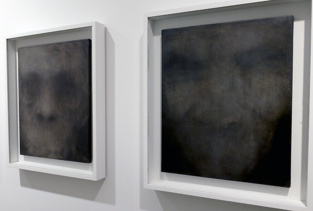
We discovered before leaving that a colleague of mine, UCS senior lecturer and photographer Mark Edwards, was part of an exhibition at Hestercombe House & Gardens in Somerset. Being only about an hour’s drive from where we were staying we decided to pay it a visit. The show is titled Double Take: Photography and the Garden, and features two other contemporary artist photographers alongside Edwards; Sarah Jones and Helen Sear. It also showcases photographs by landscape gardener Gertrude Jekyll’s, who alongside Edwin Lutyens, designed the Formal Garden and Victorian Terrace at Hestercombe. It is an interesting exhibition in that each artist takes a very different approach in responding to the theme of the garden. Jekyll’s beautiful black and white shots from the early 1900s record garden vistas, plants, and most interesting to me, the gardeners working either horticulturally or on hard landscaping. Although none of these were of Hestercombe, they all come from a collection of photos Jekyll took of her own garden at Munster House near Godalming.

Hestercombe Gardens by Jekyll and Lutyens © Nigel Ball
Edwards photography is a much longer process than the ‘shots’ by Jekyll, as he finds locations and returns to them repeatedly before photographing them. He often captures gardens that are about to revert back to nature, on the cusp of becoming overgrown or are overlooked and as a result, despite the fact they can appear as everyday scenes that in the flesh you may not take a second glance at, but as large scale prints they have an underlying sense of tension between nature and nurture. Sear’s work is much more manipulated which can lead the viewer to question whether they are actually looking at photographs—some appear as if ceramic tiles and others potentially paintings or tapestry. Jones’ work has a more menacing tonality to it with very dark backgrounds that focus the viewer in on, for example, a woman lying on a large tree branch, or to pick out the detail of a rose bush and thus forcing you to pay equal attention to the thorns and branches as you do to the flowers.
The show is part of Hestercombe’s programme of showcasing art in reclaimed spaces, and much of the gallery attached to the house is in a poor state of repair, clearly having been reclaimed from going into ruin just in time. This adds a temporal air to the whole show which creates an atmosphere that contrasts appropriately to the very orderly gardens outside. It also helps to echo the fact that gardens that aren’t continually tended, much like buildings left unmaintained, soon destroy themselves, a feature that is not lost as you look at some of Edwards work in particular.
Apologies for not showing any images of the exhibition to accompany this post, but I was so engrossed in the work that I neglected to take any of the work on the walls, (and I didn’t want to scan in images from the catalogue for copyright reasons). The show runs until 18 October 2015, and the £10 admission price includes access to the exhibition, gardens and house.

Claire and I had also planned to take a look at Bournemouth at sometime during the holiday, as I believed, (wrongly), that I had never been there. (As we drove part the Pavillion, I was reminded that I went to a conference there some 30 years ago!) Unfortunately we left this visit until our return journey back to Ipswich, so didn’t have time to mooch around the town as we wanted to take in the Alphonse Mucha exhibition at the Russell Coates House and Gallery before continuing our drive back to Suffolk.
The house itself is a visual overload—a clash of Victoriana and Art Nouveau—rammed as it is with paintings, furniture, garish carpets and ornate internal architectural mouldings. A feast for the eyes and a fascinating insight into the lives and tastes of yuppie hipsters of the day. As the Russell Coates websites states: “In 1901 Merton Russell-Cotes gave his wife Annie a dream house on a cliff-top, overlooking the sea. It was an extraordinary, extravagant birthday present – lavish, splendid, and with a touch of fantasy. They filled this exotic seaside villa with beautiful objects from their travels across the world, and lined the walls with a remarkable collection of British art, creating a unique atmosphere in a most dramatic setting.”

In many ways it is the perfect location for a Mucha exhibition outside of Paris, and the museum has done a good job of framing the entrance to the Mucha show with paintings that were contemporary to his work, thus informing the visitor of just what Mucha may have been influenced by. Once in the actual exhibition, (which you have to walk through the entire house to get to), there is a sense of calm after the visual overload you are subjected to beforehand.
I know Mucha’s work well, but what is impressive about this exhibition is actually seeing the life-size posters rather than reproductions in design books. Getting to see the work at this scale bought home to me once again just how important he was to the development of not just poster art but to Graphic Design, (poster art being the precursor trade before the concept of the ‘graphic designer’ emerged). His typographic excellence is something to be truly admired, and both his use of graphic architecture within an artwork to frame the subject/steer the viewer as well as his incorporation of type into the actual image must have appeared revolutionary in its day.

One thing that did strike me for the first time, seeing the work up close, was that in much of the early work he wasn’t particularly good at drawing facial features. In many pieces I felt there was a tentative hand at work when working in these areas whereas he displayed sheer confidence in figures, illustration, graphic patterns and typography. His execution improved as his techniques developed, but this difference was noticeable to me for the first time on looking at this early work at their intended size.
The exhibition isn’t large, it only occupies two rooms, but it does also include a video of his life, photography of some of his models which he would later draw from, and examples of packaging alongside preliminary sketches. All in all it is well worth a visit if you happen to be in the area and is on until 27 September 2015. The entrance fee is £5, (inclusive of house).

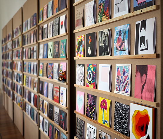
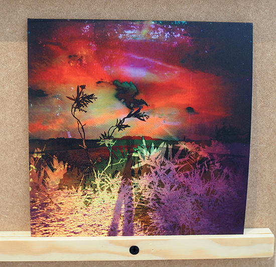
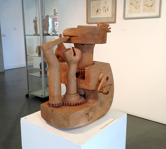
 The show opens to the public on 3 June in the UCS Arts Building, (weekdays 10:00–18:00; weekends 11:00–15:00), with the Private View on the evening of 2 June from 18:15–21:00.


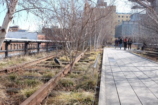
 Two days in to this New York trip with my colleague Russell Walker and UCS graphic design and illustration students and they’ve been busy ones. I can’t even try to imagine how many miles I’ve walked so far.