Archive

Architecture

imageTwo days in to this New York trip with my colleague Russell Walker and UCS graphic design and illustration students and they’ve been busy ones. I can’t even try to imagine how many miles I’ve walked so far.

The journey wasn’t without its problems, which I won’t go into here, but now we’ve settled in and are walking, walking, walking, and filling up memory card after memory card of photos. Here’s a few I’ve taken, with comments, while I manage to jump on Macy’s free wifi from my hotel room.

image

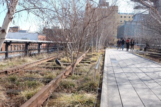
The first day I went to The Highline, an overhead deserted rail line that has been converted into a mile and a half long public park. It is absolutely stunning. Luckily the weather was excellent and it was a good choice of activity for the first day. It really helped me to feel embedded within New York as you get a real sense of location walking a few metres above the Avenues and Streets of this city and in amongst apartment blocks.

image

I was also very impressed with the honesty of the rubbish bins, labelling landfill waste as just that.

image

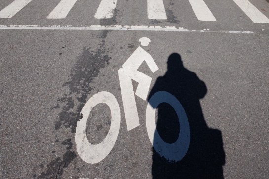
Other graphics that have impressed included this cycle path road sign with the addition of a cycling helmet. And no trip to New York for a graphic designer would be complete if it didn’t include some vernacular type spotting.

image

There have also been a plethora of Graphic Interruptions for me to record, such as this:

image

Today I went to The Guggenheim and saw an excellent Fischli & Weiss retrospective titled How To Work Better, and a Photo-poetics exhibition. The F&W exhibition opened my eyes to a lot of their work I hadn’t seen before, and I drew parallels between them and designers like Daniel Eatock, (as well as explaining to a few students I bumped into that the Honda ‘Cog’ ad ripped them off). With the photo exhibition I’ve found a few new names to research for my Masters, such as Erica Baum. Obviously though, it doesn’t really matter what is on at The Guggenheim as the building is stunning in itself and worth the entrance fee just to see the architecture.

I had planned to drop into MoMA on my way back to the hotel after visiting The Guggenheim, but having walked from the bottom of Central Park to the gallery and back, I was exhausted so jumped on a bus back to the hotel for afternoon tea. However, I did manage to get a few tourist shots in Central Park.

image

So as I write this I’m sitting in my very basic hotel room with a heater rattling away in the background, which at least helps to drown out the sounds of the street at night. Not that I’m getting much sleep, as while I hit the sack at a reasonable (US) hour, my body & brain seem to be colluding and waking me up in UK time, so sorry if this post is slightly uncoordinated and bitty. But I’m ploughing on regardless, and tomorrow I plan to take a boat trip around Manhatten Island that some of the students have done already and highly recommend. It’s predicted to be colder than today, (snow forecast for Friday), so I’m glad I packed some gloves because the camera will be out all the time.

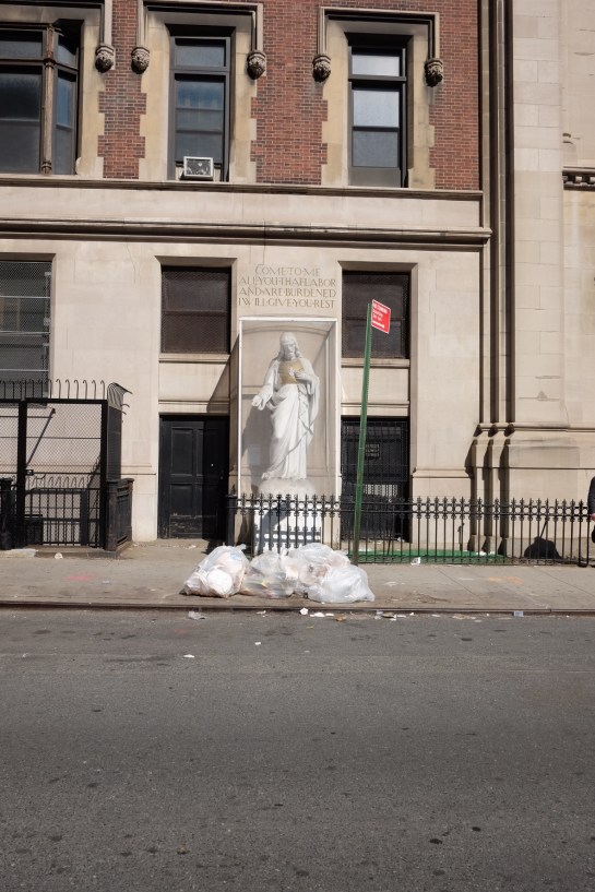
I’ll leave you with my favourite photo I’ve taken so far, a shrine to rubbish, but expect more to follow on Flickr once I’ve had a chance to go through everything in a few weeks time.

image

When walking the Victorian stroller pier in Swanage, as Claire and I did a week ago on our Dorset holiday, you could be forgiven for staring at the glorious sea-scapes out towards the Isle of Wight.

Fromthepier

The view from Swanage Pier out to the English Channel

But if you can tear yourself away from this beautiful vista for just a second and glance down at the planks you are walking on, you will discover thousands of memorial plaques.

Pier

Wrought-iron railings and memorial plaques

Set out in rows they are each very personal memorials, dedications or private jokes that are helping to pay for the maintenance of this Victorian structure.

Grid

The dedications are in the most part very personal and sometimes very touching. Other’s are comical or celebratory. The fact the pier is no longer used for its historical commercial function, (to load paddle steamers with Purbeck stone), and now is predominantly used for the pleasure of taking in sea-views and fresh air, makes the stories even more pertinent in my mind. This is neither a candy-floss and arcade games pier, nor one of busy tourist boat trippers—it is much more sedate for simple pleasures with loved ones or in solitude.

Grandad

Grandson and Granddad creating future memories

On the day we were there we saw one person cleaning his plaque, which with a sneak glance, revealed itself to be dedicated to his late dog. His current pet, whether a new addition to the family or not, sat patiently by his side. After he had finished polishing the brass, he tearfully hugged his four-legged companion in what was a truly touching sight. Our thoughts immediately went out to him, having lost so many pets ourselves over the years. While we might not choose to show our emotions so publicly, we certainly know the feelings this man must have been experiencing—that rawness of losing a loved one, whether human or animal, was bought home to us again in that instance.

Brasso

One man and his dog

I became fascinated with memorial benches a few years ago after I started to study them on a visit to Felixstowe, (see Flickr set here). I had previously not given these little brass rectangles much thought. But on this Felixstowe visit I saw a silver haired woman sitting on a bench staring out to sea and a realisation hit me: she may have sat there many times before with her partner. I suddenly felt the sense of loss I assumed she was feeling—all she had left was to sit there alone, remembering their life together. Obviously this is something I laid on top of what I was witnessing, and this may not have been her personal situation at all. But whether it was the truth or not, I was hit by how important such memorials could be in helping to remember the past, to respect departed loved ones, or simply to spend some personal time reflecting on life. Since then I have always taken the time to read an inscription on a bench whenever I come across one, weaving in my own voyeuristic narrative onto someone else’s personal experience recorded in such a public way. Walking up Swanage Pier I found myself doing exactly the same.

Waggy

Birthdays, dogs and newly weds

On Swanage Pier though, it is amazing the amount of different stories that present themselves to you as you stare down at the woodwork. What makes them so poignant is that they are tales that are common to all of us—we can appreciate the emotions attached as we relate these messages to our own experiences. Marriages, deaths, anniversaries, birthdays, dogs, friends, family, football teams, and private jokes that will remain lost to everyone else but those who bought the plaque. The sense of loss, celebration or the joy of a private joke creates an all embracing sense of humanity and that we aren’t all so different from each other.

Myturn

C’mon Matthew

There are even celebrities represented; this plaque from a BBC’s Britain At Risk programme made in 2011, (the B signifies the row, helping people to find their plaque), has John Craven and Jules Hudson leaving a dedication.

BBC

Craven image

Unfortunately I wasn’t able to find a video online of Britain at Risk to link here. However, I did find this fascinating documentary about the pier that features a 4 minute section purely about the plaques. It interviews the ‘plaque warden’ and some of the people who have bought them talking about their stories, and is well worth a watch.

So if you find yourself in the Purbeck area of Dorset, do take time out to visit Swanage Pier and read some of the messages beneath your feet. Touching and amusing alike, collectively they are themselves a memorial to the human need for reflection and remembrance. And if Claire and I have decided what we want on the plaque we’re planning to buy by then, you can search out ours and tweet me a picture.

I’ve been admiring St Andrew’s church in Felixstowe every time I have walked or driven past it for a while now. Today, I finally went out of my way to take a closer look, and some pictures.

OLYMPUS DIGITAL CAMERA

As a bit of a fan of concrete buildings my eye was drawn to St Andrew’s from afar, and as I got closer, it didn’t disappoint.

OLYMPUS DIGITAL CAMERA

I assumed correctly that it was built circa 1930, as there is an Art Deco essence to it with the gridded balustrades and sharp geometric corners. After my foray, I did a little bit of searching on the Internet and discovered St Andrew’s was completed in 1930–31 by Hilda Mason and Raymond Erith.

OLYMPUS DIGITAL CAMERA

OLYMPUS DIGITAL CAMERA

It is certainly an imposing figure, albeit one that has been softened by the Yew trees surrounding it. Interestingly, on closer inspection, you can see lots of other architectural influences. In the image below, if you replaced the concrete and pebble-dashing with timber beams & wattle and daub you would have what looked like a Tudor manor house.

OLYMPUS DIGITAL CAMERA

One of the most striking features in my opinion are the balustrades that top off the whole building giving a sense of a battlement or castle like structure.

OLYMPUS DIGITAL CAMERA

OLYMPUS DIGITAL CAMERA

OLYMPUS DIGITAL CAMERA

These Modern features, (for 1930), are then strangely augmented by more traditional big heavy oak doors.

OLYMPUS DIGITAL CAMERA

OLYMPUS DIGITAL CAMERA

A notable point that I’ve come across in my research is one of female architects and their associations with churches. In an article on the subject by Lynne Walker, St Andrew’s and Hilda Mason are featured extensively:

The tradition of women as patrons of ecclesiastical buildings goes back to at least the middle ages. In the nineteenth century, the design of churches, their furnishings and decoration were considered appropriate for women, especially if they were built as a memorial to a family member or associated with the professional activities of a male family member. The design of churches reinforced the idea of women’s supposedly superior moral and spiritual nature. Like the design of houses, it could be viewed as associated with private unpaid ‘ladies’ accomplishments’ which were comfortably within the domestic sphere.

With professionalisation, churches continued to be a building type which attracted women’s design activities. Experimentation with concrete was a pre-war Arts and Crafts adventure, but it became a hallmark of modernism. St. Andrew’s Church in Felixstowe was designed in reinforced concrete by Hilda Mason (1880- 1955) in collaboration with Raymond Erith.

The Architectural Review called it: “The only English Church built in concrete—this is, in which concrete is used otherwise than as a cheap substitute for stone”. The construction was concrete frame with steel rods providing the tensile strength and concrete slabs made on the site (cavity brickwork). It was a church which the Architect & Building News, and its architects, believed welded “a logical and straight forward use of material to the strong fifteenth century tradition of East Anglia, such as Dedham, Lavenham, and Blythburgh”, although the tower, an important element of the composition was unexecuted. Erith’s superb drawing skills were put to good use in producing a set of presentation drawings for parish consumption which made the concrete church look more like a Suffolk parish church than it would ever do again.

Not surprisingly perhaps this unexpected building got a rough ride from the Church Commissioners’ architects, but Architectural Review supported St. Andrew’s as a “brave experiment that has the merit of combining structural sincerity with a genuine English feeling.” Hilda Mason anticipated that a connection with the Perrett’s concrete Church of Notre Dame, Le Raincy (1922-3) was, and is, inevitable. She feared that this would increase the unpopularity of her own church by association with architecture which was too innovative, foreign and Catholic.

Hilda Mason’s other major work was completely modernist, Kings Knoll, 1933, Woodbridge, a house for herself in the International Style.

OLYMPUS DIGITAL CAMERA

This now Grade II listed building is a fascinating hodgepodge of styles, one that bravely predates by many years postmodernist architects willingness to mix historical styles which was so forbidden by hardline Modernists.


LynchI spent a very agreeable Saturday with my friend Liz a couple of week’s ago visiting various exhibitions in London. The main objective was to catch the Warhol, Burroughs and Lynch shows at The Photographers Gallery, but we also took in the Royal Academy’s Sensing Spaces, before making the unwise decision to take in the Portrait Gallery on the first sunny day of the year on a busy Saturday afternoon.

The Photography Gallery shows were a mixed bunch. I thought the Warhol exhibition was largely pointless, with the images being shown more because they were by Warhol rather than because there was anything inherently interesting in the photographs themselves. The only shots that really made sense to exhibit, in my opinion, were the ones where Warhol had repeat printed and stitched together creating gridded montages much like some of his screenprints. At least with these there was some tangible link to how he approached the physical production of other works of his. I also thought the Lynch show was boring. Photographs of abandoned and derelict buildings, albeit expertly shot, were dull in the extreme. In fact, I would go as far as to say they were pretentiously dull; shot entirely in black and white I felt he was trying too hard to create ‘art’, and it was all a bit like looking at a 1980s British Journal of Photography annual. However, well worth the entrance fee alone was the Burroughs show. Of the three, he was the only artist who gave the sense he was truly experimenting with the medium, testing and pushing the capabilities. And the shots themselves had a far stronger narrative. While Warhol was playing and Lynch was trying too hard, Burroughs was exploring a medium and seeing what it could do and what he could produce.

RADiébédoFrancisKéréOver at the Royal Academy the Sensing Spaces: Architecture Reimagined show was a blast. Each room had a different theme, and you were encouraged to be interactive with the work. As you walked around each exhibit created a different atmosphere in their given spaces which engaged the viewer and took them with the work. There could have been no more an explicit introduction to the uninitiated as to the power of architecture to influence moods and behaviour. For example, the image above of Diébedo Francis Kéré’s piece encouraged visitors to stick brightly coloured straws into the structure to create a furry, fun walkthrough. While the mausoleum  solemnness of Grafton Architects’ main room stopped people in their tracks, slowed them down and made them gape upwards in astonishment, (see below).

RAGrafton3And Pezo von Ellrichshausen’s monstrous wooden beauty could be climbed via a ramp or spiral staircases in the legs, which allowed a closer view of the Academy’s architectural gilding linking the imposing structure with the building that housed it and bringing a greater appreciation of everyone’s surroundings.

RAPezovonEllrichshausenWhile I wasn’t overly impressed with two of the shows at the Photography Gallery, I would still highly recommend a visit, and the Royal Academy is only a short 5-10 minute walk away, which would be a shame to miss while it is still on.

Warhol, Lynch and Burroughs is on at the Photographers Gallery until 30 March.

Sensing Spaces is on at the Royal Academy of arts until 6 April.

More photographs over on Flickr.

After reading the latest copy of Varoom the other day, I’ve really taken to Joe Caslin’s Our Nation’s Sons project which has just won a New Talent award from the Association of Illustrators.

Viewcraig-Street-575px

The project is aimed at repositioning the views of young men about themselves in a world of negative stereotypes. As Caslin puts it on his website: “As a nation we have pushed a significant number of our young men to the very edges of society and created within them feelings of neglect and apathy. It is now time to empower these young lads and give them a sense of belonging. I cannot fix the complex problems of apathy and disillusionment by simply sticking a drawing to a wall. However, I can create something more meaningful than any bureaucratic promise and generate a more positive social impact than many published articles, political broadcasts or speeches.”

At the centre of the project is the subject, in more ways than one—as Casiln explains when discussing the process of creating the work: “Find them, draw them, get them to stick them up”, and the positive power of this action on the participant/collaborators can clearly be heard in their voices in this video:


In watching the video it is refreshing to hear the observation of one of the lads involved: “When you’re walking around town you see these huge billboards with pictures of celebrities and models for big brands, it’ll be good just to see a giant image of a normal teenager”. This brings into question stereotypes beyond those of anti-social behaviour and challenges the perception that all teenagers are brand obsessed and incapable of decoding when they are being manipulated by advertising.

This project is a positive one on so many different levels, and it probably takes Caslin to sum it up best: “A drawing has the power to go further than words. But a 40ft drawing has the potential to resonate and disrupt the visual landscape of a city. It has the power to pull a passer-by from the mundane, the power to trend and the power to gain real social momentum. It will re-establish respect for and showcase the capabilities of our nation’s sons.”

The project has just recently moved from the streets of Edinburgh to Caslin’s native Ireland and the dramatic Achill-henge. Read here what the local news made of the project.


Follow Our Nation’s Sons on Facebook

It has been a bit of John Peel fortnight. Firstly, I got a call from a Shelia Ravenscroft regarding some tickets I had inquired about weeks ago. As the gig I wanted to go to had sold out in a matter of days, I had forgotten that I had left my number with the box office. On snapping up the tickets that had suddenly been found, and putting the phone down, Claire informed me that Shelia was in fact The Pig, as John Peel affectionately referred to his wife when broadcasting.

The tickets were to see Billy Bragg play Woody Guthrie songs at the newly formed John Peel Centre for Creative Arts in Stowmarket. It was a great evening, and as much a lecture about the life and times of Woody Guthrie as it was a concert. Bragg was in fine voice, and having seen him perform three time in the last 3 years, twice within a year, I can definitely state he is a better performer under a Tory government than he was under Gordon Brown’s administration. John Peel would have loved it.

The Centre itself holds a lot of promise. Still in development, the old Corn Exchange has only recently had accessible toilets plumbed in. As the Centre’s committee raise more money, they plan to put in a mezzanine floor for a cafe and rehearsal space for local bands, which will also help to improve the acoustics, as the roof is somewhat cavernous, albeit beautifully so.

My second brush with the man came when the archiving of John Peel’s record collection was announced. Initially focussing on vinyl LPs, this excited me no end, (despite meaning that the 7″ single I feature on that he played on his evening show in 1992 won’t be included). The mammoth task of alphabetically uploading 100 albums a week is a daunting one and I’m amazed they did all the ‘A’s in one go, expecting there to be more in his collection. However, it looks like the ‘B’s may take a little longer.

Disappointingly, the only tracks you can listen to are linked to Spotify, meaning that if you were hoping to hear again some obscure German techno artist you first heard on a Tuesday evening in 2001, you will probably be sorely disappointed. More exciting though, from the perspective of graphic design, is that all album artwork has been scanned, including inner sleeves. Unfortunately there isn’t a zoom function, which is frustrating, and the site works better on a desktop computer than on an iPad, but I feel churlish to complain too much considering that this historic document wouldn’t otherwise be accessible in any format.

My one big grumble though, is that the release dates of each disc aren’t featured.

For anyone who listened to John Peel’s late night shows, (or for a period in the 90s, his Saturday afternoon show), this will prove to be an enticing trip down memory lane. And as if to prove the point, David Stubbs’ trawl through the first 100 records in the collection, along with YouTube clips, is well worth a read over on Quietus.

And lastly, my final brush with Peel this week was on visiting some friends last night who were listening to Tom Ravencroft’s 6music show, on iPlayer, meaning it was one week old. It is kind of odd hearing old news repeated as if it were just breaking, especially the announcement of Adam Yauch’s death at regular intervals. I didn’t find out about Yauch’s death when it was announced last Friday evening, because that was when I was at the John Peel Centre listening to Billy Bragg. So last night I witnessed John Peel’s son, who’s voice and intonation spookily sound like that of his father’s, announcing the death of someone from a week ago, when I had actually been at his Dad’s legacy with his mother in the audience!

Strange, talk about augmented reality.

Saw this interesting For Sale/To Let sign in Ipswich yesterday. I’ve often seen adverts painted on the side of old buildings—faded through the ages and now referred to as ‘ghost typography’—but never an estate agent’s pitch. The ‘out of register’ effect is particularly intriguing.