Archive

Politics

Eardrum Buzz is an irregular Dubdog feature looking at key pieces of music that have altered my perception of exactly what music can be. See Eardrum Buzz (intro) for further context. All comments are highly subjective.
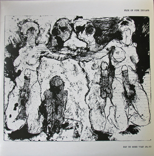
flux_of_pink_indians-the_fucking_cunts_treat_us_like_pricks

Title: The Fucking Cunts Treat Us Like Pricks
Author: Flux of Pink Indians
Label: Spiderleg Records
UK Release Year: 1984

2016 sees celebrations of the 40th anniversary of the birth of Punk with a very London centric focus. Halfway into the year and only a couple of months into the festivities, I am already sick of the sight of computer generated ransom lettering, dayglo colours and screened images. Don’t get me started on musical anthems from my youth being used in TV adverts—every time I see that McDonald’s / Buzzcocks’ advert I die a little inside.

But I was late to punk as a teenager, that was more my older brother’s era. I grew up with 2-Tone for my teenage rebellion, before getting into punk well after-the-fact. After getting into the first wave of punk bands several years from when they emerged, I fell for anarchopunk, as much for its political stance as its musical output. If I listen to much of that genre’s oeuvre today I find it embarrassing, but musically I still hold Crass and Flux of Pink Indians in high esteem. Both pushed the boundaries of what they did and challenged their fans to embrace more than just a three chord thrash with shouty animal rights lyrics. Their investigation into social and personal politics stretched to their craft—they were progressive, embracing free-jazz, noise, industrial, electronics, and in Flux’s case, dub and funk.

When, in 1985, I returned home after swapping 8 LPs I’d grown tired of at Colchester’s Parrot Records for Flux’s second album, little had prepared me for the assault my ears were about to receive. I assumed, very wrongly, I would be getting more of the same of their first release: Strive To Survive Causing The Least Suffering Possible. That was a concise metallic guitar/feedback thrash through shouty green anarchist lyrics, pithy and earnest with song titles such as: They Lie, We Die; We Don’t Want Your Progress; and Myxomatosis. It was sharp, to the point, aggressive and polemic. But as I had already fallen in love with the uncompromising artwork and title of their second album: The Fucking Pricks Treat Us Like Cunts, The Fucking Cunts Treat Us Like Pricks; I didn’t want the music to let me down.

My first impression, (after WTF have I swapped 8 LPs for?), was to ask myself whether I had a miss-pressing? The sound was muffled in places; the tracks didn’t seem to end but bled into each other; overdubbed electronic noises burst in and out; music stopped dead, punctuated with samples from different radio stations; the whole thing sounded like a complete racket. Which it is, of course. The first track  starts with feedback, electronic vibrating noises, then what sounds like the band playing live punches in with several people yelping ‘punk punk punk punk punk punk punk punk…’ The music/noise was as uncompromising as the artwork and title.

So in the spirit of these Eardrum Buzz posts, why have I picked this record out as changing my perspective of just what music can be? Firstly because it taught me the value of not rejecting something on first listen—I learned to love this record. Secondly because it was deliberately challenging and it shocked me out of my then musical complacencies. Thirdly because I got into its experimental nature. This, I thought, is what punk should be all about. Not because it is aggressive, but because it is attempting to explore new ground beyond the conventional, and anarcho-punk, like punk rock before it, had become conventional with their rockisms and formulas.

Fucking Pricks… is punk, sure, but it is also noise, industrial, jazz, and Dada. It is also extremely and unapologetically political. Sure, there are moments of pious preaching when the noise abates and you can make out spoken lyrics. This is as only anarchopunk bands can be, and this is what I have come to wince at when listening back to the genre’s cast. In Flux’s case these are the weaker elements against the sonic overload that is the rest of this album, and these wince-inducing parts become inconsequential against the rest of the musical onslaught. But all that that aside, in 1985 the record felt exciting and it got my heart racing.

As it transpires, on looking back, it was an important record for me. Later I would get into Tackhead’s industrial funk and more recently I’ve been listening to a lot of free-jazz, things I’m convinced this record paved the way for my ears to appreciate when the time came for me to discover them. Fucking Pricks… taught me to give things a second listen, it reaffirmed in me that anything can be music, and that the more you become familiar with something that you don’t first understand, the more it can reward your senses as you spend time with it.

What would I make of it today if I heard it for the first time? I don’t know, I expect I would find it sprawling and in need of editing and honing. But I would still recognise its challenging nature, its uncompromising and brave approach, and its sense of perversion. In listening back to it for the first time in years before writing this post, I thought of it in comparison with the Buzzcocks advert and the 40th anniversary of the first wave of punk that McDonald’s have jumped on. In thinking about this, Flux of Pink Indians need high praise indeed for making something that no corporation could ever appropriate.

Other interesting articles on The Fucking Pricks… :
Uncarved
Public Embarrassment Blues
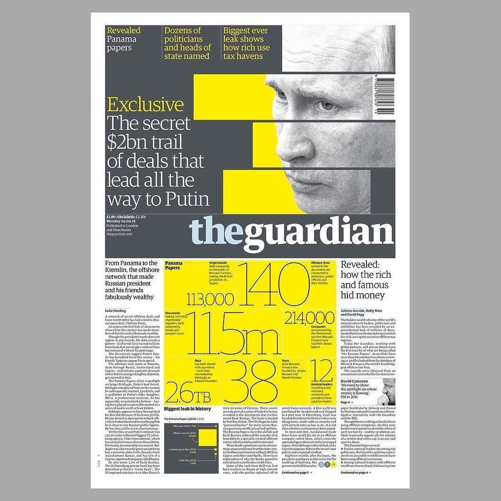
I’ve long believed the Guardian to be the best designed newspaper in the country, which is convenient for me considering some may think I fit the profile of a typical reader—feminist liberal-left vegetarian art teacher. It would be difficult for me to take if the Daily Mail fitted this design accolade.

But I like the Guardian for more than its graphic design; the fact its investigative journalism helps to keep in check those in power is equally as important to me, particularly in these days of party political impotence. Simon Jenkins summed this up well this week in From Snowden to Panama, all hail the power of the press during the breaking revelations about tax evasion.

But journalism with integrity isn’t enough on its own, just as great graphic design isn’t enough on its own. You have to be able to engage readers in your content or it won’t gain the attention it requires. And this is where the Guardian really sets itself apart from pretty much all other news vendors, (with the exception of Channel 4 News, albeit via a different medium). The marriage of purpose and presentation is given equal respect in this daily paper, and the approach is integrated across all of its platforms, from newsprint to website to app.

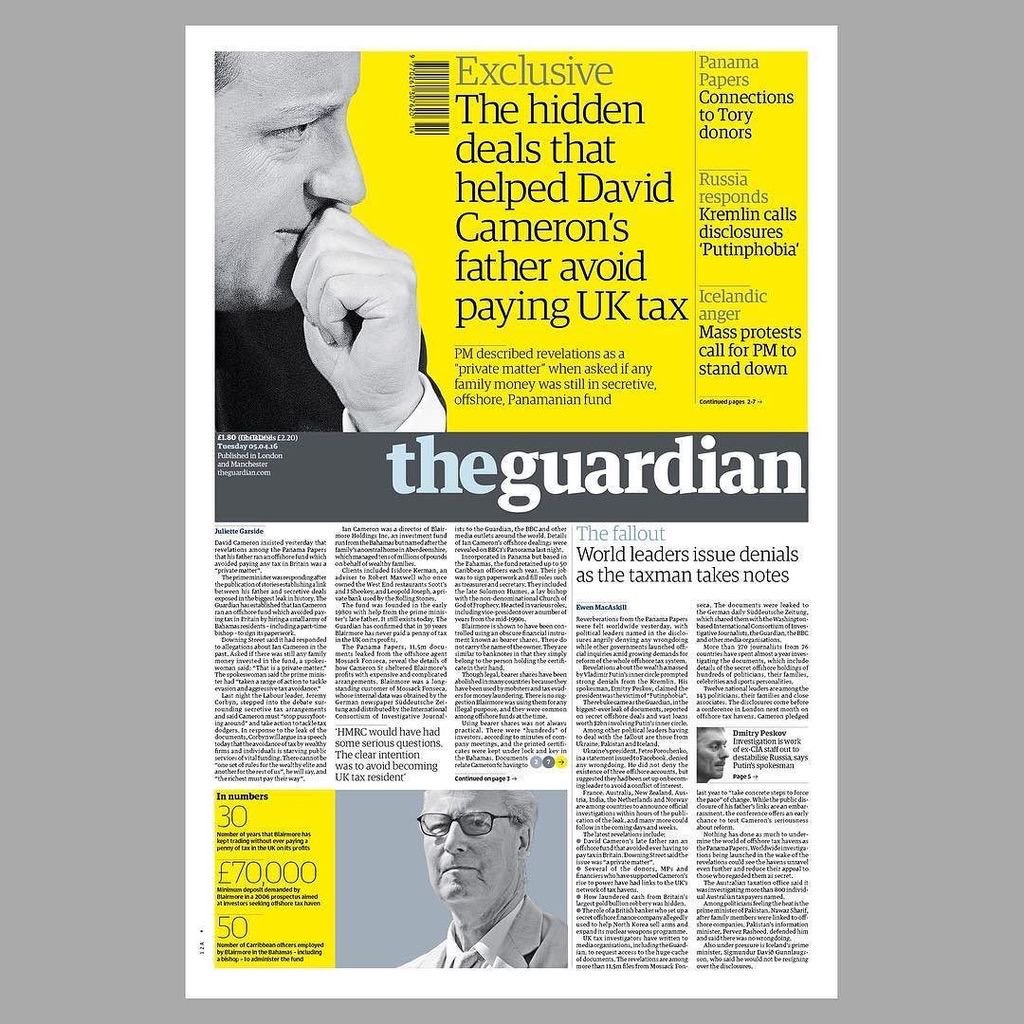
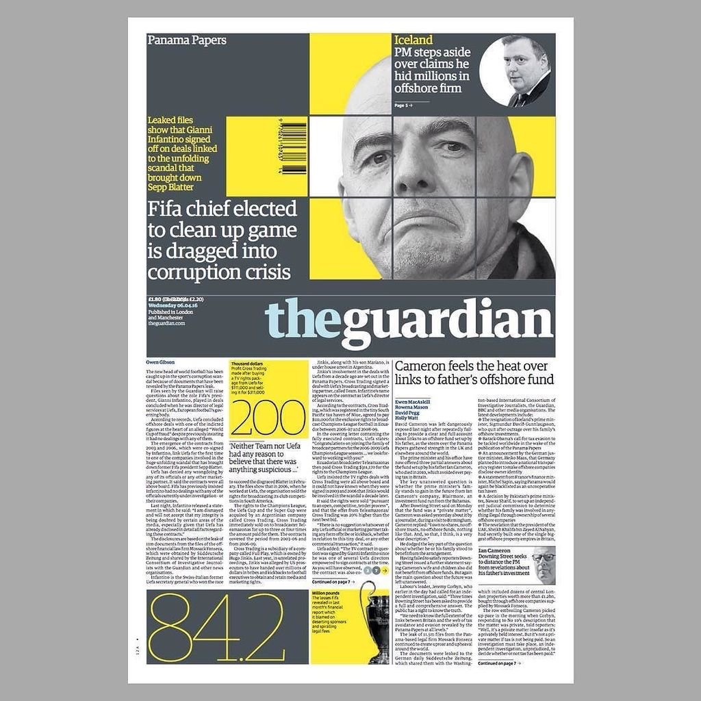
If anybody should need a case study to prove my point, the Panama Papers story this week should be a convincing one. Deputy Creative Director of the Guardian, Chris Clarke, tweeted the next day’s front page every evening, and there were many of his followers waiting for the reveal each night as the story broke, (and continued to break throughout the week). If the awkward adjective ‘impactful’ can be ascribed to anything, it is the design decisions the creative team at the Guardian took to grab their readership’s attention.

IMG_2792

Monday. Source: @chrisclarkcc

Monday’s front page was really brave, dropping the masthead from its usual position at the top to halfway down the page. All advertising was removed, and using the daffodil yellow to punch out of the grey, as Clarke’s choice of a ‘punching fist’ emoticon to accompany his tweets accurately indicated, had real visual impact to match the world leader shaking story.

And the approach continued all week:

IMG_2791

Tuesday. Source: @chrisclarkecc

IMG_2793

Wednesday. Source: @chrisclarkecc

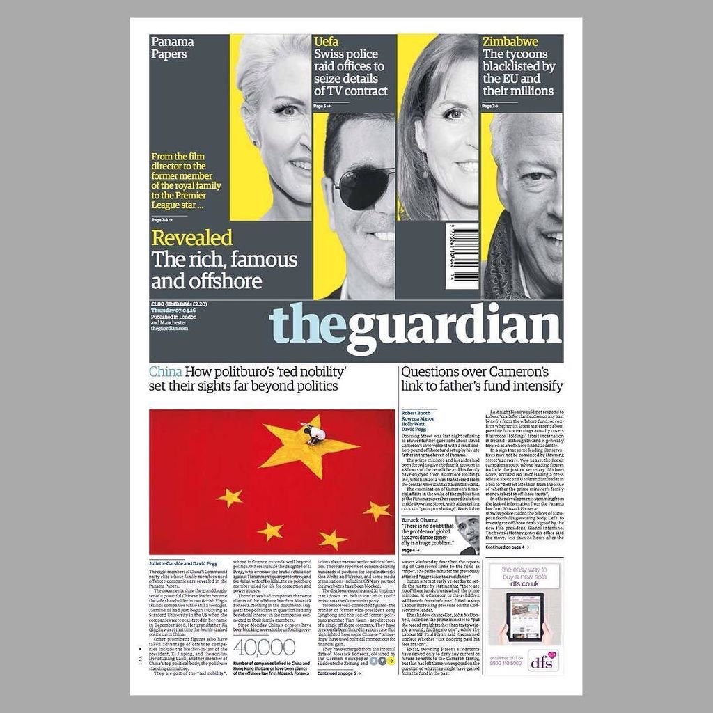
It is not until Thursday that advertising crept back onto the front page, and then it was cornered and given bottom billing:

IMG_2794

Thursday. Source: @chrisclarkecc

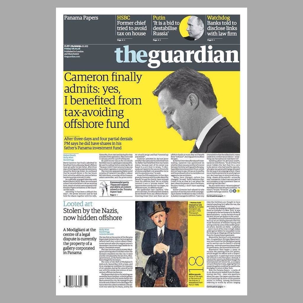
On Friday the masthead resumed its usual position at the top of the paper, no longer taking second billing to the story, but the visual language deployed stayed the same—dramatic, powerful and as attention grabbing as the headline. Again, like Monday through Wednesday, Friday sees the front devoid of advertising:

IMG_2803

Friday. Source: @chrisclarkecc

IMG_2795

iPhone app: the visual approach worked across platforms

I would be very surprised if both the Guardian’s journalistic and graphic design approaches from this week’s editions does not win them awards in their respective fields—they rightfully should.


DSCF3376

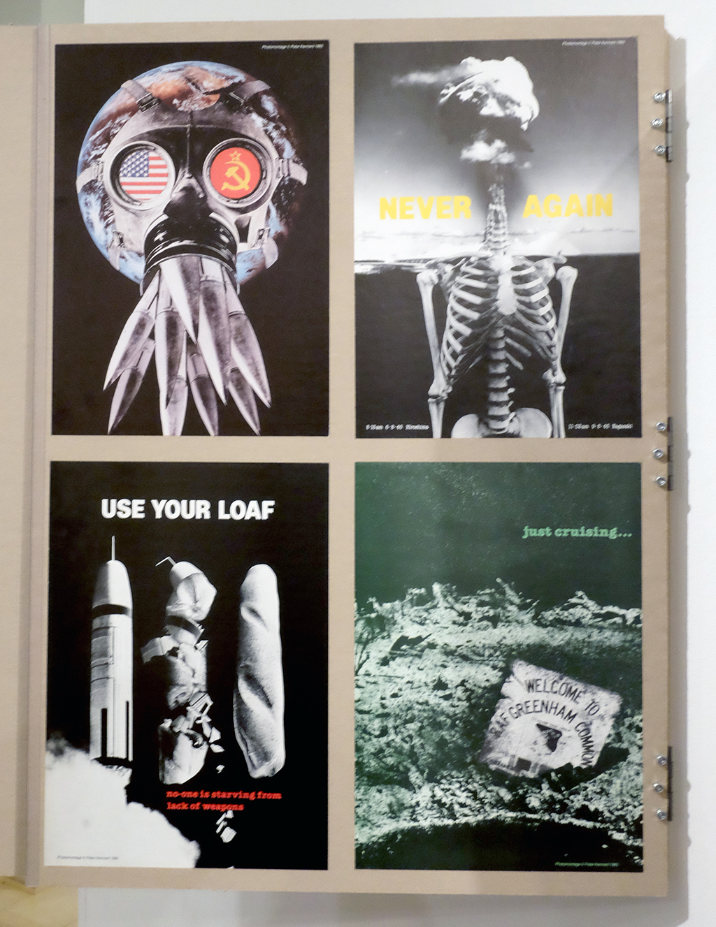
In my teens in the 1980s, as I was becoming politically aware and active, (going on CND demonstrations and reading radical publications), it is difficult for me not to be very familiar with the work of Peter Kennard. I think I must have held several of his images in my hands as placards and certainly stuck some of his photomontages on my bedroom wall torn from pages in lefty rags. When I heard he was having a retrospective at the Imperial War Museum, titled Unofficial War Artist, I debated whether I should go or not, thinking that I knew what I would get and worried about it being an exercise in personal nostalgia. It wasn’t until I read Art-e-facts’ review of her several visits to the show that I decided to go, and without a shadow of a doubt it blew me away, (no pun intended).

DSCF3390

From the outset it was refreshing to see an exhibition with both process and application on show, as you can see below in the anti-apartheid image for The Guardian.

DSCF3384

DSCF3385

It was equally good to see some sketchbook work that wasn’t ever applied.

DSCF3387

The skilfulness of Kennard’s photomontage is without question. There is an assured confidence and directness in his visual metaphors that makes them work with little-to-no text. His use of imagery isn’t subtle, but then neither are the effects of war. In that respect Kennard’s work creates a powerful message that hits its target again and again. Regardless of this skilfulness of technique, it is amazing that one man can find so many ways to keep attacking power-mongers’ lust for weaponry. For all of Kennard’s sheer determination we should have seen the back of nuclear weapons years ago, and it seems unfathomable to me that Jeremy Corbyn is criticised in 2015 for coming out saying he would not press the nuclear button, but I digress.

Up until I saw the show, what I knew of Kennard’s output was largely confined to his ‘Thatcher’ period. Before attending I considered what it is to be so defined by an era, just as John Heartfield was to the 1930s and Jamie Ried was to the mid-late 1970s. As the 80s moved to the 90s it isn’t surprising that Kennard became somewhat dejected, stating: “a mixture of personal experience, disillusion with organised politics and the use of the media of innumerable digital photomontages,” caused him to, “question the effectiveness of photomontage as a critical, social probe”, (exhibition panel.) Imagine coming to the realisation that such dedication of energy doesn’t appear to have actually won any battles and that the ‘opposition’ then adopt your mechanisms of protest for their own ends. While you could call any faith in art being able to change the world naive, with Kennard you need to remember that he cut his political teeth on the student protests of the late 1960s, when a different world really did seem possible.

DSCF3388

Not knowing much of his work past the 1980s, (save for the infamous Blair Photo-op), it was what Kennard did following this period that really blew me away as he started making work that was even more powerful, direct, and particularly brutal.

DSCF3399

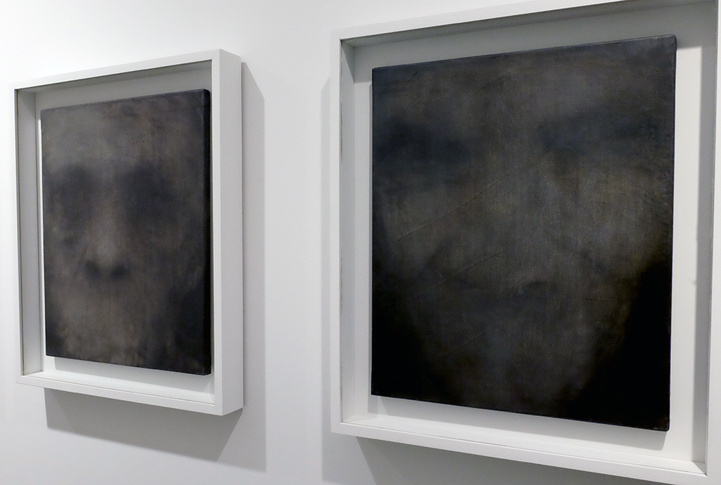
From the large eyes staring out at you from the Reading Room exhibit, and the hands clawing at newspaper columns, you sense humanity grasping and pleading for some sanity in a world full of marginalised desperate people. Then a corridor of paintings suduces you in with ghostly portraits that stop you in your tracks as their mouthless, thus voiceless, apparitions stare back at you. I was stunned into silence also by their power.

DSCF3398

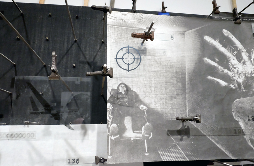
And all this before you enter the room with his most recent work, The Boardroom, an ongoing project of Kennard’s that revisits photomontage but in a 3D space. This room is not for the faint-hearted—the imagery is particularly brutal while equations and statistics about war, hunger and poverty adorn the handrails you just might need to cling to in order to steady yourself against the visual onslaught.

DSCF3409

DSCF3416

DSCF3405

No photograph can do justice to this room—it is truly powerful stuff. If you do not feel emotionally affected by its overload of the injustices of war then you either do not have a soul, or you are a government minister.

DSCF3407

The statistics displayed are as equally an important element of the work as the visuals are. In the exhibition’s accompanying book, Kennard states: “I realise the seed for the idea…was actually planted a quarter of a century ago, … I made a speech at the UN to open my exhibition that began with a series of numbers I heard from Dr Hiroshi Nakajima, Director General of the World Health Organisation. I recounted in the speech how these numbers had been haunting me. For one billion dollars, he had said, or the cost of 20 modern military planes, the world could control illnesses that kill 11 million children every year in the developing world. At that moment, I saw that the connection between children needlessly dying from illness and bloated military spending was concealed in our society; the numbers that are the foundation of our modern world”. (2015, Kennard, IWM.) That phrase is worth repeating as you look at the image below: the numbers are the foundation of the modern world.

Untitled-2

On leaving the exhibition and reflecting on the necessary brutality of The Boardroom, I thought of the bravery of the Imperial War Museum to commission this exhibition. It continues until May 2016, and I hope that when it is taken down, the museum consider making this last room a permanent exhibition in their collection.

Peter Kennard: Unofficial War Artist is free: go see.

WCountry_Cover

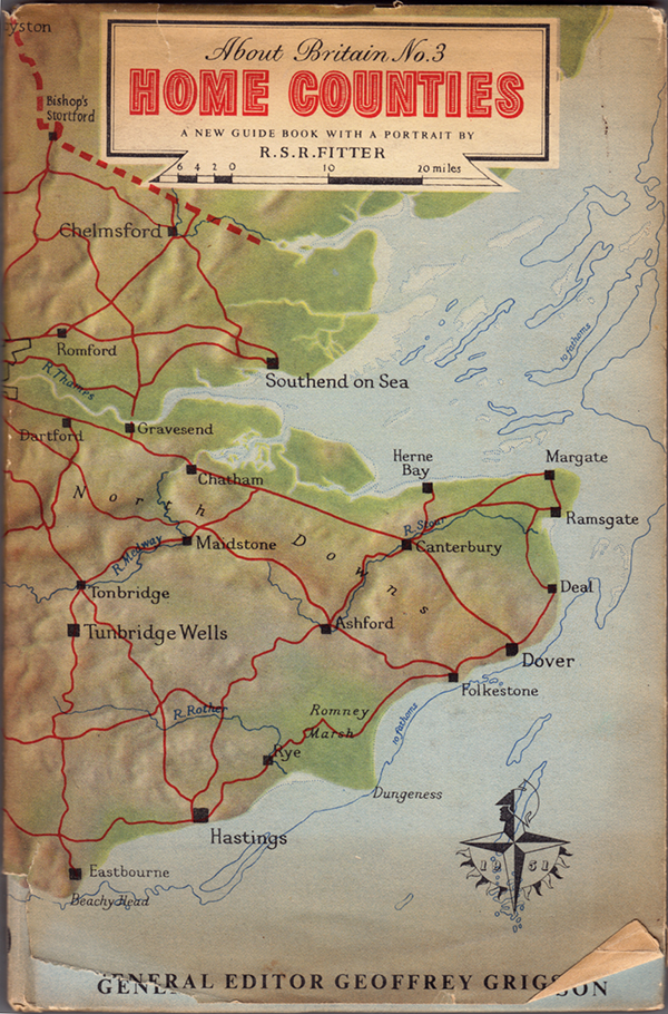
A few years ago I wrote an article for Eye magazine blog after coming across a programme for the 1951 Festival of Britain. At the time I was aware of the existence of a series of small guide-books published to coincide with the festival called About Britain, but it was only recently that I actually came across any.
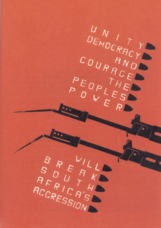
There were 13 of these books published covering different regions of Britain. The two that I’ve been lucky enough to find cover the West Country and Home Counties. The latter is more fascinating to me being more familiar with the areas discussed within. As the inside dust jacket cover states: “These books are guides to the living Britain, covering the whole country, England, Wales, Scotland and Northern Ireland. Each is a guide to a well-defined district, planned to give you the fundamental facts about its scenery, its monuments, its buildings, its natural history, its people and their work and characteristics.”

HCounties_Cover

The covers feature maps of the region, both as a hard-case wrap and as a dust jacket. The fact the map was printed on both case and jacket allowed the owner of the book to remove the jacket and use it for reference while reading, as the inside back cover of the Home Counties edition explains, (below). Whether this was a deliberate design decision or some clever post-rationalisation will never be known, but it is still a great idea.

HCounties_InsideBackCover

Naturally the books at first glance seem somewhat dated. However, there is a real sense of optimism and forward thinking in regard to the contents once you consider the context within which these were published. These are meant to be egalitarian and easily accessible by all to instil a sense of pride in our nation, and encourage the reader of better times to come as the country shook off the last vestiges of the Second World War.

HCounties_Ford

Featured inside are stories of emerging industries, as can be seen in the spread above about Ford. However, I’m not sure how the residents of Canvey Island or Peacehaven would react to where they lived as being described as “unplanned calamities”. Alongside such articles were stories of traditional farming methods, town planning, historical features and natural wonders.

Also published in these guides were tours of local areas with maps you could follow by car, bus or bike, clearly aimed at the working classes taking time out to visit the country and thus encouraging an emerging tourist industry.

HCounties_TheTours

HCounties_Tour

Some aspects are seen as very antiquated, such as the description of Londoners’ characteristics: “his steadiness, humour, independence and attitude to authority…His loyalty to the ruler he approves is unbounded, and he likes to show it on Royal occasions.” Many republicans of today would disagree with such cap doffing, and further dating the writing, you have to remind yourself of the times when noticing the inherent sexism within the text. That, and references to empire aside, there is a refreshing regard to immigration: “London welcomes strangers of all countries and all colours, whether they seek refuge as exiles, come to work or come to play.” UKIP take note, the Britain in the 1950s you would wish us to return to was more forward thinking than you would have us believe.

HCounties_Londoners

HCounties_Welcome

The openness and forward thinking is evident throughout as Britain looked to escape the war years and propel itself into the 1950s. It had a plan to rebuild itself, reject the austerity of rationing and launch into a new era of rebuilding a country that worked for its inhabitants. As the opening chapter states:

“This guide-book is one of a series ‘About Britain,’ so we hope, in a new way…it begins with a portrait of the district—an account of many of the facts about it which are worth knowing…  These guides have been prompted by the Festival of Britain. The Festival shows how the British people, with their energy and natural resources, contribute to civilisation. So the guide-books as well celebrate a European country alert, ready for the future, and strengthened by a tradition which you can see in its remarkable monuments and products of history and even pre-history. If the country includes Birmingham, Glasgow or Belfast, it includes Stonehenge. If it contains Durham Cathedral, it contains coal mines, iron foundries, and the newest factories devising all the goods of a developing civilisation.”

Reading through these guide-books in the last three weeks of a General Election in this country—one that is caged in the terminology of austerity, cuts, Europe and immigration; one that seeks to blame, point fingers, build walls and retract in on itself—I am reminded of the feelings I had when I first read the official Festival of Britain programme that compelled me to write my Eye piece. And that is if politicians in the late 1940s/early 1950s could envisage emerging from such a financial disaster as the Second world War, looking forward and having hope for the future, why can’t they today? For the Festival of Britain organisers, their take on the world wasn’t one of austerity and boarders, blaming those worst off while appeasing financiers; theirs was a vision of everyone working together for the benefit of all. Something I believe that many of our current crop of politicians could do well to learn from.

Quaint maybe, ambitious certainly, but if history teaches us anything, it teaches us that these visionaries achieved their goals; for this is the era that gave us public services such as the NHS and much of the infrastructure that has supported us for the last 63 years. Will the decisions of the next government have such a huge impact on our way of life and our culture? Only negatively I fear.

Cover

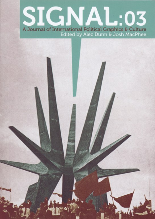
It seems somewhat ironic that a journal called Signal should pass me by, again. I wrote about the first two issues here in 2012. I can’t remember what, but something pricked my memory of the journal a couple of weeks ago and I went searching for the publication again only to find that issue three was released nearly a year ago with the forth due out this coming May. I quickly ordered Signal:03 and it doesn’t disappoint.

IMG_0001

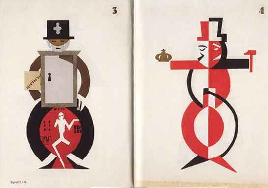
Once again, what I’m genuinely impressed about with this publication is its breadth. The level of research done by the contributors is impressive and there is a sense of importance given to documenting/archiving social design stories that otherwise would be lost in the midst of time. For example, the image above is from a comical anarchist publication from Brussels in the 1930s. Titled: Game of Massacre: 12 Figures Looking for a Ball, the article explains this Aunt Sally type parlour game, created by Fred Deltor, (aka Frederico Antonio Carasso, 1899–1969), that enables you to cut-out various puppet figures, such as The Military, Property, Fascism, Religion etc, in order that you can throw balls at them. Included in the game was a mock cut-out theatre to set the figures in, and a ball, along with descriptions of the puppets. The above were described thus: (3) “Philanthropy has a chest in the form of a bank vault full of cash and tosses a single coin toward a cadaverous figure (lacking an arm and a leg) in from of a hospital”; and (4) “Social democracy is a two-faced figure who wields the attributes of both royalty and communism”. In uncovering the original publication, Stephen Goddard says: “Stylistically Carasso’s figures betray a knowledge of many of the important international impulses associated with progressive art organisations, periodicals, and movements of the 1920s, such as DeStijl, Het Oversight, Constructivism, and…Agit-prop.”

Signal reprints the preface to the game with a translation which states: “This is the game of massacre. Come! … Here it is, the opulent collection of royal, imperial, and devine puppets, that control you as they wish, you poor crowd, and who, by tragic reversal of roles, pull, from one to the other, the strings of your poor destiny.” Who says that anarchists don’t have a sense of humour?

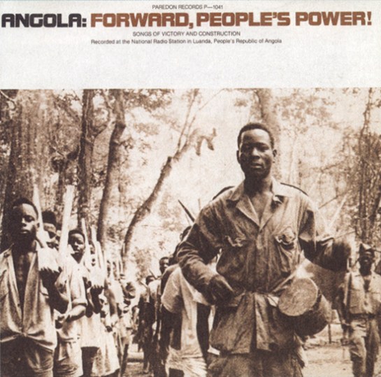
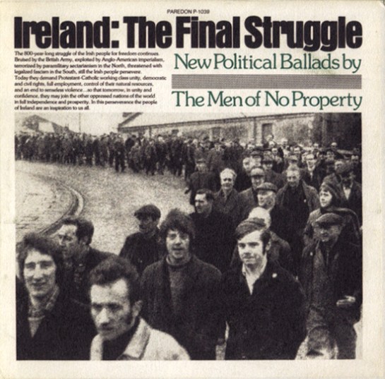
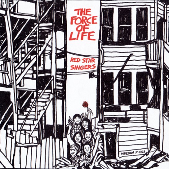
Like the previous two editions of Signal, issue three mixes historical and contemporary struggles and their associated graphics. So alongside an article on student led strikes in Québec in September 2012, you find the story of the incredible Barbara Dane, co-founder of Paredon Records. Between 1969 and 1985 Dane tried to document revolutionary music being made around the world and in an interview with Alec Dunn and Eric Yanke, she describes how she’d go from country to country recording different musicians and singers and return to the States to release them. In the space of 16 years, Paredon Records, with very little budget, released recordings from Vietnam, Salvador, Puerto Rico, Cuba, Northern Ireland, Ecuador, Italy, Britain, Angola, Chile, Greece, Thailand and a host of other countries. Of the sleeves, she says: “If you look at the records, they’re 12″ x 12″ on the front and then fold around about 5 inches on the back. It was done this way so they could print four at once, four-up on a single sheet of paper…At this printer, what dictated what you could do was economics… And so you figure out things like one color has read, the other blue, so then third cover can have purple. You figure out how to work with two colors, matte paper, that size.”

Record2

1978, design Ronald Clyne

Record1

1975, design by Ronald Clyne

Asking Dane about working with the designer Ronald Clyne, she says: ” If you caught him at the right time of day, before he drank too much wine, he was very very clever about what he did. You can see that he could take any kind of photo, work with it, and make it meaningful and not destroy the meaning of it. And always, his forte was selection of type and layout and all that. I’d bring him basic tools, the basic elements, photos and also drawings from artists I’d met.”

Record3

1975, design by Ronald Clyne

Record4

1974, cover art by Jane Norling

If Barbara Dane wasn’t inspirational enough, Signal:03 publishes an article by Ropbert Burghardt and Gal Kirn on the former Yugoslavia monuments to anti-fascism and revolution. These impressive and often modernist brutal memorials, built between 1945 and 1990, litter what is now split into seven different nations. The authors state: “These monuments are not only modernist, but contain as unique typology: monumental, symbolic (fists, stars, hands, wings, flowers, rocks), bold (and often structurally daring), otherworldly and fantastic. … Instead of formally addressing suffering, these memorial sites incite universal gestures of reconciliation, resistance, and progress…for those that encounter them, they remain highly imaginative objects: they could be ambassadors from far-away stars, witnesses of an unrealised future, historical spectres that haunt the present.”

Y_Mon4

Y_Mon3

Some have been landscaped and provide opportunities for family days out with cafes and play areas. Some are more formal monuments that you can enter, such as the one above in Kozara, while others you happen upon in the middle of nowhere. Started as a way of remembering the second world war, they were initially built spontaneously by local artisans. And if the guidebook to them printed in Signal is anything to go by, there is a vast amount of these monuments dotted around the region, with a map stating over 200 locations, (although many have been destroyed or decayed).

Y_Mon2

Y_Mon1

Once again I am truly impressed by Signal. Its historical importance stretches across many areas including art, design, architecture, music, politics, protest and social history. And although this could be seen as a research journal, it is easily accessible for those who are just generally interested in the topics it covers, students, scholars and armchair revolutionaries alike. I’m already looking forward to the forth edition due in May.

Signal:03 is available to buy from PM Press for $14.95

SA

image

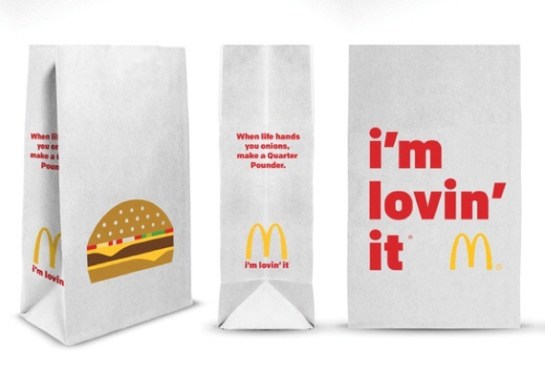
Vector illustration and chunky lower case type make for the new look reductive graphics adorning McDonald’s take away packaging. Created by Leo Burnett design agancy in Chicago, (I’m currently unsure if this packaging has made it to the UK yet), it appears to be another opportunity missed.

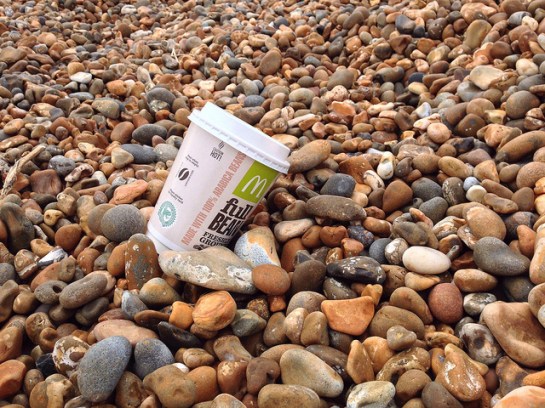
I think it’s fair to say that McDonald’s has an image problem. Well, it has many image problems actually, but I’m specifically talking about the one that glares at us all from roadside gutters and courtryside hedgerows. Any repeat visitors to Dubdog will know that I’m talking litter, a particular bugbear of mine. The world over, McDonald’s is the top brand, or one of the top brands, found on fast food litter, (see this report from Australia, and this from the USA, and this by the UK’s Keep Britian Tidy). I first noticed it some 14 years ago and it prompted my McJunk project. McJunk was an exploration into the relationship between graphic design and disposable culture through a photographic study of McDonald’s litter, (download the introduction to the McJunk photobook as a PDF from here, or visit the McJunk website).

Discovering this new McDonald’s packaging today prompted me to hunt around the Internet for current research into littering and I found some key reports by Keep Britain Tidy, ( * links at bottom of post). In these I came across two specific points of interest that relate to my own graphic design related research:

  • Firstly: through focus group discussions it is claimed that people would be less likely to buy a brand that they saw being littered. While this could be one of a whole host of reasons why McDonald’s had a bad year in 2014, I’m somewhat sceptical—what someone states in a focus group in the company of others is not necessarily the reality of what they actually do. But even if this were true, and it makes business sense to take seriously such market research, you would have thought McDonald’s would take note and try to do more to convince people not to litter;
  • Secondly: many of those surveyed by Keep Britain Tidy stated that they thought the Tidyman logo made little difference to people’s littering habits. This I can well believe. Usually sidelined within any graphic design hierarchy—often on the bottom of any packet—as iconic as I think Tidyman is, the Keep Britain Tidy report suggests that as a nation we have become used to it if indeed we notice it at all.

And herein lies my major problem with this McDonald’s redesign. When the graphics applied to something do not affect whether someone is going to buy a product or not—McDonald’s takeaways are not bought off a shelf; you don’t see the packaging until a BigMac has been ordered, ‘cooked’ and handed over—graphics are technically not needed for marketing purposes. They are usually only there to encourage brand recognition or as decoration. Therefore, if you rethought the side of a take away bag, there is a perfect opportunity for McDonald’s to challenge their litter problem by educating consumers through graphic design. But alas McDonald’s chose not to take this opportunity.

As mentioned in one of the Keep Britian Tidy reports that I read, it is a depressing thought that litter problems will only get worse over the coming years with further public sector cuts. Such cuts mean local councils have to decide what services to shelve, and I suspect many authorities will rightly decide important issues such as social care trump litter patrols. And unfortunately public sector cuts are likely to continue. For regardless of who wins the UK general election this year, both Labour and Conservative have declared their intentions to continue with these cuts. Even if we have another coalition government come May, which is the most likely scenario, one of these two parties is likely to hold the balance of power.

A couple of years ago I put McJunk on a hiatus. With this new packaging launch and after reading several Keep Britian Tidy reports, it looks like it might be time to resurrect the project.

10105410934_ff578b3723_z

McJunk, as found, on Shingle Street beach, Suffolk. Pre-2015 redesign.

Keep Britain Tidy 2013 Litter Report 

Keep Britain Tidy 2013: When it comes to litter, which side of the fence are you on report findings

PearShaped

When Occupy Design UK put out a call last week for Crisis Graphics in protest against climate change I immediately knew what I was going to submit—a reworked version of my 2002 piece Pear Shaped.

Originally created for a People Tree design competition, for which it won an award, I was never really happy with the typography. Occupy Design’s call gave me the opportunity to rework it, channelling a typographic treatment I liked in a piece of work by Ivan Chermayeff that I first saw at his Cut and Paste retrospective last year, (see Holiday exhibitioning pt 1). I’m not usually one for returning to my past creations but Pear Shaped suited the cause and recycling an old idea seemed appropriate. It is, however, an inditement of the lack of progress on climate change that an image created 13 years ago is still relevant today.

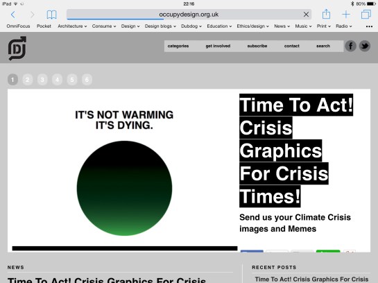
Occupy Design UK’s aim is to create an ‘Agit-Prop Army’ of images for the Time to Act on Climate Change protest in London on 7 March 2015. Time to Act’s intention is to put pressure on political parties to consider the environment in the run-up to the general election in the UK in May, with a further aim to build towards the COP21 UN Climate Summit being held in Paris in December.

Occupy Design UK’s call for Crisis Graphics.

image

Occupy Design UK is calling for posters and memes to support a day of action on climate change on 7 March.

They say on their website: “The demonstration on March 7th aims to put pressure on political parties before the general election, and raise the profile of climate change. It is also intended to energise and strengthen the climate movement – not an end-point but a stepping stone, it will be followed by local action immediately before the general election, the Climate Coalition lobby of Parliament in June and planning throughout 2015 towards the crucial Paris.”

On the call for images, they say: “We want your Posters and Memes for the Movement to use as an Agit-Prop Army of images to bolster the campaign on the streets and on the Net throughout the year.”

For more details, check out Occupy Design UK’s website here.

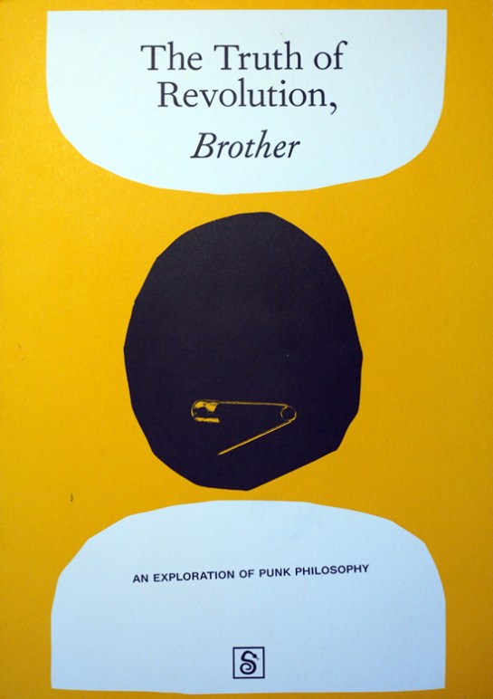
You could argue the need for yet another publication about punk. The ‘1976 and all that’ narrative has been told so often now that it reads like a dull pantomime with all original relevance of the story bled dry through over telling. There have been some publications in the last few years that have gone beyond this nostalgic rehash, such as 2012’s excellent Punk: An Aesthetic, but recently published The Truth of Revolution, Brother: An Exploration of Punk Philosophy (Situation Press) focusses, as the title says, on an area of the punk phenomenon that has largely been ignored.

OLYMPUS DIGITAL CAMERA

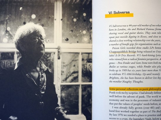
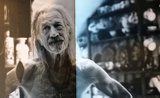
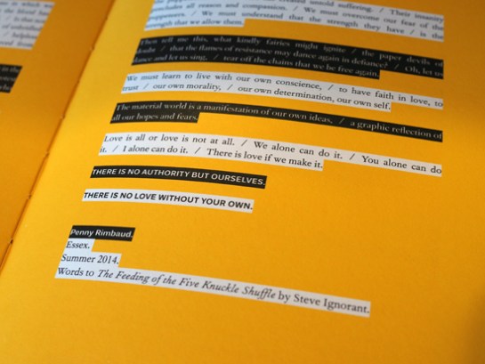
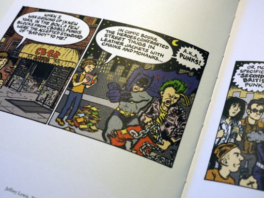
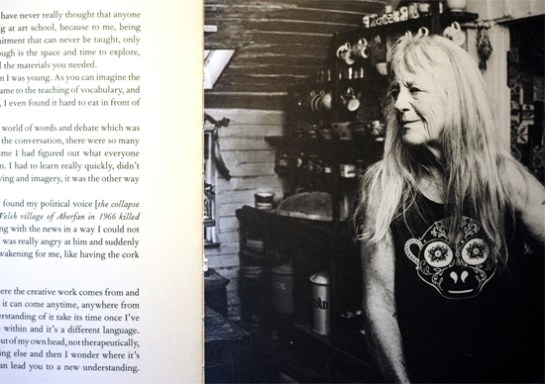
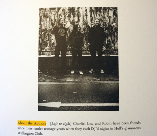
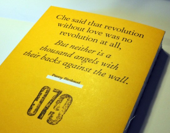
Produced by Lisa Sofia, Robin Ryde and Charlie Waterhouse, The Truth of Revolution, Brother, taking its title from a lyric by UK’s Crass, mostly examines second and third generation punks that took the early rebellious attitude and DIY beliefs and formed life philosophies of them. The UK anarcho-punk scene is more of a starting point for many of the very personal stories told throughout to book, and specifically Crass are cited by many as being influential to their world view. But this book is much more expansive than that as the authors travelled the globe to interview those they thought carried the spirit of ‘Do It Yourself’ and who looked for alternatives to accepted societal belief systems. Interviews with Crass‘ Penny Rimbaud, Steve Ignorant and Gee Vaucher, Subhumans’ Dick Lucas and the Poison Girls’ Vi Subversa tell the tale of alternative living and libertarian leanings in the UK. What punk meant to those on the other side of the Atlantic is represented by American comic book author and singer songwriter Jeffrey Lewis, producer / musician Steve Albini, straight-edge pioneer and Fugazi guitarist Ian MacKaye and Dead Kennedys‘ Jello Biafra.

OLYMPUS DIGITAL CAMERA

OLYMPUS DIGITAL CAMERA

Penny Rimbaud

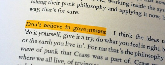
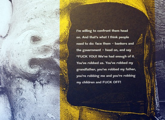
Similar themes emerge throughout the different interviews, from being anti-war to championing vegetarianism, from environmental concerns to resolutely rejecting the ideology of government and control. While this may be a book about philosophy, personal politics and taking responsibility for your own actions is really at its heart.

OLYMPUS DIGITAL CAMERA

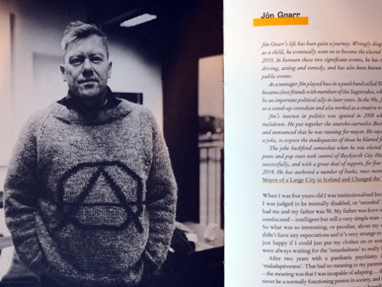
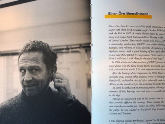
It is incredible to see what impact a small music scene from the UK, (in anarcho-punk), has had globally, for this isn’t just a tale of Anglo-American agit-prop. Einar Örn Benediktsson, (from Iceland’s The Sugarcubes), and Jón Gnarr formed the Best Party as a protest against Iceland’s 2008 economic crash which resulted in Gnarr becoming Major of Reykjavik in 2010—both cite punk as major influences on their attitude to politics. When it was set up the Best Party declared it would dissolve itself and as a result, after 4 years in power, Gnarr stepped down as Mayor this year after successfully running the city on anarchist principles. Benediktsson, who was a City Councillor says: “I’m an anarchist and people say, ‘But you’re not an anarchist because you work within the system. You are part of the system now’. Okay, I may be part of the system, but what I learned through punk was to listen and to take on board ideas, to try to understand and not make up my mind that things should be only one way.” After also stepping down after his first term, he goes on to say: “I don’t want the power. It’s not mine to own. It is everybody else’s so please, please come in, use it, be part of it because it’s ours to share, to feel good. I don’t think it’s naïve to say it.”

OLYMPUS DIGITAL CAMERA

OLYMPUS DIGITAL CAMERA

The interviews running throughout the book are interspersed with topic heading such as Disruption; Construction; Distraction; Creation; and The Dark Side of Punk as monikers to discuss different philosophical attitudes that emanated from punk. Anarchy as a political theory and personal practice is interwoven throughout, and shining through all the interviews and discussions is a positive attitude to humanity and wanting to make life better firstly through self-determination and secondly through not wanting to rip others off. As a result, at the heart of this is a very humanist world view, one that believes living by a personal set of principles is as important as trying to shake things up.

OLYMPUS DIGITAL CAMERA

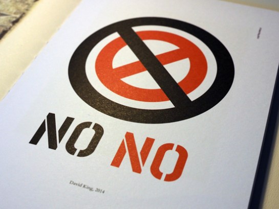
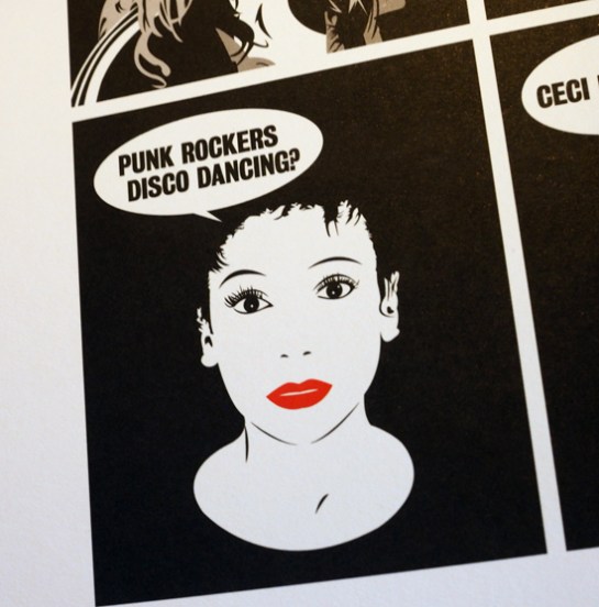
There are several new pieces of artwork featured throughout as well, from the likes of Gee Vaucher, Jeffrey Lewis, Dominic Thackray, Gaye Black and David King, among others.

OLYMPUS DIGITAL CAMERA

Jeffrey Lewis, 2014

OLYMPUS DIGITAL CAMERA

David King, 2014

OLYMPUS DIGITAL CAMERA

Dominic Thackray, 2014

OLYMPUS DIGITAL CAMERA

Gee Vaucher, 2014

Co-author Charlie Waterhouse, a graphic designer and photographer, has ensured that the book is beautifully typeset avoiding any punk aesthetic clichés. This helps to set this study firmly in the here and now, deliberately steering this away from coffee table book nostalgia and ensuring the reader sees this text is about the relevancy of punk and its myriad of associated philosophies to today.

OLYMPUS DIGITAL CAMERA

OLYMPUS DIGITAL CAMERA

OLYMPUS DIGITAL CAMERA

Gee Vaucher

OLYMPUS DIGITAL CAMERA

Each of the authors have been affected by punk as a musical force in different ways. “Charlie’s life was derailed when he heard the Fall’s Lay Of The Land on [John] Peel'”, declares the acknowledgements. While, “Lisa’s DJing career was almost strangled at birth by Steve Albini when she cued up her first record by Big Black at the wrong speed,”…and “Robin cut his teeth on punk music at the age of 13 by sneaking into UK Subs and Stiff Little Fingers gigs”. It goes on to say: “Although none of them knew it, The Truth of Revolution, Brother was always going to be the result of their friendship.”

For myself this book has allowed me to reflect on my days as a punk and the attitudes and beliefs that sprang from reading bands’ lyrics as I listened to their music. This went on to shape my personal view of the world and my sense of responsibility to those around me and society in general. One of the things that bands like Crass did for me was to teach me not to just be anti something but to also consider my role in shaping the world. As such, my vegetarianism, environmental considerations and distrust of hierarchical structures and elites comes very much from my time listening to Crass and associated bands in my late teens and early twenties. While I haven’t called myself a punk in years—I haven’t needed the youthful obsession of creating an identity for myself and thus labelling my whole persona for many years—this book has made me think again about punk as a proud term, the philosophies I adopted in my youth that have stuck with me to this day, and how this has shaped my outlook on life. And for that, I am very grateful to Lisa, Robin and Charlie, and to all the contributors to The Truth of Revolution, Brother.

OLYMPUS DIGITAL CAMERA

Truth of Revolution back cover

The Truth of Revolution, Brother and a number of prints of photographs taken while conducting interviews can be purchased directly from Situation Press

Below, Crass’ Bloody Revolutions, the last line of which gives this publication its title:

Back in May I wrote here about a visit Claire and I paid to the People’s History Museum in Manchester. Today I read in The Observer that due to spending cuts the museum is under threat.

image

This museum is a true gem that collects together many important pieces of graphic design that chart the history of people’s movements in this country, from pamphlets to posters, from badges to banners. As a result of the funding cut, which means the museum is due to lose out on £200,000, the PHM has launched a campaign to fill this gap. Help the museum survive by making a donation or becoming a supporter and save these graphic relics that played their part in getting us the many rights that we enjoy today.