Archive

Branding

image

Vector illustration and chunky lower case type make for the new look reductive graphics adorning McDonald’s take away packaging. Created by Leo Burnett design agancy in Chicago, (I’m currently unsure if this packaging has made it to the UK yet), it appears to be another opportunity missed.

I think it’s fair to say that McDonald’s has an image problem. Well, it has many image problems actually, but I’m specifically talking about the one that glares at us all from roadside gutters and courtryside hedgerows. Any repeat visitors to Dubdog will know that I’m talking litter, a particular bugbear of mine. The world over, McDonald’s is the top brand, or one of the top brands, found on fast food litter, (see this report from Australia, and this from the USA, and this by the UK’s Keep Britian Tidy). I first noticed it some 14 years ago and it prompted my McJunk project. McJunk was an exploration into the relationship between graphic design and disposable culture through a photographic study of McDonald’s litter, (download the introduction to the McJunk photobook as a PDF from here, or visit the McJunk website).

Discovering this new McDonald’s packaging today prompted me to hunt around the Internet for current research into littering and I found some key reports by Keep Britain Tidy, ( * links at bottom of post). In these I came across two specific points of interest that relate to my own graphic design related research:

  • Firstly: through focus group discussions it is claimed that people would be less likely to buy a brand that they saw being littered. While this could be one of a whole host of reasons why McDonald’s had a bad year in 2014, I’m somewhat sceptical—what someone states in a focus group in the company of others is not necessarily the reality of what they actually do. But even if this were true, and it makes business sense to take seriously such market research, you would have thought McDonald’s would take note and try to do more to convince people not to litter;
  • Secondly: many of those surveyed by Keep Britain Tidy stated that they thought the Tidyman logo made little difference to people’s littering habits. This I can well believe. Usually sidelined within any graphic design hierarchy—often on the bottom of any packet—as iconic as I think Tidyman is, the Keep Britain Tidy report suggests that as a nation we have become used to it if indeed we notice it at all.

And herein lies my major problem with this McDonald’s redesign. When the graphics applied to something do not affect whether someone is going to buy a product or not—McDonald’s takeaways are not bought off a shelf; you don’t see the packaging until a BigMac has been ordered, ‘cooked’ and handed over—graphics are technically not needed for marketing purposes. They are usually only there to encourage brand recognition or as decoration. Therefore, if you rethought the side of a take away bag, there is a perfect opportunity for McDonald’s to challenge their litter problem by educating consumers through graphic design. But alas McDonald’s chose not to take this opportunity.

As mentioned in one of the Keep Britian Tidy reports that I read, it is a depressing thought that litter problems will only get worse over the coming years with further public sector cuts. Such cuts mean local councils have to decide what services to shelve, and I suspect many authorities will rightly decide important issues such as social care trump litter patrols. And unfortunately public sector cuts are likely to continue. For regardless of who wins the UK general election this year, both Labour and Conservative have declared their intentions to continue with these cuts. Even if we have another coalition government come May, which is the most likely scenario, one of these two parties is likely to hold the balance of power.

A couple of years ago I put McJunk on a hiatus. With this new packaging launch and after reading several Keep Britian Tidy reports, it looks like it might be time to resurrect the project.

10105410934_ff578b3723_z

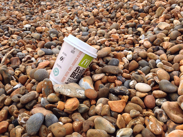
McJunk, as found, on Shingle Street beach, Suffolk. Pre-2015 redesign.

Keep Britain Tidy 2013 Litter Report 

Keep Britain Tidy 2013: When it comes to litter, which side of the fence are you on report findings

Claire and I have just returned from a holiday in the very untouristy Lincolnshire. We visited two years ago, knowing nothing about the county, (read a write up here), and decided to pay the delightful county another visit this year after scratching our heads wondering where to go for our summer break.

Interestingly, last time we visited, we commented on it feeling so unspoilt and un-gentrified, that it was probably reminiscent of the north Norfolk coast of 30 years ago. On our return journey back to Suffolk, we drove via the Norfolk coast, from Hunstanton to Cromer, which only served to reinforce this feeling—the difference between the two areas could not have been starker, and not just because of the amount of Volvos on the small country lanes. No, the most telling thing of the gentrification of north Norfolk was the signage. It is almost as if the entire north Norfolk coast has been branded by one design firm working to a single guideline with the area steeped in Farrow & Ball’s muted grey/greens and grey/blues, while upper case Gill Sans seems to have become the official typeface of the coast line. Upmarket eateries, gift shops and watercolour exhibitions all bare these hallmarks of ‘good taste’. I’m inclined to believe the National Trust marketing department has taken over the entire coastal district and marked it out as a middle class haven of national interest. (Sheringham and Cromer seem to have been left out of this gentrification process and there is a very clear visual divide as you pass by these bucket & spade and candifloss lower brow destinations).

In comparison, the visual language of Lincolnshire retains its vernacular, being a complete mixture of professional and amateur attempts at signage. Its historical typographic heritage is unashamedly on display, and as such, comes across as unpretentious, honest and down to earth. There is no typographic cleansing going on here, and long may it stay that way.

Find below a few typographic treats that caught my attention as we explored the Lincolnshire Wolds. More photographs to follow on Flickr—I’ll provide a link here when I’ve fully trawled through my memory cards.

Lincolnshire Co-op

Unfortunately this building is no longer a Co-op, there being a newly built store round the corner: Horncastle

The people of Spilsby are rightly proud of their new Co-op, enough to write graffiti welcoming others to the store.

The people of Spilsby are rightly proud of their new Co-op, enough to write graffiti welcoming others to the store.

To the train station in Market Rasen, on the edge of the Lincolnshire Wolds

To the train station in Market Rasen, on the edge of the Lincolnshire Wolds

Mareham on the Hill directions to a tiny chapel on a hillside behind a farm. We would have missed visiting the beautiful and picturesque church were it not for this sign. (Click on photo for more information).

An old pub and post office: Louth.

An old pub and post office: Louth.

Beautiful old school house in Spilsby.

Building ties as letterforms: Old Bollingbroke

Building ties as letterforms: Old Bollingbroke

Many Lincolnshire churches  had semi-circular graves. this one in Market Rasen had moss growing on the stone carving creating a living, growing  typographic memorial to the dead.

Many Lincolnshire churches had semi-circular tomb-stone graves. This one in Market Rasen had moss growing on the stone carving creating a living, growing typographic memorial to the dead.

Ghost typography on a building in Louth.

This restored building in Louth has had the original signage thoughtfully restored as well.

This restored building in Louth has had the original signage thoughtfully restored as well.

The Anderby Creek Cloud Bar, where no trip to Lincolnshire would be complete without a visit to both the bar, commissioned by the Cloud Appreciation Society, and to the miles of gloriously sandy dog friendly beaches that after 6pm are devoid of people.

ThePartners

I’ve just finished reading Preserved Thoughts by The Partners’ Jim Prior. It is a neat little A5 (ish) book and download of essays, blog posts and talks he has written and delivered over the course of the last three years. It deals with many different aspects of branding, touching on topics as diverse as morality, creativity in big business, social purpose and human aspiration. Thought provoking and intelligent, it is highly recommended for anyone interested in branding.

Get the book here, or the download here.