Vernacular spectacular
Claire and I have just returned from a holiday in the very untouristy Lincolnshire. We visited two years ago, knowing nothing about the county, (read a write up here), and decided to pay the delightful county another visit this year after scratching our heads wondering where to go for our summer break.
Interestingly, last time we visited, we commented on it feeling so unspoilt and un-gentrified, that it was probably reminiscent of the north Norfolk coast of 30 years ago. On our return journey back to Suffolk, we drove via the Norfolk coast, from Hunstanton to Cromer, which only served to reinforce this feeling—the difference between the two areas could not have been starker, and not just because of the amount of Volvos on the small country lanes. No, the most telling thing of the gentrification of north Norfolk was the signage. It is almost as if the entire north Norfolk coast has been branded by one design firm working to a single guideline with the area steeped in Farrow & Ball’s muted grey/greens and grey/blues, while upper case Gill Sans seems to have become the official typeface of the coast line. Upmarket eateries, gift shops and watercolour exhibitions all bare these hallmarks of ‘good taste’. I’m inclined to believe the National Trust marketing department has taken over the entire coastal district and marked it out as a middle class haven of national interest. (Sheringham and Cromer seem to have been left out of this gentrification process and there is a very clear visual divide as you pass by these bucket & spade and candifloss lower brow destinations).
In comparison, the visual language of Lincolnshire retains its vernacular, being a complete mixture of professional and amateur attempts at signage. Its historical typographic heritage is unashamedly on display, and as such, comes across as unpretentious, honest and down to earth. There is no typographic cleansing going on here, and long may it stay that way.
Find below a few typographic treats that caught my attention as we explored the Lincolnshire Wolds. More photographs to follow on Flickr—I’ll provide a link here when I’ve fully trawled through my memory cards.
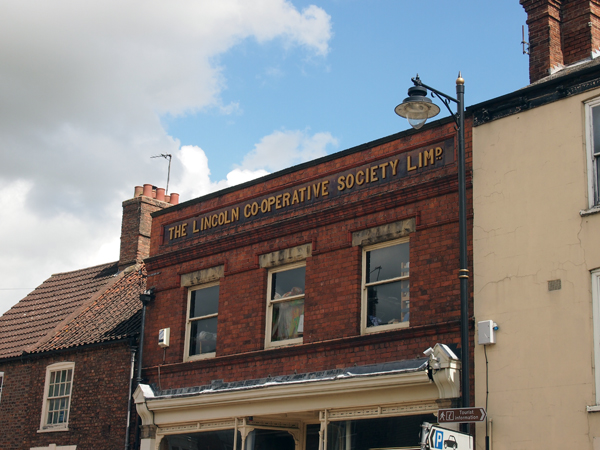
Unfortunately this building is no longer a Co-op, there being a newly built store round the corner: Horncastle

The people of Spilsby are rightly proud of their new Co-op, enough to write graffiti welcoming others to the store.

To the train station in Market Rasen, on the edge of the Lincolnshire Wolds

Mareham on the Hill directions to a tiny chapel on a hillside behind a farm. We would have missed visiting the beautiful and picturesque church were it not for this sign. (Click on photo for more information).

An old pub and post office: Louth.

Beautiful old school house in Spilsby.
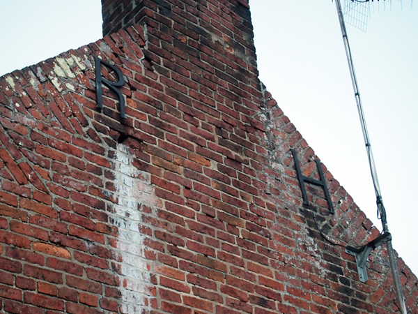
Building ties as letterforms: Old Bollingbroke

Many Lincolnshire churches had semi-circular tomb-stone graves. This one in Market Rasen had moss growing on the stone carving creating a living, growing typographic memorial to the dead.

Ghost typography on a building in Louth.

This restored building in Louth has had the original signage thoughtfully restored as well.

The Anderby Creek Cloud Bar, where no trip to Lincolnshire would be complete without a visit to both the bar, commissioned by the Cloud Appreciation Society, and to the miles of gloriously sandy dog friendly beaches that after 6pm are devoid of people.

Pingback: Recents | Dubdog