Archive

Publishing

image

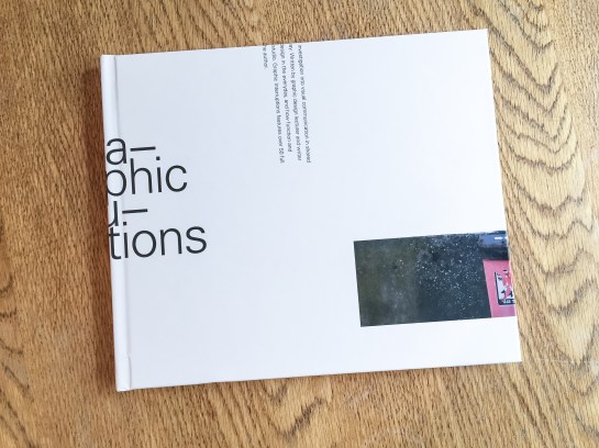
Graphic Interruptions book, front cover

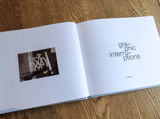
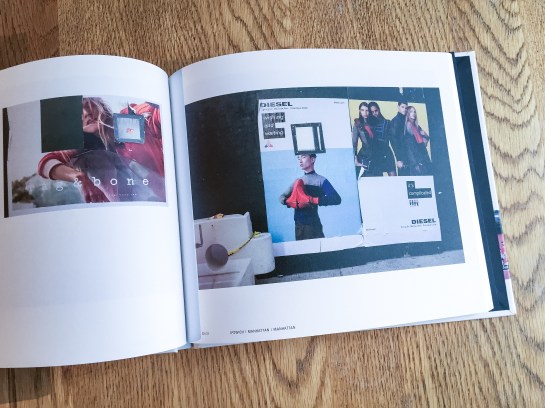
Graphic Interruptions has reached some sort of a completion, for now, with the production of a one-off hard back book for an assessment of the project for my masters degree. The project will continue in the background and you can follow its Instagram account here.

image

Graphic Interruptions, back cover

I would like to have produced more books and sold them, but because of the production values I insisted on, it means each copy would cost upwards of £60 and I just can’t justify selling copies for that price. However, without going into details at the moment, I have been talking to a publisher and if a book proposal I’m writing is accepted, Graphic Interruptions may enter the public realm as part of a wider project.

image

Title page

In the latter stages of working on the project, which had been ongoing since October, I fell back on familiar territory, (see McJunk, links on Elsewhere page), as I needed to create a tangible outcome for a looming deadline. This resulted in me jettisoning explorations into maps, autobiographic writing and psychogeography which had all been part of this project at one point or another. My interest in these makes me certain I will return to them in the future but in order to wrap this up for an assessment I went with what I knew I could achieve.

image

The essay I wrote as the introduction to the book will see the light of day here in the near future, but for the time being I’m pleased to call some sort of pause to Graphic Interruptions, at least in relation to my MA studies. It has helped shape my thinking for the next stages of my academic research. And more than that, I’m looking forward to blogging about more than Graphic Interruptions here.

I’ve long believed the Guardian to be the best designed newspaper in the country, which is convenient for me considering some may think I fit the profile of a typical reader—feminist liberal-left vegetarian art teacher. It would be difficult for me to take if the Daily Mail fitted this design accolade.

But I like the Guardian for more than its graphic design; the fact its investigative journalism helps to keep in check those in power is equally as important to me, particularly in these days of party political impotence. Simon Jenkins summed this up well this week in From Snowden to Panama, all hail the power of the press during the breaking revelations about tax evasion.

But journalism with integrity isn’t enough on its own, just as great graphic design isn’t enough on its own. You have to be able to engage readers in your content or it won’t gain the attention it requires. And this is where the Guardian really sets itself apart from pretty much all other news vendors, (with the exception of Channel 4 News, albeit via a different medium). The marriage of purpose and presentation is given equal respect in this daily paper, and the approach is integrated across all of its platforms, from newsprint to website to app.

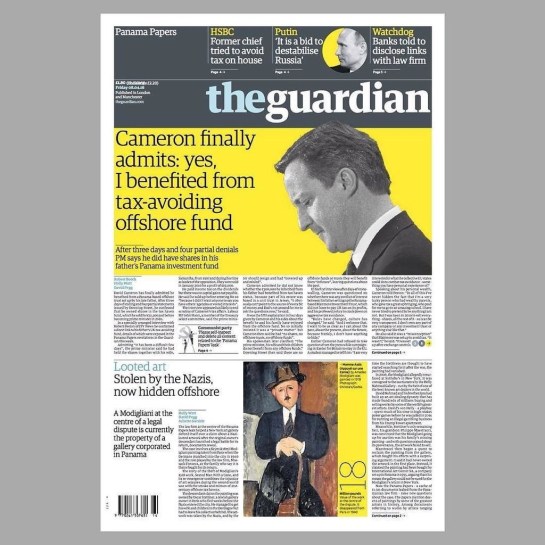
If anybody should need a case study to prove my point, the Panama Papers story this week should be a convincing one. Deputy Creative Director of the Guardian, Chris Clarke, tweeted the next day’s front page every evening, and there were many of his followers waiting for the reveal each night as the story broke, (and continued to break throughout the week). If the awkward adjective ‘impactful’ can be ascribed to anything, it is the design decisions the creative team at the Guardian took to grab their readership’s attention.

IMG_2792

Monday. Source: @chrisclarkcc

Monday’s front page was really brave, dropping the masthead from its usual position at the top to halfway down the page. All advertising was removed, and using the daffodil yellow to punch out of the grey, as Clarke’s choice of a ‘punching fist’ emoticon to accompany his tweets accurately indicated, had real visual impact to match the world leader shaking story.

And the approach continued all week:

IMG_2791

Tuesday. Source: @chrisclarkecc

IMG_2793

Wednesday. Source: @chrisclarkecc

It is not until Thursday that advertising crept back onto the front page, and then it was cornered and given bottom billing:

IMG_2794

Thursday. Source: @chrisclarkecc

On Friday the masthead resumed its usual position at the top of the paper, no longer taking second billing to the story, but the visual language deployed stayed the same—dramatic, powerful and as attention grabbing as the headline. Again, like Monday through Wednesday, Friday sees the front devoid of advertising:

IMG_2803

Friday. Source: @chrisclarkecc

IMG_2795

iPhone app: the visual approach worked across platforms

I would be very surprised if both the Guardian’s journalistic and graphic design approaches from this week’s editions does not win them awards in their respective fields—they rightfully should.


image

10 years ago I started blogging, which I guess makes me a blogger, (not a descriptive term I’ve ever considered using for myself before now—not sure why). On 4 April 2006 the photograph above was the first thing I posted over on Blogger.com. It was taken in New York on my first visit to the city a few days beforehand.

In that decade there have been some significant changes to my life. I’ve changed jobs; very nearly moved house; been to lots of exhibitions and seen lots of bands; suffered the loss of some close relatives, friends and pets; stopped making music; stopped smoking; started taking shit loads of photographs; published a book; designed a few things; taught a lot of students; travelled this country much more extensively; been to lots of conferences; read a lot of books; listened to lots of music; become a grandfather; started an MA (ongoing); and written hundreds of blog posts of widely variying qualities. I’ve also managed to stay married to my lovely wife, which in itself is a major achievement considering how much I must annoy her a lot of the time.

The reason for this post is that tomorrow I am off to New York once again, the first time since my previous visit 10 years ago. The fact my blogging and my first visit to NYC coincided are mostly coincidental, although the it could be that the original trip opened up my eyes to a bigger world which made me want to document my part in it.

I’m going for slightly longer this time, but only an extra couple of days, (6 in total), but hope to get as much out of the visit as I did last time. Equally, I hope the students that I am going with will get as much out of the experience as I did on my first visit, and I’m looking forward to spending time with my colleague who has spent a lot of time in the city and claims to know the best bars.

Expect Dubdog: field readings to have a stateside focus over the next week—wifi access dependant—and probably for a while afterwards. Follow Twitter and Instagram updates via the links on the ‘elsewhere’ page.

WCountry_Cover

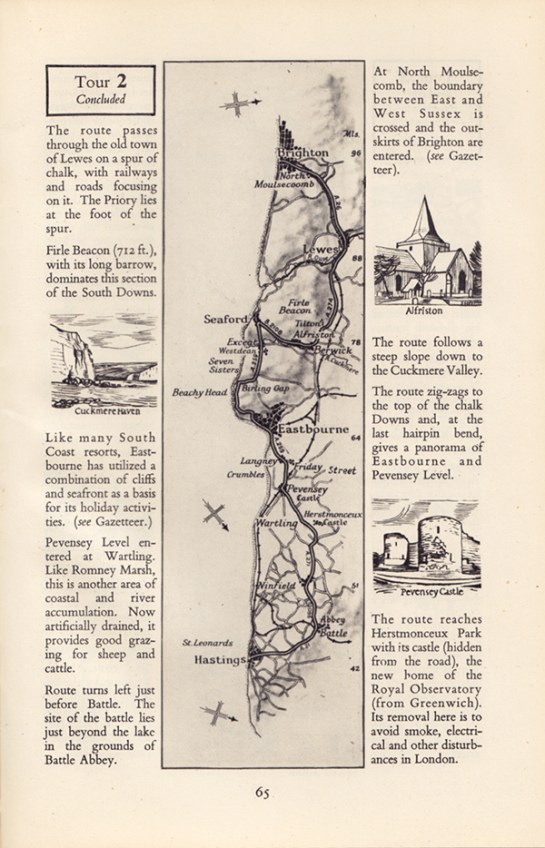
A few years ago I wrote an article for Eye magazine blog after coming across a programme for the 1951 Festival of Britain. At the time I was aware of the existence of a series of small guide-books published to coincide with the festival called About Britain, but it was only recently that I actually came across any.

There were 13 of these books published covering different regions of Britain. The two that I’ve been lucky enough to find cover the West Country and Home Counties. The latter is more fascinating to me being more familiar with the areas discussed within. As the inside dust jacket cover states: “These books are guides to the living Britain, covering the whole country, England, Wales, Scotland and Northern Ireland. Each is a guide to a well-defined district, planned to give you the fundamental facts about its scenery, its monuments, its buildings, its natural history, its people and their work and characteristics.”

HCounties_Cover

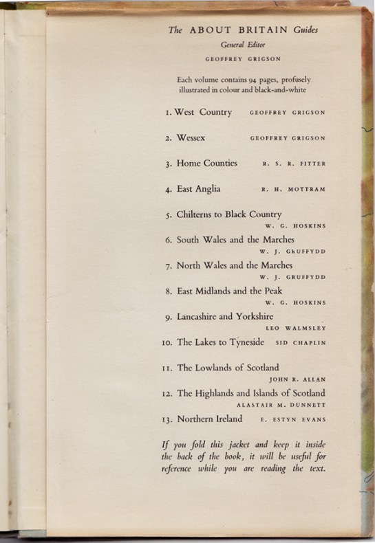
The covers feature maps of the region, both as a hard-case wrap and as a dust jacket. The fact the map was printed on both case and jacket allowed the owner of the book to remove the jacket and use it for reference while reading, as the inside back cover of the Home Counties edition explains, (below). Whether this was a deliberate design decision or some clever post-rationalisation will never be known, but it is still a great idea.
HCounties_InsideBackCover

Naturally the books at first glance seem somewhat dated. However, there is a real sense of optimism and forward thinking in regard to the contents once you consider the context within which these were published. These are meant to be egalitarian and easily accessible by all to instil a sense of pride in our nation, and encourage the reader of better times to come as the country shook off the last vestiges of the Second World War.
HCounties_Ford

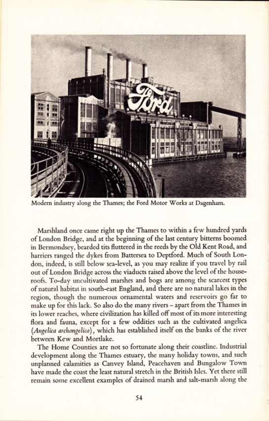
Featured inside are stories of emerging industries, as can be seen in the spread above about Ford. However, I’m not sure how the residents of Canvey Island or Peacehaven would react to where they lived as being described as “unplanned calamities”. Alongside such articles were stories of traditional farming methods, town planning, historical features and natural wonders.

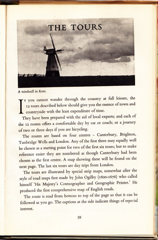
Also published in these guides were tours of local areas with maps you could follow by car, bus or bike, clearly aimed at the working classes taking time out to visit the country and thus encouraging an emerging tourist industry.
HCounties_TheTours

HCounties_Tour

Some aspects are seen as very antiquated, such as the description of Londoners’ characteristics: “his steadiness, humour, independence and attitude to authority…His loyalty to the ruler he approves is unbounded, and he likes to show it on Royal occasions.” Many republicans of today would disagree with such cap doffing, and further dating the writing, you have to remind yourself of the times when noticing the inherent sexism within the text. That, and references to empire aside, there is a refreshing regard to immigration: “London welcomes strangers of all countries and all colours, whether they seek refuge as exiles, come to work or come to play.” UKIP take note, the Britain in the 1950s you would wish us to return to was more forward thinking than you would have us believe.

HCounties_Londoners

HCounties_Welcome

The openness and forward thinking is evident throughout as Britain looked to escape the war years and propel itself into the 1950s. It had a plan to rebuild itself, reject the austerity of rationing and launch into a new era of rebuilding a country that worked for its inhabitants. As the opening chapter states:

“This guide-book is one of a series ‘About Britain,’ so we hope, in a new way…it begins with a portrait of the district—an account of many of the facts about it which are worth knowing…  These guides have been prompted by the Festival of Britain. The Festival shows how the British people, with their energy and natural resources, contribute to civilisation. So the guide-books as well celebrate a European country alert, ready for the future, and strengthened by a tradition which you can see in its remarkable monuments and products of history and even pre-history. If the country includes Birmingham, Glasgow or Belfast, it includes Stonehenge. If it contains Durham Cathedral, it contains coal mines, iron foundries, and the newest factories devising all the goods of a developing civilisation.”

Reading through these guide-books in the last three weeks of a General Election in this country—one that is caged in the terminology of austerity, cuts, Europe and immigration; one that seeks to blame, point fingers, build walls and retract in on itself—I am reminded of the feelings I had when I first read the official Festival of Britain programme that compelled me to write my Eye piece. And that is if politicians in the late 1940s/early 1950s could envisage emerging from such a financial disaster as the Second world War, looking forward and having hope for the future, why can’t they today? For the Festival of Britain organisers, their take on the world wasn’t one of austerity and boarders, blaming those worst off while appeasing financiers; theirs was a vision of everyone working together for the benefit of all. Something I believe that many of our current crop of politicians could do well to learn from.

Quaint maybe, ambitious certainly, but if history teaches us anything, it teaches us that these visionaries achieved their goals; for this is the era that gave us public services such as the NHS and much of the infrastructure that has supported us for the last 63 years. Will the decisions of the next government have such a huge impact on our way of life and our culture? Only negatively I fear.
aba8a88d-2d01-49b8-85cb-893134732c9e-620x451

The US and UK book jacket designs for Harper Lee’s Go Set A Watchman. Picture: L—HarperCollins / R—William Heinemann. Source: guardian.com

I’ve written here and elsewhere before about how graphic design is overlooked in favour of other arts disciplines, (see the post Shelf / Life and my McJunk essay as two examples). I’ve come to expect this, so when Will Gompertz—the BBC’s Arts Correspondent—recorded a piece for the Six O’Clock News this week about the Design of the Year Awards at The Design Museum, I wasn’t surprised that the graphic design nominations weren’t mentioned at all.

When The Guardian published an article on its website in the same week about the book jackets for the release of Harper Lee’s sequel / prequel to To Kill A Mockingbird, I thought some balance may be restored. In fairness to The Guardian at least the article is about design, and they did invite designer Stuart Bache to critique the covers for an accompanying piece, (which he does excellently). But what really annoyed me was that no designer’s names are mentioned at all in either article. I don’t blame The Guardian for this, as none of the stories I’ve read about these jackets on any other website mentions the designers involved either. This suggests that for some reason the publishing houses aren’t mentioning names, (the book is being released by different publishers in the UK and the US). It maybe standard for in-house designers not to be given publicity—although I’d hope their names will be on the actual release somewhere—but both William Heinemann (UK) and HarperCollins (US) are heavily publicising these design previews to generate free advertising in the press in the run-up to the July publishing date.

I think it is a shame that none of the articles I’ve read in regard to these jackets chooses to question why such anonymity exists when it comes to graphic design, and this in itself maintains the status quo of graphic design not being treated with the same esteem as other arts disciplines. While at least Bache mentions the covers are designed by designers and The Guardian did seek him out as an expert witness, it would be good to read journalists questioning this lack of credit as they surely would do if this was the preview of a tie-in artwork by an actual proper artist.

The WordPress.com stats helper monkeys prepared a 2014 annual report for this blog.

Here’s an excerpt:

A New York City subway train holds 1,200 people. This blog was viewed about 4,900 times in 2014. If it were a NYC subway train, it would take about 4 trips to carry that many people.

Click here to see the complete report.

Today I stumbled across The Truth of Revolution, Brother, a proposed book about the philosophy of punk.

Taking its title from a Crass lyric, (the infamous anarcho-punk band that took punk’s DIY ethos to a whole new socio-political level), the book promises to go well beyond the music, fashion and graphics shlock that most nostalgic punk cash-ins opt for. For anyone like myself who formed many of their personal and social political beliefs from their experiences within the punk movement will understand what an important document this could end up being. Particularly if the accompanying promo video is anything to go by:


The book is being put together by the surnameless Lisa, Charlie and Robin, who say the book is largely written and designed, almost ready to go. With a launch date of August 2014, they’ve started a Kickstarter campaign to raise enough funds for the first print run, and come payday, I’ll be on Kickstarter making my donation.


ChildhoodRemixed_cover

I’m proud to have recently finished working on the third edition of Childhood Remixed, a University Campus Suffolk (UCS) online interdisciplinary academic journal themed on childhood. The journal, published annually, has previously only featured papers from staff and students at UCS. However, this year much of the publication has been made up of submissions to the international Children and Childhoods Conference held at UCS in July of last year.

ChildhoodRemixed_welcome

The international flavour of this edition demonstrates not just how much the journal has grown in three years, but how much UCS has developed in that time as well. First launched in 2012, Childhood Remixed was intended as a ‘stepping stone’ into the world of being peer-reviewed and published. For third year undergraduate and postgraduate students, and for lecturers who hadn’t been published before, this was an excellent opportunity for a safe trial into the daunting world of academic publishing. The journal still provides this platform, but now allows those same students and staff to be featured alongside academics and researchers from across the globe.

ChildhoodRemixed_pagesIt is hoped with this international issue, that the journal will be available to the wider public soon as a download rather than just internally within UCS as the previous two editions have been. More details will be posted here when it is available.

Thanks to Dr Alison Boggis, Senior Lecturer in Early Years at UCS, who has tirelessly pushed this publication forward since its first inception three years ago.  Read a report of the launch of the first edition here on Blogger.

When I was a design student there didn’t seem to be an abundance of books about graphic design. There were obviously some, such as recommended canons on the discipline like Meggs’ History of Graphic Design, but they were few and far between. And none, to my eyes, seemed particularly contemporary in their approach to relating to the subject.

IMG_6495

Thankfully this is no longer the case. In the last ten years there has been an explosion in the amount of books published about the subject, from self-published/vanity monographs to historical re-tellings, from exhibition tie-ins to in-depth breakdowns of the process of designing. Academic/student friendly publishing houses such as AVA, (now under Bloomsbury), and Laurence King have gone a long way to help those studying graphic design today, and it is likely that the growth of undergraduate graphic design students over the last 10 years has created a captive audience.

One publishing house that is worthy of praise for its output in the last few years is Unit Editions. Set up in 2009 by Tony Brook of Spin, and Adrian Shaughnessy, previously of Intro, their first releases trickled slowly onto the market but quickly established a standard of exceptional quality in both the critical content and production values. Their output has increased dramatically since then, and in the last 18 months alone they’ve published monographs on over-looked designers; FHK Henrion, Herb Lubalin and Ken Garland. They’ve also produced a study on contemporary expressive typography: Type Only, and a collection of Shaughnessy’s writing collated from various websites and magazines that he contributes to, titled Scratching The Surface.

threecolumn_page header_optimised2

The lavish production values of FHK Henrion monograph: Unit Editions—2013. (Photo: Unit Editions.)

Brook and Shaughnessy describe Unit Editions as producing books “for designers by designers”. While it is true that the latter two publications mentioned above do add to an introspective discourse about contemporary graphic design practice, and the designer/publishers have been showcased on many design blogs such as It’s Nice That, I believe that what Unit Editions are doing is much more than just ‘for designers’.

The desire to showcase designers that have become ‘lost’ in the fog of design history, such as Henrion et al, is obviously a desire to pay these people their dues. The research into their past; how they became designers; what underpinned their practice, (in terms of personal ethos); as well as the excellent archiving of their life’s work, should also be of great interest to those outside of the discipline as well as to designers. For to document their contributions to society at large is to showcase their relevence to popular culture. It is difficult to read Structure and Substance without getting the sense that Garland is dedicated to making the best work he can for the end user. The fact that these designers understood who they were creating work for underpinned an ethos of responsibility in their thinking about graphic design that fed into the aesthetic appeal of what they produced. When you then consider that their work has influenced the world we see around us today by feeding into the evolution of graphic design and how the viewer reads visual communications in their everyday, it is fair to say they also helped to fashion social history.

Ken_Garland_Spread_p23_NEW_full product_optimised2

Spread from Ken Garland, Structure and Substance: Unit Editions—2012. (Photo: Unit Editions.)

It is interesting to note that at the conferences Graphic Design: History In The Making, and Critical Tensions, both held at St Bride Library in 2011, several speakers discussed the standing of graphic design history and graphic design practice in the eyes of the general public. At the latter, Jonathan Barnbrook spoke of graphic designers being the lowest regarded ‘arts’ discipline after advertising, while the history themed conference debated why graphic design was not afforded the respect with which art history is bestowed. While it is fair to claim that many graphic designers have chips on their shoulders, these are still relevant debating points. To address the issue of design history’s standing, someone speaking from the floor at History In The Making stated that graphic design can only ever be judged by non-designers in relation to its original context. In other words, a designs’ reason for existence is what it should be judged against. And in my mind, Unit Editions have come closest to publishing books on what is generally an inward-looking discipline that are accessible, and attractive, to a much wider audience than just designers.

Ken_Garland_Spread_p138_full product_optimised2

Spread from Ken Garland, Structure and Substance: Unit Editions—2012. (Photo: Unit Editions.)

I will look forward to the publications that will come out of Unit Editions during 2014, as well as those that other publishing houses produce. Unlike when I was a student, it is fair to say that books about graphic design have never been in ruder health. The bonus that they could be seen as of great importance in documenting social history is one I think that should be championed, and could go a long way to repositioning graphic design in the mind of the general public.

For more on Unit Editions and design books in general, then check out this excellent interview with Tony Brook and Adrian Shaughnessy on Designers & Books.

To start the new academic year off with a shot of inspiration, we took all Graphic Design and Graphic Illustration students at UCS to GRAPHICS, the Romek Marber exhibition at The Minories in Colchester.

OLYMPUS DIGITAL CAMERAMarber’s influence on British Graphic Design can not be underestimated. His most famous work was for Penguin Books, particularly their crime series, producing many of the iconic green covers utilising photography, collage and drawn imagery to full effect to capture the title of each book he designed for. He also famously designed one of the grid systems that Penguin used for many years.

OLYMPUS DIGITAL CAMERAAmong the covers on display was also his rationale behind the layout. As the exhibition literature states: “Romek Marber’s work often communicates in a clear and direct manner that is bought by combining a stripped down use of colour with well defined formal structures within which text and image are framed. A sense of pragmatism and design that grows out of necessity in terms of delivery of message results in an efficient visual imagery that wastes nothing but at the same time appears to leave nothing out.”.

OLYMPUS DIGITAL CAMERASome of Marber’s typographic work balances a tightrope between experimentation and reductive modernist austerity, clearly influencing many designers working today. In fact, the covers he did for The Economist only look dated because of the mastheads—Marber’s type explorations themselves could grace many contemporary magazines and certainly wouldn’t look out of place on Bloomberg Business Week.

OLYMPUS DIGITAL CAMERAAnd this film title sequence could be mistaken for some of the experimental and fluid graphic illustration coming out of the UK at the turn of 21st century by the likes of Dávid Földvári et al:

OLYMPUS DIGITAL CAMERAGRAPHICS exhibition is highly recommended, and runs until 25 October: details here. Thanks to Cydney and Kaavous at The Minories.

While in Colchester, and with the Firstsite Gallery a stone’s throw from The Minories, we also took the opportunity to take a look at the Xerography exhibition that is on there. This celebrates the role of photocopying in art, from the 1960s through to the modern day.

OLYMPUS DIGITAL CAMERAThis show has an impressive list of 40 contributors, and naturally for graphic design students, the more graphic and book orientated work seemed to appeal the most.

OLYMPUS DIGITAL CAMERAThe Hockney’s were particularly good and of interest to illustrators:

OLYMPUS DIGITAL CAMERAAnd I was really taken with this mail-art piece by Eugenio Dittborn:

OLYMPUS DIGITAL CAMERAThe show is mixed enough for something to appeal to everyone, although I doubt that there would be anyone who would like everything that was on show. But despite its breadth, the one obvious omission for me was the lack of graphic design. For an exhibition which is tied together by the process of using a photocopier to produce work, this seems like a massive black hole. For example, there are no punk era fanzines such as Mark P’s Sniffin’ Glue which helped to define the aesthetic of an era. This form of instant publishing also helped to introduce some to a career in graphics, such as Terry Jones. There were also no rough and ready record sleeves, whether by the likes of practicing designer Linder Sterling or by the many unknowns who embraced the Do It Yourself nature of punk in 1976/77.

Omissions aside, this is a worthwhile exhibition to go and see, especially if you can go when the Marber exhibition is still on at The Minories, as the juxtaposition between the two makes for refreshing contrast. Xerography runs until 10 November, details here.

Thanks to Sue Hogan for the student talk.