Archive

Critique

It’s not everyday your local Tory MP big’s you up in the local newspaper. But to my surprise, I found my McJunk project featured in MP Ben Gummer’s weekly Ipswich Star article yesterday.

While I’m not sure Ben has completely seen he point of McJunk, (see McJunk website here), and I’m certainly not sure that the free advertising McDonald’s are getting from this is appropriate, I can’t be too harsh on the man as I expect that Ben’s love of beef burgers is a family thing that he is unable to distance himself from.

McGummer

Ipswich Star, Friday 25 July 2014

Letter to the East Anglian Daily Times, re: an article printed on 28.06.14 regarding the publication of the 2014 State Of Ipswich report

Dear EADT

I write to take issue with analysis of the State of Ipswich report in Paul Geater’s article on Saturday. It claims “…the poor standard of education probably contributes to it, [Ipswich], having one of the lowest average wages of any town in the country”. Such ‘analysis’ that makes assumptions without presenting any evidence is compounded when, in a reference to the fact that 25% of Ipswich workers earn below the ‘living wage’, it states there is: “a difference between the genders with 18% of men earning below this figure, [£7.65 / hour], but 32% of women below that line”. This is despite the fact that Mr Pinter of Ipswich Borough Council is quoted as saying, “that this difference in wages was in spite of the fact that girls did much better than boys at school”.

In summary the article presents the view that women are worse off in employment than men despite doing better at school, but it is ultimately the education system that is at fault for low wages. While there may be many things wrong with the education system in Ipswich that need addressing, I’m afraid that the blame for low wages and gender differences in the workplace can only be laid at the feet of employers. Such reporting does not hold employers accountable for poor wages and inequality, and in doing so excuses such unacceptable behaviour.

Nigel Ball

2014 sees the 50th anniversary of the 1964 First Things First manifesto. In the run up to the launch of First Things First 2014 on Monday 3 March, you can read an article I recently wrote, along with an interview with the author of this contemporary update, over on Eye blog.

Designforlife

Timelessness

Last week I was asked to introduce Gary Hustwit’s Helvetica for a screening to UCS MA Journalism students and members of the public. Afterwards, in a question and answer session, someone unexpectedly asked if I thought Helvetica was timeless. It was a good question in relation to the film we had just watched, but not one that I had anticipated being asked, and therefore I said the first thing that came into my head, (and a little more sharply than maybe I should have done). As the thought of something being timelessness has always seemed an odd concept to me, I stated that nothing was timeless.

As a result of this knee-jerk response, the idea of timelessness has been on my mind all week. It is a phrase that crops up again and again in graphic design circles. It is often spoken of as a quality of good logo design and it is supposedly one of the characteristics that a design classic should embody, according to the cover of Phaidon’s publication on the same topic at least.

Phaidon2

But I’m highly sceptical about this. Taking issue with Phaidon’s description, if you look at my idea of a design classic—the iconic Donor Card as written about here a few weeks ago—it could never be described as timeless. Its styling’s are very much of the 1970s.

DonorCardThen

Any piece of visual communication stays the same as the world around it moves on, leaving the item caged in the aesthetics of the time it was created. Think of one of the most famous pieces of graphic design in the history of this country—Beck’s Underground map—it is absolutely a product of its time. It may have been tweaked, altered and changed over the years, and maybe not enough each time that anyone would notice that it was dramatically different from its predecessor. But if you see the original and the current version side by side, you can automatically see that it came from a different era. Jump to a recent piece of famous graphic design, the 2012 Olympics logo, and that arguably started to date even before the games started, designed as it was 5 years previously.

HarryBeck_TubeMap_580

Harry Beck’s original Underground Map c.1932

standard-tube-map

Current version of the Underground Map

To strive to make something timeless from the outset is to set oneself a challenge that I believe can never be achieved. Maybe as an old Marxist I’m still stuck with the philosophy that everything changes; but this is an philosophy that history seems to have proved right. As a designer, at best you may create some sort of longevity in a piece of work. If your creation doesn’t have to be redesigned too soon then your client can get many years of service out of it, decades even, but eventually it will look dated.

I accept that in the case of a typeface much of that dating may depend on the application. Sure, Helvetica can still look contemporary when applied well in 2014 as much as it did when it was designed in 1957, but that is because it may be used in a contemporary setting. However, there are plenty of examples from the history of graphic design where it looks outdated. I agree that one has to be cognisant of the fact that there are lots of things that can change the appearance of a typeface even if the individual characters remain the same; tracking, point size, uppercase/lowercase, background colour, supporting imagery such as illustration, photography or other graphic architecture; all will alter how you ‘read’ the form of the face and bring different meaning to it. But over time, the choices diminish and it has to be asked whether Helvetica will still have fresh ways of being applied in 1000 years time? I personally doubt it.

When I was a design student there didn’t seem to be an abundance of books about graphic design. There were obviously some, such as recommended canons on the discipline like Meggs’ History of Graphic Design, but they were few and far between. And none, to my eyes, seemed particularly contemporary in their approach to relating to the subject.

IMG_6495

Thankfully this is no longer the case. In the last ten years there has been an explosion in the amount of books published about the subject, from self-published/vanity monographs to historical re-tellings, from exhibition tie-ins to in-depth breakdowns of the process of designing. Academic/student friendly publishing houses such as AVA, (now under Bloomsbury), and Laurence King have gone a long way to help those studying graphic design today, and it is likely that the growth of undergraduate graphic design students over the last 10 years has created a captive audience.

One publishing house that is worthy of praise for its output in the last few years is Unit Editions. Set up in 2009 by Tony Brook of Spin, and Adrian Shaughnessy, previously of Intro, their first releases trickled slowly onto the market but quickly established a standard of exceptional quality in both the critical content and production values. Their output has increased dramatically since then, and in the last 18 months alone they’ve published monographs on over-looked designers; FHK Henrion, Herb Lubalin and Ken Garland. They’ve also produced a study on contemporary expressive typography: Type Only, and a collection of Shaughnessy’s writing collated from various websites and magazines that he contributes to, titled Scratching The Surface.

threecolumn_page header_optimised2

The lavish production values of FHK Henrion monograph: Unit Editions—2013. (Photo: Unit Editions.)

Brook and Shaughnessy describe Unit Editions as producing books “for designers by designers”. While it is true that the latter two publications mentioned above do add to an introspective discourse about contemporary graphic design practice, and the designer/publishers have been showcased on many design blogs such as It’s Nice That, I believe that what Unit Editions are doing is much more than just ‘for designers’.

The desire to showcase designers that have become ‘lost’ in the fog of design history, such as Henrion et al, is obviously a desire to pay these people their dues. The research into their past; how they became designers; what underpinned their practice, (in terms of personal ethos); as well as the excellent archiving of their life’s work, should also be of great interest to those outside of the discipline as well as to designers. For to document their contributions to society at large is to showcase their relevence to popular culture. It is difficult to read Structure and Substance without getting the sense that Garland is dedicated to making the best work he can for the end user. The fact that these designers understood who they were creating work for underpinned an ethos of responsibility in their thinking about graphic design that fed into the aesthetic appeal of what they produced. When you then consider that their work has influenced the world we see around us today by feeding into the evolution of graphic design and how the viewer reads visual communications in their everyday, it is fair to say they also helped to fashion social history.

Ken_Garland_Spread_p23_NEW_full product_optimised2

Spread from Ken Garland, Structure and Substance: Unit Editions—2012. (Photo: Unit Editions.)

It is interesting to note that at the conferences Graphic Design: History In The Making, and Critical Tensions, both held at St Bride Library in 2011, several speakers discussed the standing of graphic design history and graphic design practice in the eyes of the general public. At the latter, Jonathan Barnbrook spoke of graphic designers being the lowest regarded ‘arts’ discipline after advertising, while the history themed conference debated why graphic design was not afforded the respect with which art history is bestowed. While it is fair to claim that many graphic designers have chips on their shoulders, these are still relevant debating points. To address the issue of design history’s standing, someone speaking from the floor at History In The Making stated that graphic design can only ever be judged by non-designers in relation to its original context. In other words, a designs’ reason for existence is what it should be judged against. And in my mind, Unit Editions have come closest to publishing books on what is generally an inward-looking discipline that are accessible, and attractive, to a much wider audience than just designers.

Ken_Garland_Spread_p138_full product_optimised2

Spread from Ken Garland, Structure and Substance: Unit Editions—2012. (Photo: Unit Editions.)

I will look forward to the publications that will come out of Unit Editions during 2014, as well as those that other publishing houses produce. Unlike when I was a student, it is fair to say that books about graphic design have never been in ruder health. The bonus that they could be seen as of great importance in documenting social history is one I think that should be championed, and could go a long way to repositioning graphic design in the mind of the general public.

For more on Unit Editions and design books in general, then check out this excellent interview with Tony Brook and Adrian Shaughnessy on Designers & Books.

With 2013 nearly over, as usual, I’m publishing the most listened to purchases, downloads, steals and donated music of my year. I leave it until after Christmas, safe in the knowledge that I’m unlikely to come across any other music between now and 1 January 2014, while thinking that many lists are produced too early. If I’d have written this when others were doing so, such as my most ‘go-to’ music publications in 2013, The Quietus and The Wire, I’d not have included The Fall’s very recently released EP, The Remainderer, which is, in a nutshell, excellent.

This list comprises everything that I’ve given time to and have returned to again and again after an initial listen. Much more music has been consumed in these past 12 months, but much has fallen by the wayside and I’ve stripped this back to all that I rate, and that has been repeatedly replayed, whether through sheer enjoyment, or trying to find some redeeming feature.

On repeat
Of those that have had the most listens, then The Baptist Generals’ Jackleg Devotional To The Heart and The Ex & Brass Unbound’s Enormous Door are probably neck and neck, closely followed by Wire’s Change Becomes Us. The latter shows Wire continuing to push the boundaries of what they do, and proving, as they state, they are a contemporary band. The Ex & Brass Unbound merge rhythmic hypnotic punk rock with Congotronic style riffs, Ethiopian rhythms and free jazz—sounds awful on paper, but you’ll have to take it from me if you haven’t heard them, they are truly spectacular. Finally, The Baptist General’s return was maybe not as glorious as it could be, considering the long wait, but this is probably the album that has grown on me the most over repeated listens this year.

Surprises
The surprises this year came from Matmos’ excellent 
The Marriage of True Minds, particularly their truly remarkable cover of Buzzcocks’ ESP. Another surprise was one that many probably experiences, in David Bowie’s The Next Day. While he didn’t make an outstanding LP, and in fact, the first half is far stronger than the remainder as it proves to outstay its welcome on listening to it as a whole, it is at least credible and there are some good tunes on there. I think we can safely agree he has redeemed himself of the travesties of everything he has done since Let’s Dance. Lastly, another breath of fresh air, and one I have to thank The Wire for introducing me to, was Young Echo’s Nexus, which proved there is still life in Bristolian dub, (at least visible to those outside of Bristol).

Disappointments
Akron/Family continue to disappoint, which is a real shame after 2009’s excellent Set ‘Em Wild, Set ‘Em Free—my favourite album of that year. In 2009 I thought I’d discovered a band that I’d carry to the grave. In 2013, after two poor follow-ups, this year’s being Sub Verses, I’ve decided to stop buying their records. Nick Cave was equally disappointing; although note that I didn’t say The Bad Seeds. The latter are at the top of their game, sounding brooding, tight and displaying a maturity that is completely befitting. Unfortunately, when coupled with some truly atrocious lyrics, on Push The Sky Away, (come on Nick, “I fire up her snatch”; please), they are unsubtly trampled over, that and with the exaggerated vocal performance that tries just a little too hard. If only it had been a solo Bad Seeds album and Mr Cave had stayed at home, but at least he, (and the Bad Seeds that were involved), are over the mid-life crisis that was Grinderman, which I suppose we have something to be grateful for.

That’s it for those that are interested. Sorry I haven’t provided links for everything, but it’s all out there in Internetland somewhere for you to find for yourself.

This is what a year sounds like: 2013—presented in reverse chronological order:
The Fall – The Remainderer EP
Lee “Scratch” Perry & The Upsetters – Roaring Lion
Burial – Rival Dealer EP
Africa Express – Maison Des Jeunes
British Sea Power – From The Sea To The Land Beyond
Nick Cave & The Bad Seeds – Live from KCRW
Ezra Furman – Day Of The Dog
Stealing Stars – Noah And The Paper Moon
Death Grips – Government Plates
The Thing – Boot!
Arcade Fire – Reflektor
Autechre – L Event EP
Various – The Wire Tapper 33
Robert Wyatt – 68
Four Tet – Beautiful Rewind
MGMT – MGMT
Jeffrey Lewis and the Rain – WWPRD? EP
The Mighty Diamonds – Reggae Anthology: Pass The Knowledge
Linval Thompson & The Revolutionaries – Boss Man’s Dub
Storm Bugs – No Nothingness
Eleanor Friedberger – Personal Record
Dinos Chapman – Luftbobler
Hugh Cornwall and Robert Williams – Nosferatu
Young Echo – Nexus
Belle & Sebastian – The Third Eye Centre
Phil Ochs – The Broadside Tapes
Various – The Wire Tapper 32
Public Service Broadcasting – Inform – Educate – Entertain
Thee Oh Sees – Floating Coffin
Fuck Buttons – Slow Focus
Kanye West – Yeezus
Congo Natty – Jungle Revolutions
The Beatles – All albums from Please Please Me through to Let It Be
James Blake – Overgrown
Ghostpoet – Some Say I, So I Say Light
Dan Deacon – America
Julian Cope – Revolutionary Suicide
Terry Edwards – 681
Laura Marling – Once I Was An Eagle
These New Puritans – Field of Reeds
Boards of Canada – Tomorrow’s Harvest
Jon Hopkins – Immunity
Baptist Generals – Jackleg Devotional To The Heart
The Fall – Re-mit
The Ex & Brass Unbound – Enormous Door
Stereolab – Emperor Tomato Ketchup
Savages – Silence Yourself
Anne James Chaton & Andy Moor – Transfer
Neon Neon – Praxis Makes Perfect
Akron/Family – Sub Verses
Matmos – The Marriage of True Minds
The Knife – Shaking The Habitual
Chumbawamba – In Memoriam: Margaret Thatcher
Kraftwerk – Trans Europe Express
Lee Perry And The Sufferers – The Sound Doctor: Black Ark Singles And Dub Plates 1972 – 1978
Kraftwerk – Man Machine
British Sea Power – Machineries Of Joy
Wire – Change Becomes Us
Autechre – Exai
LCD Soundsystem – LCD Soundsystem
John Foxx And The Maths – Evidence
Various – The Story of Blue Best 1961: Parts 1 & 2
Various – The Story of Blue Beat 1960
David Bowie – The Next Day
Various – Caveat Emptor 2
The Pre New – Music For Homeowners
Roots Manuva – Banana Skank EP
Nick Cave and the Bad Seeds – Push The Sky Away
Various – Deutsche Elektronische Musik Vol 1 & 2
Atoms For Peace – AMOK
Andy Moor and Colin McLean – Everything But The Beginning
Mogwai – Les Revenants Soundtrack
Dawn McCarthy and Bonnie Prince Billy – What The Brothers Sang
Sun Ra – A Space Odyssey: From Birmingham to the Big Apple
Darkstar – News From Nowhere
Unknown Mortal Orchestra – II
The Stranglers – La Folie
Various – Evolution of Dub, Volume 7: Creationist Rebel
The Thing – Bag it!
Neneh Cherry & The Thing – The Cherry Thing Remixes
Can – Delay 1968
Fire! Orchestra – Exit!
Pere Ubu – Lady from Shanghai
Villagers – {Awayland}
Broadcast – Berberian Sound Studio
Lean Left – Live at Cafe Oto

And so goodbye to 2013—with the promise of new Mogwai and Polar Bear albums in the news already, I can’t wait for 2014. If you’ve made it this far, then thanks for reading, and I’ll leave 2013 with a live set from The Baptist Generals for your listening pleasure.

For the last few years I’ve set a short project for my graphic design students to declare what they believe to be a design classic. The purpose of this exercise is for them to think about measurable, objective criteria when judging a piece of graphic design rather than instinctively stating they ‘like’ something. As an educational rationale I’m less interested in what they believe to be a ‘classic’, and am aiming more at getting them to have to justify their opinions using a well reasoned argument backed up by research and a critical analysis. 

In running this project, I’m often asked by students what I think can justifiably be called a design classic, a question that I’ve never really answered. Well, the other night when weeding out receipts and detritus from my wallet, it struck me that something I carry around with me on a daily basis can justifiably be called a design classic: the original Donor Card.

DonorCardThen

The rounded font disarms what is a direct and to-the-point statement—”if you find this when I’m dead, then go ahead and use my body for whatever you need because I don’t need it anymore!” The colour scheme is deliberately attention grabbing, helping anyone going through someone’s wallet in the unfortunate event of their death to find it as it is immediately visible. The fact that it has become an iconic piece of design, (one measure of something being an icon I would argue is mimicry—just Google ‘donor card’ to see many spoofs and détournements), means that its recognisable form is cemented in a doctor, nurse or paramedic’s mind’s eye. It is certainly distinct from many other cards someone would carry in their wallet or purse.

Death is not an easy topic for everyone to talk about. And while these cards aren’t trying to be over friendly in their styling, as this would diminish the seriousness of the situation, they do make a sensitive subject approachable, which is no easy thing to do—these cards don’t flinch from the reality, but they do offer some hope.

I’ve had the card above for a while now; its tattiness making it look a tired and in need of replacing. But I dare not throw it away as the newer variety are such a poor substitute graphically.

DonorCardNow

While I’m unsure whether the version pictured above is the most recent version, it is a poor piece of design in comparison to the original. Any mention of death has been relegated to such a secondary piece of information and rendered in a much smaller typeface that it almost appears cursory and timid, as if to say: “let’s not really discuss what this is about”. The off-centred title is visually awkward, not to mention a strange choice when everything else, (except for the NHS logo), is centred. The lowercase characters, along with the drawing together of the words ‘donor’ and ‘card’, I hazard a guess, is an attempt to create a visual identity for the card. But unfortunately this just looks like it is trying too hard and comes across as a gimmick. Finally, the heart symbol is misleading; the NHS are desperately in need of kidneys, corneas, lungs and livers as well as hearts, so it isn’t exactly a fitting icon.

I carry one of these newer cards in my wallet as well, just in case the original isn’t seen as an official declaration anymore, but it can get lost in amongst the array of other cards have, looking more like a store loyalty card by comparrison. This fact, above all the other criticisms I’ve stated above, is the most serious flaw in its design. In contrast, the original had been considered as a functional item—with the words ‘Donor Card’ being prominent at the top of the rectangle. This makes it quickly readable without pulling the card, along with many others, out of its holder by someone searching for identification in an emergency. Below is a photo of how it sits in my wallet, clearly in view and unmistakable.

Wallet

Completely by coincidence, this morning I received a letter from the DVLA telling me that I had to renew my driving licence and supply a new photograph. On the enclosed from was a box marked Organ Donation where I could declare my wishes as to what I’m happy to donate after my death. These details are then logged on the NHS Organ Donor Register.

DonorLicense

I have already signed up on the national register, but this does not make carrying a Donor Card any the less necessary, as in an emergency, and with so many people on waiting lists for an organ, time is of the essence. Carrying something that indicates your wishes is very immediate and can give the go ahead for a potentially life saving proceedure without the need to access an online register, which in many scenarios could be problematic. This reinforces the need for a Donor Card to be designed to be recognisable, obvious and immediate. The original version is all of these.

One other attribute the original Donor Card has is that it serves as a badge of honour. I’m very proud of carrying my card, and I’m happy to prick other’s consciences if they happen to glance at my open wallet while at the till in the Co-op. If it prompts anyone who doesn’t carry a card to do so, then I’m pleased to have played a role in this. The iconic nature of the original design, with its longstanding recognisable typography, has the chance to do this. The later version is anonymous and hidden from sight unless carried in a window pocket in a purse or wallet, and therefore has a much harder job to do and is therefore less likely to be effective.

All these considerations make me declare the original Donor Card a design classic, and I hope that the NHS reconsider the design of the current card and re-employ the stylings of this classic.

This post was written without being able to find out who the designer was of the original Donor Card, nor when it was first designed. If anyone reading this can supply this information, I would be most grateful and will update this post accordingly.

TomG

It is interesting to think why a signature on a piece of work attracts people to part with more money for an item than that item would otherwise be ‘worth’, particularly for work by graphic designers.

This week UCS Graphic Design and Illustration students held an International Design Auction of work they had, not to put too finer a point on it, ‘blagged’ from well known graphic designers and illustrators around the globe. The event was packed with people wanting to get their hands on (in the main) mass produced items that had been made unique with the quick squiggle of a fine liner.

I am very happy that I got the Tom Gauld piece I won, (pictured above), and I had earmarked this to bid on because it was a one off piece original artwork, (you can still see traces of tippex on it), and because I’m an admirer of his work. While the signature authenticates this as an original, had it been a signed print I would have been less interested. I also bid on other lots because I actually wanted them, such as Sam Potts’ poster celebrating 100 years of the Tour De France:

PottsHowever, I got carried away and bid on some items purely because they had a signature, such as the Johnson Banks ‘Power Of Creativity’ poster and a Karlssonwilker book that carried an invite to visit their New York studio, (but alas, without the addition of plane ticket). Don’t get me wrong, I like the work, this wasn’t some act of design star worship, but I now question whether I really can justify the purchase of something I wouldn’t have otherwise have wanted to actually buy and would have been happy admiring from a distance. I can categorically state that it was the lure of the signature that got me!

Johnson

Karlsson

Signing work is a controversial subject for some designers. We produce work that is reproducible not a one-off, (in the main), and a signature can lend the self-indulgent and egotistical air of pretension that dogs fine art. So to mark something out as ‘special’ goes a little against the grain for some in our trade. When design students last year ran the inaugural International Design Auction at UCS, I approached Javier Mariscal’s PA to see if he would sign a children’s Camper shoe box I owned, (it is adorned with some of his illustrated characters). The answer came back that Mariscal was not happy to do this because he was a designer, not an artist. Likewise, Barney Bubbles, record sleeve designer to Ian Dury and Elvis Costello et al, famously never put his name on a piece of work, not wanting to draw attention to himself and seeing the musicians his work showcased as its reason for existence. He was not in the game of self-publicity, and very much saw that graphic designer is a service industry.

But while I have strong sympathies with such beliefs, which at their heart, I believe to be political constructs of anti-elitist leanings, I can’t help being attracted to the ‘specialising’ of an item and the promotion of ‘ownership’ that such activity breeds. Over and above what I bought at this week’s auction, I also own a limited edition poster by Build celebrating 50 years of Helevtica signed by Michael C Place and a poster by Experimental Jetset that is collectively signed ‘EJ’ by the threesome, (both of these were competition wins). And recently I bought a poster by Unit Editions advertising their monograph on Ken Garland, signed by the man himself.

Garland

The Garland poster is a little odd in some ways: the poster wasn’t designed by him, and it is advertising a book that he didn’t write, so it seems slightly at odds with his self-effacing manner. Yet when Unit Editions posted on Facebook they were selling these as a limited run of 50, I had a knee-jerk reaction and bought one on the spot, being a fan of both Garland, and Unit Editions output.

Maybe a less aggrandising way to approach the concept of designer signatures is one I found by the great Paul Rand. On buying a copy of the children’s book he wrote and designed with his wife, ‘Sparkle and Spin’, I took a sneak peak at what lay behind the dust jacket, only to find Ann and Paul’s signatures printed onto the hard case (which was completely different to what the dust jacket portrayed):

Rand

This book feels just as special to me as any of the uniquely signed books or posters I own, because it is a little secret that you have to discover. The Rands, I believe, thought this hidden gem adds a personal touch to the piece, despite the fact it is mass produced. If I’m right in this assumption, it worked on me.

photoAgainst my better judgement I bought a Ginsters’ sandwich yesterday.

On eating it, I glanced at the packaging to see the declaration above—that Ginsters had donated the side of the pack to a charity. I turned the packaging over, and, as they claim, there was information about the Royal Voluntary Service.

This struck me as somewhat insidious because of how this supposed act of corporate social responsibility was being turned into a marketing opportunity. In my opinion, the fact that Ginsters have felt it necessary to so prominently proclaim their act of altruism defeats any good will the act itself might bring to the company. To think that Ginsters’ marketing department didn’t realised this potential reaction might happen—that no one who see through this forced ‘look at us, aren’t we wonderful’ approach—is incredulous. The contempt for the consumer is further compounded by the additional emotional blackmail of the question “what could you give?”. Coming after the statement about their ‘donation’, (as if it really cost Ginsters anything other than a couple hours of a graphic designer’s time), is insulting as it suggests that the company believe they have done their bit and now the responsibility lies with the consumer.

Corporate social responsibility is an important issue in contemporary business practice. But if companies like Ginsters want us to believe that they are genuine in their commitment to the voluntary sector, then they need to stop patronising consumers and use their involvement in social issues for more than a marketing opportunity.

It was nearly enough to put me off a sandwich I wasn’t particularly enjoying.

Well, I’ve been back at the day job for a week now and my summer holiday seems like a distant memory. So before it stretches back any further, I thought I should post some of the cultural highlights from our two weeks away.

First up, we stumbled across the Bubble Car Museum when in Lincolnshire, and what a find. I wasn’t sure what to expect, and all I really hoped was that they had a Bond Bug, because I had a Dinky toy version as a little boy. But it has to be said, this was a gem of a little museum.

OLYMPUS DIGITAL CAMERAFrom the outside the museum looked like a small shed, and I half expected to just see a few rusting, half refurbished cars. But no, the place was rammed with these amazing vehicles. There was something optimistic about these 700cc or less cars and bikes—futuristic and weirdly beautiful. And the museum curators had done an excellent job of displaying them all, trying to put them into context with mock-ups of 1950s shop fronts, front rooms and kitchens around the two exhibition rooms.

OLYMPUS DIGITAL CAMERAThis museum is highly recommended and it has a great little no nonsense cafe with adjoining campsite. I think we might be bringing the tent next time we visit Lincolnshire.

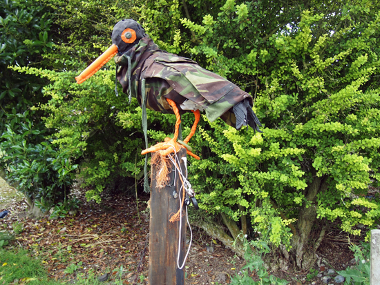
On the drive home, as mentioned here, we went via the north Norfolk coast. Having holidayed there for several summers we stopped off in Cley-Next-the-Sea hoping to catch their summer art exhibition, Cley 13, usually held in the village church. This year in a field next to the graveyard, as we approached the church, we were greeted by these wonderful bird sculptures.

Created by artist Jessica Perry and the children of Stalham High School, they certainly grabbed your attention. And while there was interesting work on display in the church, it is very much like a very well crafted and presented college foundation course end of year show. Good, but not exactly challenging.  However, these birds were just fun and unpretentious and as a result blew everything else away.

We took a couple days out in London in the second week of our holiday. We were lucky enough to have been bought membership of the Royal Academy as a present so decided to check out the Summer Show for the first time. As I’d only ever seen it on TV before, it was interesting to see it in the flesh, but ultimately, it is a difficult thing to review, what with so much on show. However, it was quite a good way to assess your tastes, as we ended up just looking at what immediately grabbed our attention. With most exhibitions we go to being themed or of a single artist/designer, just letting your instincts and knee-jerk judgements kick in was refreshing, and almost the only way to react to such an overwhelming display of work. I found several pieces that I really liked, but equally was surprised by many of the entries being allow in. An ultimate favourite for me though had to be the Greyson Perry tapestries, most of which were created in response to his TV programme on taste. Seeing them in their full glory, and being able to concentrate of their detail and the narrative they told, only went to confirm my opinion that the man is an illustrator rather than a fine artist, especially with his work deviating from pottery.

While at the RA, we also took the opportunity to see the Mexico: A Revolution in Art 1910–1940, which I loved. It hadn’t had great reviews, but the fact it was a mix of painting and photography, I thought made it a strong documentary on the the changes and difficulties that Mexico faced during this time period.

While in London, we also took in the Ibrahim El-Salahi exhibition, some of who’s drawings blew me away. This was shown alongside Meschac Gaba’s Museum of Contemporary African Art, which was sort of a museum within a gallery.

TateGaba’s show was really refreshing, not least because you were allowed to take photographs. Gaba wants to challenge the notion of what a museum/gallery should be, and over the years adds new ‘rooms’ to this travelling show, encourages audience participation, (in the first room there was a large Jenga type game for people to interact with), and showcases his life and work as part of the show, (he even had large scale photographs of his wedding and wedding gifts on display as an exhibit!). I wasn’t overly impressed with his individual pieces of work, with its over reliance on symbolism and a sense of having seen similar approaches done much better, but then the Museum has become an artwork in its own right. As a whole, it is definitely greater than the sum of its parts. And what he is trying to achieve with challenging the notion of an exhibition was a joy to behold and completely refreshing.

Gaba's wedding photographs and gifts

Gaba’s wedding photographs and gifts

Just the fact that I’m able to publish photographs here that I took in the exhibition, and couldn’t photograph anything and publish it here form the, arguable much stronger, El-Salahi show, is testament to breath of fresh air this approach filled me with. Why can’t you take (non-flash) photographs in exhibitions? I’ve always thought it was fucking rediculous.

Lastly, while in London, we met up with Claire’s daughter and they both went off to watch a show at The Globe, which was a present from Callie to her mother for her birthday. So I took myself off the Design Museum. It was a shame because the whole place felt like it was winding down, readying itself for its move across London to its new building in 2014/15. But despite there being an air of the place being unloved, the Future Is Here exhibition was genuinely interesting, once I got my head around what it was about. It basically gathers together examples of new ways of working and designing/producing goods, including crowdsourcing ideas, 3D printing, producing construction materials on a building site, and small scale robot construction. These themes and exhibits, when taken collectively, demonstrated how manufacturing processes are changing around us and how new methods of industry were being formed in the now. The Design Museum was half proposing we are in times of a new industrial revolution, and while I’m not completely convinced, it was a thought provoking experience.

As if to reinforce the feeling that the museum is ‘winding down’, it had on display items from its collection themed into six categories rather than the usual second commissioned exhibition. While it is good to see this work coming out of the closet, and promises much for the new bigger space the museum will have in Kensington, (with some of their collection being on permanent display), it did give the impression that energies and finances were being diverted elsewhere. That said, I naturally made a beeline for the graphic design section, and it was good to see Calvert and Kinneir‘s road signage templates:

Maidenheadand the Design Research Unit‘s branding guidelines for British Rail:

BR