Archive

Critique

Dear Mr Ball

Thank you for your letter to Sir Nicholas Serota raising your concerns about zero hours contracts at Tate. Sir Nicholas is currently away from the Gallery on Annual Leave but I will be sure to show him your letter when he returns at the end of August. In the meantime I would very much like to reassure you that Tate takes these concerns very seriously.We are aware that the use of zero hours contracts has been criticised in the media in recent weeks. We understand that you have questions about how Tate specifically uses them.

Tate Gallery, and its subsidiary Tate Enterprises Ltd, are committed to engaging members of staff with contracts and working arrangements that are fair. Tate Gallery does not employ any staff on zero hours contracts while Tate Enterprises Ltd employs 40 per cent of its staff on zero hours contracts. Staff engaged on zero hours contracts by Tate Enterprises Ltd work hours based on the employee’s agreed availability and the operational needs of the business. They also accrue holiday pay and are entitled to company sick pay.

Tate Gallery and Tate Enterprises Ltd engages people on a range of contracts appropriate to the type of work. Zero hours contracts, used by Tate Enterprises Ltd, are an effective way to manage the changes in staffing levels that are inherent in retail and catering operations. Zero hours contracts also mean that Tate can offer opportunities to those who require flexibility in their working hours and who choose not to commit to fixed hours.

Thank you again for contacting us with your concerns.

With kind regards,

Lucy Dow
Director’s Assistant
Director’s Office
TATE

Zero

Dear Nicholas

I have been a Tate member since 2005 and am writing to you regarding the recent disclosure in the media that the Tate employs people on what has been termed ‘zero-hours contracts’. As a Tate member, I feel that I am being complicit in an employment practice that I feel is unacceptable in 2013, and one that I am surprised that the Tate is actively involved in.

Not giving your employees guaranteed hours of employment, I believe, is a practice that should have been outlawed many years ago. I am sure you are aware of the many arguments against such contracts, but to state my opposition to them, I believe they give people on low incomes no security and forces them to live a hand-to-mouth existence. There is little chance of people employed on these contracts being able to find accommodation due to the lack of proof of a guaranteed income. Further to this, should they have legitimate reasons for turning down work, there are reports of people on such contracts fearing they will be marked down as being inflexible and risk losing future employment opportunities. As an organisation that I previously regarded as progressive, I am shocked to find that the Tate thinks this is an acceptable way to ‘reward’ its hard working staff and believe that it could potentially be regarded as an exploitative act, knowing how desperate some people are to work in the arts and how few job opportunities there are in this field.

As a graphic designer and arts based educator, just like you and your staff, I am employed in the creative industries. The UK based creative industries are globally respected and generate a vast wealth that feeds into the UK economy. Further to this, as a university lecturer, I discuss employment ethics with my students on a regular basis and have a strong personal interest in corporate social responsibility. As a result of this, I believe that employers in the creative sector have a responsibility to uphold this respect for all involved in the sector and to treat its workers fairly.

Because of my strong feelings about this issue, I find that my continued financial support of the Tate to be in conflict with my views. I have recently renewed my membership—I even increased it from a ‘Member + Guest’ to a ‘Member + Guest + Extra Card’—but had I been aware of the Tate’s use of ‘zero-hours contracts’ at the time, I would not have renewed it.

There is little I can do about my current membership. However, unless I learn that the Tate has stopped using these ethically questionable contracts before my current membership has run out, I will not be renewing it again. In the meantime, I will boycott cafes and bookshops at any of the Tate galleries that I visit over the coming year so as to not give further financial support to the Tate.

Yours sincerely

Nigel Ball


Contractual Freedom is a short film I made seven years ago about the then obsession with ID Cards and surveillance that Tony Blair’s governement had at the time.

While not directly relevant to the current internet spy scandle, there are enough cross overs to feel it is worth posting this old film again in 2013.

Contractual Freedom

Contractual Freedom was short listed for the Big Issue Film Festival in 2007.

sound-system-the-clash

In my teens and early twenties I was a big Clash fan. Then as my music tastes matured, and I started to tire of rock music’s clichés, I started to fall out of love with the band’s early work, which traded so heavily on rock clichés. Half of Black Market Clash, and all of Sandinista and Combat Rock are all I can really listen to by them now. It is almost as if I have divided them into two different bands. The diversity of their later work, post-London Calling, which experimented with different styles and genres of music, bought a breadth to the band that wasn’t previously there. This period of material outshines anything that went before it for its sheer inquisitiveness. Their artistry flourished as their music became conceptually linked to lyrical content and they matured as they became more and more interested in emerging popular cultures from around the globe.

Outside of their music, another appeal of The Clash to my young eyes was their over-all aesthetic. Encouraged in their early days by manager Bernie Rhodes, the army surplus and leather jacket stylings gave a rebel stance that became emblematic, and spawned many a teenage lookalike. This defined punk fashion in many immotators eyes, not least myself in my late teenage years. In their graphics, their evolving visual language of distressed or stencil typography, saturated revolutionary reds and military greens, heavily posed photographs, and knowing reggae and hip-hop reference points, formed an aggressive identity that flirted with insurrectionary fervour. The influence of this has been utilised by many a marketeer in the last 20 years, and you see their graphic stylings on anything nowadays that is trying to look slightly edgy, urban and rebellious, from skateboard magazines to energy drinks. Mainstream ‘alternative’ would be an apt description and the ‘making money out of rebellion’ Strummer quote rather obviously comes back to haunt his memory.

When I heard about the proposed release of Sound System, a box set of Clash material due to hit the shops this September, nostalgia got the better of me and I searched it out online. I was expecting to be disappointed, a feeling that nostalgia often promotes—stripped of any contemporary relevance and promoting a sense of longing for something that can never be again. However, disappointing is too weak a word for what I found; as I looked at the pre-release marketing shots and promo videos I was gob-smacked by how truly awful this looked. The ‘boom’ box container is the first thing that grates. I can’t even think where I would keep this in my house if I owned one, I certainly wouldn’t want it on show. Ugly and cheap are words I try to avoid when discussing design, but I’m afraid I can find no better ones to articulate here. Then there are the contents—stickers, dog tags, a poster presented in a giant cigarette tube, badges, more stickers—gimmick after gimmick thrown together on a whim with little thought to consistency or sophistication. Childish, naive, and verging on being patronising, it is if Sound System is aimed at the average 14 year-old punk new-bee rather than ageing Clash fans with the disposable £111 to spend on it.

If this project was just down to record company excesses trying to make a quick buck in a dying industry, then I could almost excuse it, distancing as it would the product from the band. But to know that Mick Jones and Paul Simonon have been involved in designing this is disheartening, as it does a real disservice to The Clash’s legacy. I can’t believe that Joe Strummer isn’t turning in his grave.

ThePartners

I’ve just finished reading Preserved Thoughts by The Partners’ Jim Prior. It is a neat little A5 (ish) book and download of essays, blog posts and talks he has written and delivered over the course of the last three years. It deals with many different aspects of branding, touching on topics as diverse as morality, creativity in big business, social purpose and human aspiration. Thought provoking and intelligent, it is highly recommended for anyone interested in branding.

Get the book here, or the download here.

Strom

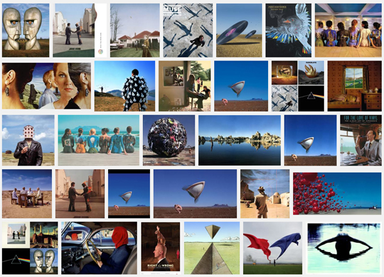
Google image search results for Storm Thorgerson

It was very sad news to hear of the death of Storm Thorgerson last month. Without a shadow of a doubt, Thorgerson was one of the greatest album sleeve designers ever and there are probably few record collections that don’t boast some of his work amongst their ranks.

It was refreshing to hear the reverence with which he was held in news reports and in discussions with friends. It was interesting to consider that some of those that mourned his passing may not even have previously known know his name, (nor that of Hipgnosis), but knew the work extremely well. This is testament to his enormous talent as much as because they recognised the work in relation to their  favourite bands. It is also interesting to consider that during these pronouncements, Thorgerson has himself become a metaphor by which to mourn the ‘good old days’ of vinyl.

However,  and here is where I commit graphic design sacrilege: I don’t actually like his work.

So there is a dichotomy at work here—how can I praise someone so much, admire their output and recognise its importance, while at the same time not actually liking it? This cognitive dissonance boils down to the fact of what Thorgerson was—a brilliant graphic designer. In an interview with Adrian Shaughnessy, of which aspects were reprinted in Thorgerson’s Creative Review’s obituary, he says: “All I try to do is represent the music.” In this one statement, he hits the nail on the head. As I don’t like the music he is designing for, it is only right, that if he is trying to represent that music, that I don’t like the imagery. But I can recognise its effectiveness all the same. Thorgerson has done his job brilliantly, and not attracted me, because I’m not the desired audience.

In reading through the discography on Wikipedia of the hundreds of album sleeves that Hipgnosis designed in their career—not to mention what Thorgerson did after their demise—I think I could list about eight records I actually like. Take Pink Floyd for example, I have never liked their post-Barrett output believing it to be pompous, cryptic, arrogant, nerdy, polished, and far too serious. I’ve always felt it to be stripped of the psychedelic drug induced experimentalism that made early Floyd so great with Barrett, (who also happened to write some killer pop hooks).  And as I cut my musical teeth in the late 1970s and early 1980s during post-punk, where playful and experimental records could make it into the pop charts, where there was a broadening of musical horizons rather, such terms as pompous, cryptic, arrogant, nerdy and polished, collectively have negative associations for me.  But Thorgerson brilliantly illustrates these in his cryptic, overblown set pieces full of knowing metaphors and forced school boy humour, yet devoid of any rough edges and any sense of irony. The one sleeve that Hipgnosis produced that stands head and shoulders above anything else they did during their reign, in my opinion, is XTC’s Go2. See previous Dubdog posts over on Blogger where I’ve discussed this sleeve extensively.

When thinking about album sleeve design, there are a few designers that have become synonymous with the medium that I really admire, such as Barney Bubbles, Malcolm Garrett, Stanley Donwood, and Julian House; but there are also many un-tutored designers who remain un-credited whose work I would just as easily hang on my wall. There are also plenty of examples of bands who have created their own artwork which are equally as effective as professional designers, and record labels, such as Constellation Records, who steer an aesthetic visual tone through the label’s output. Regardless of the scenario, if an album sleeve works, then it is generally because the author shares the same rationale as Thorgerson when creating the work—to represent the music. And as in book jacket design, if a graphic designer is doing their job properly, tutored or otherwise, you absolutely should be able to judge a record by its sleeve.

I saw Storm Thorgerson interviewed by Adrian Shaughnessy at D&AD XChange in 2009, and he proved to be a likeable rogue; slightly arrogant and antagonistic but a natural raconteur with a huge wit. The fact he wasn’t overly mobile, and that he needed several helpers to aid him on and off the stage, (as well as to give out postcards of his work to the entire audience, which was a nice touch), it was obvious that this larger than life character wasn’t in the best of health. Therefore I wasn’t completely surprised to hear of his passing. But regardless of my personal tastes dictating my knee-jerk reactions to the work he did for bands I didn’t like, his graphic design and music legacy is an important one, and I have nothing but utmost respect for the man and his enormous talent. The world is a poorer place for his passing and all music lovers, regardless of taste, owe him an enormous debt. RIP Storm Thorgerson.

Screen Shot 2013-04-02 at 17.51.22

I’m not sure when streaming a band’s forthcoming album, pre-launch date, became a popular marketing ploy. But for at least 7 of the new releases I’ve bought this year so far, I’ve been able to listen to them in their entirety prior to making a purchase, and usually several weeks in advance.

As a marketing ploy, this is good news for me—it is good to know what I’m getting before I buy it, especially with bands I am unfamiliar with. It was streaming The Villagers album {Awayland}, a band that had previously passed me by, that convinced me to buy it. This doesn’t mean I’m not prepared to take risks, or rely on a trusted journalist’s or friend’s recommendation, but it does mean I can be more discerning when hitting the ‘buy’ button.

Could this work against an artist? Well, certainly. That hotly tipped release that has been slavered over by critics who have had advance copies months ahead could end up being just hyperbole and bandwagon jumping, which is often the case. I pre-ordered the last, much lauded, Nick Cave CD when its release was first announced, and then nearly cancelled the order when it streamed on The Guardian as the lyrics were, in places, embarrassing, and the overly dramatic vocal delivery grated, (The Bad Seeds though, what a band—please make a solo album without Nick). But I still kept the order if only for the promise of well designed packaging.

Therefore, it struck me as odd yesterday, when The Quietus announced that Stockholm electronic experimentalists, The Knife, were streaming their new album, due for release next week, on their website. Not so odd in itself in this day and age, but the fact that the artwork for Shaking The Habitual was also on show for all to see did strike me as such. The artwork contains a witty anti-capitalist side swipe by comic strip artist Liv Strömquist, (section above). This will come with all physical and digital purchases, and, as The Knife proudly announce, be fully readable online. As someone who has never given up on buying CDs as I’m old fashioned enough to still like having an artefact with artwork, this stumped me slightly. For now, I’ve read the comic online, laughed, got the joke. I’ve heard the music. Anytime between now and next week I can go back to The Knife’s website and listen to it again to the point that I could get bored with it. And then, I could stream it on Spotify once it has been released if there are still a few listens left in it. And I can point anyone that I might think is interested in such things to the website to read the comic strip, as I’m technically doing here. Therefore, this seems to really make buying a physical or digital own-able item pointless.

The question that now remains is: will I buy the album? Under normal circumstances I would do, as I like it. In some respects, as a sucker for (good) experimental electronic music that has its feet firmly rooted in pop, and as the sort of person who laps up satirical agit-prop comic book art, then I’m a target market for this ‘product’. The fact I’ve become interested enough to want to write about all this ‘new’ media gubbings, probably, also demonstrates that I’ve already, metaphorically at least, bought into this album. The fact that I will want to put it on my iPhone for the walk to work or for playing in the car, as well as listen to it on the decent stereo we have in our front room, (rather than on my computer speakers), will probably tip the balance. But if free wifi was rolled out across the country and I was truly always connected, then this, and other similar marketing activities, would probably, finally, start to kill the collector in me.

IMG_1052

Coastguard mast seen from the ground, Shingle Street, Suffolk

I’ve recently rejoined Instagram. My departure in December 2012 was, like many others, due to the announcement that Instagram was going to change their terms and conditions that would allow them to let advertisers use my content without asking. Instagram soon backtracked on this, but I had made the break. At the time I was considering leaving anyway, as I had started to question how many social networking sites I was on, and what I was getting out of them. So this minor media blow-up prompted my exit, and as such, I wasn’t bothered about rejoining once the back peddling started.

However, much to my surprise, I actually found that I missed it.

Around the same time, many photographers I know started getting quite vitriolic about people who use Instagram, and posted articles on their Facebook walls against the photo sharing app. One such was by Jonathan Jones in The Guardian, which pretty much calls anyone who uses Instagram mindlessly deluded. Now, if there is one thing that winds me up more than anything else, it is artistic elitism—so I rejoined Instagram, if for nothing more than to wind up people with such attitudes.

To be honest, I was a little incensed by such opinions, and so some furious notebook scribbling has resulted in the following points, presented here for your reading pleasure:

  • Anyone who is so vehemently opposed to something usually feels threatened by it, and this usually results in a defensive attitude. This is what I believe we are seeing here. Anything that looks popular is immediately denounced and elitist walls start rising, soon to be followed by over blown pompous statements and incredulous derisions that do not really have an ounce of an objective rationale.
  • Photographers do not own photography. It is a popular activity, for anyone to take part in for their own purposes. In fact, anyone who owns a camera is automatically a photographer, and therefore has as much right to do what they want within the medium as anyone else. For good or for bad.
  • I do not disagree that much on Instagram is vacuous and of little artistic merit. Particularly the filters, which I use sparingly and only to enhance a poor photograph. But that doesn’t damn the medium. A good analogy is with that of looking at Punk music between1976–79. Immediate and of the people, Punk encouraged anyone to pick up a guitar and get involved. This was both its beauty and its downfall, as a thousand god awful bands formed. But a few fantastic talents emerged that wouldn’t have otherwise, and they developed and grew to be of great importance to the wider world of music. So to with Instagram—it is there, free to download if you are lucky enough to be able to afford a smart phone, and there is stuff of value there if you choose wisely in who you follow.
  • Many of the people I follow are designers. There is something about its immediacy and ‘of the now’ nature that is appealing in sharing with people who have a particular visual outlook on their surroundings. As well as locations I am unlikely to see, typography, book jackets found in flea markets and architectural points of interest, to name a few subject matters that occur regularly, are visual thoughts knocked backwards and forwards between followers. To be able to check this in the middle of a mundane day is not just to feel connected, but it encourages the viewer to look at their own everyday from a different perspective.
  • Instagram is by far a better designed interactive mobile image sharing vehicle than Tumblr, which, in and of itself, tends to encourage the sharing of other people’s work with little to no respect for copyright. (No offence Tumblr, you have your purpose and are good at it).
  • There is just as much vacuous art photography outside of Instagram as there is engaging and intelligent work. Shit photography is not the preserve of Instagram, and photographers have no high-horse to get on from this perspective.
  • And finally, the concept that something can only be validated if it is on a gallery wall is beyond ridicule.

I use Instagram as a visual scrapbook for my on-the-go visual notes and thoughts, albeit a scrapbook that I welcome others to share in. I do not want to see photographs of other people’s meals or kids or snowmen with or without a wacky filter; so I don’t follow those that post such things. But I do want to see the photos of, say, Dan Hill, the architect, designer, writer and CEO of communication research centre Fabrica , whose City of Sound blog is always a stimulating and intelligent read and who has much to say on all things design related. To see the the experiences and interests behind what informs his opinions and his writing is always engaging, and never ever deluded.

My first article for Eye magazine’s blog was published today. It is available to read here.

Screen Shot 2013-01-25 at 17.08.10

We had Jude Law bemoaning Michael Gove’s education plans from the Turner Prize rostrum earlier this month, and there have been a few rumblings beneath the surface from a few design professionals, not least with Neville Brody taking the presidency at D&AD earlier this year, (as mentioned here a few months ago). But generally, no one was really sticking their neck out and actually organising anything to try and counter act this government’s disastrous education policy and fighting for the future of the creative industries in this country. Well, now many design professionals have decided to club together to try and make the government see sense in not abandoning art and design education in the new Ebacc qualifications. Check out the Include Design website, sign the petition, and write to your MP.

Screen Shot 2012-12-16 at 17.04.37