People Power installation by Stephan Charnook

Claire and I visited Manchester for the first time at the end of April. Of the many things we saw and did, a highlight for us both was a visit to the People’s History Museum. Housed in a specially converted pump-house, the museum hosts an amazing visual display of artefacts relating to political history of ordinary people in this country, with an obvious bent towards Manchester related events and organisations, from the Peterloo Massacre to celebrating 150 years of the Co-op.

OLYMPUS DIGITAL CAMERA

OLYMPUS DIGITAL CAMERA

The museum could equally be called the Graphic People’s History Museum, as walking around it becomes obvious just how important graphic design has been to organised labour and grass-roots movements in this county. From broadsheets to posters, from trade union banners to badges and T-shirts—this must be a go-to museum for anyone interested in political graphic design. Importantly, they also have a dedicated conservation room, with conservers fighting the effects of time on historically important trade union banners. (You even get to see them at work through a large plate glass window into what looks like a humidity controlled room with banners laid out on vast tables; unfortunately this is the only area you are not permitted to take photographs).

OLYMPUS DIGITAL CAMERA

OLYMPUS DIGITAL CAMERA

OLYMPUS DIGITAL CAMERA

OLYMPUS DIGITAL CAMERA

OLYMPUS DIGITAL CAMERA

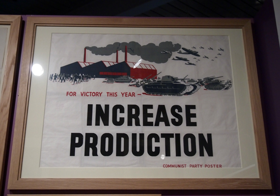
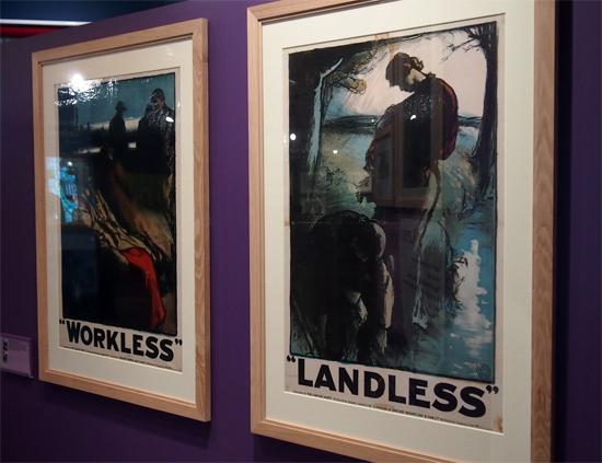
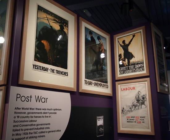
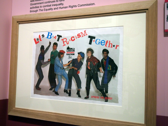
As the museum covers a vast time period, it is not surprising that the visuals employed to ‘agitate, educate and organise’ change throughout the three floors. From original iconic pre-World War 1 posters that you’ll readily see in graphic design history books, to some truly excruciating 1980s anti-racist GLC posters:

OLYMPUS DIGITAL CAMERA

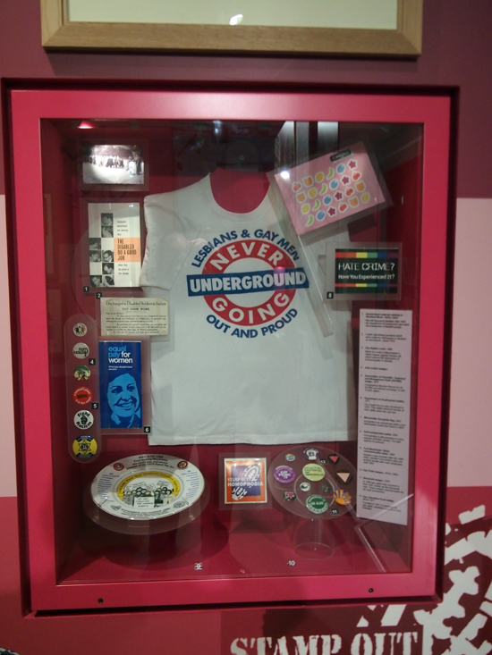
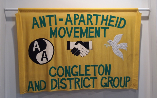
If there are any criticisms I can make of the collection it is that the narrative presented has a left-wing bias that gives the sense that this is the ‘official’ story. While it is understandable that the Labour Party and key trade unions are focussed on in large measure, being highly important and having the biggest historical impact on this country, some factional left parties and organisations are given exposure over others. For example, a sympathetic nod is given to the Anti-Nazi League and the SWP and Militant Tendency, while there is a complete lack of anything relating to anarchist history; there is no Class War or anarcho-punk mentioned anywhere, both of which were very visual in their output and both politically and culturally important throughout the 1980s and into the 1990s in the north of England. Despite this minor gripe, there is a good spread of other worthy causes such as gay & lesbian rights and the Anti-Apartheid Movement, although these were quite fleeting considering the impact they had on changing societal attitudes.

OLYMPUS DIGITAL CAMERA

OLYMPUS DIGITAL CAMERA

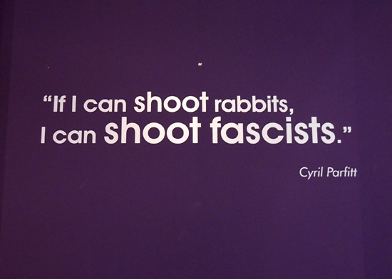
One of the most touching displays for me was a celebration of those that volunteered from the UK to fight fascists in Spain during the Spanish Civil War in 1936, including a typed and signed letter from George Orwell. There is something about this story that I always find moving. Having read and seen much about how ordinary people gave up their time, (and many their lives), to help fight the advance of fascism in Spain, so that the Spanish themselves could concentrate on fighting their own revolution, being confronted by collections of belongings from those on the front lines was over-powering.

OLYMPUS DIGITAL CAMERA

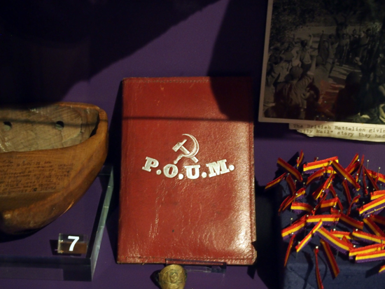
A POUM wallet is displayed with volunteers’ belongings from the Spanish Civil War. POUM—a Spanish communist/Marxist party with anarchist sympathies who organised battalions of foreign volunteers to help fight fascists, (and for whom George Orwell fought alongside).

OLYMPUS DIGITAL CAMERA

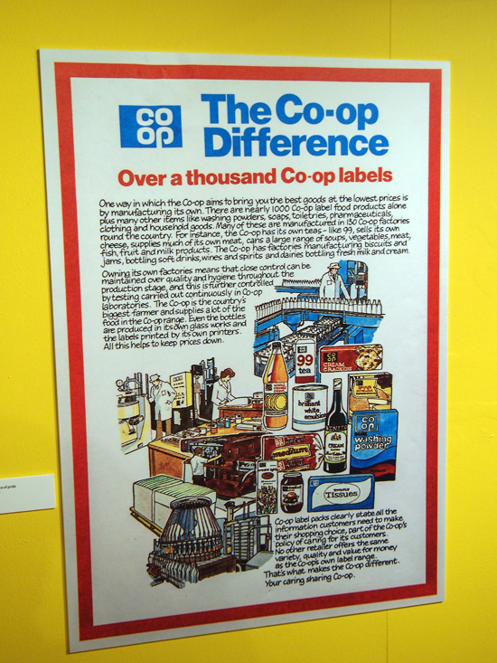
It seems both fitting and sad to write this post today when many right-wing, (and some openly racist), parties have had electoral success in European elections this last week. It was hard not to let his thought linger today as I edited these images to post here. But when we were walking around the museum it was equally depressing that there was not only a corner of the permanent collection devoted to the Manchester born Co-operative Society, but also on the ground floor the Museum was hosting a special exhibition celebrating 150 years of the Co-op. While this in and of itself was a great exhibition, with the Co-op in so much financial and organisational trouble at the moment, it felt like a very deflating experience looking through the Co-operative’s rightfully proud history with knowledge of how recent greed and mismanagement has bought such an important British institution to its knees.

Employees’ magazine for the pre-Co-op CWS

OLYMPUS DIGITAL CAMERA

OLYMPUS DIGITAL CAMERA

OLYMPUS DIGITAL CAMERA

So it is with a bitter-sweet taste in my mouth that I post these pictures here. But regardless, if you are in Manchester at any time then I can not recommend a visit to the People’s History Museum enough.

OLYMPUS DIGITAL CAMERA


I’ve recently had the pleasure of working with Eddie Duggan of the BA (Hons) Computer Games Design course at UCS. Eddie has been organising From Cardboard to Keyboard and Back, the XVII Annual Colloquium for the International Board Game Studies Association, due to be hosted at UCS’s Ipswich campus later this month. It is a major conference with papers being presented from academics, historians, archaeologists and students from around the world.

I agreed to design and artwork the conference programme last year, and after a hectic few weeks of work on the contents over Easter, the artwork was finally sent to print this week. Eddie and I involved second year UCS graphic design and illustration students in the process, who in small teams had to pitch concepts for a cover illustration and delegate maps, with Eddie acting as an external client who they had never met before. The activity provided them with a chance to hone their professional skills by presenting their concepts to someone who wasn’t a peer or a lecturer they were familiar with.

Cover

Colloquium programme cover with the winning illustration by second year graphic design student team comprised of: Jamie Bird, Tatjana Gecmane and Georgina Warden; who won a ‘client pitching’ activity to have their work featured in the publication.

It has been an honour to be involved in some small way with this conference, and great to have been able to give graphic design students a chance to have their work showcased to an international audience.

Our-EnglandA4

An exhibition of work created by third year Graphic Design students at UCS themed on English culture. This exhibition will also feature work by graphic design students from Edith Cowen University in Australia, who answered a brief in tandem with UCS students looking at Australian culture.

The exhibition is being curated by second year UCS Graphic Design students as part of a professional practice module. Second year students are creating the visuals that support and publicise the exhibition, deciding how to hang the work on display, as well as blog and tweet about their experiences in hosting an exhibition for the first time.

The Private View is 20 May at 17:30, Public View weekdays 21–26 May 10:00–17:00, (email graphics@ucs.ac.uk in advance for access).

Room 1, University Campus Suffolk, Arts Building, Ipswich

ourenglanducs.wordpress.com

@OurEnglandUCS

Today I stumbled across The Truth of Revolution, Brother, a proposed book about the philosophy of punk.

Taking its title from a Crass lyric, (the infamous anarcho-punk band that took punk’s DIY ethos to a whole new socio-political level), the book promises to go well beyond the music, fashion and graphics shlock that most nostalgic punk cash-ins opt for. For anyone like myself who formed many of their personal and social political beliefs from their experiences within the punk movement will understand what an important document this could end up being. Particularly if the accompanying promo video is anything to go by:


The book is being put together by the surnameless Lisa, Charlie and Robin, who say the book is largely written and designed, almost ready to go. With a launch date of August 2014, they’ve started a Kickstarter campaign to raise enough funds for the first print run, and come payday, I’ll be on Kickstarter making my donation.


I have always been fascinated by maps. On returning from family camping holidays in France as a boy, my dad, a photographer by trade, would create a big photo album of our adventures, and in pride of place at the front of these albums he would stick a photostat map of France that detailed our journey. My father had itchy feet on holiday and we would rarely stay in one location more than 2 days before he bundled the five of us back in our rusty old Fiat van to trundle off to another site of interest. I think between the age of 8–14 I must have experienced most of France over 2 week periods every summer. Now days Claire and I mostly holiday in the UK, and as we near the date of departure we always buy an Ordinance Survey map of where we are heading and study it intently. It has become a bit of a ritual which I think harks back to the family holidays of my youth.

This information is given as background to the fact that I have recently come across several personal coincidences featuring maps. Two weeks ago it was my mother’s eightieth birthday, and struggling to think of what to get her I struck upon the idea to take her to Norfolk on a trip down memory lane, (my family had relocated there from London in the 1960s, and as a result it is my county of birth). The obvious way to physically give this as a present to my mum—with the date for the intended trip yet to be arranged—was via a map. So I bought an Ordinance Survey map of The Broads, some stickers, and wrapped them up with an instruction card informing her to choose the locations she wanted to revisit.

OLYMPUS DIGITAL CAMERA

OLYMPUS DIGITAL CAMERA

The coincidence of maps on that weekend happened when early on the Saturday morning, prior to making my mum’s card and wrapping her present, I had to go to the Post Office to pick up my order of Where You Are by Visual Editions, a book / box of maps by “writers, artists and thinkers … each one exploring the idea of what a map can be”. The coincidence was cemented in my mind when sitting down to look through the Visual Edition maps, still prior to creating my mum’s card, and realising another book on my studio table waiting to be read had a map on its front cover. This book about typography and printing was published in 1947 by the long gone Cowell’s printers in Ipswich, which I had been prompted to buy the week before after reading Ruth Artmonsky’s excellent Do You Want It Good Or Do You Want It Tuesday: The Halcyon Days of W.S. Cowell Ltd. Printers.

OLYMPUS DIGITAL CAMERA

A Handbook of Printing Types by John Lewis, published by W.S Cowell Ltd, 1947

The former of these two books, Where You Are, really stretches the traditional concept of what a map actually is and how maps can be interpreted. I was particularly taken with Valeria Luiselli’s beautiful and mysterious Polariods in her map: Swings of Harlem contained within Where You Are, in which she photographed her daughter on every set of swings in every play-park in Harlem. In her text accompanying these images she passes detached thoughts on the location, the procedure of getting to the park, and her own mood as she watches her daughter play and eavesdrops on other people’s parent–child conversations.

I got to thinking about the concept of psychogeography as I read Luiselli’s piece over the following week. In particular I was considering how we can approach the world around us in a detached manner, forming our own maps of our circumstances and psychologies, and how these can differ greatly from maps produced with the purpose of trying to give order to the world around us. Feeding into this thought process was a post I read in February on Al Jazeera America questioning why the north ended up on top of the map. This led me to dig out The Situationist City by Simon Sadler, a book that had been sitting on my shelf unread since I bought it last year.

OLYMPUS DIGITAL CAMERA

The cover of Sadler’s book features Guy Debord’s 1959 psychogeographical map, of which the author says: “…made as part of Debord’s correspondence with his situationist colleague Constant, the piece was a tiny gem of situationist pot-latch (art created as a gift) and détournement (art composed from ‘diverted’ aesthetic elements).” This image in turn reminded me of a catalogue cover I had produced 12 years previously for a graffiti art-trail of Ipswich I curated. The project’s intention was to question what could be constituted as an art gallery and the cover image I designed openly and appropriately rips off Debord’s visual concept—appropriate because situationism was never afraid of plagiarism as a concept and actively courted it as an artistic device, as highlighted by Sadler above when discussing détournement.

OLYMPUS DIGITAL CAMERA

The catalogue, circa 2002, also contained a map I designed, (below), for exhibition goers to follow. A few years after designing this I realised it was similar to a map of London that NB Studio created, (see link). I don’t know when NB Studio made their work, but if it was prior to my map, I was completely ignorant of it at the time—this is a statement which I realise calls into question my honesty considering my previous comment about Debord’s map, but I swear it is true. Regardless of this, anyone looking at NB Studio’s map will soon agree that my mediocre design effort pales into insignificance in comparison.

OLYMPUS DIGITAL CAMERA

To wrap up all this map talk I suppose that I’ve come to realise that all my recent thinking around the subject has actually been a journey in itself, and therefore, this blog post is a map of my thought processes over the last few weeks. I will be the first to admit that these thoughts and coincidences are somewhat ill formed and disjointed at the moment, but I’m currently ruminating on many different thoughts with the hope of formulating some of the more interesting ones into a future project. So without wanting to force a pun, I haven’t come to the end of my journey in this matter, and I fully expect to return to it again here in the near future.

However, it is probably worth pointing out an irony from the starting point of this post. On the way to a celebratory meal in a pub for my mother’s eightieth birthday on the evening of the aforementioned Saturday, at which my childhood fellow French adverturer brother and sister were going to be present, Claire and I got completely lost on the drive there, too reliant were we on Apple’s iPhone Maps app!


LynchI spent a very agreeable Saturday with my friend Liz a couple of week’s ago visiting various exhibitions in London. The main objective was to catch the Warhol, Burroughs and Lynch shows at The Photographers Gallery, but we also took in the Royal Academy’s Sensing Spaces, before making the unwise decision to take in the Portrait Gallery on the first sunny day of the year on a busy Saturday afternoon.

The Photography Gallery shows were a mixed bunch. I thought the Warhol exhibition was largely pointless, with the images being shown more because they were by Warhol rather than because there was anything inherently interesting in the photographs themselves. The only shots that really made sense to exhibit, in my opinion, were the ones where Warhol had repeat printed and stitched together creating gridded montages much like some of his screenprints. At least with these there was some tangible link to how he approached the physical production of other works of his. I also thought the Lynch show was boring. Photographs of abandoned and derelict buildings, albeit expertly shot, were dull in the extreme. In fact, I would go as far as to say they were pretentiously dull; shot entirely in black and white I felt he was trying too hard to create ‘art’, and it was all a bit like looking at a 1980s British Journal of Photography annual. However, well worth the entrance fee alone was the Burroughs show. Of the three, he was the only artist who gave the sense he was truly experimenting with the medium, testing and pushing the capabilities. And the shots themselves had a far stronger narrative. While Warhol was playing and Lynch was trying too hard, Burroughs was exploring a medium and seeing what it could do and what he could produce.

RADiébédoFrancisKéréOver at the Royal Academy the Sensing Spaces: Architecture Reimagined show was a blast. Each room had a different theme, and you were encouraged to be interactive with the work. As you walked around each exhibit created a different atmosphere in their given spaces which engaged the viewer and took them with the work. There could have been no more an explicit introduction to the uninitiated as to the power of architecture to influence moods and behaviour. For example, the image above of Diébedo Francis Kéré’s piece encouraged visitors to stick brightly coloured straws into the structure to create a furry, fun walkthrough. While the mausoleum  solemnness of Grafton Architects’ main room stopped people in their tracks, slowed them down and made them gape upwards in astonishment, (see below).

RAGrafton3And Pezo von Ellrichshausen’s monstrous wooden beauty could be climbed via a ramp or spiral staircases in the legs, which allowed a closer view of the Academy’s architectural gilding linking the imposing structure with the building that housed it and bringing a greater appreciation of everyone’s surroundings.

RAPezovonEllrichshausenWhile I wasn’t overly impressed with two of the shows at the Photography Gallery, I would still highly recommend a visit, and the Royal Academy is only a short 5-10 minute walk away, which would be a shame to miss while it is still on.

Warhol, Lynch and Burroughs is on at the Photographers Gallery until 30 March.

Sensing Spaces is on at the Royal Academy of arts until 6 April.

More photographs over on Flickr.

ChildhoodRemixed_cover

I’m proud to have recently finished working on the third edition of Childhood Remixed, a University Campus Suffolk (UCS) online interdisciplinary academic journal themed on childhood. The journal, published annually, has previously only featured papers from staff and students at UCS. However, this year much of the publication has been made up of submissions to the international Children and Childhoods Conference held at UCS in July of last year.

ChildhoodRemixed_welcome

The international flavour of this edition demonstrates not just how much the journal has grown in three years, but how much UCS has developed in that time as well. First launched in 2012, Childhood Remixed was intended as a ‘stepping stone’ into the world of being peer-reviewed and published. For third year undergraduate and postgraduate students, and for lecturers who hadn’t been published before, this was an excellent opportunity for a safe trial into the daunting world of academic publishing. The journal still provides this platform, but now allows those same students and staff to be featured alongside academics and researchers from across the globe.

ChildhoodRemixed_pagesIt is hoped with this international issue, that the journal will be available to the wider public soon as a download rather than just internally within UCS as the previous two editions have been. More details will be posted here when it is available.

Thanks to Dr Alison Boggis, Senior Lecturer in Early Years at UCS, who has tirelessly pushed this publication forward since its first inception three years ago.  Read a report of the launch of the first edition here on Blogger.

2014 sees the 50th anniversary of the 1964 First Things First manifesto. In the run up to the launch of First Things First 2014 on Monday 3 March, you can read an article I recently wrote, along with an interview with the author of this contemporary update, over on Eye blog.

Designforlife

One sunny Sunday afternoon walk around Woodbridge today and all I seemed to see around me were examples of living, moving typography.

ImageThis antique shop’s sign caught my eye with its peeling letterforms. There’s something fittingly accidental in the evolving visual language of an old sign decaying for an antique’s dealer. And the shapes created by this natural ageing process give up unique shapes—a typeface being undesigned, if such a thing were possible—that organically visualise the forward march of time. While the motion may not be obvious in the moment in which I looked at these, motion had happened and was happening none–the–less, albeit at a very, very slow rate.

ImageAnother antique shop had a similar feel but this time caused by peeling paint, rather than lifting vinyl.

ImageI moved from black and white to a dash of colour when walking through a graveyard and I caught sight of moss taking hold to letterforms carved on a gravestone. An interesting thought occurred to me that this type that usually memorialises the dead has turned into a piece of living type, changing with the seasons.

Image

ImageLater, after returning from Woodbridge and taking the dog for a walk I found this spray painted GUR on a local heath that doubles as a golf course. I have no idea what GUR stands for, and as this is a golf course it is likely to be cut short before anyone will get to see how it develops. But it is still a piece of living typography while it lasts, as the grass grows.

Image

Timelessness

Last week I was asked to introduce Gary Hustwit’s Helvetica for a screening to UCS MA Journalism students and members of the public. Afterwards, in a question and answer session, someone unexpectedly asked if I thought Helvetica was timeless. It was a good question in relation to the film we had just watched, but not one that I had anticipated being asked, and therefore I said the first thing that came into my head, (and a little more sharply than maybe I should have done). As the thought of something being timelessness has always seemed an odd concept to me, I stated that nothing was timeless.

As a result of this knee-jerk response, the idea of timelessness has been on my mind all week. It is a phrase that crops up again and again in graphic design circles. It is often spoken of as a quality of good logo design and it is supposedly one of the characteristics that a design classic should embody, according to the cover of Phaidon’s publication on the same topic at least.

Phaidon2

But I’m highly sceptical about this. Taking issue with Phaidon’s description, if you look at my idea of a design classic—the iconic Donor Card as written about here a few weeks ago—it could never be described as timeless. Its styling’s are very much of the 1970s.

DonorCardThen

Any piece of visual communication stays the same as the world around it moves on, leaving the item caged in the aesthetics of the time it was created. Think of one of the most famous pieces of graphic design in the history of this country—Beck’s Underground map—it is absolutely a product of its time. It may have been tweaked, altered and changed over the years, and maybe not enough each time that anyone would notice that it was dramatically different from its predecessor. But if you see the original and the current version side by side, you can automatically see that it came from a different era. Jump to a recent piece of famous graphic design, the 2012 Olympics logo, and that arguably started to date even before the games started, designed as it was 5 years previously.

HarryBeck_TubeMap_580

Harry Beck’s original Underground Map c.1932

standard-tube-map

Current version of the Underground Map

To strive to make something timeless from the outset is to set oneself a challenge that I believe can never be achieved. Maybe as an old Marxist I’m still stuck with the philosophy that everything changes; but this is an philosophy that history seems to have proved right. As a designer, at best you may create some sort of longevity in a piece of work. If your creation doesn’t have to be redesigned too soon then your client can get many years of service out of it, decades even, but eventually it will look dated.

I accept that in the case of a typeface much of that dating may depend on the application. Sure, Helvetica can still look contemporary when applied well in 2014 as much as it did when it was designed in 1957, but that is because it may be used in a contemporary setting. However, there are plenty of examples from the history of graphic design where it looks outdated. I agree that one has to be cognisant of the fact that there are lots of things that can change the appearance of a typeface even if the individual characters remain the same; tracking, point size, uppercase/lowercase, background colour, supporting imagery such as illustration, photography or other graphic architecture; all will alter how you ‘read’ the form of the face and bring different meaning to it. But over time, the choices diminish and it has to be asked whether Helvetica will still have fresh ways of being applied in 1000 years time? I personally doubt it.