Archive

UCS

Timelessness

Last week I was asked to introduce Gary Hustwit’s Helvetica for a screening to UCS MA Journalism students and members of the public. Afterwards, in a question and answer session, someone unexpectedly asked if I thought Helvetica was timeless. It was a good question in relation to the film we had just watched, but not one that I had anticipated being asked, and therefore I said the first thing that came into my head, (and a little more sharply than maybe I should have done). As the thought of something being timelessness has always seemed an odd concept to me, I stated that nothing was timeless.

As a result of this knee-jerk response, the idea of timelessness has been on my mind all week. It is a phrase that crops up again and again in graphic design circles. It is often spoken of as a quality of good logo design and it is supposedly one of the characteristics that a design classic should embody, according to the cover of Phaidon’s publication on the same topic at least.

Phaidon2

But I’m highly sceptical about this. Taking issue with Phaidon’s description, if you look at my idea of a design classic—the iconic Donor Card as written about here a few weeks ago—it could never be described as timeless. Its styling’s are very much of the 1970s.

DonorCardThen

Any piece of visual communication stays the same as the world around it moves on, leaving the item caged in the aesthetics of the time it was created. Think of one of the most famous pieces of graphic design in the history of this country—Beck’s Underground map—it is absolutely a product of its time. It may have been tweaked, altered and changed over the years, and maybe not enough each time that anyone would notice that it was dramatically different from its predecessor. But if you see the original and the current version side by side, you can automatically see that it came from a different era. Jump to a recent piece of famous graphic design, the 2012 Olympics logo, and that arguably started to date even before the games started, designed as it was 5 years previously.

HarryBeck_TubeMap_580

Harry Beck’s original Underground Map c.1932

standard-tube-map

Current version of the Underground Map

To strive to make something timeless from the outset is to set oneself a challenge that I believe can never be achieved. Maybe as an old Marxist I’m still stuck with the philosophy that everything changes; but this is an philosophy that history seems to have proved right. As a designer, at best you may create some sort of longevity in a piece of work. If your creation doesn’t have to be redesigned too soon then your client can get many years of service out of it, decades even, but eventually it will look dated.

I accept that in the case of a typeface much of that dating may depend on the application. Sure, Helvetica can still look contemporary when applied well in 2014 as much as it did when it was designed in 1957, but that is because it may be used in a contemporary setting. However, there are plenty of examples from the history of graphic design where it looks outdated. I agree that one has to be cognisant of the fact that there are lots of things that can change the appearance of a typeface even if the individual characters remain the same; tracking, point size, uppercase/lowercase, background colour, supporting imagery such as illustration, photography or other graphic architecture; all will alter how you ‘read’ the form of the face and bring different meaning to it. But over time, the choices diminish and it has to be asked whether Helvetica will still have fresh ways of being applied in 1000 years time? I personally doubt it.

TomG

It is interesting to think why a signature on a piece of work attracts people to part with more money for an item than that item would otherwise be ‘worth’, particularly for work by graphic designers.

This week UCS Graphic Design and Illustration students held an International Design Auction of work they had, not to put too finer a point on it, ‘blagged’ from well known graphic designers and illustrators around the globe. The event was packed with people wanting to get their hands on (in the main) mass produced items that had been made unique with the quick squiggle of a fine liner.

I am very happy that I got the Tom Gauld piece I won, (pictured above), and I had earmarked this to bid on because it was a one off piece original artwork, (you can still see traces of tippex on it), and because I’m an admirer of his work. While the signature authenticates this as an original, had it been a signed print I would have been less interested. I also bid on other lots because I actually wanted them, such as Sam Potts’ poster celebrating 100 years of the Tour De France:

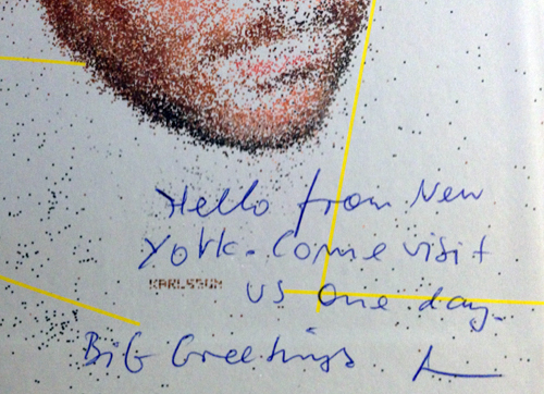
PottsHowever, I got carried away and bid on some items purely because they had a signature, such as the Johnson Banks ‘Power Of Creativity’ poster and a Karlssonwilker book that carried an invite to visit their New York studio, (but alas, without the addition of plane ticket). Don’t get me wrong, I like the work, this wasn’t some act of design star worship, but I now question whether I really can justify the purchase of something I wouldn’t have otherwise have wanted to actually buy and would have been happy admiring from a distance. I can categorically state that it was the lure of the signature that got me!

Johnson

Karlsson

Signing work is a controversial subject for some designers. We produce work that is reproducible not a one-off, (in the main), and a signature can lend the self-indulgent and egotistical air of pretension that dogs fine art. So to mark something out as ‘special’ goes a little against the grain for some in our trade. When design students last year ran the inaugural International Design Auction at UCS, I approached Javier Mariscal’s PA to see if he would sign a children’s Camper shoe box I owned, (it is adorned with some of his illustrated characters). The answer came back that Mariscal was not happy to do this because he was a designer, not an artist. Likewise, Barney Bubbles, record sleeve designer to Ian Dury and Elvis Costello et al, famously never put his name on a piece of work, not wanting to draw attention to himself and seeing the musicians his work showcased as its reason for existence. He was not in the game of self-publicity, and very much saw that graphic designer is a service industry.

But while I have strong sympathies with such beliefs, which at their heart, I believe to be political constructs of anti-elitist leanings, I can’t help being attracted to the ‘specialising’ of an item and the promotion of ‘ownership’ that such activity breeds. Over and above what I bought at this week’s auction, I also own a limited edition poster by Build celebrating 50 years of Helevtica signed by Michael C Place and a poster by Experimental Jetset that is collectively signed ‘EJ’ by the threesome, (both of these were competition wins). And recently I bought a poster by Unit Editions advertising their monograph on Ken Garland, signed by the man himself.

Garland

The Garland poster is a little odd in some ways: the poster wasn’t designed by him, and it is advertising a book that he didn’t write, so it seems slightly at odds with his self-effacing manner. Yet when Unit Editions posted on Facebook they were selling these as a limited run of 50, I had a knee-jerk reaction and bought one on the spot, being a fan of both Garland, and Unit Editions output.

Maybe a less aggrandising way to approach the concept of designer signatures is one I found by the great Paul Rand. On buying a copy of the children’s book he wrote and designed with his wife, ‘Sparkle and Spin’, I took a sneak peak at what lay behind the dust jacket, only to find Ann and Paul’s signatures printed onto the hard case (which was completely different to what the dust jacket portrayed):

Rand

This book feels just as special to me as any of the uniquely signed books or posters I own, because it is a little secret that you have to discover. The Rands, I believe, thought this hidden gem adds a personal touch to the piece, despite the fact it is mass produced. If I’m right in this assumption, it worked on me.

digital_invite_international_design_auction_27_November

This week saw the first exhibition in London by UCS Ipswich Graphic Design graduates. Titled We Are, the exhibition was held at The Coningsby Gallery, and was a deliberate attempt to try and buck the trend of the morale sapping rigmarole of New Blood, New Designers and Free Range graduate exhibitions, where by thousands of graphic design students compete for attention all at the same time of year and all under one roof. Notably at such events, those from the design industry tend to seek out the courses they already have contacts with, and rarely spend time looking for new talent from emerging courses. What successes come from this first UCS solo exhibition this week are as yet to be seen, but as this was the first of its kind for our students, it was a bit of a trial run and will hopefully develop over the coming years.

It appeared to inspired current first, second and third year students, who we took up to the gallery at various stages this week. And during a very busy period for current final year students as they are in the middle of writing their dissertation proposals and completing course work, they are also preparing for their International Design Auction which will help to finance any such ventures for them in 2014. The ‘We Are‘ graduates ran one last year, and raised nearly £2000 for their end of year show and London exhibition, and if the lots that are coming in so far this year are anything to go by, the 2013 auction is likely to raise a lot more money. There is signed work from Stefan Sagmeister, Tom Gauld, Jessica Hirsche, Milton Glaser, Armin Vit…I could go on, (and on, and on). While in London on Monday to catch the We Are show, current students even managed to find time to visit Margaret Calvert to pick up her 3 donations to the auction, (as well as accept her hospitality of tea and biscuits).

International Design Auction 2013 is being held at University Campus Suffolk’s Waterfront Building in Ipswich on 27 November at 17:30. Check out the lots on the  students’ website for the auction, and follow them on Facebook and Twitter for up to date information.

ida2013.com
ida on Facebook
@IDAuction2013

We_Are_Invite_CGGraduates from the Graphic Design and Graphic Illustration courses at UCS Ipswich are taking their end of year show, We Are, to London’s Coningsby Gallery next week. The show will featuring work from their time on the course as well as new work completed since graduating.

The show is the result of the overwhelming success of an International Design Auction that students held last December, when they managed to blag work from such luminaries as Jonathan Barnbrook, Brian Grimwood and Gerald Scarfe, among many others.

The show opens to the public on 12 November and runs daily until Friday 15 November from 10:30–18:00.

The Coningsby Gallery, 30 Tottenham Street, London, W1T 4RJ

www.coningsbygallery.com

Watch this space for details about a follow up International Design Auction being held by current final year Graphic Design students at UCS Ipswich to be held on 27 November.

To start the new academic year off with a shot of inspiration, we took all Graphic Design and Graphic Illustration students at UCS to GRAPHICS, the Romek Marber exhibition at The Minories in Colchester.

OLYMPUS DIGITAL CAMERAMarber’s influence on British Graphic Design can not be underestimated. His most famous work was for Penguin Books, particularly their crime series, producing many of the iconic green covers utilising photography, collage and drawn imagery to full effect to capture the title of each book he designed for. He also famously designed one of the grid systems that Penguin used for many years.

OLYMPUS DIGITAL CAMERAAmong the covers on display was also his rationale behind the layout. As the exhibition literature states: “Romek Marber’s work often communicates in a clear and direct manner that is bought by combining a stripped down use of colour with well defined formal structures within which text and image are framed. A sense of pragmatism and design that grows out of necessity in terms of delivery of message results in an efficient visual imagery that wastes nothing but at the same time appears to leave nothing out.”.

OLYMPUS DIGITAL CAMERASome of Marber’s typographic work balances a tightrope between experimentation and reductive modernist austerity, clearly influencing many designers working today. In fact, the covers he did for The Economist only look dated because of the mastheads—Marber’s type explorations themselves could grace many contemporary magazines and certainly wouldn’t look out of place on Bloomberg Business Week.

OLYMPUS DIGITAL CAMERAAnd this film title sequence could be mistaken for some of the experimental and fluid graphic illustration coming out of the UK at the turn of 21st century by the likes of Dávid Földvári et al:

OLYMPUS DIGITAL CAMERAGRAPHICS exhibition is highly recommended, and runs until 25 October: details here. Thanks to Cydney and Kaavous at The Minories.

While in Colchester, and with the Firstsite Gallery a stone’s throw from The Minories, we also took the opportunity to take a look at the Xerography exhibition that is on there. This celebrates the role of photocopying in art, from the 1960s through to the modern day.

OLYMPUS DIGITAL CAMERAThis show has an impressive list of 40 contributors, and naturally for graphic design students, the more graphic and book orientated work seemed to appeal the most.

OLYMPUS DIGITAL CAMERAThe Hockney’s were particularly good and of interest to illustrators:

OLYMPUS DIGITAL CAMERAAnd I was really taken with this mail-art piece by Eugenio Dittborn:

OLYMPUS DIGITAL CAMERAThe show is mixed enough for something to appeal to everyone, although I doubt that there would be anyone who would like everything that was on show. But despite its breadth, the one obvious omission for me was the lack of graphic design. For an exhibition which is tied together by the process of using a photocopier to produce work, this seems like a massive black hole. For example, there are no punk era fanzines such as Mark P’s Sniffin’ Glue which helped to define the aesthetic of an era. This form of instant publishing also helped to introduce some to a career in graphics, such as Terry Jones. There were also no rough and ready record sleeves, whether by the likes of practicing designer Linder Sterling or by the many unknowns who embraced the Do It Yourself nature of punk in 1976/77.

Omissions aside, this is a worthwhile exhibition to go and see, especially if you can go when the Marber exhibition is still on at The Minories, as the juxtaposition between the two makes for refreshing contrast. Xerography runs until 10 November, details here.

Thanks to Sue Hogan for the student talk.

Yesterday I attended the annual UCS (University Campus Suffolk) Learning and Teaching conference. It was a day packed with presentations looking at open, distant and e-learning, as well as investigating how technology in both the lecture theatre and online can enhance learning.

Keynote speakers, Dr Andrew Middleton and Professor Stephen Gomez discussed student engagement and learning landscapes. Gomez interestingly pointed out that perceptions of what constituted a lecture when he first came to education hadn’t changed since the 14th century, whereby a didactic method of imparting knowledge from one source, the lecturer, to a passive audience, the students, was still being used today. He related this to the differences in business or health care in the 14th century to current day practice, stating that as academics we were either incredibly lucky to hit upon the ‘correct’ methodology back then, or we needed to rethink these old ideologies.

Throughout the rest of the day, I heard speakers discuss the benefits of online handbooks and  teaching resources; using technologies for adaptive release of tests to students (whereby a learner can not progress to the next stage of a test until they’ve completed that section correctly); the advantages of verbal feedback being supplied as audio files; and the idea of releasing feedback and grades separately to encourage reflection and help students see feedback as supportive rather than linking it to what they may see as negative grades.

In the afternoon Professor David Gill gave a presentation on how Web 2.0 technologies had become leading tools in linking students, academic research and the press, with how the Looting Matters blog, which reports on archaeological research and stolen antiquaries, had become a ‘go to’ website for Reuters when reporting on such issues. As a counterpoint to some of the other presentations during the proceedings, Dr Fidel Meraz and Dr Mike Doherty, lecturers from the UCS Interior Architecture and Design course, discussed the importance of not relying on the fetishisation of technology when working with students who have to have an experiential perspective on the human and social aspects of navigating space and designing for interaction in a physical environment.

The day was extremely stimulating. The pedagogical rationale surrounding different frameworks of teaching, and how the  methodology behind decisions of delivery using technology has provided much food for thought in considering my own teaching. In particular, Professor Gomez demonstrated an online resource for tagging imagery which could be very useful in critiques about student work, or when teaching the history of design.

However, throughout the day there were many questions I felt weren’t being discussed. These include:
—data protection of staff recording things on personal devices
—staff using personal devices they’ve paid for in order to meet expectations of contemporary education
—health and safety issues around RSI
—the possible disenfranchising of students who can’t afford up to date technology
—the possible disenfranchising of students and staff who live in areas of web poverty
—workload management and work/life balance issues in an ‘always connected’ culture

The focus of all the presenters tended to be on pedagogy without any discussion about any wider ethical implications. For example, data protection was only raised once in one Q&A session, and social justice was only briefly discussed at the end of the day in the plenary session when a student raised the issue for the panel to discuss. For me, for such ethical considerations in open, distance and e-learning have to be explored alongside all other discussions about the positive benefits of championing existing and emerging technologies in higher education. Drs Meraz and Doherty have a point in using the term the ‘fetishisation of technology’ and I worry we are rushing into a future where by all manner of problems will rear their heads down the line for both students and lectures if due consideration of such issues isn’t embedded into current dialogue.

These comments are not meant to be critical of any discussions that took place, or to be seen with any luddite connotations, because I embrace new technology in both my personal life and professional practice, and can truly see the potential advantages to both learners and teachers that emerged from the majority of presentations I witnessed. But they are meant as a word of caution on not divorcing the social and political implications of championing technology in any such discussions, and the belief that, as educationists, it is our duty to always be considering our practice holistically.

Below is a comment I made on the Creative Review blog in response to a post about commercial enterprise initiatives on higher education graphic design courses. For the full context, please read the original post on Creative Review first:
NUA students design beer brand identity

—————————————————————————————————————————————

I am inundated with requests every year from people wanting students to get involved in a live project, stating they think it will be good for their folio. Many are just after a free piece of design, and when I point out the ethics of this in my (now) stock email reply, I rarely hear from them again. If we can run something through a module, so it counts towards the students’ degree, or if the company is prepared to offer up a competition brief, then we will look at what we can do to run such requests while ensuring that students are not being exploited.

But as agendas in HE change, and there is a pressure for institutions to become ‘income generators’ as application figures plummet, then I can see the rationale for what NUA have done here. But I’m still left with an uncomfortable feeling with such arrangements especially with increased fees situation. Questions arise such as how you give a similar level of experience to ALL students so that there is parity of opportunity in an increasingly commodified education system? It would also be interesting to know the level of tutor involvement in the NUA project, and how much of the success of the project, in design terms, was down to their expert consultancy? Was this overview an incentive for commercial companies to get involved in education in this way, and how do local design firms in Norwich feel about this loss of potential revenue? However, experience is experience, and is often a prerequisite for any graduate to get a job these days so it could be argued that the industry has created a rod for its own back should any design firm have a problem with this.

I recently ran a project with second year graphic design students to design a healthy eating guide for people who are in the unfortunate position of having to rely on food aid/food banks. Suffolk County Council got involved, and students had to pitch their ideas to them, liaise directly with the client, organise meetings and buy all the print themselves, (with SCC paying all production costs). The students ran this from start to finish and the learning experience was invaluable to them, as was the underpinning social/community aspect of the project. I deliberately kept a hands off approach to the design side of things, as this was for the students and the client to discuss, and all I did was over see the process to ensure students weren’t coming unstuck or were not at anytime out of their depth in what was an ambitious brief. At no stage in the project did I feel I was compromising the students in their development as professionals, and the transferable skills they learnt along the way advanced them in leaps and bounds. It will be interesting to see how this feeds into their final year of study and their future professional careers. Project details can be found here for anyone interested: http://tinyurl.com/kgtj5rc

This is a vital debate for both design education and the design industry to be having. I look forward to reading future reports along these lines in Creative Review.
Nigel Ball
2013-06-07 12:39:17

OLYMPUS DIGITAL CAMERAA big thank you to Sam Hall and Jess Harvey of The Partners for their presentation to second year UCS Graphic Design and Graphic Illustration students last week. Thanks also go out to Sarah Habershon, Art Director at The Guardian, for her talk to students on the same day about The Guardian’s illustration commissioning process.