Archive

Graphic Design

We_Are_Invite_CGGraduates from the Graphic Design and Graphic Illustration courses at UCS Ipswich are taking their end of year show, We Are, to London’s Coningsby Gallery next week. The show will featuring work from their time on the course as well as new work completed since graduating.

The show is the result of the overwhelming success of an International Design Auction that students held last December, when they managed to blag work from such luminaries as Jonathan Barnbrook, Brian Grimwood and Gerald Scarfe, among many others.

The show opens to the public on 12 November and runs daily until Friday 15 November from 10:30–18:00.

The Coningsby Gallery, 30 Tottenham Street, London, W1T 4RJ

www.coningsbygallery.com

Watch this space for details about a follow up International Design Auction being held by current final year Graphic Design students at UCS Ipswich to be held on 27 November.

To start the new academic year off with a shot of inspiration, we took all Graphic Design and Graphic Illustration students at UCS to GRAPHICS, the Romek Marber exhibition at The Minories in Colchester.

OLYMPUS DIGITAL CAMERAMarber’s influence on British Graphic Design can not be underestimated. His most famous work was for Penguin Books, particularly their crime series, producing many of the iconic green covers utilising photography, collage and drawn imagery to full effect to capture the title of each book he designed for. He also famously designed one of the grid systems that Penguin used for many years.

OLYMPUS DIGITAL CAMERAAmong the covers on display was also his rationale behind the layout. As the exhibition literature states: “Romek Marber’s work often communicates in a clear and direct manner that is bought by combining a stripped down use of colour with well defined formal structures within which text and image are framed. A sense of pragmatism and design that grows out of necessity in terms of delivery of message results in an efficient visual imagery that wastes nothing but at the same time appears to leave nothing out.”.

OLYMPUS DIGITAL CAMERASome of Marber’s typographic work balances a tightrope between experimentation and reductive modernist austerity, clearly influencing many designers working today. In fact, the covers he did for The Economist only look dated because of the mastheads—Marber’s type explorations themselves could grace many contemporary magazines and certainly wouldn’t look out of place on Bloomberg Business Week.

OLYMPUS DIGITAL CAMERAAnd this film title sequence could be mistaken for some of the experimental and fluid graphic illustration coming out of the UK at the turn of 21st century by the likes of Dávid Földvári et al:

OLYMPUS DIGITAL CAMERAGRAPHICS exhibition is highly recommended, and runs until 25 October: details here. Thanks to Cydney and Kaavous at The Minories.

While in Colchester, and with the Firstsite Gallery a stone’s throw from The Minories, we also took the opportunity to take a look at the Xerography exhibition that is on there. This celebrates the role of photocopying in art, from the 1960s through to the modern day.

OLYMPUS DIGITAL CAMERAThis show has an impressive list of 40 contributors, and naturally for graphic design students, the more graphic and book orientated work seemed to appeal the most.

OLYMPUS DIGITAL CAMERAThe Hockney’s were particularly good and of interest to illustrators:

OLYMPUS DIGITAL CAMERAAnd I was really taken with this mail-art piece by Eugenio Dittborn:

OLYMPUS DIGITAL CAMERAThe show is mixed enough for something to appeal to everyone, although I doubt that there would be anyone who would like everything that was on show. But despite its breadth, the one obvious omission for me was the lack of graphic design. For an exhibition which is tied together by the process of using a photocopier to produce work, this seems like a massive black hole. For example, there are no punk era fanzines such as Mark P’s Sniffin’ Glue which helped to define the aesthetic of an era. This form of instant publishing also helped to introduce some to a career in graphics, such as Terry Jones. There were also no rough and ready record sleeves, whether by the likes of practicing designer Linder Sterling or by the many unknowns who embraced the Do It Yourself nature of punk in 1976/77.

Omissions aside, this is a worthwhile exhibition to go and see, especially if you can go when the Marber exhibition is still on at The Minories, as the juxtaposition between the two makes for refreshing contrast. Xerography runs until 10 November, details here.

Thanks to Sue Hogan for the student talk.

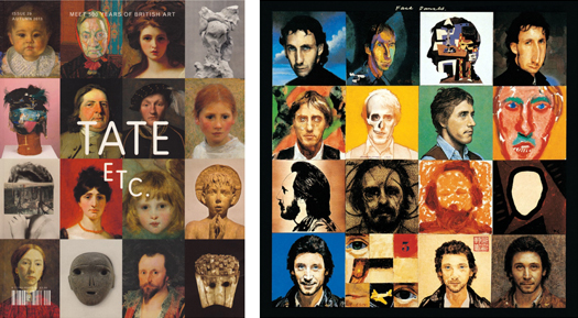
FaceAcheLeft: Tate Etc. Issue 29, Autumn 2013. Design & Art Direction—Mark El-khatib and Sara De Bondt
Right: Face Dances by The Who. 1981. Sleeve—Peter Blake

photoAgainst my better judgement I bought a Ginsters’ sandwich yesterday.

On eating it, I glanced at the packaging to see the declaration above—that Ginsters had donated the side of the pack to a charity. I turned the packaging over, and, as they claim, there was information about the Royal Voluntary Service.

This struck me as somewhat insidious because of how this supposed act of corporate social responsibility was being turned into a marketing opportunity. In my opinion, the fact that Ginsters have felt it necessary to so prominently proclaim their act of altruism defeats any good will the act itself might bring to the company. To think that Ginsters’ marketing department didn’t realised this potential reaction might happen—that no one who see through this forced ‘look at us, aren’t we wonderful’ approach—is incredulous. The contempt for the consumer is further compounded by the additional emotional blackmail of the question “what could you give?”. Coming after the statement about their ‘donation’, (as if it really cost Ginsters anything other than a couple hours of a graphic designer’s time), is insulting as it suggests that the company believe they have done their bit and now the responsibility lies with the consumer.

Corporate social responsibility is an important issue in contemporary business practice. But if companies like Ginsters want us to believe that they are genuine in their commitment to the voluntary sector, then they need to stop patronising consumers and use their involvement in social issues for more than a marketing opportunity.

It was nearly enough to put me off a sandwich I wasn’t particularly enjoying.

Well, I’ve been back at the day job for a week now and my summer holiday seems like a distant memory. So before it stretches back any further, I thought I should post some of the cultural highlights from our two weeks away.

First up, we stumbled across the Bubble Car Museum when in Lincolnshire, and what a find. I wasn’t sure what to expect, and all I really hoped was that they had a Bond Bug, because I had a Dinky toy version as a little boy. But it has to be said, this was a gem of a little museum.

OLYMPUS DIGITAL CAMERAFrom the outside the museum looked like a small shed, and I half expected to just see a few rusting, half refurbished cars. But no, the place was rammed with these amazing vehicles. There was something optimistic about these 700cc or less cars and bikes—futuristic and weirdly beautiful. And the museum curators had done an excellent job of displaying them all, trying to put them into context with mock-ups of 1950s shop fronts, front rooms and kitchens around the two exhibition rooms.

OLYMPUS DIGITAL CAMERAThis museum is highly recommended and it has a great little no nonsense cafe with adjoining campsite. I think we might be bringing the tent next time we visit Lincolnshire.

On the drive home, as mentioned here, we went via the north Norfolk coast. Having holidayed there for several summers we stopped off in Cley-Next-the-Sea hoping to catch their summer art exhibition, Cley 13, usually held in the village church. This year in a field next to the graveyard, as we approached the church, we were greeted by these wonderful bird sculptures.

Created by artist Jessica Perry and the children of Stalham High School, they certainly grabbed your attention. And while there was interesting work on display in the church, it is very much like a very well crafted and presented college foundation course end of year show. Good, but not exactly challenging.  However, these birds were just fun and unpretentious and as a result blew everything else away.

We took a couple days out in London in the second week of our holiday. We were lucky enough to have been bought membership of the Royal Academy as a present so decided to check out the Summer Show for the first time. As I’d only ever seen it on TV before, it was interesting to see it in the flesh, but ultimately, it is a difficult thing to review, what with so much on show. However, it was quite a good way to assess your tastes, as we ended up just looking at what immediately grabbed our attention. With most exhibitions we go to being themed or of a single artist/designer, just letting your instincts and knee-jerk judgements kick in was refreshing, and almost the only way to react to such an overwhelming display of work. I found several pieces that I really liked, but equally was surprised by many of the entries being allow in. An ultimate favourite for me though had to be the Greyson Perry tapestries, most of which were created in response to his TV programme on taste. Seeing them in their full glory, and being able to concentrate of their detail and the narrative they told, only went to confirm my opinion that the man is an illustrator rather than a fine artist, especially with his work deviating from pottery.

While at the RA, we also took the opportunity to see the Mexico: A Revolution in Art 1910–1940, which I loved. It hadn’t had great reviews, but the fact it was a mix of painting and photography, I thought made it a strong documentary on the the changes and difficulties that Mexico faced during this time period.

While in London, we also took in the Ibrahim El-Salahi exhibition, some of who’s drawings blew me away. This was shown alongside Meschac Gaba’s Museum of Contemporary African Art, which was sort of a museum within a gallery.

TateGaba’s show was really refreshing, not least because you were allowed to take photographs. Gaba wants to challenge the notion of what a museum/gallery should be, and over the years adds new ‘rooms’ to this travelling show, encourages audience participation, (in the first room there was a large Jenga type game for people to interact with), and showcases his life and work as part of the show, (he even had large scale photographs of his wedding and wedding gifts on display as an exhibit!). I wasn’t overly impressed with his individual pieces of work, with its over reliance on symbolism and a sense of having seen similar approaches done much better, but then the Museum has become an artwork in its own right. As a whole, it is definitely greater than the sum of its parts. And what he is trying to achieve with challenging the notion of an exhibition was a joy to behold and completely refreshing.

Gaba's wedding photographs and gifts

Gaba’s wedding photographs and gifts

Just the fact that I’m able to publish photographs here that I took in the exhibition, and couldn’t photograph anything and publish it here form the, arguable much stronger, El-Salahi show, is testament to breath of fresh air this approach filled me with. Why can’t you take (non-flash) photographs in exhibitions? I’ve always thought it was fucking rediculous.

Lastly, while in London, we met up with Claire’s daughter and they both went off to watch a show at The Globe, which was a present from Callie to her mother for her birthday. So I took myself off the Design Museum. It was a shame because the whole place felt like it was winding down, readying itself for its move across London to its new building in 2014/15. But despite there being an air of the place being unloved, the Future Is Here exhibition was genuinely interesting, once I got my head around what it was about. It basically gathers together examples of new ways of working and designing/producing goods, including crowdsourcing ideas, 3D printing, producing construction materials on a building site, and small scale robot construction. These themes and exhibits, when taken collectively, demonstrated how manufacturing processes are changing around us and how new methods of industry were being formed in the now. The Design Museum was half proposing we are in times of a new industrial revolution, and while I’m not completely convinced, it was a thought provoking experience.

As if to reinforce the feeling that the museum is ‘winding down’, it had on display items from its collection themed into six categories rather than the usual second commissioned exhibition. While it is good to see this work coming out of the closet, and promises much for the new bigger space the museum will have in Kensington, (with some of their collection being on permanent display), it did give the impression that energies and finances were being diverted elsewhere. That said, I naturally made a beeline for the graphic design section, and it was good to see Calvert and Kinneir‘s road signage templates:

Maidenheadand the Design Research Unit‘s branding guidelines for British Rail:

BR

Below is a comment I made on the Creative Review blog in response to a post about commercial enterprise initiatives on higher education graphic design courses. For the full context, please read the original post on Creative Review first:
NUA students design beer brand identity

—————————————————————————————————————————————

I am inundated with requests every year from people wanting students to get involved in a live project, stating they think it will be good for their folio. Many are just after a free piece of design, and when I point out the ethics of this in my (now) stock email reply, I rarely hear from them again. If we can run something through a module, so it counts towards the students’ degree, or if the company is prepared to offer up a competition brief, then we will look at what we can do to run such requests while ensuring that students are not being exploited.

But as agendas in HE change, and there is a pressure for institutions to become ‘income generators’ as application figures plummet, then I can see the rationale for what NUA have done here. But I’m still left with an uncomfortable feeling with such arrangements especially with increased fees situation. Questions arise such as how you give a similar level of experience to ALL students so that there is parity of opportunity in an increasingly commodified education system? It would also be interesting to know the level of tutor involvement in the NUA project, and how much of the success of the project, in design terms, was down to their expert consultancy? Was this overview an incentive for commercial companies to get involved in education in this way, and how do local design firms in Norwich feel about this loss of potential revenue? However, experience is experience, and is often a prerequisite for any graduate to get a job these days so it could be argued that the industry has created a rod for its own back should any design firm have a problem with this.

I recently ran a project with second year graphic design students to design a healthy eating guide for people who are in the unfortunate position of having to rely on food aid/food banks. Suffolk County Council got involved, and students had to pitch their ideas to them, liaise directly with the client, organise meetings and buy all the print themselves, (with SCC paying all production costs). The students ran this from start to finish and the learning experience was invaluable to them, as was the underpinning social/community aspect of the project. I deliberately kept a hands off approach to the design side of things, as this was for the students and the client to discuss, and all I did was over see the process to ensure students weren’t coming unstuck or were not at anytime out of their depth in what was an ambitious brief. At no stage in the project did I feel I was compromising the students in their development as professionals, and the transferable skills they learnt along the way advanced them in leaps and bounds. It will be interesting to see how this feeds into their final year of study and their future professional careers. Project details can be found here for anyone interested: http://tinyurl.com/kgtj5rc

This is a vital debate for both design education and the design industry to be having. I look forward to reading future reports along these lines in Creative Review.
Nigel Ball
2013-06-07 12:39:17

Strom

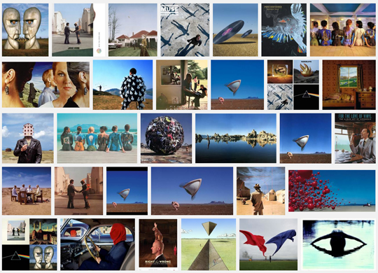
Google image search results for Storm Thorgerson

It was very sad news to hear of the death of Storm Thorgerson last month. Without a shadow of a doubt, Thorgerson was one of the greatest album sleeve designers ever and there are probably few record collections that don’t boast some of his work amongst their ranks.

It was refreshing to hear the reverence with which he was held in news reports and in discussions with friends. It was interesting to consider that some of those that mourned his passing may not even have previously known know his name, (nor that of Hipgnosis), but knew the work extremely well. This is testament to his enormous talent as much as because they recognised the work in relation to their  favourite bands. It is also interesting to consider that during these pronouncements, Thorgerson has himself become a metaphor by which to mourn the ‘good old days’ of vinyl.

However,  and here is where I commit graphic design sacrilege: I don’t actually like his work.

So there is a dichotomy at work here—how can I praise someone so much, admire their output and recognise its importance, while at the same time not actually liking it? This cognitive dissonance boils down to the fact of what Thorgerson was—a brilliant graphic designer. In an interview with Adrian Shaughnessy, of which aspects were reprinted in Thorgerson’s Creative Review’s obituary, he says: “All I try to do is represent the music.” In this one statement, he hits the nail on the head. As I don’t like the music he is designing for, it is only right, that if he is trying to represent that music, that I don’t like the imagery. But I can recognise its effectiveness all the same. Thorgerson has done his job brilliantly, and not attracted me, because I’m not the desired audience.

In reading through the discography on Wikipedia of the hundreds of album sleeves that Hipgnosis designed in their career—not to mention what Thorgerson did after their demise—I think I could list about eight records I actually like. Take Pink Floyd for example, I have never liked their post-Barrett output believing it to be pompous, cryptic, arrogant, nerdy, polished, and far too serious. I’ve always felt it to be stripped of the psychedelic drug induced experimentalism that made early Floyd so great with Barrett, (who also happened to write some killer pop hooks).  And as I cut my musical teeth in the late 1970s and early 1980s during post-punk, where playful and experimental records could make it into the pop charts, where there was a broadening of musical horizons rather, such terms as pompous, cryptic, arrogant, nerdy and polished, collectively have negative associations for me.  But Thorgerson brilliantly illustrates these in his cryptic, overblown set pieces full of knowing metaphors and forced school boy humour, yet devoid of any rough edges and any sense of irony. The one sleeve that Hipgnosis produced that stands head and shoulders above anything else they did during their reign, in my opinion, is XTC’s Go2. See previous Dubdog posts over on Blogger where I’ve discussed this sleeve extensively.

When thinking about album sleeve design, there are a few designers that have become synonymous with the medium that I really admire, such as Barney Bubbles, Malcolm Garrett, Stanley Donwood, and Julian House; but there are also many un-tutored designers who remain un-credited whose work I would just as easily hang on my wall. There are also plenty of examples of bands who have created their own artwork which are equally as effective as professional designers, and record labels, such as Constellation Records, who steer an aesthetic visual tone through the label’s output. Regardless of the scenario, if an album sleeve works, then it is generally because the author shares the same rationale as Thorgerson when creating the work—to represent the music. And as in book jacket design, if a graphic designer is doing their job properly, tutored or otherwise, you absolutely should be able to judge a record by its sleeve.

I saw Storm Thorgerson interviewed by Adrian Shaughnessy at D&AD XChange in 2009, and he proved to be a likeable rogue; slightly arrogant and antagonistic but a natural raconteur with a huge wit. The fact he wasn’t overly mobile, and that he needed several helpers to aid him on and off the stage, (as well as to give out postcards of his work to the entire audience, which was a nice touch), it was obvious that this larger than life character wasn’t in the best of health. Therefore I wasn’t completely surprised to hear of his passing. But regardless of my personal tastes dictating my knee-jerk reactions to the work he did for bands I didn’t like, his graphic design and music legacy is an important one, and I have nothing but utmost respect for the man and his enormous talent. The world is a poorer place for his passing and all music lovers, regardless of taste, owe him an enormous debt. RIP Storm Thorgerson.

OLYMPUS DIGITAL CAMERAA big thank you to Sam Hall and Jess Harvey of The Partners for their presentation to second year UCS Graphic Design and Graphic Illustration students last week. Thanks also go out to Sarah Habershon, Art Director at The Guardian, for her talk to students on the same day about The Guardian’s illustration commissioning process.

Earlier last month few could have escaped the surprise announcement of a new David Bowie album, scheduled for a March release, titled The Next Day.

The artwork dropped with almost as much of a shock, to some, as the album. The artwork places a white square over the original iconic cover of “Heroes”, Bowie’s 1977 collaboration with Brian Eno which is considered by many as one of his best works. While this was sacrilege to some, others, along with myself, thought it a brave masterstroke by Jonathan Barnbrook, who has worked with David Bowie for the last 10 years.

newheroes_0

David Bowie – The Next Day. Sleeve by Jonathan Barnbrook, 2013

On seeing Barnbrook’s work for Bowie, I immediately drew associations between The Next Day sleeve and a new jacket for George Orwell’s Nineteen Eighty Four by David Pearson that was showcased on the Creative Review blog shortly before the announcement of the Bowie album. Here, Pearson obliterates the title and author of the book to reflect the redacting of history in this classic Orwellian tale.

nineteeneightyfourdropshadow569_0

George Orwell – Nineteen Eighty Four, cover by David Pearson, 2013

Naturally enough though, I wasn’t the only person to make such a comparison as Richard Weston’s Ace Jet 170 blog testifies. And there, my thoughts would have rested, beaten in the blogosphere to writing a post about the Bowie/Orwell connection.

However, I then got thinking about these two pieces of work and their deliberate graphic obscuring—where one piece of communication has been interrupted by another to create a new work that forces the viewer to question what they are reading—and how this related to things I’d been observing in my everyday. For a little while now I’d been noticing such occurances as road markings being obliterated by the visual remains of where road works had taken place, their primary communication scarred and temporarily interrupted; or where different street signs had been overlaid partially obscuring aspects of one or both.

IMG_2967

JacobsWay

These observations have started to inform a new photographic project of mine, (working title Graphic Interruptions), which currently only consists of some test pieces posted to Flickr. The obvious differences here are that Barnbrook’s and Pearson’s work both deliberately interrupt one visual device with another to form a new narrative, where as what I had been looking at were mostly accidental. I don’t quite know yet where this project is going, but I’m finding it visually intriguing.

But then this visual intrigue was whetted again this week when I succumbed to buying the John Stezaker monograph, which I had been coveting for some time. The book was published in 2011 to accompany his exhibition at the Whitechapel Gallery the same year. Unfortunately I missed the show, but was bowled over by the images that were shown alongside many of the rave reviews in newspapers and on blogs at the time. Could it be that this work, first seen a couple of years ago, had stayed with me and fed my visual thinking when walking around and noticing my graphic interruptions?

StezakerMaskIV 2005

John Stezaker, Mask IV, 2005

Mask IV is typical of the collage work that attracted me to Stezaker. At first, I didn’t make an immediate connection between all of the above and the influence Stezaker’s show, directly or indirectly, has potentially had on my thoughts about what the book calls ‘occlusion’, (the art of blocking).  But I am beginning to now.

And then, looking through the book, I came across two images that made me wonder whether Stezaker’s work had also influenced, consciously or otherwise, Barnbrook’s The Next Day sleeve:

StezakerTabula RasaXI2008

John Stezaker, Tabula Rasa XI, 2008

John Stezaker, Tabula Rasa II 1983

John Stezaker, Tabula Rasa II, 1983

With or without placing ‘The Next Day’ text in the white rectangle, you can easily see the connection between this and the sleeve of the anticipated David Bowie record.

My observations here are purely that, observations. I’m drawing together recent thoughts that may or may not have fed into each other, but that do spark a line of questioning regarding the narrative of an image. This might just become my 2013 obsession.