Archive

Graphic Design

I’ve recently had the pleasure of working with Eddie Duggan of the BA (Hons) Computer Games Design course at UCS. Eddie has been organising From Cardboard to Keyboard and Back, the XVII Annual Colloquium for the International Board Game Studies Association, due to be hosted at UCS’s Ipswich campus later this month. It is a major conference with papers being presented from academics, historians, archaeologists and students from around the world.

I agreed to design and artwork the conference programme last year, and after a hectic few weeks of work on the contents over Easter, the artwork was finally sent to print this week. Eddie and I involved second year UCS graphic design and illustration students in the process, who in small teams had to pitch concepts for a cover illustration and delegate maps, with Eddie acting as an external client who they had never met before. The activity provided them with a chance to hone their professional skills by presenting their concepts to someone who wasn’t a peer or a lecturer they were familiar with.

Cover

Colloquium programme cover with the winning illustration by second year graphic design student team comprised of: Jamie Bird, Tatjana Gecmane and Georgina Warden; who won a ‘client pitching’ activity to have their work featured in the publication.

It has been an honour to be involved in some small way with this conference, and great to have been able to give graphic design students a chance to have their work showcased to an international audience.

Our-EnglandA4

An exhibition of work created by third year Graphic Design students at UCS themed on English culture. This exhibition will also feature work by graphic design students from Edith Cowen University in Australia, who answered a brief in tandem with UCS students looking at Australian culture.

The exhibition is being curated by second year UCS Graphic Design students as part of a professional practice module. Second year students are creating the visuals that support and publicise the exhibition, deciding how to hang the work on display, as well as blog and tweet about their experiences in hosting an exhibition for the first time.

The Private View is 20 May at 17:30, Public View weekdays 21–26 May 10:00–17:00, (email graphics@ucs.ac.uk in advance for access).

Room 1, University Campus Suffolk, Arts Building, Ipswich

ourenglanducs.wordpress.com

@OurEnglandUCS

I have always been fascinated by maps. On returning from family camping holidays in France as a boy, my dad, a photographer by trade, would create a big photo album of our adventures, and in pride of place at the front of these albums he would stick a photostat map of France that detailed our journey. My father had itchy feet on holiday and we would rarely stay in one location more than 2 days before he bundled the five of us back in our rusty old Fiat van to trundle off to another site of interest. I think between the age of 8–14 I must have experienced most of France over 2 week periods every summer. Now days Claire and I mostly holiday in the UK, and as we near the date of departure we always buy an Ordinance Survey map of where we are heading and study it intently. It has become a bit of a ritual which I think harks back to the family holidays of my youth.

This information is given as background to the fact that I have recently come across several personal coincidences featuring maps. Two weeks ago it was my mother’s eightieth birthday, and struggling to think of what to get her I struck upon the idea to take her to Norfolk on a trip down memory lane, (my family had relocated there from London in the 1960s, and as a result it is my county of birth). The obvious way to physically give this as a present to my mum—with the date for the intended trip yet to be arranged—was via a map. So I bought an Ordinance Survey map of The Broads, some stickers, and wrapped them up with an instruction card informing her to choose the locations she wanted to revisit.

OLYMPUS DIGITAL CAMERA

OLYMPUS DIGITAL CAMERA

The coincidence of maps on that weekend happened when early on the Saturday morning, prior to making my mum’s card and wrapping her present, I had to go to the Post Office to pick up my order of Where You Are by Visual Editions, a book / box of maps by “writers, artists and thinkers … each one exploring the idea of what a map can be”. The coincidence was cemented in my mind when sitting down to look through the Visual Edition maps, still prior to creating my mum’s card, and realising another book on my studio table waiting to be read had a map on its front cover. This book about typography and printing was published in 1947 by the long gone Cowell’s printers in Ipswich, which I had been prompted to buy the week before after reading Ruth Artmonsky’s excellent Do You Want It Good Or Do You Want It Tuesday: The Halcyon Days of W.S. Cowell Ltd. Printers.

OLYMPUS DIGITAL CAMERA

A Handbook of Printing Types by John Lewis, published by W.S Cowell Ltd, 1947

The former of these two books, Where You Are, really stretches the traditional concept of what a map actually is and how maps can be interpreted. I was particularly taken with Valeria Luiselli’s beautiful and mysterious Polariods in her map: Swings of Harlem contained within Where You Are, in which she photographed her daughter on every set of swings in every play-park in Harlem. In her text accompanying these images she passes detached thoughts on the location, the procedure of getting to the park, and her own mood as she watches her daughter play and eavesdrops on other people’s parent–child conversations.

I got to thinking about the concept of psychogeography as I read Luiselli’s piece over the following week. In particular I was considering how we can approach the world around us in a detached manner, forming our own maps of our circumstances and psychologies, and how these can differ greatly from maps produced with the purpose of trying to give order to the world around us. Feeding into this thought process was a post I read in February on Al Jazeera America questioning why the north ended up on top of the map. This led me to dig out The Situationist City by Simon Sadler, a book that had been sitting on my shelf unread since I bought it last year.

OLYMPUS DIGITAL CAMERA

The cover of Sadler’s book features Guy Debord’s 1959 psychogeographical map, of which the author says: “…made as part of Debord’s correspondence with his situationist colleague Constant, the piece was a tiny gem of situationist pot-latch (art created as a gift) and détournement (art composed from ‘diverted’ aesthetic elements).” This image in turn reminded me of a catalogue cover I had produced 12 years previously for a graffiti art-trail of Ipswich I curated. The project’s intention was to question what could be constituted as an art gallery and the cover image I designed openly and appropriately rips off Debord’s visual concept—appropriate because situationism was never afraid of plagiarism as a concept and actively courted it as an artistic device, as highlighted by Sadler above when discussing détournement.

OLYMPUS DIGITAL CAMERA

The catalogue, circa 2002, also contained a map I designed, (below), for exhibition goers to follow. A few years after designing this I realised it was similar to a map of London that NB Studio created, (see link). I don’t know when NB Studio made their work, but if it was prior to my map, I was completely ignorant of it at the time—this is a statement which I realise calls into question my honesty considering my previous comment about Debord’s map, but I swear it is true. Regardless of this, anyone looking at NB Studio’s map will soon agree that my mediocre design effort pales into insignificance in comparison.

OLYMPUS DIGITAL CAMERA

To wrap up all this map talk I suppose that I’ve come to realise that all my recent thinking around the subject has actually been a journey in itself, and therefore, this blog post is a map of my thought processes over the last few weeks. I will be the first to admit that these thoughts and coincidences are somewhat ill formed and disjointed at the moment, but I’m currently ruminating on many different thoughts with the hope of formulating some of the more interesting ones into a future project. So without wanting to force a pun, I haven’t come to the end of my journey in this matter, and I fully expect to return to it again here in the near future.

However, it is probably worth pointing out an irony from the starting point of this post. On the way to a celebratory meal in a pub for my mother’s eightieth birthday on the evening of the aforementioned Saturday, at which my childhood fellow French adverturer brother and sister were going to be present, Claire and I got completely lost on the drive there, too reliant were we on Apple’s iPhone Maps app!


ChildhoodRemixed_cover

I’m proud to have recently finished working on the third edition of Childhood Remixed, a University Campus Suffolk (UCS) online interdisciplinary academic journal themed on childhood. The journal, published annually, has previously only featured papers from staff and students at UCS. However, this year much of the publication has been made up of submissions to the international Children and Childhoods Conference held at UCS in July of last year.

ChildhoodRemixed_welcome

The international flavour of this edition demonstrates not just how much the journal has grown in three years, but how much UCS has developed in that time as well. First launched in 2012, Childhood Remixed was intended as a ‘stepping stone’ into the world of being peer-reviewed and published. For third year undergraduate and postgraduate students, and for lecturers who hadn’t been published before, this was an excellent opportunity for a safe trial into the daunting world of academic publishing. The journal still provides this platform, but now allows those same students and staff to be featured alongside academics and researchers from across the globe.

ChildhoodRemixed_pagesIt is hoped with this international issue, that the journal will be available to the wider public soon as a download rather than just internally within UCS as the previous two editions have been. More details will be posted here when it is available.

Thanks to Dr Alison Boggis, Senior Lecturer in Early Years at UCS, who has tirelessly pushed this publication forward since its first inception three years ago.  Read a report of the launch of the first edition here on Blogger.

2014 sees the 50th anniversary of the 1964 First Things First manifesto. In the run up to the launch of First Things First 2014 on Monday 3 March, you can read an article I recently wrote, along with an interview with the author of this contemporary update, over on Eye blog.

Designforlife

Timelessness

Last week I was asked to introduce Gary Hustwit’s Helvetica for a screening to UCS MA Journalism students and members of the public. Afterwards, in a question and answer session, someone unexpectedly asked if I thought Helvetica was timeless. It was a good question in relation to the film we had just watched, but not one that I had anticipated being asked, and therefore I said the first thing that came into my head, (and a little more sharply than maybe I should have done). As the thought of something being timelessness has always seemed an odd concept to me, I stated that nothing was timeless.

As a result of this knee-jerk response, the idea of timelessness has been on my mind all week. It is a phrase that crops up again and again in graphic design circles. It is often spoken of as a quality of good logo design and it is supposedly one of the characteristics that a design classic should embody, according to the cover of Phaidon’s publication on the same topic at least.

Phaidon2

But I’m highly sceptical about this. Taking issue with Phaidon’s description, if you look at my idea of a design classic—the iconic Donor Card as written about here a few weeks ago—it could never be described as timeless. Its styling’s are very much of the 1970s.

DonorCardThen

Any piece of visual communication stays the same as the world around it moves on, leaving the item caged in the aesthetics of the time it was created. Think of one of the most famous pieces of graphic design in the history of this country—Beck’s Underground map—it is absolutely a product of its time. It may have been tweaked, altered and changed over the years, and maybe not enough each time that anyone would notice that it was dramatically different from its predecessor. But if you see the original and the current version side by side, you can automatically see that it came from a different era. Jump to a recent piece of famous graphic design, the 2012 Olympics logo, and that arguably started to date even before the games started, designed as it was 5 years previously.

HarryBeck_TubeMap_580

Harry Beck’s original Underground Map c.1932

standard-tube-map

Current version of the Underground Map

To strive to make something timeless from the outset is to set oneself a challenge that I believe can never be achieved. Maybe as an old Marxist I’m still stuck with the philosophy that everything changes; but this is an philosophy that history seems to have proved right. As a designer, at best you may create some sort of longevity in a piece of work. If your creation doesn’t have to be redesigned too soon then your client can get many years of service out of it, decades even, but eventually it will look dated.

I accept that in the case of a typeface much of that dating may depend on the application. Sure, Helvetica can still look contemporary when applied well in 2014 as much as it did when it was designed in 1957, but that is because it may be used in a contemporary setting. However, there are plenty of examples from the history of graphic design where it looks outdated. I agree that one has to be cognisant of the fact that there are lots of things that can change the appearance of a typeface even if the individual characters remain the same; tracking, point size, uppercase/lowercase, background colour, supporting imagery such as illustration, photography or other graphic architecture; all will alter how you ‘read’ the form of the face and bring different meaning to it. But over time, the choices diminish and it has to be asked whether Helvetica will still have fresh ways of being applied in 1000 years time? I personally doubt it.

When I was a design student there didn’t seem to be an abundance of books about graphic design. There were obviously some, such as recommended canons on the discipline like Meggs’ History of Graphic Design, but they were few and far between. And none, to my eyes, seemed particularly contemporary in their approach to relating to the subject.

IMG_6495

Thankfully this is no longer the case. In the last ten years there has been an explosion in the amount of books published about the subject, from self-published/vanity monographs to historical re-tellings, from exhibition tie-ins to in-depth breakdowns of the process of designing. Academic/student friendly publishing houses such as AVA, (now under Bloomsbury), and Laurence King have gone a long way to help those studying graphic design today, and it is likely that the growth of undergraduate graphic design students over the last 10 years has created a captive audience.

One publishing house that is worthy of praise for its output in the last few years is Unit Editions. Set up in 2009 by Tony Brook of Spin, and Adrian Shaughnessy, previously of Intro, their first releases trickled slowly onto the market but quickly established a standard of exceptional quality in both the critical content and production values. Their output has increased dramatically since then, and in the last 18 months alone they’ve published monographs on over-looked designers; FHK Henrion, Herb Lubalin and Ken Garland. They’ve also produced a study on contemporary expressive typography: Type Only, and a collection of Shaughnessy’s writing collated from various websites and magazines that he contributes to, titled Scratching The Surface.

threecolumn_page header_optimised2

The lavish production values of FHK Henrion monograph: Unit Editions—2013. (Photo: Unit Editions.)

Brook and Shaughnessy describe Unit Editions as producing books “for designers by designers”. While it is true that the latter two publications mentioned above do add to an introspective discourse about contemporary graphic design practice, and the designer/publishers have been showcased on many design blogs such as It’s Nice That, I believe that what Unit Editions are doing is much more than just ‘for designers’.

The desire to showcase designers that have become ‘lost’ in the fog of design history, such as Henrion et al, is obviously a desire to pay these people their dues. The research into their past; how they became designers; what underpinned their practice, (in terms of personal ethos); as well as the excellent archiving of their life’s work, should also be of great interest to those outside of the discipline as well as to designers. For to document their contributions to society at large is to showcase their relevence to popular culture. It is difficult to read Structure and Substance without getting the sense that Garland is dedicated to making the best work he can for the end user. The fact that these designers understood who they were creating work for underpinned an ethos of responsibility in their thinking about graphic design that fed into the aesthetic appeal of what they produced. When you then consider that their work has influenced the world we see around us today by feeding into the evolution of graphic design and how the viewer reads visual communications in their everyday, it is fair to say they also helped to fashion social history.

Ken_Garland_Spread_p23_NEW_full product_optimised2

Spread from Ken Garland, Structure and Substance: Unit Editions—2012. (Photo: Unit Editions.)

It is interesting to note that at the conferences Graphic Design: History In The Making, and Critical Tensions, both held at St Bride Library in 2011, several speakers discussed the standing of graphic design history and graphic design practice in the eyes of the general public. At the latter, Jonathan Barnbrook spoke of graphic designers being the lowest regarded ‘arts’ discipline after advertising, while the history themed conference debated why graphic design was not afforded the respect with which art history is bestowed. While it is fair to claim that many graphic designers have chips on their shoulders, these are still relevant debating points. To address the issue of design history’s standing, someone speaking from the floor at History In The Making stated that graphic design can only ever be judged by non-designers in relation to its original context. In other words, a designs’ reason for existence is what it should be judged against. And in my mind, Unit Editions have come closest to publishing books on what is generally an inward-looking discipline that are accessible, and attractive, to a much wider audience than just designers.

Ken_Garland_Spread_p138_full product_optimised2

Spread from Ken Garland, Structure and Substance: Unit Editions—2012. (Photo: Unit Editions.)

I will look forward to the publications that will come out of Unit Editions during 2014, as well as those that other publishing houses produce. Unlike when I was a student, it is fair to say that books about graphic design have never been in ruder health. The bonus that they could be seen as of great importance in documenting social history is one I think that should be championed, and could go a long way to repositioning graphic design in the mind of the general public.

For more on Unit Editions and design books in general, then check out this excellent interview with Tony Brook and Adrian Shaughnessy on Designers & Books.

For the last few years I’ve set a short project for my graphic design students to declare what they believe to be a design classic. The purpose of this exercise is for them to think about measurable, objective criteria when judging a piece of graphic design rather than instinctively stating they ‘like’ something. As an educational rationale I’m less interested in what they believe to be a ‘classic’, and am aiming more at getting them to have to justify their opinions using a well reasoned argument backed up by research and a critical analysis. 

In running this project, I’m often asked by students what I think can justifiably be called a design classic, a question that I’ve never really answered. Well, the other night when weeding out receipts and detritus from my wallet, it struck me that something I carry around with me on a daily basis can justifiably be called a design classic: the original Donor Card.

DonorCardThen

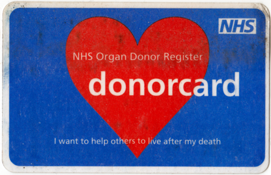
The rounded font disarms what is a direct and to-the-point statement—”if you find this when I’m dead, then go ahead and use my body for whatever you need because I don’t need it anymore!” The colour scheme is deliberately attention grabbing, helping anyone going through someone’s wallet in the unfortunate event of their death to find it as it is immediately visible. The fact that it has become an iconic piece of design, (one measure of something being an icon I would argue is mimicry—just Google ‘donor card’ to see many spoofs and détournements), means that its recognisable form is cemented in a doctor, nurse or paramedic’s mind’s eye. It is certainly distinct from many other cards someone would carry in their wallet or purse.

Death is not an easy topic for everyone to talk about. And while these cards aren’t trying to be over friendly in their styling, as this would diminish the seriousness of the situation, they do make a sensitive subject approachable, which is no easy thing to do—these cards don’t flinch from the reality, but they do offer some hope.

I’ve had the card above for a while now; its tattiness making it look a tired and in need of replacing. But I dare not throw it away as the newer variety are such a poor substitute graphically.

DonorCardNow

While I’m unsure whether the version pictured above is the most recent version, it is a poor piece of design in comparison to the original. Any mention of death has been relegated to such a secondary piece of information and rendered in a much smaller typeface that it almost appears cursory and timid, as if to say: “let’s not really discuss what this is about”. The off-centred title is visually awkward, not to mention a strange choice when everything else, (except for the NHS logo), is centred. The lowercase characters, along with the drawing together of the words ‘donor’ and ‘card’, I hazard a guess, is an attempt to create a visual identity for the card. But unfortunately this just looks like it is trying too hard and comes across as a gimmick. Finally, the heart symbol is misleading; the NHS are desperately in need of kidneys, corneas, lungs and livers as well as hearts, so it isn’t exactly a fitting icon.

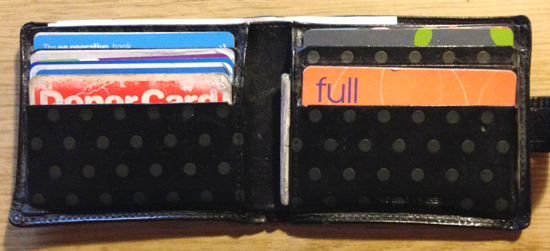
I carry one of these newer cards in my wallet as well, just in case the original isn’t seen as an official declaration anymore, but it can get lost in amongst the array of other cards have, looking more like a store loyalty card by comparrison. This fact, above all the other criticisms I’ve stated above, is the most serious flaw in its design. In contrast, the original had been considered as a functional item—with the words ‘Donor Card’ being prominent at the top of the rectangle. This makes it quickly readable without pulling the card, along with many others, out of its holder by someone searching for identification in an emergency. Below is a photo of how it sits in my wallet, clearly in view and unmistakable.

Wallet

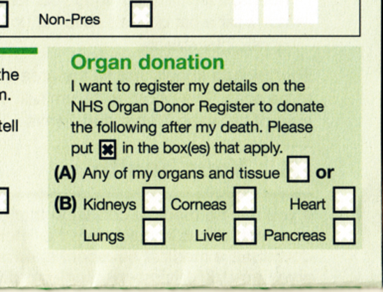
Completely by coincidence, this morning I received a letter from the DVLA telling me that I had to renew my driving licence and supply a new photograph. On the enclosed from was a box marked Organ Donation where I could declare my wishes as to what I’m happy to donate after my death. These details are then logged on the NHS Organ Donor Register.

DonorLicense

I have already signed up on the national register, but this does not make carrying a Donor Card any the less necessary, as in an emergency, and with so many people on waiting lists for an organ, time is of the essence. Carrying something that indicates your wishes is very immediate and can give the go ahead for a potentially life saving proceedure without the need to access an online register, which in many scenarios could be problematic. This reinforces the need for a Donor Card to be designed to be recognisable, obvious and immediate. The original version is all of these.

One other attribute the original Donor Card has is that it serves as a badge of honour. I’m very proud of carrying my card, and I’m happy to prick other’s consciences if they happen to glance at my open wallet while at the till in the Co-op. If it prompts anyone who doesn’t carry a card to do so, then I’m pleased to have played a role in this. The iconic nature of the original design, with its longstanding recognisable typography, has the chance to do this. The later version is anonymous and hidden from sight unless carried in a window pocket in a purse or wallet, and therefore has a much harder job to do and is therefore less likely to be effective.

All these considerations make me declare the original Donor Card a design classic, and I hope that the NHS reconsider the design of the current card and re-employ the stylings of this classic.

This post was written without being able to find out who the designer was of the original Donor Card, nor when it was first designed. If anyone reading this can supply this information, I would be most grateful and will update this post accordingly.

TomG

It is interesting to think why a signature on a piece of work attracts people to part with more money for an item than that item would otherwise be ‘worth’, particularly for work by graphic designers.

This week UCS Graphic Design and Illustration students held an International Design Auction of work they had, not to put too finer a point on it, ‘blagged’ from well known graphic designers and illustrators around the globe. The event was packed with people wanting to get their hands on (in the main) mass produced items that had been made unique with the quick squiggle of a fine liner.

I am very happy that I got the Tom Gauld piece I won, (pictured above), and I had earmarked this to bid on because it was a one off piece original artwork, (you can still see traces of tippex on it), and because I’m an admirer of his work. While the signature authenticates this as an original, had it been a signed print I would have been less interested. I also bid on other lots because I actually wanted them, such as Sam Potts’ poster celebrating 100 years of the Tour De France:

PottsHowever, I got carried away and bid on some items purely because they had a signature, such as the Johnson Banks ‘Power Of Creativity’ poster and a Karlssonwilker book that carried an invite to visit their New York studio, (but alas, without the addition of plane ticket). Don’t get me wrong, I like the work, this wasn’t some act of design star worship, but I now question whether I really can justify the purchase of something I wouldn’t have otherwise have wanted to actually buy and would have been happy admiring from a distance. I can categorically state that it was the lure of the signature that got me!

Johnson

Karlsson

Signing work is a controversial subject for some designers. We produce work that is reproducible not a one-off, (in the main), and a signature can lend the self-indulgent and egotistical air of pretension that dogs fine art. So to mark something out as ‘special’ goes a little against the grain for some in our trade. When design students last year ran the inaugural International Design Auction at UCS, I approached Javier Mariscal’s PA to see if he would sign a children’s Camper shoe box I owned, (it is adorned with some of his illustrated characters). The answer came back that Mariscal was not happy to do this because he was a designer, not an artist. Likewise, Barney Bubbles, record sleeve designer to Ian Dury and Elvis Costello et al, famously never put his name on a piece of work, not wanting to draw attention to himself and seeing the musicians his work showcased as its reason for existence. He was not in the game of self-publicity, and very much saw that graphic designer is a service industry.

But while I have strong sympathies with such beliefs, which at their heart, I believe to be political constructs of anti-elitist leanings, I can’t help being attracted to the ‘specialising’ of an item and the promotion of ‘ownership’ that such activity breeds. Over and above what I bought at this week’s auction, I also own a limited edition poster by Build celebrating 50 years of Helevtica signed by Michael C Place and a poster by Experimental Jetset that is collectively signed ‘EJ’ by the threesome, (both of these were competition wins). And recently I bought a poster by Unit Editions advertising their monograph on Ken Garland, signed by the man himself.

Garland

The Garland poster is a little odd in some ways: the poster wasn’t designed by him, and it is advertising a book that he didn’t write, so it seems slightly at odds with his self-effacing manner. Yet when Unit Editions posted on Facebook they were selling these as a limited run of 50, I had a knee-jerk reaction and bought one on the spot, being a fan of both Garland, and Unit Editions output.

Maybe a less aggrandising way to approach the concept of designer signatures is one I found by the great Paul Rand. On buying a copy of the children’s book he wrote and designed with his wife, ‘Sparkle and Spin’, I took a sneak peak at what lay behind the dust jacket, only to find Ann and Paul’s signatures printed onto the hard case (which was completely different to what the dust jacket portrayed):

Rand

This book feels just as special to me as any of the uniquely signed books or posters I own, because it is a little secret that you have to discover. The Rands, I believe, thought this hidden gem adds a personal touch to the piece, despite the fact it is mass produced. If I’m right in this assumption, it worked on me.

digital_invite_international_design_auction_27_November

This week saw the first exhibition in London by UCS Ipswich Graphic Design graduates. Titled We Are, the exhibition was held at The Coningsby Gallery, and was a deliberate attempt to try and buck the trend of the morale sapping rigmarole of New Blood, New Designers and Free Range graduate exhibitions, where by thousands of graphic design students compete for attention all at the same time of year and all under one roof. Notably at such events, those from the design industry tend to seek out the courses they already have contacts with, and rarely spend time looking for new talent from emerging courses. What successes come from this first UCS solo exhibition this week are as yet to be seen, but as this was the first of its kind for our students, it was a bit of a trial run and will hopefully develop over the coming years.

It appeared to inspired current first, second and third year students, who we took up to the gallery at various stages this week. And during a very busy period for current final year students as they are in the middle of writing their dissertation proposals and completing course work, they are also preparing for their International Design Auction which will help to finance any such ventures for them in 2014. The ‘We Are‘ graduates ran one last year, and raised nearly £2000 for their end of year show and London exhibition, and if the lots that are coming in so far this year are anything to go by, the 2013 auction is likely to raise a lot more money. There is signed work from Stefan Sagmeister, Tom Gauld, Jessica Hirsche, Milton Glaser, Armin Vit…I could go on, (and on, and on). While in London on Monday to catch the We Are show, current students even managed to find time to visit Margaret Calvert to pick up her 3 donations to the auction, (as well as accept her hospitality of tea and biscuits).

International Design Auction 2013 is being held at University Campus Suffolk’s Waterfront Building in Ipswich on 27 November at 17:30. Check out the lots on the  students’ website for the auction, and follow them on Facebook and Twitter for up to date information.

ida2013.com
ida on Facebook
@IDAuction2013