Archive

Graphic Design

UCS graduate Graphic Design and Graphic Illustration students are hosting an exhibition at London’s Coningsby Gallery next week.

This_London_InviteV4.indd

The money to put on the show came from the very successful International Design Auction held at UCS that was organised by the students in 2013, their final year. On display will be work created both on the course and since.

Check out the This is… website with links to the exhibitors personal sites.

Check out This is… on Twitter: @this_is_2014

photo-main

Image: Kemistry Kickstarter

After 10 years of exhibitions, London’s Kemistry Gallery is being forced from its Shoreditch premises because of redevelopment and rising rents. However, Kemistry Gallery is far from dead and buried as the team behind it launch a Kickstarter campaign to realise a ’10 years of Kemistry’ exhibition in 2015. This exhibition will be the start of the search for a new gallery space in London.

Why is Kemistry important? Well, it is the only exhibition space in London that is dedicated to Graphic Design, and in its 10 year existence has become the leading graphics gallery in the UK. In its history some of the biggest names in Graphic Design such as Saul Bass, Milton Glaser and Alan Fletcher have graced its walls. Alongside this, there have been exhibitions showcasing over-looked and emerging talent alike.

The Kickstarter campaign hopes to raise £15000 to match the same amount awarded by the Arts Council. This pot will then be used to put on a major exhibition featuring the work of everyone who has shown in the gallery in the past decade, and act as a pilot for the next stage of Kemistry. As stated on the Kemistry Kickstarter webpage: “‘Kemistry Gallery: 10 Years 60 Works’ promises to be a truly unique event, not just a taste of things to come with the new permanent Kemistry Gallery, but in itself one of the most ambitious and exciting explorations the past, present and future of graphic design to take place in London for many years”.

You can donate as little as £1, with rewards starting from a small £5 donation. More details here.

For current, future and past exhibitions at Kemistry, visit their website here.

cf4af3d788ccd0b653b0806fc92dd1cf_large

Image: Kemistry Kickstarter


BvAI-ghIcAE-R4L

I’ve discovered Scarfolk.*

Scarfolk is a story pieced together by Dr Ben Motte, who discovered a package one day stuffed with printed ephemera from a town that never left the 1970s. And as the story unfolds, you discover that Scarfolk is a very dark place indeed.

Never

Imagine Quatermass, Survivors and The League of Gentlemen rolled into one in the minds of Chris Morris and Douglas Adams, with paranormal children, tacit-racism, mind control and mythical folk tales thrown into the mix. If you can’t imagine it, then just think what it would be like.

Sam

Scarfolk is the brilliant invention of Richard Littler, a graphic designer who has a very keen eye for detail in recreating the 1970s and imagining the worst town to move to in the north of England.

Beige

Scarfolk has been a blog for a while, and is now a book. I can’t wait for the soundtrack and the documentary, they are sure to be coming soon.

Scarfolkswimstegosaurus

You should visit Scarfolk and discover it for yourself. *

* For more information please re-read.


September is a busy month for me in the run-up to the start of a new academic year, hence no new posts here for a month. However, I’ve been far from idle and I’m proud to announce one particular project is about to come to fruition. ‘This is us’ is something I’ve been working on with colleagues at University Campus Suffolk for a few months now, with the launch set for Tuesday 29 September and press ads to hit the news-stands from 1 October.

OLYMPUS DIGITAL CAMERA

3 of the 11 portraits in the UCS Waterfront Building lobby

The campaign was envisaged by UCS Provost Richard Lister who wanted to celebrate the individual stories of both students and staff at the institution as it turns seven years old this September. After initial idea sessions between Richard, Graphic Design Senior Lecturer Russell Walker, UCS Head of Marketing Michelle Wootton, Photography Lecturer Matthew Andrew and myself, we decided large portraits of some of the individuals who have been involved in the UCS story over the last seven years would be appropriately fitting.

BeckyBlunk

UCS Librarian Becky Blunk—Becky is American, before anyone comments on the spelling

After Michelle selected some initial candidates for the project, Matthew set about shooting them in-house at UCS over the summer. Michelle then copy-wrote the text based on interviews with all the sitters while I worked on handwriting samples, scanning them in at ridiculously high resolutions and cutting them about to compliment Matthew’s stunning portraits.

MarkEdwards

Course Leader and Senior Lecturer for Photography, Mark Edwards

After Matthew had finished the post-production, we worked closely with printing and hanging the images, using a low tack and re-positional adhesive paper that was completely new to us. The scale creates a dramatic statement as you enter the UCS Waterfront Building lobby, where the 11 images are currently hung.

EstherFaniyan

Esther Faniyan, current BSc (Hons) Bioscience student

JonCoy

UCS receptionist, Jon Coy

It is hoped that this project will develop into more portraits and stories over the coming years, but in the meantime, the full scale images can be seen in the UCS Waterfront Building until the end of October, and over the coming weeks will be run as press ads, one-a-week, in the East Anglian Daily Times which will expand upon the sitters’ stories. Alongside this, postcard packs will provide further information about the individuals’ accounts of their time at UCS.

HannahMaynard

It has been an honour to work alongside my colleagues on ‘This is us’ and it has been a mark of pride to be able to help showcase the difference UCS is making not just to Ipswich and East Anglia, but to the individuals involved; from students to academic and support staff.

For more information, go to: ucs.ac.uk/thisisus

TomGauld_Marvello

Tom Gauld’s response to reader’s letters about Steven Pinker’s article on grammatical rule breaking. The Guardian Review 23.08.14.

Do we need less or fewer pedants in this world? Well, according to Steven Pinker’s article in last weeks’ Guardian Review, (16.08.14), there are some grammatical ‘rules’ that we can afford to break. If you are convinced by his argument, then we can clearly agree we need less pedants in the world.

Personally I’m with him on this. There are just too many English language rules, many of which I have no knowledge of. And if you don’t know what they are, how can you change your behaviour? One of the problems with language pedants is they adopt a moral high ground that judges the character of the person who doesn’t quite get it right, despite the fact they may be communicating perfectly well.

That doesn’t mean I don’t have my pet peeves. My wife and step-daughter will warn anyone in my company they will fuel my wrath if they start a list-based sentence with ‘A’, and then progress to the second part of their list without saying ‘B’ beforehand. This in my mind is less about pedantry though, and more about committment. Worse though, they will tell you about my hatred of the use of the word ‘evocative’ to describe something without stating what it is evocative of! I find this particularly annoying if used to describe music. But again, this is less about pedantry and more about ensuring what you are saying actually makes sense.

Professionally however, when it comes to communicating clearly, use of language is important. My degree design students don’t know it yet, (they will find out in approximately one month, unless any of them read this post), but in one of my second year modules I ban certain words. That’s not quite true; I have a list of words and phrases that they aren’t allowed to use unless they are followed with a qualifying statement. For example, I don’t allow them to use the word bold. In and of itself, bold a meaningless describer for something visual unless it is being used when talking about a typeface, in which case it is entirely appropriate. Otherwise, it is just a subjective descriptor. I want my students to dig deeper than that—for starters, what makes something bold as opposed to not being bold? It is important to acknowledge such distinctions otherwise such phrases are meaningless. Likewise, the phrase ‘eye-catching’ has me thinking of someone playing ‘catch’ with an eyeball. What does eye-catching actually mean if it isn’t qualified; it is not something that can exist in its own vacuum. And while this might mark me out as a pedant to my students, it is an important aspect of design education, because as graphic designers we have to justify our rationale for the design decisions we make. We have to convince clients that we have analysed their communication problems and aim to successfully deliver their messages to their target audience, rather than employing our own artistic tastes. I’ve said it before and I’ll say it again: when we are designing we are not artists.

Despite not classing myself as a pedant, there is one area where I will confess to such a trait and that is when teaching typography. Students get sick of me discussing the difference between dashes and hyphens and appropriate usage of an ampersand. I’m not about to go into a typographic lesson here, but I think it is fair to say that there is a certain amount of pedantry at the heart of any typographer.

The contradictions in my views are not lost on me. Where I’m happy for the English language to be adapted over time, and accept this as part of a cultural/societal evolution, I am more resistant to the bastardisation of typographic constructs. But I equally accept that this is all they are, constructs—rules some people have mutually agreed to adopt that then become standards that others follow. Despite this dichotomy I am able to accept both my pedantry and that some of the things I believe in will fall out of usage by the simple fact others don’t accept it as that important as I do. I shudder that the em dash could disappear within my lifetime, but by rights, what should I really care?

Regardless of what does or doesn’t happen in the future of typography, I still believe it is important that graphic designers should understand what they are doing, (or not doing), and why, and to be able to justify their reasoning. The ability to communicate is at the heart of being a designer, and to choose to break ‘rules’ is fine if, A: you can demonstrate this is appropriate for the communication that needs to be delivered; and secondly: errr… if it makes a point.

image

Snape birdwalk by Peter Silk (Spring, 2011 brochure)—image courtesy of Silk Pearce website

I popped up to Snape Maltings near Aldeburgh in Suffolk at the weekend to find two great, if small, exhibitions.

The first celebrates 15 years of Colchester based graphic design agency Silk Pearce‘s work for the annual Aldeburgh Music festival. Their branding of the festival and programme designs have often featured in design magazines such as Creative Review, and a large display of all of their programme covers collected together features as you enter the show. This is followed by many framed prints of artwork they’ve created over the years, featuring techniques including collage, photomontage, screenprints and digital illustration that reference many aspects of Snape and Aldeburgh. Often fun and full of wit, the work vibrantly shows a diverse approach to image making, and visually dispels any notion of Aldeburgh Music being po-faced as many similar ‘serious’ music festivals might come across. Whoever commissioned Silk Pearce 15 years ago made a wise decision, and the brief must be an annual joy for the studio to anticipate.

Max Gill exhibition—image courtesy of LCAT website

Max Gill exhibition—image courtesy LCAT website

The second is an exhibition of the work of Max Gill, the younger brother of the more famous Eric Gill, at the Lettering & Commemorative Arts Trust‘s centre, also at Snape. The centre is worth a visit in its own right for the amazing letter craft, stone masonry and calligraphy on display, but Gill’s maps and book work are absolutely stunning in the main exhibition room. I was particularly taken with his Tea Revives The World map, being a big tea fan myself.

It is unusual enough to get exhibitions of Graphic Design anywhere, but the fact these exhibitions are on together is a rare treat. You’ll have to be quick to catch the Silk Pearce show as if finishes at the end of August, coinciding with the Aldeburgh Music Proms. The Gill exhibition is on until 12 November.

I’d read about Ditchling Museum of Art+Craft on the Design Week blog last year when it reopened after being refurbished. It made the design press largely because of the rebranding by Phil Baines, in which he re-drew Gill Sans for all accompanying graphics. In truth, what Baines had done more than help advise on the dressing of the museum was to shine a light on an important historical design gem. And when I realised we wouldn’t be too far away while holidaying on the Kent / East Sussex boarder last week, it went on the itinerary of possible things to do. But rather than visit after going to the Chermayeff exhibition in Bexhill on our return journey home, we decided to go on a separate day, worried that two exhibitions in one day would be too much.

OLYMPUS DIGITAL CAMERA

As it turned out, the museum is very small, and we could have easily done it after visiting the De La Warr pavilion rather than travelling the congested A259/A27 from Kent on a hot summer’s day especially to see it. But Ditchling Museum of Art+Craft’s size, (and accompanying over-priced admission fee), was the only disappointment for what is otherwise an excellent museum that focusses mainly on Ditchling’s rich typographic and printing heritage. For it was in this sleepy village that Eric Gill founded an artist community that attracted the likes of Edward Johnston, Philip Hagreen and Hilary Pepler, amongst others.

OLYMPUS DIGITAL CAMERA

As one would expect, much of the museum is given over to Gill, although it is interesting to note that his controversial animal and child abuse accusations are glossed over. The only mention I could find anywhere was on a display board that simply read: “Controversy and debate were part of Gill’s day to day life when alive and they continue to be part of this artist’s legacy”. Regardless, the important work that he produced, along with all other exhibits, are given plenty of space for visitors to study.

OLYMPUS DIGITAL CAMERA

OLYMPUS DIGITAL CAMERA

OLYMPUS DIGITAL CAMERA

Some of my favourite work displayed were these small wood engravings by Philip Hagreen, and it was interesting to note how the importance of the faith of those involved in the artist community spilled over into social welfare considerations and general philanthropy.

OLYMPUS DIGITAL CAMERA

It was also refreshing to see sketches and preliminary work alongside finished pieces.

OLYMPUS DIGITAL CAMERA

There is even a small mock-up of a print room.

OLYMPUS DIGITAL CAMERA

OLYMPUS DIGITAL CAMERA

This was a delightful little museum to visit. The sensitivity with which the branding and display presentation has been approached is testament to the attention to detail paid by Phil Baines, and ensures due respect is paid to some of Britain’s most important early twentieth century graphic designers and typographers.

Ditchling Museum of Art+Craft website


We’ve just returned from our annual family holiday and 2014 saw us spending a week on the Kent / East Sussex boarder. This is an area we’ve come to grow fond of over the last few years, spending time in both counties for extended weekends and trips out, but never a whole week. Seven days gave us plenty of time to explore the area further, and aside from the usual holiday type stuff, it struck me just how much cultural activity there is to be had in this region with Hasting’s Jerwood Gallery, Brighton’s excellent Museum and Art Gallery, and further around the coast, Margate’s Turner Contemporary. Despite not visiting any of these this time, (we did make it to the Jerwood, but it was closed for a rehang), we did end the holiday on a graphic design high by visiting Ditchling Art+Craft Museum, (more of this in part two of Holiday exhibitioning, to follow shortly), and the opening day of the Ivan Chermayeff: Cut & Paste exhibition at Bexhill-On-Sea’s De La Warr Pavilion.

Chermayeff1

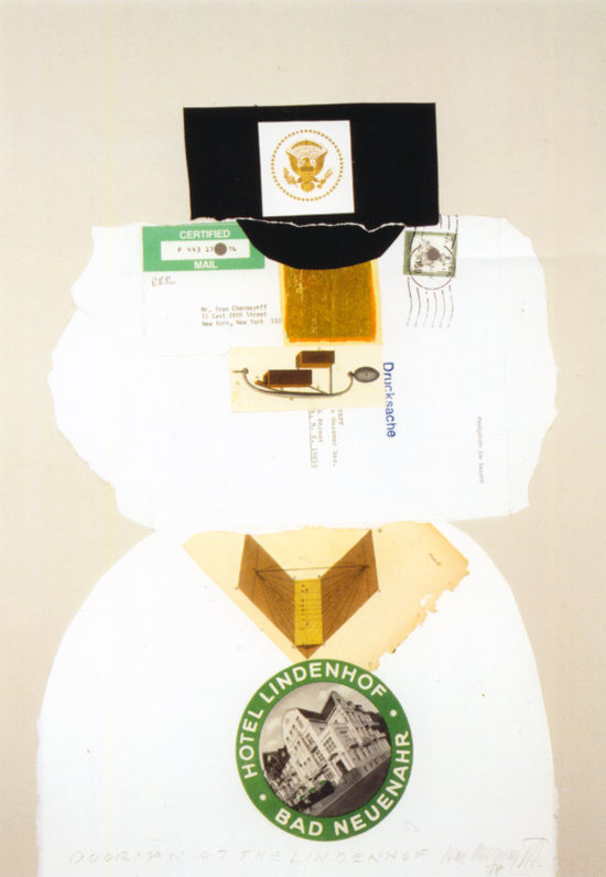
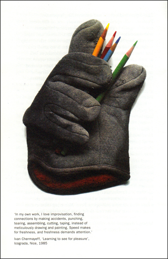
The Chermayeff exhibition was truly inspirational. I knew some of his work previously from seeing it in design history books, but I didn’t realise how prolific he was/is. The walls of the large gallery were packed with work, and as the title suggests, the focus was on assemblage. There were some posters for specific corporate and cultural clients, but the vast majority was of work he has done in his own time. Throughout, regardless of whether for a client or personal work, whether tackling something frivolous in nature or weighty in tone, there was a real sense of play and wit throughout the exhibition. So much so that I came away feeling like I had just seen one of the best graphic design exhibitions I had seen since Alan Fletcher’s retrospective at the Design Museum in 2007. Ideas, puns and visual play runs through all Chermayeff’s output.

ChermayeffCircus

ChermayeffDoorman

Chermayeff once worked alongside Fletcher, so it is no surprise that there should be some commonalities. There are also obvious comparisons to the art world’s Matisse, Picasso, Ernst and Schwitters in his collages and paper-cut montages. I’d come away from the Matisse show at Tate Modern recently not feeling overly impressed and that somehow the work on display was largely vacuous (1). Chermayeff’s creative approach was refreshingly opposite to this as it either had communication at its core, or it challenged the viewer to think differently about found objects and how one connects different visual elements to create a new narrative. In Cut & Paste’s catalogue, Milton Glaser writes in the introduction, “In a catalogue of Ivan’s collages 1987–2011, Louis Newman states, ‘Chermayeff is among the few who can transpose design into high art,’ referring to his big, red unforgettable sculpture ‘9’ on 57th Street. I always find the phrase ‘high art’ to be problematical, more like the relationship between haute cuisine and ‘home cooking’, where the differences are contextual, rather than the nature of the ingredients. I prefer to think of design and art as separate characteristics like sex and love—each can be significant and pleasurable by itself and every once in a while you get both at the same time—solving a problem is one thing, changing consciousness is another.”

ChermayeffPeace

Chermayeff2

Ultimately, as the quote above and an excellent 12 minute film in the show suggests, Chermayeff places a heavy importance on the art of seeing and finding connections, and this shone through in the collection displayed at the De La Warr Pavillion. As Alan Powers says later in the catalogue: “We see them [Chermayeff’s collages] and think, ‘I could have done that,’ and so go out with our eyes sharpened to see the second reality behind the first. This sharing of pleasure is hardly a didactic form of art, but it relates to Ivan’s mission as a designer, which, along with serving his clients to his best ability, includes a wider desire to teach the world how to see by exercising what John Milton in Paradise Lost called ‘the visual nerve’.”

Ivan Chermayeff: Cut and Paste is on at the De La Warr Pavilion until 14 September 2014. Entry is free.

Chermayeff: Cut and Paste Guardian review


(1) I know Matisse was important in terms of breaking concepts of painting, and his use of colour and form are visually amazing, but much of it looked like pointless non-applied surface pattern to my eyes. I felt his output worked much better when applied to a context, such as a book jacket, magazine cover or stain glass window. Hanging on a wall, it did nothing for me.


People Power installation by Stephan Charnook

Claire and I visited Manchester for the first time at the end of April. Of the many things we saw and did, a highlight for us both was a visit to the People’s History Museum. Housed in a specially converted pump-house, the museum hosts an amazing visual display of artefacts relating to political history of ordinary people in this country, with an obvious bent towards Manchester related events and organisations, from the Peterloo Massacre to celebrating 150 years of the Co-op.

OLYMPUS DIGITAL CAMERA

OLYMPUS DIGITAL CAMERA

The museum could equally be called the Graphic People’s History Museum, as walking around it becomes obvious just how important graphic design has been to organised labour and grass-roots movements in this county. From broadsheets to posters, from trade union banners to badges and T-shirts—this must be a go-to museum for anyone interested in political graphic design. Importantly, they also have a dedicated conservation room, with conservers fighting the effects of time on historically important trade union banners. (You even get to see them at work through a large plate glass window into what looks like a humidity controlled room with banners laid out on vast tables; unfortunately this is the only area you are not permitted to take photographs).

OLYMPUS DIGITAL CAMERA

OLYMPUS DIGITAL CAMERA

OLYMPUS DIGITAL CAMERA

OLYMPUS DIGITAL CAMERA

OLYMPUS DIGITAL CAMERA

As the museum covers a vast time period, it is not surprising that the visuals employed to ‘agitate, educate and organise’ change throughout the three floors. From original iconic pre-World War 1 posters that you’ll readily see in graphic design history books, to some truly excruciating 1980s anti-racist GLC posters:

OLYMPUS DIGITAL CAMERA

If there are any criticisms I can make of the collection it is that the narrative presented has a left-wing bias that gives the sense that this is the ‘official’ story. While it is understandable that the Labour Party and key trade unions are focussed on in large measure, being highly important and having the biggest historical impact on this country, some factional left parties and organisations are given exposure over others. For example, a sympathetic nod is given to the Anti-Nazi League and the SWP and Militant Tendency, while there is a complete lack of anything relating to anarchist history; there is no Class War or anarcho-punk mentioned anywhere, both of which were very visual in their output and both politically and culturally important throughout the 1980s and into the 1990s in the north of England. Despite this minor gripe, there is a good spread of other worthy causes such as gay & lesbian rights and the Anti-Apartheid Movement, although these were quite fleeting considering the impact they had on changing societal attitudes.

OLYMPUS DIGITAL CAMERA

OLYMPUS DIGITAL CAMERA

One of the most touching displays for me was a celebration of those that volunteered from the UK to fight fascists in Spain during the Spanish Civil War in 1936, including a typed and signed letter from George Orwell. There is something about this story that I always find moving. Having read and seen much about how ordinary people gave up their time, (and many their lives), to help fight the advance of fascism in Spain, so that the Spanish themselves could concentrate on fighting their own revolution, being confronted by collections of belongings from those on the front lines was over-powering.

OLYMPUS DIGITAL CAMERA

A POUM wallet is displayed with volunteers’ belongings from the Spanish Civil War. POUM—a Spanish communist/Marxist party with anarchist sympathies who organised battalions of foreign volunteers to help fight fascists, (and for whom George Orwell fought alongside).

OLYMPUS DIGITAL CAMERA

It seems both fitting and sad to write this post today when many right-wing, (and some openly racist), parties have had electoral success in European elections this last week. It was hard not to let his thought linger today as I edited these images to post here. But when we were walking around the museum it was equally depressing that there was not only a corner of the permanent collection devoted to the Manchester born Co-operative Society, but also on the ground floor the Museum was hosting a special exhibition celebrating 150 years of the Co-op. While this in and of itself was a great exhibition, with the Co-op in so much financial and organisational trouble at the moment, it felt like a very deflating experience looking through the Co-operative’s rightfully proud history with knowledge of how recent greed and mismanagement has bought such an important British institution to its knees.

Employees’ magazine for the pre-Co-op CWS

OLYMPUS DIGITAL CAMERA

OLYMPUS DIGITAL CAMERA

OLYMPUS DIGITAL CAMERA

So it is with a bitter-sweet taste in my mouth that I post these pictures here. But regardless, if you are in Manchester at any time then I can not recommend a visit to the People’s History Museum enough.

OLYMPUS DIGITAL CAMERA