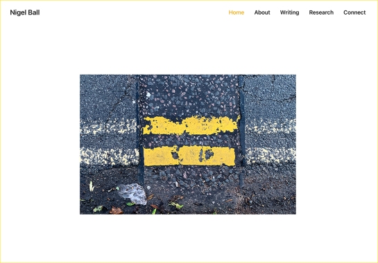
After many years of using the Dubdog moniker I have decided to move on and concentrate my efforts elsewhere.
Dubdog was initially coined as a moniker for my freelance graphic design practice many years ago. But as I have done less client work in recent years, and I have started to concentrate on my writing alongside my academic career, it has become a bit of a redundant title. While I have been more discerning about what I post here more recently, there is still a lot of personal stuff, and it has now got to a stage where my design writing doesn’t sit so well alongside that.
I have therefore launched my own website dedicated to my writing about graphic design and visual culture and my research: nigelball.co.uk
Whether I continue to post here or not for more personal thoughts will remain to be seen, but I suspect this will fall by the wayside—there is only so much time after all, and I’m not really sure who is that interested in what I’ve got to say about music and whatnot. My biggest ‘hits’ are without a doubt those posts centred on graphic design.
Much like Dubdog on Blogger, I will keep this site live, as there are still some posts that I haven’t migrated to the new site that I am proud of, and who knows, I may come back and write the odd post for things that don’t entirely fit elsewhere.
But in the meantime, see you online elsewhere, (the links are still live on the Elsewhere page). Thanks for following what I’ve written on Dubdog over the years.
Eardrum Buzz is an irregular Dubdog feature looking at key pieces of music that have altered my perception of exactly what music can be. See Eardrum Buzz (intro) for further context. All comments are highly subjective.
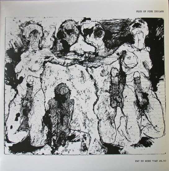
Title: The Fucking Cunts Treat Us Like Pricks
Author: Flux of Pink Indians
Label: Spiderleg Records
UK Release Year: 1984
2016 sees celebrations of the 40th anniversary of the birth of Punk with a very London centric focus. Halfway into the year and only a couple of months into the festivities, I am already sick of the sight of computer generated ransom lettering, dayglo colours and screened images. Don’t get me started on musical anthems from my youth being used in TV adverts—every time I see that McDonald’s / Buzzcocks’ advert I die a little inside.
But I was late to punk as a teenager, that was more my older brother’s era. I grew up with 2-Tone for my teenage rebellion, before getting into punk well after-the-fact. After getting into the first wave of punk bands several years from when they emerged, I fell for anarchopunk, as much for its political stance as its musical output. If I listen to much of that genre’s oeuvre today I find it embarrassing, but musically I still hold Crass and Flux of Pink Indians in high esteem. Both pushed the boundaries of what they did and challenged their fans to embrace more than just a three chord thrash with shouty animal rights lyrics. Their investigation into social and personal politics stretched to their craft—they were progressive, embracing free-jazz, noise, industrial, electronics, and in Flux’s case, dub and funk.
When, in 1985, I returned home after swapping 8 LPs I’d grown tired of at Colchester’s Parrot Records for Flux’s second album, little had prepared me for the assault my ears were about to receive. I assumed, very wrongly, I would be getting more of the same of their first release: Strive To Survive Causing The Least Suffering Possible. That was a concise metallic guitar/feedback thrash through shouty green anarchist lyrics, pithy and earnest with song titles such as: They Lie, We Die; We Don’t Want Your Progress; and Myxomatosis. It was sharp, to the point, aggressive and polemic. But as I had already fallen in love with the uncompromising artwork and title of their second album: The Fucking Pricks Treat Us Like Cunts, The Fucking Cunts Treat Us Like Pricks; I didn’t want the music to let me down.
My first impression, (after WTF have I swapped 8 LPs for?), was to ask myself whether I had a miss-pressing? The sound was muffled in places; the tracks didn’t seem to end but bled into each other; overdubbed electronic noises burst in and out; music stopped dead, punctuated with samples from different radio stations; the whole thing sounded like a complete racket. Which it is, of course. The first track starts with feedback, electronic vibrating noises, then what sounds like the band playing live punches in with several people yelping ‘punk punk punk punk punk punk punk punk…’ The music/noise was as uncompromising as the artwork and title.
So in the spirit of these Eardrum Buzz posts, why have I picked this record out as changing my perspective of just what music can be? Firstly because it taught me the value of not rejecting something on first listen—I learned to love this record. Secondly because it was deliberately challenging and it shocked me out of my then musical complacencies. Thirdly because I got into its experimental nature. This, I thought, is what punk should be all about. Not because it is aggressive, but because it is attempting to explore new ground beyond the conventional, and anarcho-punk, like punk rock before it, had become conventional with their rockisms and formulas.
Fucking Pricks… is punk, sure, but it is also noise, industrial, jazz, and Dada. It is also extremely and unapologetically political. Sure, there are moments of pious preaching when the noise abates and you can make out spoken lyrics. This is as only anarchopunk bands can be, and this is what I have come to wince at when listening back to the genre’s cast. In Flux’s case these are the weaker elements against the sonic overload that is the rest of this album, and these wince-inducing parts become inconsequential against the rest of the musical onslaught. But all that that aside, in 1985 the record felt exciting and it got my heart racing.
As it transpires, on looking back, it was an important record for me. Later I would get into Tackhead’s industrial funk and more recently I’ve been listening to a lot of free-jazz, things I’m convinced this record paved the way for my ears to appreciate when the time came for me to discover them. Fucking Pricks… taught me to give things a second listen, it reaffirmed in me that anything can be music, and that the more you become familiar with something that you don’t first understand, the more it can reward your senses as you spend time with it.
What would I make of it today if I heard it for the first time? I don’t know, I expect I would find it sprawling and in need of editing and honing. But I would still recognise its challenging nature, its uncompromising and brave approach, and its sense of perversion. In listening back to it for the first time in years before writing this post, I thought of it in comparison with the Buzzcocks advert and the 40th anniversary of the first wave of punk that McDonald’s have jumped on. In thinking about this, Flux of Pink Indians need high praise indeed for making something that no corporation could ever appropriate.
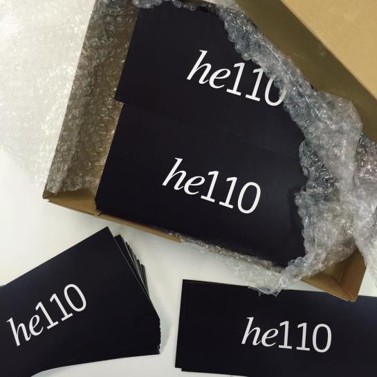
Degree show time is upon us, and this year the Graphic Design and Graphic Illustration students from UCS Ipswich have branded their show he110 after the studio number R110 they’ve been working in for the last 3 years.The show opens to the public on 3 June in the UCS Arts Building, (weekdays 10:00–18:00; weekends 11:00–15:00), with the Private View on the evening of 2 June from 18:15–21:00.
This year the graphics students have been busy marketing their show and are posting daily on their Twitter, Instagram and Facebook profiles. They’ve also launched their own he110 website with links to their personal portfolio sites.
Graphic Design and Graphic Illustration students are exhibiting alongside other degree courses: Computer Games Design; Dance; English; Fine Art; Digital Film Production; Interior Architecture and Design; and Photography. The Photography degree show is on in the UCS Waterfront Building until 8 June before going to Free Range in London.
For details of how to get to UCS follow this link and come along to the show and say he110
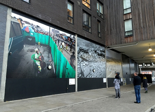
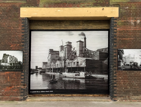
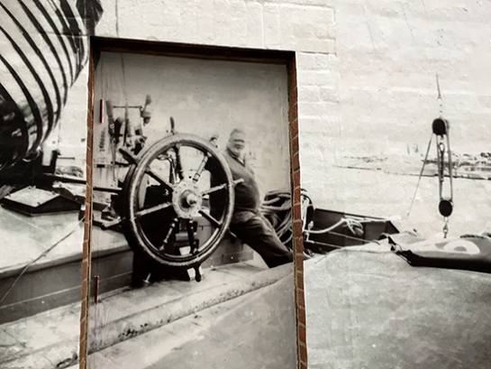
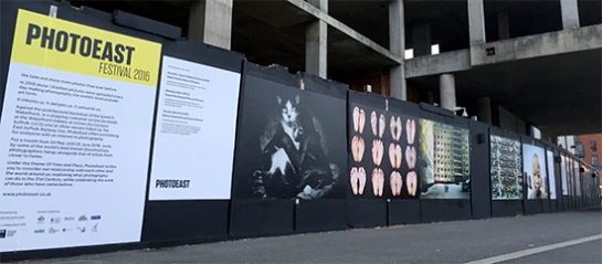
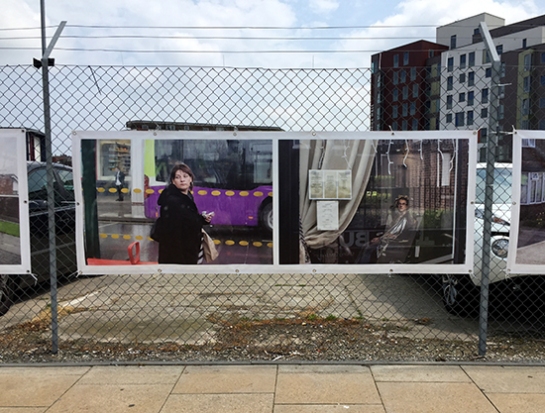
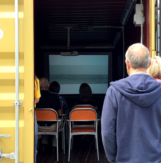
PhotoEast, Suffolk’s first festival of photography, was launched this week in Ipswich and can claim to be a major success, even within its first few days of existence. The half-mile walk along Ipswich’s waterfront from DanceEast to Cult Cafe brings dramatic images from around the world to this small Suffolk town. Local history and Ipswich life are presented alongside contemporary photography as part of the fabric of the waterside architecture. There is even a projection room inside a shipping container at the far end of the marina.
Further to the monumental quayside exhibitions, two poignant projects looking at ageing and the family by Zed Nelson and Julian Germain are displayed in UCS’s Waterfront Gallery. Alongside these keynote exhibitions, the BA (Hons) Photography degree show in the UCS Waterfront Building lobby showcases the next generation of photographers emerging from the region; while a PhotoEast Young Person’s Fellowship exhibition of local school and college students’ work is on display in the nearby Arts Building.
While walking around the quayside several times this week it has been hard not to notice a buzz in the air that this very public exhibition has brought to the town. Listening in to the conversations of teenage skateboarders making their way home from the local skatepark as they discuss the images is as fascinating as the work itself. And you can watch the drama of some of the photographs stopping people in their tracks in order to contemplate and comprehend what they are looking at.
Accompanying the exhibition is a one-day series of talks. This morning Claire and I went to hear the Picture Editor of The Guardian, Fiona Shields, talk about the challenging job of choosing the right image to illustrate a news story from some of the 25,000 pictures she looks at everyday! This afternoon we are heading back into a lecture theatre to hear George Georgiou discuss his commissioned project of photographing Ipswich from the top deck of a bus. In-between these there is a programme of talks from Mark Edwards, the Course Leader for the Photography degree course at UCS Ipswich; social documentary photographer Julian Germain will discuss his work in the Waterfront Gallery; and curator Katie Barron is in discussion with Chloe Dewe-Mathews about her WW1 tribute Shot At Dawn. The scale and breadth of this festival, both aesthetically and cerebrally, is truly impressive.
The festival continues in Halesworth and various other venues along the A12 towards Lowestoft. Tomorrow Claire and I plan to visit an exhibition of Rodchenko’s photographs in a garden nursery at Darsham, and People and Their Dogs at The Cut in Halesworth. PhotoEast organisers are hoping to host exhibitions in more towns throughout the region as the festival develops over time.
In considering what has made this festival so successful there are three key ingredients which need to be taken into account. Firstly, the calibre of the work on show is extremely high, a parochial exhibition of sunsets this is not! Secondly, the presentation is what you would expect from any metropolitan gallery or major arts event. Thirdly, the festival branding brings all the disparate aspects of the festival together with a cohesive graphic unity. If any one of these parts was not as fully considered as they have been I am in no doubt the sum total would have suffered as a result. PhotoEast is evidence of just how to put on a culturally exciting and vibrant arts event in a small town that engages local audiences well beyond their geographical boundaries.
Congratulations to the organisers for their vision, to all those involved at UCS, and to all the sponsors and supporters for helping to make this happen. PhotoEast 2016 continues until 25 June across various venues in the region. Check out the PhotoEast website for more details.
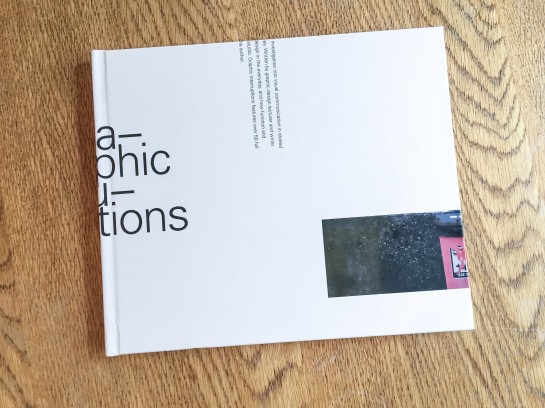
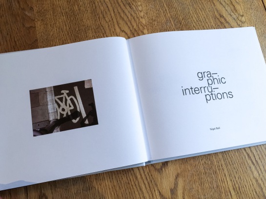
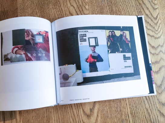
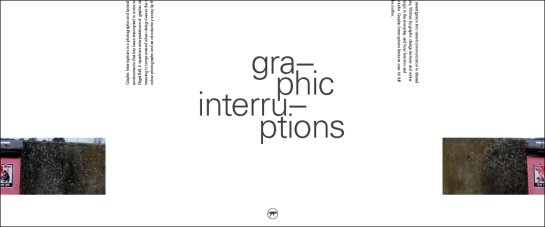
Graphic Interruptions has reached some sort of a completion, for now, with the production of a one-off hard back book for an assessment of the project for my masters degree. The project will continue in the background and you can follow its Instagram account here.
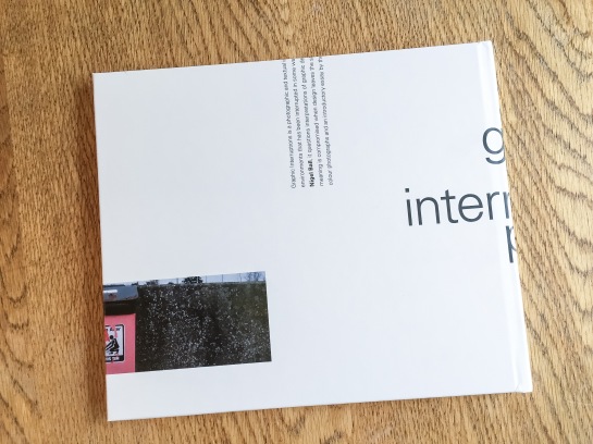
Graphic Interruptions, back cover
I would like to have produced more books and sold them, but because of the production values I insisted on, it means each copy would cost upwards of £60 and I just can’t justify selling copies for that price. However, without going into details at the moment, I have been talking to a publisher and if a book proposal I’m writing is accepted, Graphic Interruptions may enter the public realm as part of a wider project.
Title page
In the latter stages of working on the project, which had been ongoing since October, I fell back on familiar territory, (see McJunk, links on Elsewhere page), as I needed to create a tangible outcome for a looming deadline. This resulted in me jettisoning explorations into maps, autobiographic writing and psychogeography which had all been part of this project at one point or another. My interest in these makes me certain I will return to them in the future but in order to wrap this up for an assessment I went with what I knew I could achieve.
The essay I wrote as the introduction to the book will see the light of day here in the near future, but for the time being I’m pleased to call some sort of pause to Graphic Interruptions, at least in relation to my MA studies. It has helped shape my thinking for the next stages of my academic research. And more than that, I’m looking forward to blogging about more than Graphic Interruptions here.
Book jacket proposal (front and back)—work in progress
Graphic Interruptions is reaching some sort of climax as I prepare the final artwork for a one off self-published book to go to print this week. As I near the end of this stage of the project, (i.e., an assessment hand-in for a 40 credit module in mid-May for my masters degree), for no reason what-so-ever other than a little procrastination, I’ve worked out some (sketchy) stats for the project to date:
—55 photographs in book, edited down from 224
—7 short psychogeographic writing trials
—1 long psychogeographic essay with umpteen drafts
—1 introduction essay of over 1300 words, 6 drafts and copious notebook ramblings
—3 book print trials
—7+ layout trials
—untold changes in direction
—7 months reading/researching, photographing, questioning, reflecting
—6 blog posts in duration of MA, (+1 associated)
—One 3 year old blog post, (genesis of project concept)
—3 presentations
—5 critiques
—2 ring binders
—63 plastic wallets
—2 sets of inkjet cartridges
—2 maps
—One 19x25cm Moleskine softcover notebook
—One 14x21cm Leuchtturm1917 softcover notebook
—3 or 4 Lamy rollerball cartridges
—untold visits to the library
—uncountable Google searches, RSS feed follow-ups and Evernote bookmarks
—1 part-related meeting with a publisher
—1 venn diagram
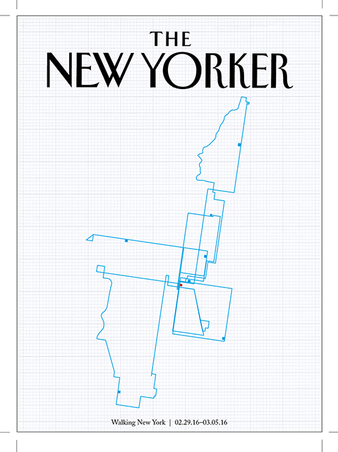
For the UCS Graphic Design trip to New York at the beginning of March, Russell set students and staff the challenge of producing a New Yorker cover that responded to their time in the city.
I had made no plans what I was going to do for the project before I went but I started drawing my walks around Manhattan from memory every evening. I didn’t attempt to draw these to any sort of scale, nor did I refer to any map. In creating these drawings it quickly became obvious that these would work for my New Yorker cover submission.
The maps represent all walks I did over the five days, typically two a day; one during the day and the other in the evening. The evening walks tended not to stray very far from the hotel we were staying in on 7th Avenue opposite Madison Square Gardens, (the red dot). The top of the map stops at the Guggenheim and the bottom in SoHo. I resisted including the boat trip around the island I took, as it wasn’t a walk, although there are a couple of bus journeys represented as these were routes to, or back from, walks I did.
Once back home I redrew the separate maps into a single record, and then scanned it and redrew it digitally in Illustrator. I did trial using a different colour for each day, but decided that a singular approach worked better and unified the whole piece. I tried tearing the graph paper to the shape of the island, but felt this gave a scale reference and detracted the emphasis from the memory-map.
This piece now forms part of an exhibition alongside student work at UCS, check out the Graphic Design course Facebook page for photos of other submissions here and here.
Scroll down here to view a couple of posts I’ve written about the trip with accompanying photos, or check out my Flickr site.
I’ve long believed the Guardian to be the best designed newspaper in the country, which is convenient for me considering some may think I fit the profile of a typical reader—feminist liberal-left vegetarian art teacher. It would be difficult for me to take if the Daily Mail fitted this design accolade.
But I like the Guardian for more than its graphic design; the fact its investigative journalism helps to keep in check those in power is equally as important to me, particularly in these days of party political impotence. Simon Jenkins summed this up well this week in From Snowden to Panama, all hail the power of the pressduring the breaking revelations about tax evasion.
But journalism with integrity isn’t enough on its own, just as great graphic design isn’t enough on its own. You have to be able to engage readers in your content or it won’t gain the attention it requires. And this is where the Guardian really sets itself apart from pretty much all other news vendors, (with the exception of Channel 4 News, albeit via a different medium). The marriage of purpose and presentation is given equal respect in this daily paper, and the approach is integrated across all of its platforms, from newsprint to website to app.
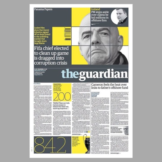
If anybody should need a case study to prove my point, the Panama Papers story this week should be a convincing one. Deputy Creative Director of the Guardian, Chris Clarke, tweeted the next day’s front page every evening, and there were many of his followers waiting for the reveal each night as the story broke, (and continued to break throughout the week). If the awkward adjective ‘impactful’ can be ascribed to anything, it is the design decisions the creative team at the Guardian took to grab their readership’s attention.
Monday’s front page was really brave, dropping the masthead from its usual position at the top to halfway down the page. All advertising was removed, and using the daffodil yellow to punch out of the grey, as Clarke’s choice of a ‘punching fist’ emoticon to accompany his tweets accurately indicated, had real visual impact to match the world leader shaking story.
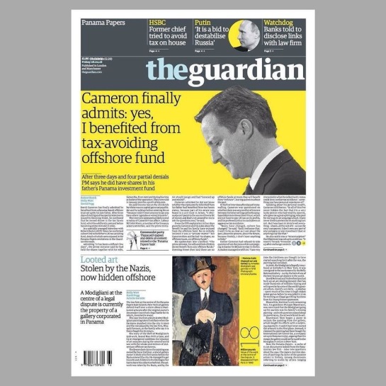
On Friday the masthead resumed its usual position at the top of the paper, no longer taking second billing to the story, but the visual language deployed stayed the same—dramatic, powerful and as attention grabbing as the headline. Again, like Monday through Wednesday, Friday sees the front devoid of advertising:
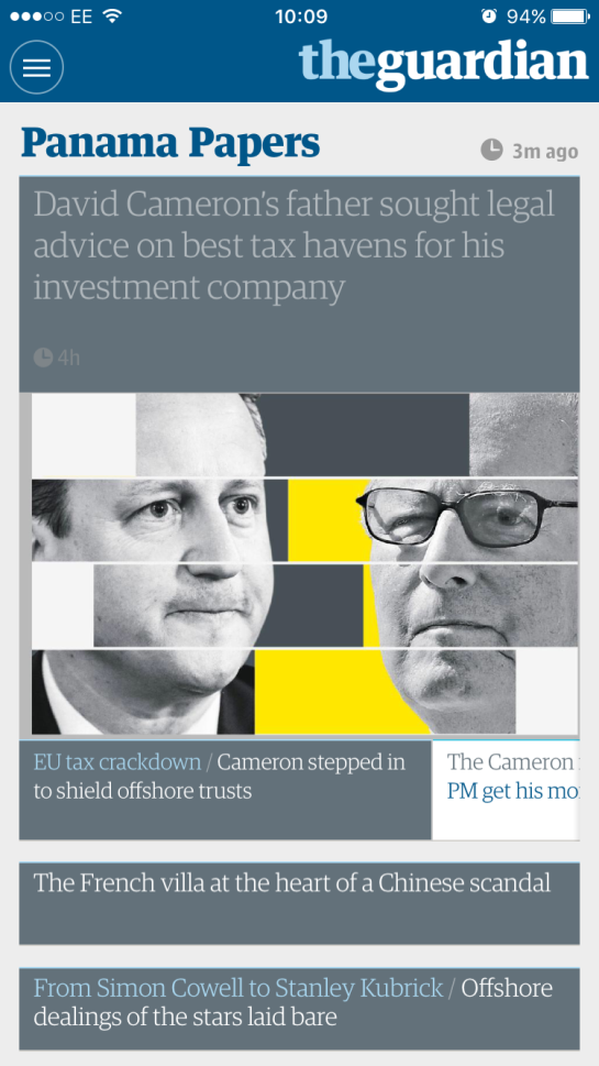
iPhone app: the visual approach worked across platforms
I would be very surprised if both the Guardian’s journalistic and graphic design approaches from this week’s editions does not win them awards in their respective fields—they rightfully should.
Eardrum Buzz is an irregular Dubdog feature looking at key pieces of music that have altered my perception of exactly what music can be. See Eardrum Buzz (intro) for further context. All comments are highly subjective.
Title: Spiral Scratch EP
Author: Buzzcocks
Label: New Hormones
UK Release Year: 1977
With all the talk in the media at the moment about punk’s 40th anniversary and whether Malcolm McLaren’s son will burn his £5m punk collection in protest against the celebrations, you’d have thought that punk only happened in London. Choosing not to mention the stateside influences, and the fact that punk was vital to those living outside of the capital, the London centric aspect of this heritage spectacle is what annoyed me in the first instance when I heard about the forthcoming celebrations.
While I heard much of the original punk shenanigans coming out of my brother’s bedroom door 40 years ago, being only 8 at the time I somewhat missed the (jubilee punk) boat. A few years later when I was living in Mansfield and all my friends were into heavy metal, which I hated, I started investigating punk for myself, despite it being pretty much dead in the water by then. Living in Mansfield with few cultural attractions and a peer group desperate for Americanisms, poodle hair and denim jackets covered in band patches, punk kept me sane, even if at that stage there weren’t really any contemporary bands for me to get into.
I can’t quite remember the order in which I heard things, (tapes from my Sister’s then boyfriend’s record collection muddies the water somewhat), but one week I paid £2.50 of my hard earned paper-round money for a copy of Spiral Scratch EP from a second hand record shop in town. I think by then I had already borrowed The Buzzcocks’ Love Bites from the local library, so I was used to Shelley’s vocals being one of the key features of the band. But Spiral Scratch knocked me for six. I immediately fell in love with Devoto’s voice, who I hadn’t heard up to that point. To this day he is one of my favourite vocalists in all of music’s rich history and I firmly believe he could sing over absolutely anything and make it better.
The music was nervy, uncoordinated, and rudimentary, and to my ears back then, incredibly fast. I don’t think I had ever heard anything so fast before. There was a frantic urgency to the four tracks as if the band were desperate to get through them and didn’t ultimately care about the quality of what they put down. The lyrics that Devoto yelped over the top were very different to Shelley’s which hid stories of homosexual longing and frustration in a overly heterosexual lyrical world. Devoto came across with much more of a sense of distain for sex that made him seem asexual and other-worldly, (that, and the Enoesque hairdo). A sense of nihilism and sarcasm shone through.
For me it captured the spirit of everything I thought that first wave of punk was about, and the Sex Pistols sounded over-produced and over-complicated in comparison, (excepting Lydon’s brilliant vocal delivery—I always thought Devoto and Rotten should compete in a sneer-off). Of the other all-male bands of the time, only Alternative TV came close in contempt for rock musics’ macho formulas and posturing, most other punk bands seemed to allow such vanities within their particular rock schtick. X-Ray Specs and The Slits, by their very nature, eschewed such things, but of the male bands, the aesthetics of sexual politics just wasn’t on their agendas, unlike Buzzcocks and Alternative TV.
The stand out track on Spiral Scratch is, without a doubt, Boredom. This track in itself sums up 1976/77 punk for me—the spirit that spawned it—and all other attempts to encapsulate the feeling of the movement were rendered pointless after this. It is no wonder that Devoto immediately left the band, having laid down the most punk of all records, there was little else to be said and he moved on to even greater things with Magazine. In essence, I suppose he became bored with punk having helped to create one of its masterpieces. He had created Boredom and became bored by it.
 The show opens to the public on 3 June in the UCS Arts Building, (weekdays 10:00–18:00; weekends 11:00–15:00), with the Private View on the evening of 2 June from 18:15–21:00.