Archive

Graphic Design

With the day job taking over of late, it’s been a while since I’ve managed to get to a graphic design talk. But thanks to an invite from Kemistry Gallery for helping with their recent Kickstarter campaign, I managed to get up to London one evening last week for a talk that was boldly titled Graphic Design: what next? With design critic, journalist, educator and publisher Adrian Shaughnessy; Why Not Associates’ Andy Altmann and designer/artist Daniel Eatock speaking, it would have been rude not to attend. And besides, I was intrigued as to what they would claim was next for graphic design.

CCx2

Gordon Young/Why Not Associates: Comedy Carpet, 2011. (Photo: comedycarpet.com)

So did any of the speakers answer the question? Well, not exactly. One tried more than the other two, but Andy Altmann, who was up first, did swear at the beginning of his talk that he was instructed to talk about Blackpool’s Comedy Carpet—Why Not Associate’s joint project with artist Gordon Young. And why not, (to coin a phrase)? If anyone should attempt to break the ‘rules’, then I think Andy Altmann has had plenty of experience of doing so and no-one should expect him to change now.

The story of the Comedy Carpet is a truly awe inspiring one, and despite knowing much about the project already, hearing the tale from Altmann himself revealed much more than I could previously ever have known. Interesting memories were keenly told, such as the tale that meeting Ken Dodd at the launch of the project humbling Altmann. However, he still managed to break a cardinal sin of comedy—being bowled over by Dodd telling him a joke while standing on his creation, Altmann blurted out the punchline as he had previously heard the gag. Dodd was not pleased, apparently. (In case you are wondering; Q: “How do you get a fat girl into bed? A: “Piece of cake”.) And the story that Gordon Young, in setting up his own concrete company in order to cut the costs of the project, had to get in one of the UK’s leading experts on concrete who just happened to be Harry Hill’s dad, was gold-dust. (I will resist going into detail here about the Comedy Carpet for those uninitiated with it, check out the dedicated website to the project for more details.)

Henrion_page header_optimised2

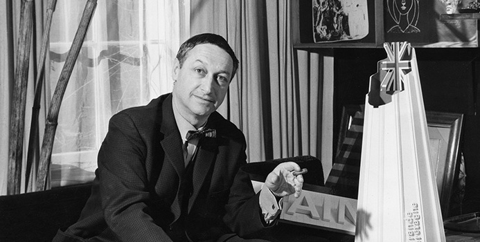
FHK Henrion (Photo: Unit Editions)

When Adrian Shaughnessy took the stage he wondered how he was going to follow Altmann’s tales, and he was also concerned he had no jokes. But at least he tried to answer the question. In choosing designer FHK Henrion to discuss—of whom Unit Editions had published a book about in 2013—Shaughnessy put the case that as a ‘complete’ designer Henrion demonstrated an attitude that future graphic designers would need to have in this ever evolving discipline. Henrion started his career as a poster artist, in the footsteps of Cassandra and Games. He then went on to be instrumental in introducing visual branding to the UK, producing in-depth identity guidebooks. He also brought his social concerns to the fore by producing work for CND, become an educator, product designer, interior architecture designer and worked in a host of other areas of design, including the emerging field motion graphics for television. A true all-rounder, one of the key aspects of his approach was to bring an open mind to all projects, in terms of what could be achieved, which meant all his work was truly tested the boundaries of design thinking. If the phrase ‘can do’ was invented for anyone, then surely it was for Henrion. In pitching that future designers should avoid becoming a niche entity and be open to all experiences, Shaughnessy put forward a credible case.

404_christmas-card-1996

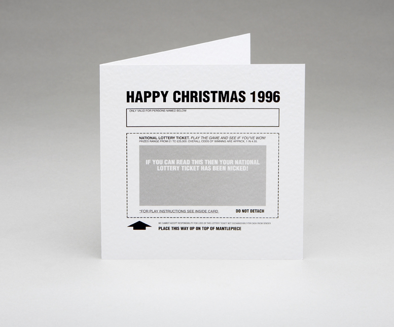
Daniel Eatock, 1996. (Photo: Daniel Eatock)

The third and final speaker was Daniel Eatock. I have been a longtime admirer of Eatock’s work and his approach in putting ideas at the heart of his outcomes. For his talk Eatock went for the middle ground and attempted to answer the question at the end after he had spoken about his work. Conceptual as ever, he decided on a system for his presentation: 20 years in 20 minutes, one project a year for one minute each, (an Eatockian Pecha Kucha if you like). He failed, due to over-talking about some projects, but this didn’t matter. It was interesting to hear him discuss his desire in his early practice to try to eradicate subjectivity from his work, fearing that style and decoration was too shallow and over-shadowed the concept. His family’s 1996 Christmas card pictured above was one attempt at this. I would argue that it is impossible to be completely objective in design, for even the choice of typeface and deliberate ‘non-styling’ becomes a style and subjective choice. Regardless, this was a fascinating insight into Eatock’s thinking and was genuinely thought provoking.

In wrapping up his talk Eatock finally attempted to answer the question of ‘what next?’, by providing a slightly awkwardly worded statement. It suggested, (and I paraphrase), that problems shouldn’t necessarily be the starting point of design, and that through investigating outcomes first, we will uncover problems we didn’t previously know existed. Or to put it in simpler terms, produce answers in order to find questions. In throwing out such a knotty statement, Eatock has, for my money, at least tried to answer the question with some sense of critical thinking and avoided defining graphic design purely in terms of commerce which is too often the case. The latter usually closes down critical thinking rather than opening it up, and if graphic design is to be anything other than a means to sell stuff, then we have to resist the market place defining our reference points, even if the market place is where most designers have to operate in order to pay their rent or mortgage.

This very enjoyable evening was rounded off with a Q&A session chaired by Ravensbourne Course Director Liz Friedman, in which education, a hand’s-on approach to design, and ‘post-digital’ became subjects of discussion.

Kemistry Gallery now starts the long haul towards trying to establish a centre for Graphic Design in London.

Cover

It seems somewhat ironic that a journal called Signal should pass me by, again. I wrote about the first two issues here in 2012. I can’t remember what, but something pricked my memory of the journal a couple of weeks ago and I went searching for the publication again only to find that issue three was released nearly a year ago with the forth due out this coming May. I quickly ordered Signal:03 and it doesn’t disappoint.

IMG_0001

Once again, what I’m genuinely impressed about with this publication is its breadth. The level of research done by the contributors is impressive and there is a sense of importance given to documenting/archiving social design stories that otherwise would be lost in the midst of time. For example, the image above is from a comical anarchist publication from Brussels in the 1930s. Titled: Game of Massacre: 12 Figures Looking for a Ball, the article explains this Aunt Sally type parlour game, created by Fred Deltor, (aka Frederico Antonio Carasso, 1899–1969), that enables you to cut-out various puppet figures, such as The Military, Property, Fascism, Religion etc, in order that you can throw balls at them. Included in the game was a mock cut-out theatre to set the figures in, and a ball, along with descriptions of the puppets. The above were described thus: (3) “Philanthropy has a chest in the form of a bank vault full of cash and tosses a single coin toward a cadaverous figure (lacking an arm and a leg) in from of a hospital”; and (4) “Social democracy is a two-faced figure who wields the attributes of both royalty and communism”. In uncovering the original publication, Stephen Goddard says: “Stylistically Carasso’s figures betray a knowledge of many of the important international impulses associated with progressive art organisations, periodicals, and movements of the 1920s, such as DeStijl, Het Oversight, Constructivism, and…Agit-prop.”

Signal reprints the preface to the game with a translation which states: “This is the game of massacre. Come! … Here it is, the opulent collection of royal, imperial, and devine puppets, that control you as they wish, you poor crowd, and who, by tragic reversal of roles, pull, from one to the other, the strings of your poor destiny.” Who says that anarchists don’t have a sense of humour?

Like the previous two editions of Signal, issue three mixes historical and contemporary struggles and their associated graphics. So alongside an article on student led strikes in Québec in September 2012, you find the story of the incredible Barbara Dane, co-founder of Paredon Records. Between 1969 and 1985 Dane tried to document revolutionary music being made around the world and in an interview with Alec Dunn and Eric Yanke, she describes how she’d go from country to country recording different musicians and singers and return to the States to release them. In the space of 16 years, Paredon Records, with very little budget, released recordings from Vietnam, Salvador, Puerto Rico, Cuba, Northern Ireland, Ecuador, Italy, Britain, Angola, Chile, Greece, Thailand and a host of other countries. Of the sleeves, she says: “If you look at the records, they’re 12″ x 12″ on the front and then fold around about 5 inches on the back. It was done this way so they could print four at once, four-up on a single sheet of paper…At this printer, what dictated what you could do was economics… And so you figure out things like one color has read, the other blue, so then third cover can have purple. You figure out how to work with two colors, matte paper, that size.”

Record2

1978, design Ronald Clyne

Record1

1975, design by Ronald Clyne

Asking Dane about working with the designer Ronald Clyne, she says: ” If you caught him at the right time of day, before he drank too much wine, he was very very clever about what he did. You can see that he could take any kind of photo, work with it, and make it meaningful and not destroy the meaning of it. And always, his forte was selection of type and layout and all that. I’d bring him basic tools, the basic elements, photos and also drawings from artists I’d met.”

Record3

1975, design by Ronald Clyne

Record4

1974, cover art by Jane Norling

If Barbara Dane wasn’t inspirational enough, Signal:03 publishes an article by Ropbert Burghardt and Gal Kirn on the former Yugoslavia monuments to anti-fascism and revolution. These impressive and often modernist brutal memorials, built between 1945 and 1990, litter what is now split into seven different nations. The authors state: “These monuments are not only modernist, but contain as unique typology: monumental, symbolic (fists, stars, hands, wings, flowers, rocks), bold (and often structurally daring), otherworldly and fantastic. … Instead of formally addressing suffering, these memorial sites incite universal gestures of reconciliation, resistance, and progress…for those that encounter them, they remain highly imaginative objects: they could be ambassadors from far-away stars, witnesses of an unrealised future, historical spectres that haunt the present.”

Y_Mon4

Y_Mon3

Some have been landscaped and provide opportunities for family days out with cafes and play areas. Some are more formal monuments that you can enter, such as the one above in Kozara, while others you happen upon in the middle of nowhere. Started as a way of remembering the second world war, they were initially built spontaneously by local artisans. And if the guidebook to them printed in Signal is anything to go by, there is a vast amount of these monuments dotted around the region, with a map stating over 200 locations, (although many have been destroyed or decayed).

Y_Mon2

Y_Mon1

Once again I am truly impressed by Signal. Its historical importance stretches across many areas including art, design, architecture, music, politics, protest and social history. And although this could be seen as a research journal, it is easily accessible for those who are just generally interested in the topics it covers, students, scholars and armchair revolutionaries alike. I’m already looking forward to the forth edition due in May.

Signal:03 is available to buy from PM Press for $14.95

SA

Slider21

Third year Graphic Design and Graphic Illustration degree students at University Campus Suffolk, (UCS), are holding an online illustration auction in April. Work has been donated from international illustrators such as Alysha Dawn, Miles Cole, Büro Ufho, Anke Weckmann, and Jamie Mitchell with more coming in on a daily basis. You can view the lots received to date on their website blink.com.

Screen Shot 2015-02-21 at 10.17.34

The auction will be hosted on their website, with bids being accepted from 30 March, concluding on 6 April. All money raised will go towards their end of year degree show, due to be held in early June at UCS’s Waterfront Building in Ipswich, (more details to follow).

The students are still open for donations if anyone has any work they would like to submit, and you can follow their progress via their Twitter feed and Facebook page, links below.

Auction website
@BlinkAuction2015
Blink on Facebook

Screen Shot 2015-02-21 at 10.30.31

website_400x5661

2014 saw London’s 10 year old Kemistry Gallery announce that it could no longer stay at its existing location in Shoreditch due to rising rents. After a successful Kickstarter campaign, Kemistry have just released details of a new pop-up exhibition to celebrate their first 10 years. 100 Years of Graphic Design will feature work from every designer and illustrator that they hosted an exhibition for in their 10 year existence, a list of design luminaries that stretches back 100 years.

The Kickstarter campaign raised £16000, and was further supported by an Arts Council grant of £15000. This money is being used to put on this celebration as well as host future pop-up exhibitions, publications and activities to support the UK’s graphic design community, and secure Kemistry Gallery’s long-term future. Excitingly, they state on their website that not only do they want to find a permanent space, but wish to transform it into a ‘National Centre for Graphic Design’.

The show will run from 7–15 March at Protein Studios, 31 New Inn Yard, London EC2A 3EY.

Find out more details from the Kemistry Gallery website here.

image

Vector illustration and chunky lower case type make for the new look reductive graphics adorning McDonald’s take away packaging. Created by Leo Burnett design agancy in Chicago, (I’m currently unsure if this packaging has made it to the UK yet), it appears to be another opportunity missed.

I think it’s fair to say that McDonald’s has an image problem. Well, it has many image problems actually, but I’m specifically talking about the one that glares at us all from roadside gutters and courtryside hedgerows. Any repeat visitors to Dubdog will know that I’m talking litter, a particular bugbear of mine. The world over, McDonald’s is the top brand, or one of the top brands, found on fast food litter, (see this report from Australia, and this from the USA, and this by the UK’s Keep Britian Tidy). I first noticed it some 14 years ago and it prompted my McJunk project. McJunk was an exploration into the relationship between graphic design and disposable culture through a photographic study of McDonald’s litter, (download the introduction to the McJunk photobook as a PDF from here, or visit the McJunk website).

Discovering this new McDonald’s packaging today prompted me to hunt around the Internet for current research into littering and I found some key reports by Keep Britain Tidy, ( * links at bottom of post). In these I came across two specific points of interest that relate to my own graphic design related research:

  • Firstly: through focus group discussions it is claimed that people would be less likely to buy a brand that they saw being littered. While this could be one of a whole host of reasons why McDonald’s had a bad year in 2014, I’m somewhat sceptical—what someone states in a focus group in the company of others is not necessarily the reality of what they actually do. But even if this were true, and it makes business sense to take seriously such market research, you would have thought McDonald’s would take note and try to do more to convince people not to litter;
  • Secondly: many of those surveyed by Keep Britain Tidy stated that they thought the Tidyman logo made little difference to people’s littering habits. This I can well believe. Usually sidelined within any graphic design hierarchy—often on the bottom of any packet—as iconic as I think Tidyman is, the Keep Britain Tidy report suggests that as a nation we have become used to it if indeed we notice it at all.

And herein lies my major problem with this McDonald’s redesign. When the graphics applied to something do not affect whether someone is going to buy a product or not—McDonald’s takeaways are not bought off a shelf; you don’t see the packaging until a BigMac has been ordered, ‘cooked’ and handed over—graphics are technically not needed for marketing purposes. They are usually only there to encourage brand recognition or as decoration. Therefore, if you rethought the side of a take away bag, there is a perfect opportunity for McDonald’s to challenge their litter problem by educating consumers through graphic design. But alas McDonald’s chose not to take this opportunity.

As mentioned in one of the Keep Britian Tidy reports that I read, it is a depressing thought that litter problems will only get worse over the coming years with further public sector cuts. Such cuts mean local councils have to decide what services to shelve, and I suspect many authorities will rightly decide important issues such as social care trump litter patrols. And unfortunately public sector cuts are likely to continue. For regardless of who wins the UK general election this year, both Labour and Conservative have declared their intentions to continue with these cuts. Even if we have another coalition government come May, which is the most likely scenario, one of these two parties is likely to hold the balance of power.

A couple of years ago I put McJunk on a hiatus. With this new packaging launch and after reading several Keep Britian Tidy reports, it looks like it might be time to resurrect the project.

10105410934_ff578b3723_z

McJunk, as found, on Shingle Street beach, Suffolk. Pre-2015 redesign.

Keep Britain Tidy 2013 Litter Report 

Keep Britain Tidy 2013: When it comes to litter, which side of the fence are you on report findings

PearShaped

When Occupy Design UK put out a call last week for Crisis Graphics in protest against climate change I immediately knew what I was going to submit—a reworked version of my 2002 piece Pear Shaped.

Originally created for a People Tree design competition, for which it won an award, I was never really happy with the typography. Occupy Design’s call gave me the opportunity to rework it, channelling a typographic treatment I liked in a piece of work by Ivan Chermayeff that I first saw at his Cut and Paste retrospective last year, (see Holiday exhibitioning pt 1). I’m not usually one for returning to my past creations but Pear Shaped suited the cause and recycling an old idea seemed appropriate. It is, however, an inditement of the lack of progress on climate change that an image created 13 years ago is still relevant today.

Occupy Design UK’s aim is to create an ‘Agit-Prop Army’ of images for the Time to Act on Climate Change protest in London on 7 March 2015. Time to Act’s intention is to put pressure on political parties to consider the environment in the run-up to the general election in the UK in May, with a further aim to build towards the COP21 UN Climate Summit being held in Paris in December.

Occupy Design UK’s call for Crisis Graphics.

image

Occupy Design UK is calling for posters and memes to support a day of action on climate change on 7 March.

They say on their website: “The demonstration on March 7th aims to put pressure on political parties before the general election, and raise the profile of climate change. It is also intended to energise and strengthen the climate movement – not an end-point but a stepping stone, it will be followed by local action immediately before the general election, the Climate Coalition lobby of Parliament in June and planning throughout 2015 towards the crucial Paris.”

On the call for images, they say: “We want your Posters and Memes for the Movement to use as an Agit-Prop Army of images to bolster the campaign on the streets and on the Net throughout the year.”

For more details, check out Occupy Design UK’s website here.

OLYMPUS DIGITAL CAMERA

There has been a surge of typography publications dropping through my letterbox recently. They are all very different in their own ways, but one thing unites them all over and above the excellent content, and that is the very high production values. Unfortunately my poor photographic skills won’t do any of them justice, but hopefully will give some indication that these are objects of desire.

Circular 18
The first that hit my door mat recently was Circular 18, the bi-annual publication of the Typographic Circle. Designed by Pentagram’s Domenic Lippa and Jeremy Kunze, and printed by Leycol in the UK, its oversized A4 proportions and clean pages are a thing of beauty.

OLYMPUS DIGITAL CAMERA

Interviews with a wide range of typographers and designers, from Ruan Hughes and Harry Pearce to Angus Hyland and Andy Altmann fill the majority of Circular 18 with images of the designers’ work relegated to a few pages at the back of the publication. This allows the focus of the issue to concentrate on the words of the designers through confident typography as conversations about graphic design function and working processes take the lead. There is a real sense that this publication was a labour of love for Lippa and Kunze.

OLYMPUS DIGITAL CAMERA

OLYMPUS DIGITAL CAMERA

Circular 18 is available free to members of The Typographic Circle, or for £15 to non-members. Email info@typocircle.com for information.

The Recorder
The second magazine I received recently is issue one of the new look The Recorder. Previously published for over 70 years by Monotype, in 2014 it has been relaunched to continue its tradition of looking at the history of typography and contemporary applications.

OLYMPUS DIGITAL CAMERA

In its own words: “Making its first appearance in 1902 … it covered everything from technology and typeface releases to historic features; offering readers an in-depth look at the type industry”. It goes on to say of its relaunch issue: “…features both the heritage of typography, and its contemporary application, focussing on how designers have used and responded to type, and how its influence has played a role in our culture and daily lives over the years”. Like Circular 18, its production quality is second to none, with a gold foiled front cover that wraps around the back, and a range of different articles all treated to individual layouts depending on the topics covered. Sized more like a traditional magazine, this is the least conventional thing about this publication. It must have been a daunting publication to revisit, given its revered history, but designer Luke Tonge has managed to give it a contemporary face that respects The Recorder’s legacy and sense of heritage while making it accessable to a new audience.

OLYMPUS DIGITAL CAMERA

The content consists of articles, essays, reviews and even a photo essay of the great poster artist / printmaker Alan Kitching.

OLYMPUS DIGITAL CAMERA

OLYMPUS DIGITAL CAMERA

The Recorder proves to be a critical read, with an excellent article by Sam Roberts on ghostsigns and the ethics of restoration, while Harry Leeson looks at how typography manipulates our relationship with the urban environment and applies theories of class to the field of graphic design. Such depth of discussion in one publication is rare outside of Eye magazine, and The Recorder is a welcome, and beautifully produced, addition to critical design writing.

OLYMPUS DIGITAL CAMERA

(As an aside, I came across an original copy of The Monotype Recorder last year, and I was lucky enough for it to be a version dedicated to the life of Stanley Morison. Unfortunately, due to leaving Tumblr and deleting my The Small Letter blog, my digital archive of this is no longer online, but I am planning to resurrect it sometime soon on a different platform.)

StanleyMorison_Cover

The Recorder is available for $17 USD from this dedicated website: click here. 

Typograph.journal
Last but by no means least, I stumbled across the new Typograph.journal via various postings from designers I follow on Instagram. Published by Nicole Arnett Phillips, aka Typography.Her, it focusses on design process through her personal reflcetions, case studies of different designer’s approaches to their work, interviews and commissioned exercises. Volume.01, published earlier this year, is titled on its spine: Can A Text Be Both Readerly And Experimental; while the recently published Volume.02 asks: Where Do We Find, And How Do We Feed, Our Creative Energy?

OLYMPUS DIGITAL CAMERA

OLYMPUS DIGITAL CAMERA

Smaller in scale than the previous publications mentioned here, it has a pocketable quality that belies its depth of discussion and questioning. Like The Recorder and Circular 18, it is inward looking and aimed squarely at graphic designers, typographers and those interested in print processes, but that doesn’t mean that those outside of these fields will not find anything of interest.

OLYMPUS DIGITAL CAMERA

OLYMPUS DIGITAL CAMERA

OLYMPUS DIGITAL CAMERA

Phillips is an Australian designer who certainly understands how to create a visually rich and consuming document. In her own words she states: “I believe rigour and critical design thinking is important. As is a great outcome. But no more so than the design discovery and creative play that happens in the middle”. As an outcome, Typography.journal is both thoughtful and inspirational in its content and production, but equally impressive due to the proud authorship Phillips demonstrates—she is a doer and has made this happen, she self-promotes it through social media and is getting people interested in what is essentially a personal project.

OLYMPUS DIGITAL CAMERA

OLYMPUS DIGITAL CAMERA

It is also very rewarding to receive Typography.journal through the post as Phillips envelopes the book in its own bespoke wrapping paper and includes print ephemera associated with the release and a hand-written note. This personal approach is a nice touch that reinforces the nature of the publication’s content as well as creating a connection with someone producing such an item half-way around the world.

Typograph.journal 01 & 02 are available to buy either individually or together for $30 AUD from Phillips’ website: click here.


What is really encouraging about these recent publications is that critical design writing is alive and well. Longstanding titles such as Eye, Creative Review, Baseline and the Journal of Design History have their specific areas carved out. And with design blogs being in rude health, it is possible to have questioned whether there was ever going to be any more room, let alone demand, for design writing. Well, these bespoke publications prove that there is a market for well produced high-quality material, both in terms of a physical entity itself, and in terms of content.


Back in May I wrote here about a visit Claire and I paid to the People’s History Museum in Manchester. Today I read in The Observer that due to spending cuts the museum is under threat.

image

This museum is a true gem that collects together many important pieces of graphic design that chart the history of people’s movements in this country, from pamphlets to posters, from badges to banners. As a result of the funding cut, which means the museum is due to lose out on £200,000, the PHM has launched a campaign to fill this gap. Help the museum survive by making a donation or becoming a supporter and save these graphic relics that played their part in getting us the many rights that we enjoy today.

Scrutinising an Innocent drink carton several weeks ago I noticed that it was recyclable “in certain areas” and that I was to check with my local authority to see if it could be recycled in my area. I didn’t of course, not looking forward to either an elongated phone call being passed through various different departments or trawling through an impenetrable menu system on my local council website. I therefore forgot all about it and sent the package merrily onto landfill. To be fair, I had previously checked several years ago whether I could recycle this sort of packaging in Ipswich and finding out that I couldn’t, I didn’t hold out much hope that this would have changed.

image

Then when walking to work one morning last week I found myself confronted with a large graphic on the side of a bin lorry telling me that I could now recycle orange juice cartons in my blue bin. I was astounded for two reasons: firstly I was surprised that my local council was actually quite advanced; and secondly that this information was bought to me and that I didn’t have to hunt it out.

This is a prime example of design that works. Not only has it bought this important bit of information directly to me, but also to all the houses on the route of the bin round. In my neighbourhood the houses are no more than 3 metres from the road, with small front gardens and pavement the only things between window and residential traffic. This means anyone opening their curtains at refuse collection time will be delivered the same information. This is an excellent example of taking the message directly to its audience.

This advert won’t win any awards though because it isn’t necessarily a great piece of design. The non-threatening cheeky bin man sticking his thumb up giving recycling encouragement to locals isn’t exactly ground-breaking or particularly inventive, and for my money I find it a little patronising. It isn’t even particularly well laid-out. But none of that actually matters because this design ultimately works. This evening I cleaned out the first Tetra Pak style carton I’ve finished since seeing the billboard ready to put in my recycling bin tomorrow. For that this advert should win an award because fundamentally it does what all design should do: it works. In my own experience the message has been effectively delivered and I have acted upon it, regardless of personal aesthetic tastes and design criticism. There often isn’t enough research done into the effectiveness of a design after it has been implemented, especially for social design, (where as increased sales figures can justify a piece of design in a commercial setting). But in this case, job done. Give a yellow pencil to whoever created this advert and decided to stick it on the side of a bin lorry.