My first article for Eye magazine’s blog was published today. It is available to read here.
Graphic Design
Work is a four letter word
A new year, a new page on the Dubdog blog.
Looking at the menu above, regular visitors here will notice a new page titled Work has suddenly appeared. Since I moved from Blogger to WordPress early in 2012, I have been meaning to create a section on this site to showcase some of my creative output, and have finally gotten round to making one. This was largely prompted as I’ve recently had to create a portfolio pdf for an application, (more news on this later), which will hopefully lead to some exciting news, (for me at least), later in the year.

The portfolio showcases a range of work created over the last 10 years, and includes both commissions and self-set projects and its aim is to demonstrate as wide an approach to visual communication as possible. It was difficult to decide what went in and what was left out, and those familiar with my long standing portfolio site that I shut down in 2010 will recognise some of the work.
Having this facility here also allows me to add other content for visitors to download, such as my McJunk essay and presentation presentation slides. This is particularly useful for those that balk at the ever increasing costs of Blurb books and who can’t afford to purchase a copy of McJunk.
While I’m discussing the four letter word that is work, 2013 is starting to look like a creative year for Dubdog, which will be a challenge to fit in alongside the full-time day job, but should be rewarding none-the-less. I’ve been approached to do some design work for a renowned fine art photographer, and the next issue of the UCS academic journal, Childhood Remixed, is being published at the end of February, so I will be busy designing that from late January onwards.
As well as the above, I also have a couple of photographic projects up my sleeve. One, called Graphic Interruptions, has already started seeing the light of day on Flickr, where I’m investigating instances of where graphic content collides, is interrupted by, or clashes with natural or man-made forms. Much like McJunk, I’m unsure of where this is going as yet, and as a project it is in its infancy, but none-the-less I finding it visually intriguing. Alongside this is another photographic project which is still in the testing phase, and may or may not be mentioned again, depending on initial results.

Thanks to all the readers who have stopped by here in the last year, and I look forward to your company again throughout 2013.
Design auction
 For more information: ucs.ac.uk/designauction
Image Conference
The BA (Hons) Graphic Design course at University Campus Suffolk is proud to be hosting Image Conference on 13 November 2012. Speakers will include designer and typographer Jonathan Barnbrook, illustrator and designer Brian Grimwood, Roderick Mills of the Association of Illustrators, and motion director Jonathan Yeo.
Held in the UCS Waterfront Building in Ipswich, the conference will look at where images come from, how they help us to understand the world we live in, as well as reflecting on the potential of images. The conference will co-incide with the UCS Waterfront Gallery hosting a retrospective exhibition of the work of Brian Grimwood, which celebrates the launch of his monograph: The Man Who Changed the Look of British Illustration.
There are three pricing structures for Image Conference: Standard ticket — £30, Studio ticket — £100 (admits 4), and Student discount — £10. Price of admission includes lunch and refreshments.
For more information, and to buy tickets, go to:
www.imageconference.org.uk
Change a coming?
For a long time I’ve been quietly critical of D&AD’s education stance. Not that it hasn’t had one, but that it is overshadowed by its other activities to the extent it felt like a platitude. Further, it seemed that the opportunities that were available for students and their courses tended to be London centric and concentrated on those institutions with big reputations and long histories. Having a stand at the graduate New Blood exhibition several years ago was a daunting experience for lowly Suffolk students, not to mention expensive. They didn’t get a single look of interest in the two years in attendance and this wasn’t because of the quality of the work or their talent. But when faced with big guns like Ravonsbourne, Kingston et al, who seem to have unlimited resources to throw at their stand and a reputation that means industry creatives seek them out first and ignore the rest, it tends to leave a bitter taste. Initially I put this down to my own cynicism, until I heard other lecturers from regional colleges and Universities say similar things. And then they stopped running the XChange conference, where inspirational speakers addressed design lecturers in a fantastic networking opportunity. All this when the D&AD website proudly claimed ‘For Education’ next to their logo. It is not surprising that D&AD’s University Network numbers appear to have dropped in the last couple of years, if comparing the amount of stands at New Blood 4 years ago and the Universities listed on their website is anything to go by.
Well hopefully all that is about to change as incoming president Neville Brody announces some major changes, as D&AD plans to refocus its commitment to education. In a D&AD 50th Anniversary Special in this month’s Creative Review, it is reported that Brody will head-up an education sub-committee, which he says, “formed in order to make sense of the education space for D&AD and also to clarify the intention, the scope and the kind of activities D&AD should be doing.” When discussing its education remit being overshadowed by D&AD Awards, he states, “…the statement of intent has never been as clear as it could be.”
This is refreshing stuff, as are his comments on government attitudes to arts education. “We’re not going to be shy of raising our voices more politically…What this government has done to creative education in this country is an absolute fucking disaster.” He goes on to explain, “They’re shooting themselves in the foot. A huge amount of UK income comes from the creative services, so what possible good can come out of killing creative education? I don’t support the idea that industry should be paying for education but we have no choice, so let’s formulate a positive response, make it work and stick two fingers up to the government.” I look forward to what develops during Brody’s presidency.
Someday…
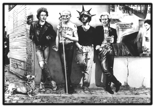
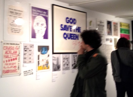
Someday All The Adults Will Die: Punk Graphics 1971–1984, opened at the Hayward Gallery last week.
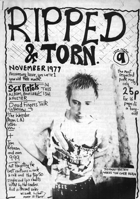
To coincide with the opening private view, curator Johan Kugelberg hosted a panel discussion of some key designers involved in early punk graphics, along with cyberpunk author William Gibson. Apologising for co-curator Jon Savage’s absence—who was very punk by being on holiday with his mum—Kugelberg introduced Gee Vaucher, who created all the graphics that surrounded Crass‘ musical output, Tony Drayton of Ripped & Torn fanzine fame, and John Holmstrom, the man behind the American Punk magazine.
The discussion was pushed along admirably by Kugelberg, prompting anecdotes from Gibson about hearing both The Beatles’ Sgt Peppers, and Velvet Underground’s first LP within weeks of each other on their release in 1967. He came away thinking the Velvets the more important work because of the shock value it contained, and the fact that lots of people didn’t like it. (I have to say I agree with him.) Holmstrom also spoke about the impact of seeing the Ramones in 1974, and Vaucher about how Freddie Laker’s cheap air fairs helped punk bands play across the Atlantic divide. However, it was strange how music only entered the discussion as a separate entirety from graphic design, and I came away thinking it disappointing that the relationship between the similar creative processes involved in making punk music and punk graphics wasn’t discussed in any depth. This may be a result of Vaucher and Holmstrom’s art school background—they weren’t untutored kids working it out for themselves in the same way that many bands and artists were. While Vaucher’s work may look like photomontage, the anti-art form first championed by Dada artists, it is in fact painted in gouache. But to overlook the relationship between creative approaches to different art forms, and how similar processes arguably tied them together, is a glaring omission.
Refreshingly, Tony Drayton, while not explicitly talking about musicianship, or lack of it, did discuss making his first rough and ready Ripped & Torn fanzine, and how speaking to The Damned at the bar of one of their gigs became the interview he would include in one of the issues. Initially being inspired by Mark P’s Sniffin’ Glue, he created his own version using a photocopier at his place of work. Producing only 10 copies, he sent several out to, among others, Compendium bookshop in London, and was then shocked to get a request for 200 more for them to sell. This legitimisation and acceptance into the ‘scene’ was one of the most interesting aspects raised. And in fact, when looking around the exhibition itself, the sense of ‘anyone can do it’ shines through. The buzz of creating something, of it becoming a legitimate artefact through production, something you’d only previously seen professionals making, helped to launch many a career. Sure, there is a lot of poor artwork on display here, as you would expect. But the fact that punk allowed those who hadn’t gone, (or even dreamt of going), to art school to find an innate talent and drive, is one of the truly revolutionary things about the movement, both musically and graphically. Add to this the raw nature of much of the visuals, their aesthetic dictated by limited means of production, and ideas and content rise above concerns about production values. The immediacy, even urgency of the process, is obvious in much of the work throughout the exhibition, which further creates a kinetic energy to what is displayed.
It is good to see that Kugelberg and Savage have included early situationist texts and graphics here too. Debord and Atelier Populaire are on display, along with King Mob, who up until this point I had only read about and never actually seen any of their visual output. The politics of these movements are echoed throughout much of the punk music graphics, particularly that of Crass. These influences are obvious and this fluid idea of what punk graphics are eschews what Vaucher called the ‘BBC or Guardian filter’ of what constitutes punk in mainstream media. The exhibition is also interesting because much of the work wasn’t created with longevity in mind. Thanks to the personal collections of Kugelberg and Dial House, (Penny Rimbaud and Gee Vaucher’s communal house that was home to Crass Records for many years), this important exhibition showcases a period that touches design, music, politics and cultural history, and is available for all to see with the potential of reaching an even bigger audience than much of it did first time around.
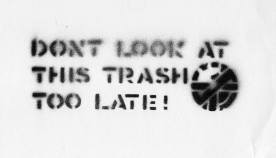
All in all, the discussion panel was thought provoking. I proudly came away with a Crass stencil that Kugelberg had made using an original Crass cut out on display in the exhibition, to raise money for Pussy Riot. The influence of punk, and punk itself, as he claimed, lives on.
Someday All The Adults Will Die: Punk Graphics 1971–1984, continues at the Hayward Gallery, London, until 4 November, and is highly recommended.
P.S Apologies for the poor quality of the private view image—blame the ridiculous ‘no photos’ policy of British galleries resulting in hasty shooting.
Signal
I read about Signal: A Journal of International Political Graphics & Culture, when Rick Poynor reviewed issue 02 for Design Observer recently, and his is a much better critique of this journal than I could give here, so I’ll keep this brief. Published in the United States, issue 01 came out in 2010, and went totally under my radar. Now, in 2012, the second edition has been released, I snapped up both as soon as I could. If you are at all interested in political/agitational graphic design, then they come highly recommended. However, I couldn’t promote one over the other as both are as packed with diverse and inspirational content as each other.
The latest issue features articles about Portuguese street murals; a painter from Mozambique called Malangatana Valente Nguenha, ; spreads of front covers of British Anarchist newspaper Freedom, from 1908 to 1917; and Gestetner Art, among other things.
Issue 01 features the adventures of Red Rat, a comic strip by Van de Weert that evolved from the Dutch punk and squatting scene in the early 1980s; Mexican protest graphics that surrounded the Mexico 68 Olympics; the Taller Tupac Amaru printmaking collective; and graffiti artist Impeach, whose work travels the United States subverting ‘wild style’ graffiti on subway trains into Wild West style graffiti on freight trains.
What I like most about this journal, edited by Alec Icky Dunn and Josh MacPhee, is the exploration of different cultures, examining work and contexts that don’t necessarily crop up in books about political graphic design. That, and the mix of historical and contemporary work. Both these things keep this small book alive and relevant, and stops it being filed under history with out any relevance to the modern day. There are some obvious ‘go to’ books for those interested in political visual communication: Liz McQuiston’s two volume set titled Graphic Agitation, Milton Glaser’s The Design of Dissent, and the recently published and excellent Beauty Is In The Street by Johan Kugelberg & Philippe Vermes. However, because Signal is published as a journal, it gives the wide range of contexts and material discussed a connection to the here and now, a relevant voice that suggests a continuation rather than a static recording.
Now that I’ve found Signal, I just hope the gap between issue 02 and 03 isn’t as great.
Analogue blog
I don’t know whether people still produce fanzines or not, but Kek-W is so tired of writing online that he has decided to produce one. Or rather, as he calls it, an analogue blog.
Titled Kid Shirt, this is basically a physically constructed fanzine involving actual cut and paste, which has then been scanned as a PDF for anyone to download. He sets out his rationale in the first pages:
Just like fanzines of old, this analogue blog contains lots of musicians you’ve probably never heard of. However, worthy of note is the strange hybrid between digital accoutrements and physical form, and the over laps in different media that Kek-W has deliberately exploited. For example, posts become pastes, and ‘previous’ and ‘next’ buttons simply indicate what direction you need to go in: they aren’t buttons at all. Further to this, comment fields remain empty because the PDF you download is a static, non-interactive document.
It is interesting to note the “proper writing” comment in the introduction, (see below), as I wonder whether the lack of audience right to reply to the text, frees up the writer. It could also be considered in direct contrast to the Guardian’s current Open Journalism campaign, which is something I could applaud if I hadn’t read many of the idiotic comments left on the Guardian website by knee-jerk reactionaries.
Aesthetically, Kid Shirt completely shreds any signs of slickness, despite the whole having a lo-fi sophistication. This, in my opinion, is all part of the publication’s charm. On his digital blog, also titled Kid Shirt, Kek-W states: “Download it, print it off, staple it together, read it like a fanzine… Or…if you’re a MediaKid, use a PDF-reader, dump it onto your tablet, whatever,” before going on to vehemently disclaim any responsibility for it not working on different platforms because his call for testers was ignored. The punk attitude he displays is more than a visual style, evidently.
In fact, it is with this in mind that I was reminded of an article in Eye 82, whereby Rick Poyner wrote about British artist Laura Oldfield Ford’s Savage Messiah fanzine. He stated that the, “visual style is a kind of reclaimed punk that recalls the anarchic graphics of Crass,” (while completely forgetting to name check Gee Vaucher, the artist behind Crass’ visual output, in the process). Well, while there are similarities between Savage Messiah and Kid Shirt in terms of the crude nature of the layout and artwork, this is much more intriguing to me, as the narrative of online publishing has been used which takes this beyond mere pastiche, as could be claimed of Ford’s work. While much less political in terms of content than Savage Messiah, Kek-W is more oppositional as these virtual signifiers are détournements, that add a critique of contemporary publishing, something that affects all who dabble in online social networking. Ford’s anachronistic visual style potentially distracts from her important messages, where as Kek-W’s is at its heart.
Download Kid Shirt here.
Thanks to Uncarved.org for the heads up.
GraphicDesign& Everything
Yesterday, Lucienne Roberts and Rebecca Wright of GraphicDesign& put a call out for people to record everyday occurrences of graphic design in the context within which they found them. In a pop-up lab at the Design Museum, they received tweets of photographs of graphic design to go towards a research project titled Everything, which endeavours to prove how interconnected graphic design is with, well, everything.
In the spirit of this venture, I joined Twitter, and started snapping away, setting myself the task of recording every item of graphic design, professional or amateur, that I personally interacted with throughout the day. I did ignore some examples I came across: for example, on reading the Guardian, I only photographed the adverts that actually made me stop and read them. But other than that, I tried to capture every piece of graphic design that caught my attention for more than a passing glance.
After sending a couple of photos to @gdand_, it soon became apparent that this was going to be a mammoth task. I think I got most items throughout the day, (apart from being too focussed on getting a Guardian and some croissants while in the Co-op to get my camera out). However, because I did only manage a couple of tweets to GraphicDesign& before their 5pm deadline, I’ve documented the results here.
1–3 Cat feeding and morning tea
4–7 Ablutions
8–10 Dressing
11–13 Driving to the Co-op (for safety reasons, photos were only taken while stationary)
14–24 Breakfast and washing up
25 Strimmer battery
26 Checking the Tour de France map in my office
27–29 Posters (and a street sign) in my office
30 Checking the Guardian website
31 Branded cutlery at lunchtime
32–34 Drive to Orford (Claire was driving)
35–36 Orford car park
37 The bin I disposed bagged dog waste in
38–39 Amateur graphic design
40 A Union Jack
41 Beware
42 Footpath
43 A lighthouse in the distance (yes, this does constitute graphic design)
44–45 & 47 More footpath signs
46 Realising the pushchair my grandson was in was branded
48 Condiment packets on the table of the tearoom we stopped at
49 Toilet sign
50 Tourist posters
51–52 Dead fish being sold
53 On the way to the Indian takeaway and pub
54 Indian takeaway
55–58 The Fat Cat pub with just enough time for a pint while waiting for the takeaway
59 The Sun in the Indian takeaway
60 Watching the Tour while eating the takeaway back at home
Can do
There is much talk about The Lost Tapes by Can at the moment, and with good reason. For those reading this that know nothing about the band, or the context within which they emerged, then there is an excellent essay on Quietus by Taylor Parkes that comes with a Dubdog recommendation. However, the point of this post isn’t to talk about Can, or the fact that these lost tapes were only rediscovered recently, or the importance of the band and their music, but to discuss the artwork and packaging.
The graphic design is done by Julian House at Intro, who is no stranger to music related projects. He has worked with many bands in his time at Intro, as well as setting up a label, Ghostbox, which bares all the visual hallmarks of his distinctive 1950s styling. Although it is a term I usually try to avoid using, but ‘retro’ can appropriately be applied to what he does for Ghostbox releases and label identity.
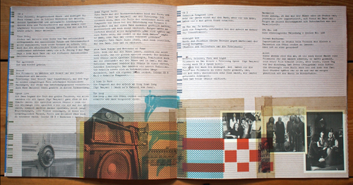
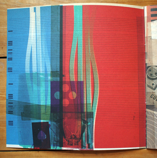
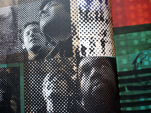
Here for Spoon Records he has created a handsome and sturdy 10″ box to house the 3 disc set, with accompanying 28 page booklet. The box itself, obviously recalls reel to reel tape boxes, which helps set an ‘authentic’ tone of voice for the whole project. The front and back cover theme of cut and paste imagery, with yellowing Sellotape and halftone-screened photographs follows through into the internal graphics perfectly emulating the immediacy of much of the music—Can famously jammed a lot of their material, and the visual language applied to The Lost Tapes mirrors that aesthetic.
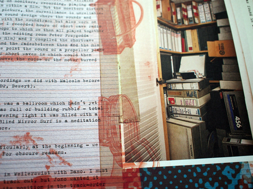
It could be argued that this showcases the House style, (pun intended), with the typewriter font, cut and paste approach and seemingly random placements, that he established with his work for Broadcast and Primal Scream. Certainly there are similarities with what he has done before, but the trick with much of his output is to make the work look as if it was thrown together, when in fact there is obvious consideration and a keen designers eye employed throughout. Image selection, editing, cropping and placement rarely look this good when they are done spontaneously—making an attractive scrapbook is not easy.
Uncoated stock helps to instil a tactile sense as the viewer holds this oversized CD packaging to read the comments from band members about the selection process they went through to edit down 50 hours of music contained in the uncovered tapes. There’s even a photograph of the cupboard they found the material in. It is remarkable that so much survived, considering that during times of little money, the band would record over old tapes they had decided weren’t worth preserving.
This is probably one of the major releases of 2012—expect it to keep cropping up in many end of year polls. And as such, it is good to see that the importance of creating visually empathetic packaging for the discs has been held in such high regard, something rare in this era of imageless digital downloads.
I would have bought this as a physical release regardless of the packaging, as I do for all albums that I consider audio quality to be of importance for. But regardless of wanting to possess high quality audio, this package is well worth £30 of anyones money in my opinion. For the first time in a long time, when I stuck on my headphones to listen to the first CD from The Lost Tapes and study the sleeve notes and artwork, I was taken back to a time when I used to do the same with vinyl LPs.


