Archive

Critique

For a long time I’ve been quietly critical of D&AD’s education stance. Not that it hasn’t had one, but that it is overshadowed by its other activities to the extent it felt like a platitude. Further, it seemed that the opportunities that were available for students and their courses tended to be London centric and concentrated on those institutions with big reputations and long histories. Having a stand at the graduate New Blood exhibition several years ago was a daunting experience for lowly Suffolk students, not to mention expensive. They didn’t get a single look of interest in the two years in attendance and this wasn’t because of the quality of the work or their talent. But when faced with big guns like Ravonsbourne, Kingston et al, who seem to have unlimited resources to throw at their stand and a reputation that means industry creatives seek them out first and ignore the rest, it tends to leave a bitter taste. Initially I put this down to my own cynicism, until I heard other lecturers from regional colleges and Universities say similar things. And then they stopped running the XChange conference, where inspirational speakers addressed design lecturers in a fantastic networking opportunity. All this when the D&AD website proudly claimed ‘For Education’ next to their logo. It is not surprising that D&AD’s University Network numbers appear to have dropped in the last couple of years, if comparing the amount of stands at New Blood 4 years ago and the Universities listed on their website is anything to go by.

Well hopefully all that is about to change as incoming president Neville Brody announces some major changes, as D&AD plans to refocus its commitment to education. In a D&AD 50th Anniversary Special in this month’s Creative Review, it is reported that Brody will head-up an education sub-committee, which he says, “formed in order to make sense of the education space for D&AD and also to clarify the intention, the scope and the kind of activities D&AD should be doing.” When discussing its education remit being overshadowed by D&AD Awards, he states, “…the statement of intent has never been as clear as it could be.”

This is refreshing stuff, as are his comments on government attitudes to arts education. “We’re not going to be shy of raising our voices more politically…What this government has done to creative education in this country is an absolute fucking disaster.” He goes on to explain, “They’re shooting themselves in the foot. A huge amount of UK income comes from the creative services, so what possible good can come out of killing creative education? I don’t support the idea that industry should be paying for education but we have no choice, so let’s formulate a positive response, make it work and stick two fingers up to the government.” I look forward to what develops during Brody’s presidency.

Someday All The Adults Will Die: Punk Graphics 1971–1984, opened at the Hayward Gallery last week.

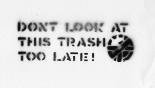
Crass stencil

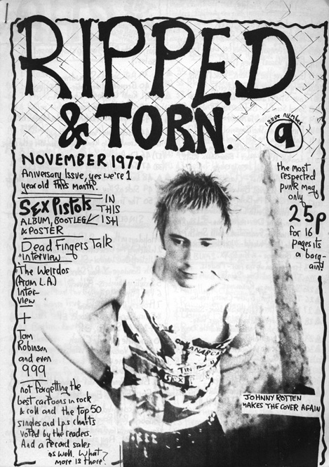
To coincide with the opening private view, curator Johan Kugelberg hosted a panel discussion of some key designers involved in early punk graphics, along with cyberpunk author William Gibson. Apologising for co-curator Jon Savage’s absence—who was very punk by being on holiday with his mum—Kugelberg introduced Gee Vaucher, who created all the graphics that surrounded Crass‘ musical output, Tony Drayton of Ripped & Torn fanzine fame, and John Holmstrom, the man behind the American Punk magazine.

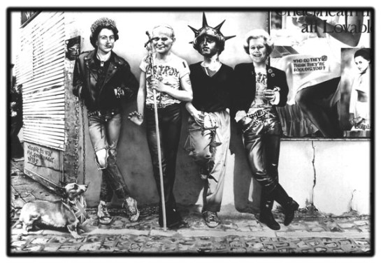
The discussion was pushed along admirably by Kugelberg, prompting anecdotes from Gibson about hearing both The Beatles’ Sgt Peppers, and Velvet Underground’s first LP within weeks of each other on their release in 1967. He came away thinking the Velvets the more important work because of the shock value it contained, and the fact that lots of people didn’t like it. (I have to say I agree with him.) Holmstrom also spoke about the impact of seeing the Ramones in 1974, and Vaucher about how Freddie Laker’s cheap air fairs helped punk bands play across the Atlantic divide. However, it was strange how music only entered the discussion as a separate entirety from graphic design, and I came away thinking it disappointing that the relationship between the similar creative processes involved in making punk music and punk graphics wasn’t discussed in any depth. This may be a result of Vaucher and Holmstrom’s art school background—they weren’t untutored kids working it out for themselves in the same way that many bands and artists were. While Vaucher’s work may look like photomontage, the anti-art form first championed by Dada artists, it is in fact painted in gouache. But to overlook the relationship between creative approaches to different art forms, and how similar processes arguably tied them together, is a glaring omission.

Gee Vaucher’s punk self-commentry—The Sex Pistols become figureheads of the State.

Refreshingly, Tony Drayton, while not explicitly talking about musicianship, or lack of it, did discuss making his first rough and ready Ripped & Torn fanzine, and how speaking to The Damned at the bar of one of their gigs became the interview he would include in one of the issues. Initially being inspired by Mark P’s Sniffin’ Glue, he created his own version using a photocopier at his place of work. Producing only 10 copies, he sent several out to, among others, Compendium bookshop in London, and was then shocked to get a request for 200 more for them to sell. This legitimisation and acceptance into the ‘scene’ was one of the most interesting aspects raised. And in fact, when looking around the exhibition itself, the sense of ‘anyone can do it’ shines through. The buzz of creating something, of it becoming a legitimate artefact through production, something you’d only previously seen professionals making, helped to launch many a career. Sure, there is a lot of poor artwork on display here, as you would expect. But the fact that punk allowed those who hadn’t gone, (or even dreamt of going), to art school to find an innate talent and drive, is one of the truly revolutionary things about the movement, both musically and graphically. Add to this the raw nature of much of the visuals, their aesthetic dictated by limited means of production, and ideas and content rise above concerns about production values. The immediacy, even urgency of the process, is obvious in much of the work throughout the exhibition, which further creates a kinetic energy to what is displayed.

It is good to see that Kugelberg and Savage have included early situationist texts and graphics here too. Debord and Atelier Populaire are on display, along with King Mob, who up until this point I had only read about and never actually seen any of their visual output. The politics of these movements are echoed throughout much of the punk music graphics, particularly that of Crass. These influences are obvious and this fluid idea of what punk graphics are eschews what Vaucher called the ‘BBC or Guardian filter’ of what constitutes punk in mainstream media. The exhibition is also interesting because much of the work wasn’t created with longevity in mind. Thanks to the personal collections of Kugelberg and Dial House, (Penny Rimbaud and Gee Vaucher’s communal house that was home to Crass Records for many years), this important exhibition showcases a period that touches design, music, politics and cultural history, and is available for all to see with the potential of reaching an even bigger audience than much of it did first time around.

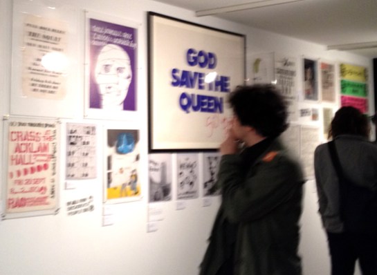
Someday… private view

All in all, the discussion panel was thought provoking. I proudly came away with a Crass stencil that Kugelberg had made using an original Crass cut out on display in the exhibition, to raise money for Pussy Riot. The influence of punk, and punk itself, as he claimed, lives on.

Someday All The Adults Will Die: Punk Graphics 1971–1984, continues at the Hayward Gallery, London, until 4 November, and is highly recommended.

P.S Apologies for the poor quality of the private view image—blame the ridiculous ‘no photos’ policy of British galleries resulting in hasty shooting.

Every year there must be hundreds of dissertations being written by undergraduate design students about the portrayal of women in advertising, all referencing the Dove Campaign for Real Beauty and Adbusters along the way. And you could spend a long time trawling the Internet for articles about sex being used to sell commercial products. I’ve become a little used to such arguments. However, I never expected to see sex being used to sell integrated office systems. That is, until I turned a corner in Norwich the other day to be confronted by this image on the back of a van:

I was dumbfounded and genuinely taken aback for a few seconds. I could start a basic National Diploma level Media Studies deconstruction at this point, mentioning the see-through blouse and the provocative pointing of the metaphor, sorry, I mean pen. I haven’t worked in many offices over the years, but I suspect this attire would receive raised eyebrows in the average insurance office. It certainly would in the Art and Design department staff-room I frequent in my day job.

Just as I was getting over the shock of this image, thinking how utterly inappropriate and offensive it was, I was confronted with this sight on the side of the van:

I can only imagine the conversation going on here, as the guy stares at the woman’s breasts and she leans provocatively over his desk. I don’t think I have ever seen anything quite so ridiculous on the side of a van before—I almost expected a slow 1970s groove to start playing as the woman in the photograph dropped her pen and reached under the table to ‘pick it up’!

I find it incredible that neither the designers who proposed this, nor the people at Mayday thought this wouldn’t be objectionable. The objectification of women in advertising and throughout the media is endemic in our society. However, the image on this van, for a photocopying business of all things, could not only be seen as an example of how sexist imagery has become a typical state of affairs in our everyday, but also how accepting and unchallenging many have become to such things. Without wanting to sound like some 1980s anarcho-feminist tubthumping kill-joy, the jolt of seeing this atrocious piece of applied graphics in a high street has convinced me more than ever that design criticism needs to challenge such things a little more often. It can’t be left to the undergraduates who still feel passionate enough about such things to write a critical dissertation only they and their lecturers will read.

I don’t know whether people still produce fanzines or not, but Kek-W is so tired of writing online that he has decided to produce one. Or rather, as he calls it, an analogue blog.

Titled Kid Shirt, this is basically a physically constructed fanzine involving actual cut and paste, which has then been scanned as a PDF for anyone to download. He sets out his rationale in the first pages:

Just like fanzines of old, this analogue blog contains lots of musicians you’ve probably never heard of. However, worthy of note is the strange hybrid between digital accoutrements and physical form, and the over laps in different media that Kek-W has deliberately exploited. For example, posts become pastes, and ‘previous’ and ‘next’ buttons simply indicate what direction you need to go in: they aren’t buttons at all. Further to this, comment fields remain empty because the PDF you download is a static, non-interactive document.

It is interesting to note the “proper writing” comment in the introduction, (see below), as I wonder whether the lack of audience right to reply to the text, frees up the writer. It could also be considered in direct contrast to the Guardian’s current Open Journalism campaign, which is something I could applaud if I hadn’t read many of the idiotic comments left on the Guardian website by knee-jerk reactionaries.

Aesthetically, Kid Shirt completely shreds any signs of slickness, despite the whole having a lo-fi sophistication. This, in my opinion, is all part of the publication’s charm. On his digital blog, also titled Kid Shirt, Kek-W states: “Download it, print it off, staple it together, read it like a fanzine…   Or…if you’re a MediaKid, use a PDF-reader, dump it onto your tablet, whatever,” before going on to vehemently disclaim any responsibility for it not working on different platforms because his call for testers was ignored. The punk attitude he displays is more than a visual style, evidently.

In fact, it is with this in mind that I was reminded of an article in Eye 82, whereby Rick Poyner wrote about British artist Laura Oldfield Ford’s Savage Messiah fanzine. He stated that the, “visual style is a kind of reclaimed punk that recalls the anarchic graphics of Crass,” (while completely forgetting to name check Gee Vaucher, the artist behind Crass’ visual output, in the process). Well, while there are similarities between Savage Messiah and Kid Shirt in terms of the crude nature of the layout and artwork, this is much more intriguing to me, as the narrative of online publishing has been used which takes this beyond mere pastiche, as could be claimed of Ford’s work. While much less political in terms of content than Savage Messiah, Kek-W is more oppositional as these virtual signifiers are détournements, that add a critique of contemporary publishing, something that affects all who dabble in online social networking. Ford’s anachronistic visual style potentially distracts from her important messages, where as Kek-W’s is at its heart.

Download Kid Shirt here.
Thanks to Uncarved.org for the heads up.

—Binoculars

Claire and I have recently returned from a week on the North Norfolk coast. We were staying in a restored fisherman’s shack halfway up a hill that overlooked the Salthouse marshes and beach. Like many people who go on holiday nowadays, we took many electrical gadgets with their associated chargers.

Despite the digital devices that shackle us to power supplies that we insist on taking with us everywhere, one of the greatest joys of the holiday was watching ships and the Sheringham Shoal wind farm through our binoculars. We bought these on the recommendation of a twitcher colleague. We wanted something reliable, comfortable, and good value for money—we didn’t want to spend mega money on a pair that were more than what we needed. We bought them several years ago, somewhere in the region of £60–70, from Cley Spy on one of our many trips up the Norfolk coast. To some this may seem like a lot of money, but they were some of the cheapest in the shop. Having only used cheap binoculars previously, I can assure you that it is worth spending that little bit more. When not holidaying, they generally live in our car, only coming out on odd occasions. But as Claire and I usually insist on holidays that involve views, they are usually a permanent fixture when away from home.

One of the things that these binoculars made me contemplate while we were away, was how I have got so used to looking at things on screens, and rapidly accepted that I need to charge my daily digital accoutrements to the extent that I have to take plugs and leads with me where ever I go. Yet while the images that appear projected onto the double ‘screens’ through these Helios Field Binoculars are crystal clear, they don’t need plugging in; no power is involved, there are no batteries to recharge, and I don’t need to turn them on. Strangely, and momentarily, I found myself surprised by this, as if I had made an observation, (no pun intended), that I hadn’t considered before.

That these thoughts should strike me is an indication of how my mind has subconsciously linked the phenomena of seeing imagery on a screen with my use of electronic media. Obviously binoculars aren’t a screen—you look through a lens—but never the less, there is a double illusion going on here. Firstly, the trick on the eye/mind in bringing things closer to view. Secondly, that my mind is reading these images as being immediately in front of my eyes on the glass discs encased in metal, rubber, and plastic. Through recent lifestyle decisions of always having screens with me on the go, be that a digital camera or iPhone, my brain has, without questioning, accepted this as a way of seeing imagery. To some extent, it could be argued, that I am no longer seeing this imagery on the screen, I am now merely looking at it.

To add an irony to this tale, I have just considered that these thoughts struck me while watching the gentle beauty of an offshore wind farm, built because of our insatiable demand for electricity due to our growing habit for digital/electronic gadgetry. And in light of all this far distance navel gazing, I have a renewed wonder for my pair of humble binoculars.

This week I published number 1000 image of McJunk to Flickr. This is a noteworthy occasion, because at the publication of the McJunk photo book in January 2011, I had only just uploaded 500 images. Therefore, in less than one and a half years, I’ve doubled the number of photographs of McDonald’s litter it had previously taken me 9 years to collect. It is difficult to tell whether this is because there is more McJunk out there, or because since the publication of the book, I’ve been more proactive in capturing examples I happen upon.

Whatever the reason, I’ve decided to take a hiatus from McJunk to concentrate my spare time on some other project ideas I’ve been scribbling in notebooks recently. To mark this breathing space, I’ve decided to publicly publish the essay I wrote to accompany the book. I will continue to take submissions to the McJunk project and post them to Tumblr, and the book will still be available—see the McJunk website for details. The McFacebook page will, likewise, continue. And if you are interested in seeing what 1000 piece of McDonald’s litter looks like, please visit the Flickr set.

The essay can be downloaded from the Dubdog Archive page

McJunk number 1000

Earlier this week, a colleague and I went to the New Designers fair at the Business Design Centre in Islington. Jumping on a Circle Line train at Liverpool Street I was immediately impressed with the brand new tube train we found ourselves on.

Spot the end of the train.

My immediate surprise was how spacious it felt. It took me a few seconds to realise that this was because the eye is taken down the entire length of the train—the doors separating each carriage have gone, replaced by a generously wide space.

Where once there were doors…

Secondly, the seats have been arranged much more appropriately, and they cleverly float off of the floor, giving the illusion of more space as the eyeliner is unbroken as you look at the floor.

So impressed was I with this layout and sense of space, (accepting that the train I got on wasn’t exactly full), the short journey we took was a pleasant experience. I will go as far as to say I was actually slightly excited—I was witnessing intelligently considered design that put the user experience first.

This experience was sharply contrasted when we stepped out of the train at Moorgate, which is a rough and unloved station. To make matters worse, changing to the Northern Line, the deepest of the lines on the London Underground, the lift wasn’t working! This proved problematic for the pensioner in front of us, who struggled with the stairs clinging onto the rail with one hand and a walking stick with the other. Just in front of her was a man with a small child in a pushchair on his own. There could not have been two greater examples of the contrast between the user focussed design I had previously experienced and just how bad this was for people going about their everyday activities, bar there being a wheelchair user on the top step staring blankly ahead.

Pushchair man managed the first flight of stairs, conventional as they were—he was able to bump the chair down on its back wheels. However, when he got to the spiral staircase, he looked exasperated. I therefore offered to help him and carried the front of the pushchair for him. Finally, out of breath and sweating profusely on a humid and muggy summer day, my colleague and I got on a Northern Line train, which was cramped, unfriendly, and had none of the sense of consideration for giving people a quality experience that we had previously felt.

Back to reality

Mark Stewart w/ fig rolls

It is good to see that BBC4’s Punk Britannia ended on a high note as it looked at Post Punk, after my previous comments here. I was not in the mood to be disappointed, having blown out a gig I really wanted to go to because I felt unwell earlier in the day, (sorry Rocky). Several medicinal whiskeys later, and laying on the sofa, I was braced for an anticlimax to an anticlimax. But it did the period of 1978–1981 some justice, with most of the key names present; The Fall, Magazine, PiL, Gang of Four, The Slits, Wire, etc. It strayed into anarcho-punk, electronica, and Two Tone, but still took a wide berth around industrial music. There was much else missing as well, just like in the previous programme, and again, it focussed mostly on music. Although their was a brief section that broke off to talk about how Rough Trade changed the music industry; there was still a distinct lack of discussion about other art, design and media revolutions in the wake of punk, such as fashion, publishing, broadcasting and graphic design.

The harking on about the grimness of the 1970s started to grate after a while, but the talking heads were genuinely funny, despite the austere music that came from many of them. Jah Wobble eulogised his love of bass, and clay pigeon shooting, (!); Mark E Smith slurred along with a can of Tennents ever present, (the logo was blurred, I guess, at Tennents’ request of not wanting him to be an advert for their product, rather than advertising censorship from the beeb); Colin and Graham from Wire came across like an old married couple as Graham objected to Colin stating they were grumpy old grand dads; and Mark Stewart out-quoted John Lydon, having Claire and I in stitches of laughter at various points: “Punk is about experimenting… not about some fat fart lecturing you about Punk on BBC4”, with his packet of fig rolls on the coffee table as ever present as Smith’s can of lager.

If you know nothing of any of the bands discussed in this post, go watch the programme, this one felt at least a little educational, and is certainly entertaining.

For the second year running, Snape Maltings in Suffolk has hosted SNAP: Art At The Aldeburgh Festival.

Emily Richardson’s Over The Horizon in Derelict Building A

Like last year, one of the things I like most about this exhibition is its inventive use of the space at Snape Maltings. Old derelict buildings and the beautiful scenery of Snape become temporary gallery spaces through projections, sound scapes and integration with the landscape. In fact, the siting of the work is often better than the work itself, and the location brings something of an improvement. For example, I was rather taken with the work above by Emily Richardson, which married a slideshow of stills of derelict buildings on Orford Ness on the Suffolk coast—something of a common art/photography project in these parts of the world—with sounds recorded there. The effect of derelict buildings displayed in derelict buildings had a mesmerising effect as the framing of the work became part of the work, despite the fact I’ve seen many Orford Ness projects to make me scream ‘enough already’ when ever I see another.

May Cornett’s Walled Garden

Some of the work is striking and I particularly liked May Cornett’s Walled Garden, with a series of pallets of bricks making giant raised flower beds. I’d debate that this was more design than art, and I’d readily have several of these in my garden.

Matthew Darbyshire & Scott King’s Ways of Sitting, with Sarah Lucas’ Perceval

Matthew Darbyshire and Scott King’s Ways of Sitting framed existing artwork dotted around various locations at the Maltings, with ‘quotes’ by King that poke fun at artist mythology. Some of the texts were a little obtuse and appeared to lack pertinence to the work they coincided with, although a couple, such as a ‘quote’ from Nancy Spungen about wanting to raise animals in the country with Sid Vicious next to Perceval by Sarah Lucas, did make me laugh.

Gavin Turk’s L’Age d’or

I also enjoyed Gavin Turk’s oversized door, there was something very Alice in Wonderland about it, and my Grandson loved running through it. (Apologies for the saturated colour in these two shots, my camera changed settings without me realising.)

Callie and Alfie and Gavin Turk

Overall, an exhibition worth visiting. Other artists on display include Glenn Brown, Brian Eno, Aston Ernest, Ryan Gander, Maggi Hambling, and Mark Limbrick. The exhibition runs until 24 June.


The BBC is doing Punk this month, with Punk Britannia on BBC4 on Friday nights, along with a host of associated programmes, while 6music is having a month of Punk with guest DJs and themed programming.

A month is a long time, especially when most things I’ve watched and heard so far are bereft of analysis; tending to veer between re-documentation and nostalgia. In the words of Crass, I’m left asking, ‘so what?’

Here’s a round up so far:
Firstly, the good. The Evidently…John Cooper Clarke documentary was excellent. Intelligent, honest, respectful and it held no prisoners in terms of discussing Clarke’s heroin addiction. None of the ‘stay away from drugs, kids’ patronising schtick you usually get from celebrities who come out the other side of smack. With John Cooper Clarke it is more a case of it happened, he moved on, he survives. The messages are left for the audience to deduce, and the fact he couldn’t write for almost 20 years while under the influence, with his regret written across his face, says more than any rhetoric could. Clips of him reading his poetry were mixed from different eras, with some (unusually) perceptive talking head pieces from those that have been long time fans. Well worth watching, and the best thing that has been on so far.
This Friday BBC4 screened an Arena special called Who is Poly Styrene? Made in 1979, it follows the band X-Ray Spex in the studio, sound checking, and in the back of a van on the road, with a rambling monologue from Poly Styrene herself. It had a distinctively fitting ‘distant’ feel, and Poly came across phased and remote most of the time. The overall effect was compelling, and very 1979.
The previous week I fell asleep through much of We Who Wait: TV Smith & The Adverts, which appeared interesting, but not enough to keep me awake. But then I never ‘got’ The Adverts, and have had many arguments with friends about their supposed greatness.
I have so far missed the first two month of Sunday’s guest DJ slots on 6music, where John Lydon and Siouxsie Sioux chose records to play, but I have caught some ridiculous features on different programmes, such as listeners phoning in with their most ‘punk moment’, “but nothing illegal please”, came the caveat from Nemone this morning. Hmmmm! Unfortunately, I will have to listen to this trite again as I missed the interview with Viv Albertine of The Slits.

In terms of the flagship programming for this series though, the Punk Britannia Friday night triptych, it has so far been a mixed, and disappointing bag. The first looked at Pre-Punk, and was genuinely interesting, discussing how pub rock in the mid 1970s helped to fuel the desire for live music in London for anything that wasn’t Prog Rock. However, it completely failed to mention the importance from the US music scene, in terms of what followed. I understand that this series is about British music, but the influence of The Stooges and MC5, et al, was completely overlooked. The fact that these bands created the musical aesthetic which so many of the early British Punk bands styled themselves on, is a massive oversight. And the omissions continued into the second episode—first screened this Friday—which failed to mention many bands within the UK Punk scene in 1976 and 77, focusing mostly on the scene bands. Where were Eater, Wire, X Ray Spex, Alternative TV; to name but a few? And what of band wagon jumpers like The Lurkers, Nine Nine Nine, The Vibrators etc? All these bands were just as important as the majors to the story, regardless of quality. This is especially true because their inclusion would have demonstrated record companies moving in for the kill, and an over saturation of similarly sounding bands which ultimately made the Punk Rock aesthetic boring and obvious. Further to the musical aspect of this movement, the contextual story being told was one that has oft been repeated; Pistols held back from No 1—tick. River boat antics—tick. Spitting—tick. Safety pins—tick. Swearing on television—tick. It was so obvious and a missed opportunity to go beyond this nostalgic rough ride through the facts. What about Situationism, Dada and nihilism? What about the importance of Punk in influencing other mediums outside of music; from publishing and fashion to broadcasting and film?

Of the three episodes in this series, I always suspected the middle one, focussing on 1976–78, would be the weakest. Well, until the Post-Punk episode has aired next week, I can’t be certain, but it is looking that way. I truly hope the BBC doesn’t fuck up Post-Punk, being, in my mind, much more of an important time in music than either Pre-Punk or Punk itself. And it is a story that doesn’t get much of a showcase. Most of my music tastes were formed by this period in popular music history—Public Image Ltd., Wire, Gang Of Four, Magazine, The Au Pairs, Pop Group, The Fall, Crass; and on into Two Tone and early British industrial/electronic music. These innovative and explorative bands are the truly exciting things to come out of Punk, much more so than the Pistols, Clash and Damned. However, I’m not holding my breath that the BBC will do it justice. To do that, they should just set Simon Reynold’s Rip It Up And Start Again book to film, job done.