Living typography
One sunny Sunday afternoon walk around Woodbridge today and all I seemed to see around me were examples of living, moving typography.
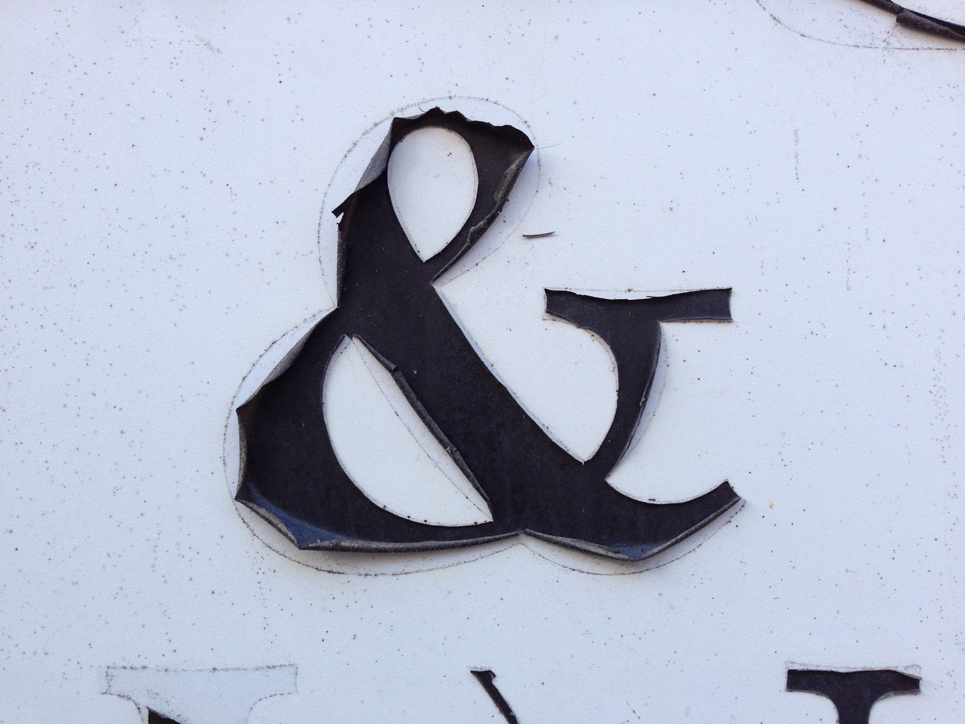
 This antique shop’s sign caught my eye with its peeling letterforms. There’s something fittingly accidental in the evolving visual language of an old sign decaying for an antique’s dealer. And the shapes created by this natural ageing process give up unique shapes—a typeface being undesigned, if such a thing were possible—that organically visualise the forward march of time. While the motion may not be obvious in the moment in which I looked at these, motion had happened and was happening none–the–less, albeit at a very, very slow rate.
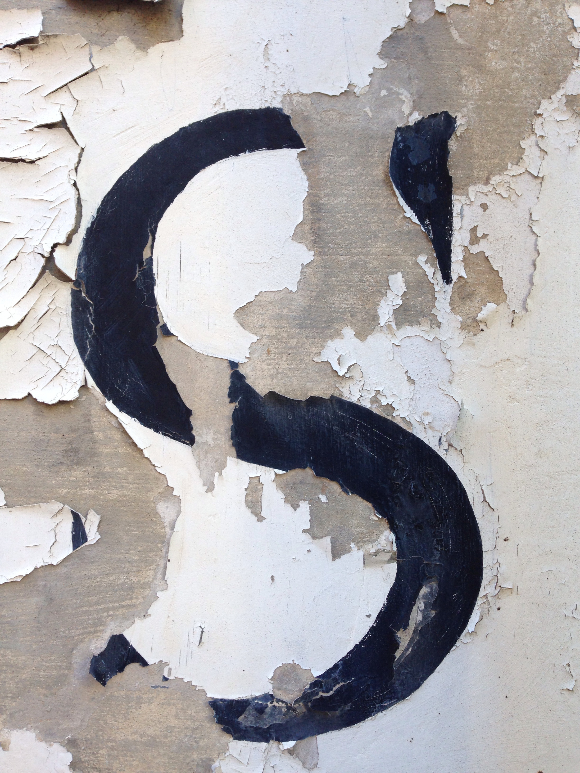
 Another antique shop had a similar feel but this time caused by peeling paint, rather than lifting vinyl.
 I moved from black and white to a dash of colour when walking through a graveyard and I caught sight of moss taking hold to letterforms carved on a gravestone. An interesting thought occurred to me that this type that usually memorialises the dead has turned into a piece of living type, changing with the seasons.

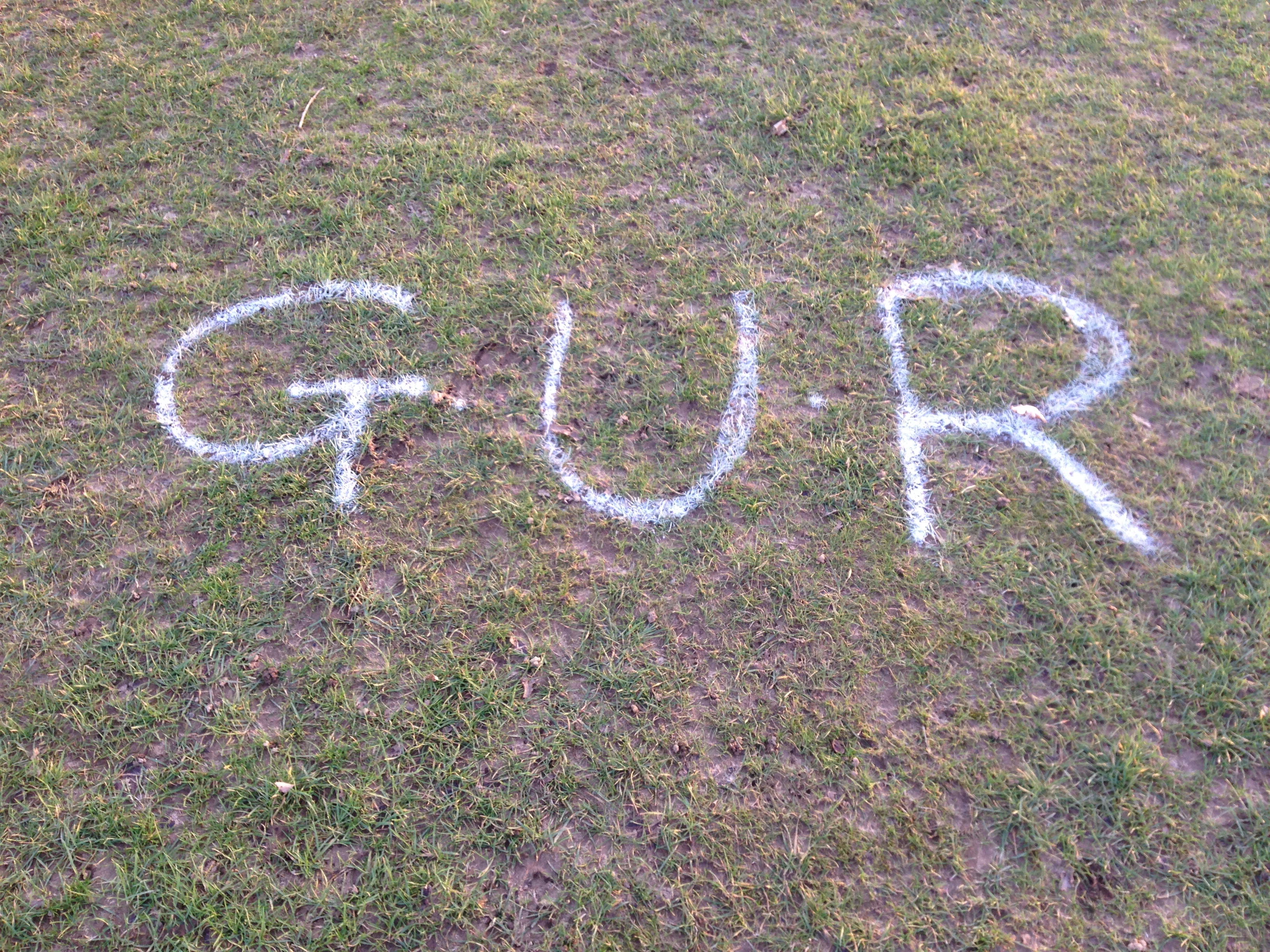
 Later, after returning from Woodbridge and taking the dog for a walk I found this spray painted GUR on a local heath that doubles as a golf course. I have no idea what GUR stands for, and as this is a golf course it is likely to be cut short before anyone will get to see how it develops. But it is still a piece of living typography while it lasts, as the grass grows.